I also decided to add some text at the beginning. One block on the first page to indicate the dates the images were taken, the second page to give some background on how the zine came to pass. Again, adding text wasn’t quite as easy as you’d hope. Rather than clicking on the page and then typing like on a blog post, you have to create a text box, click into the textbox, create the text, save the text… When it came to font choices, I went for a typewriter style font for the introductory text (kingthings trypewriter - downloaded for free from FontSquirrel), as well as for the front cover. It’s a style of font I quite like, partly because it looks more like someone has typed on it rather than it being created by a computer (it’s also a font style commonly used for the liner notes in some of my favourite albums).
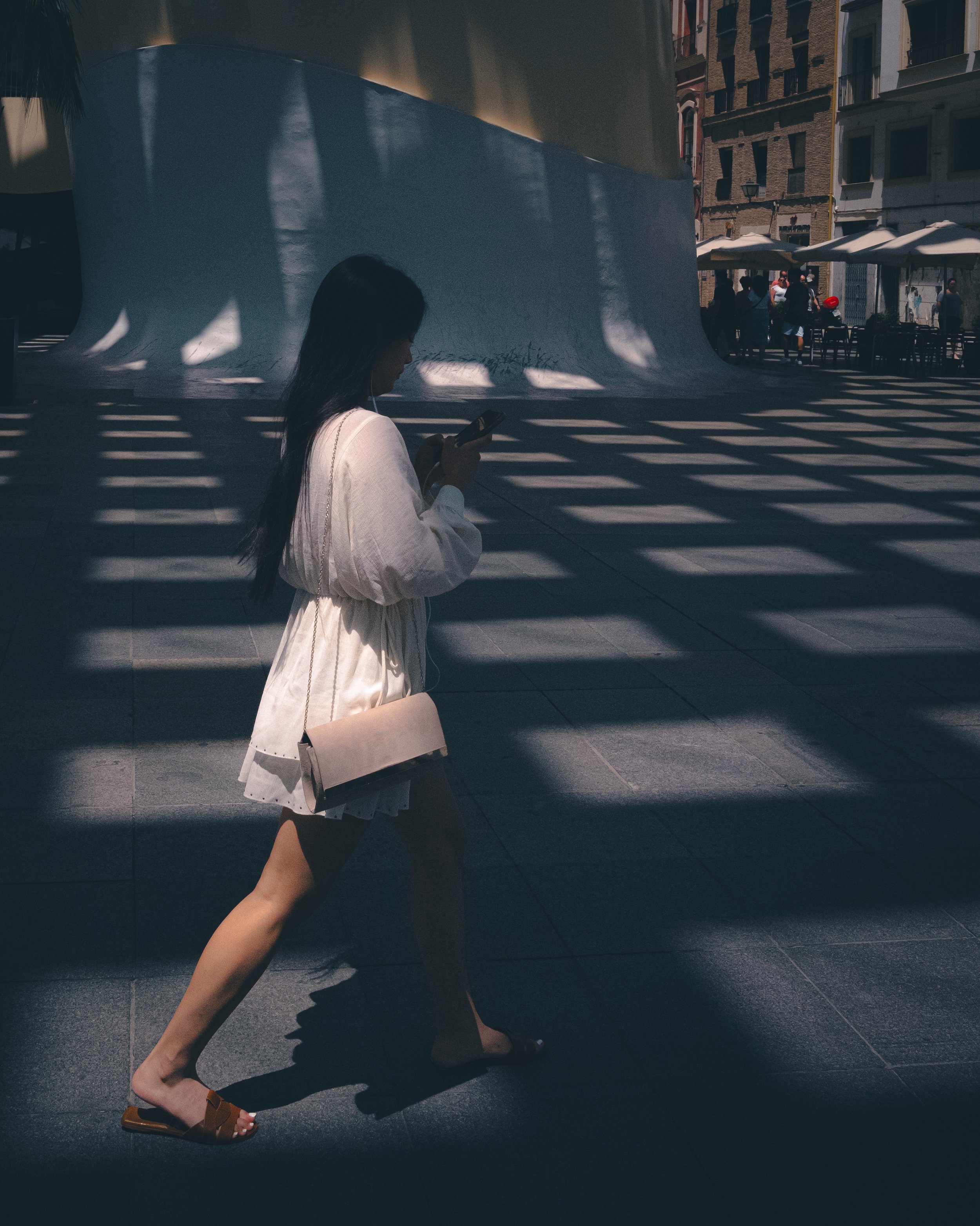
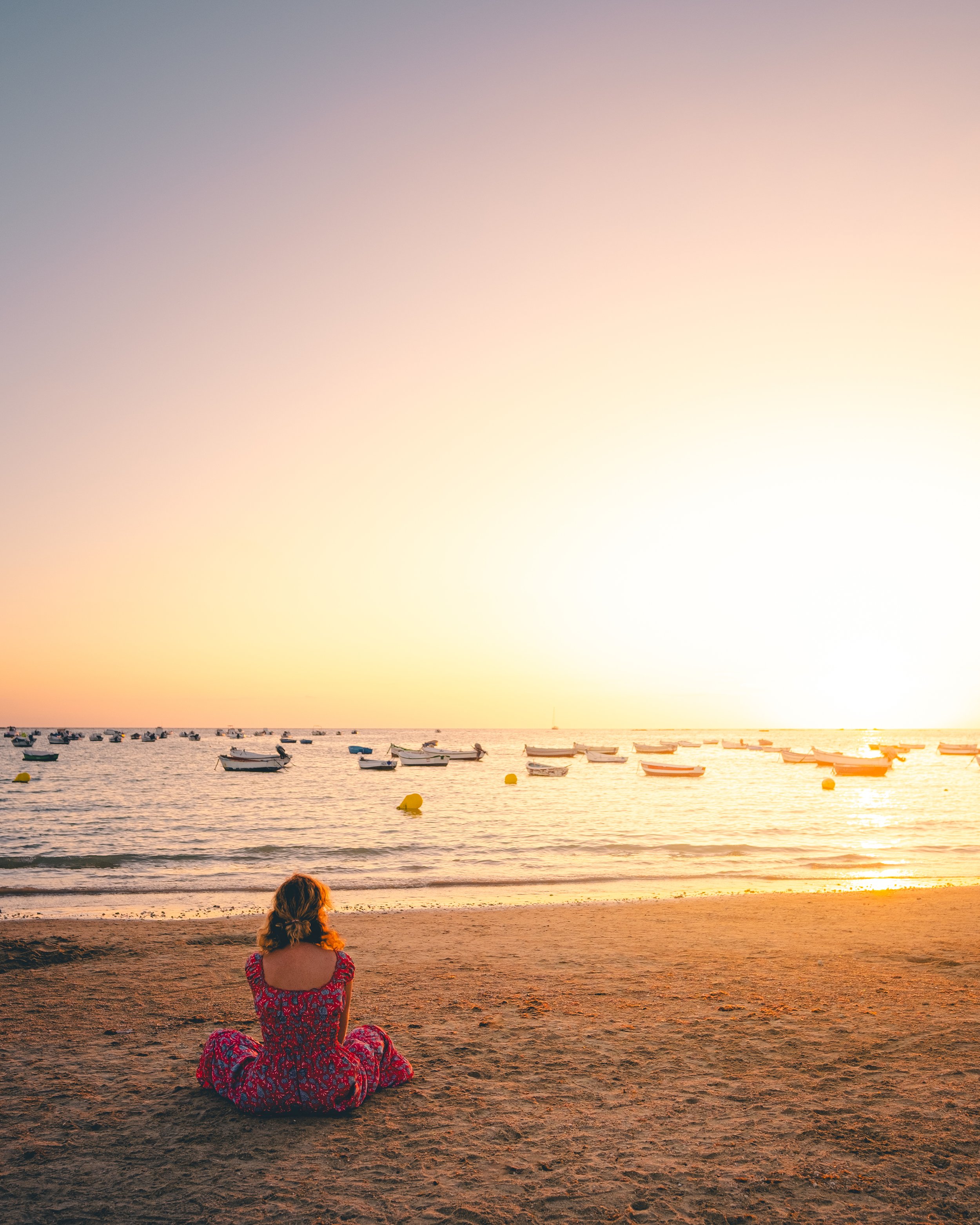
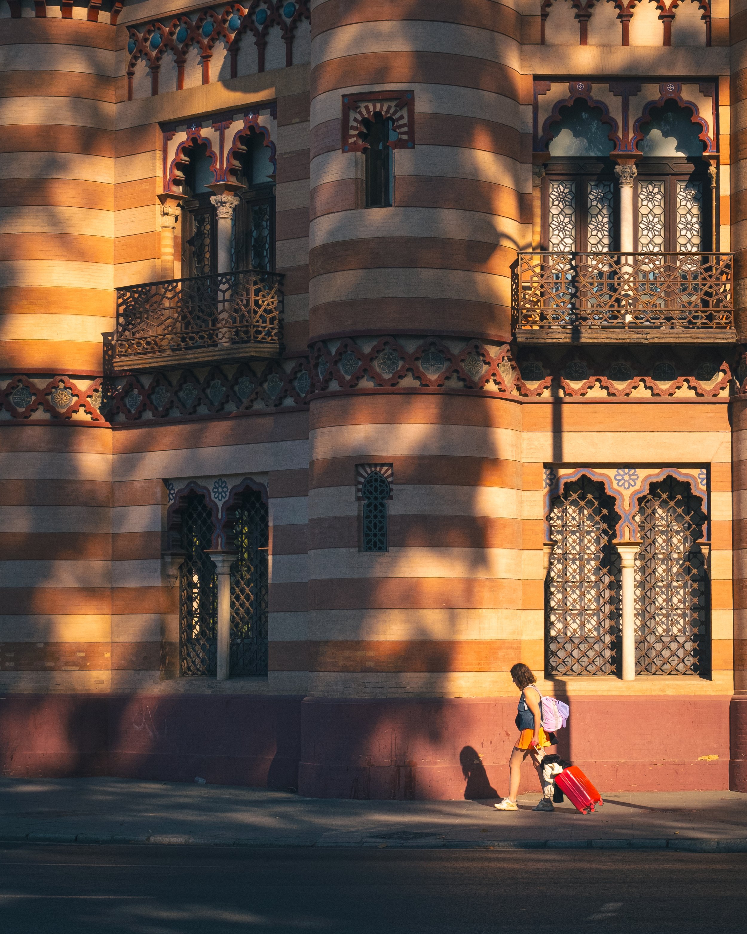
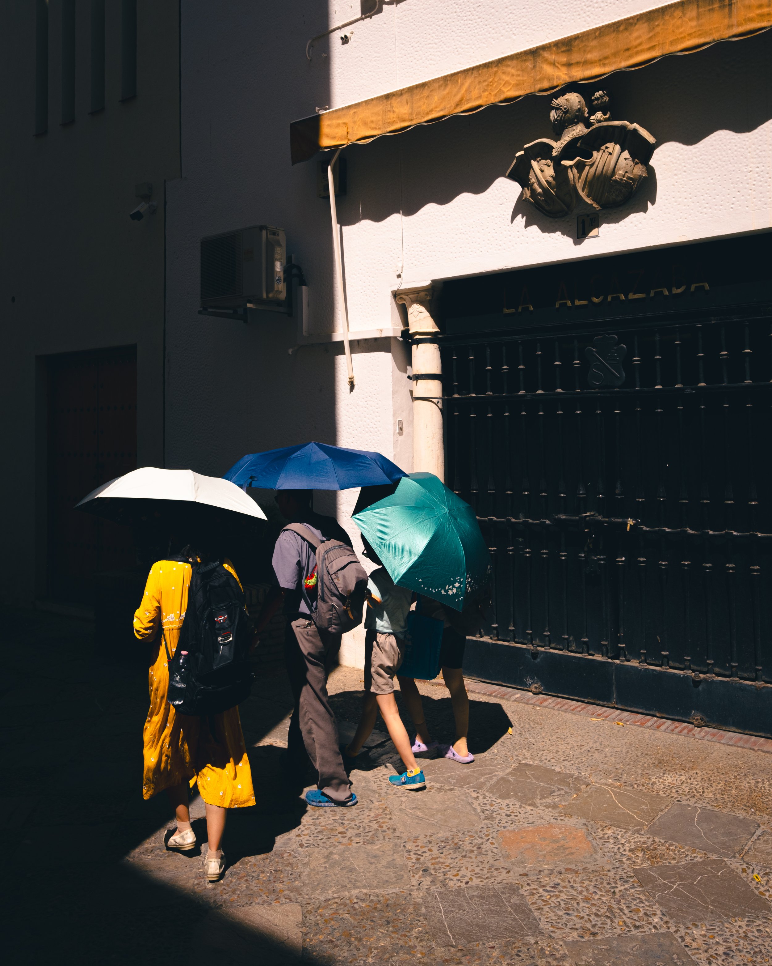
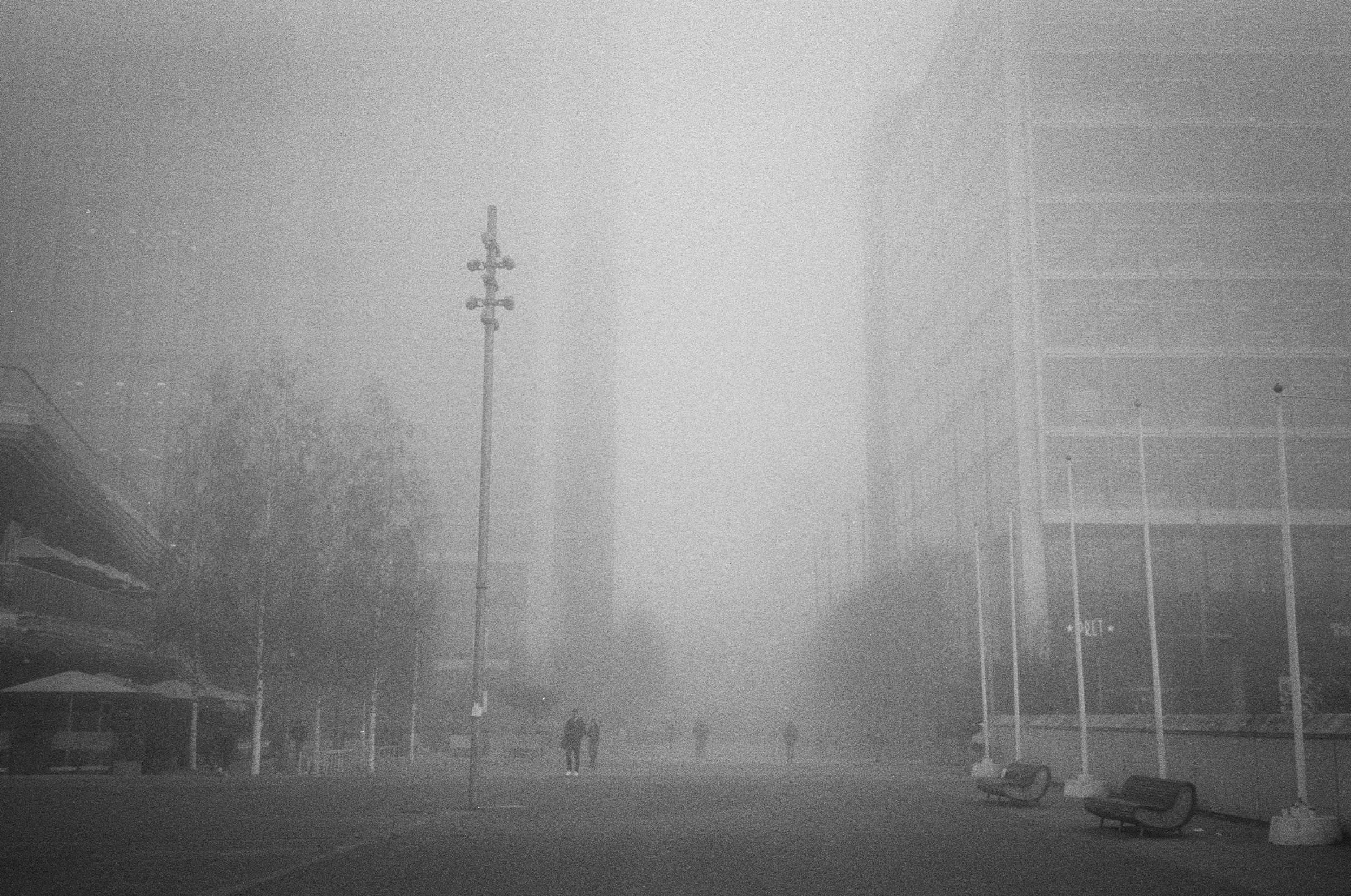
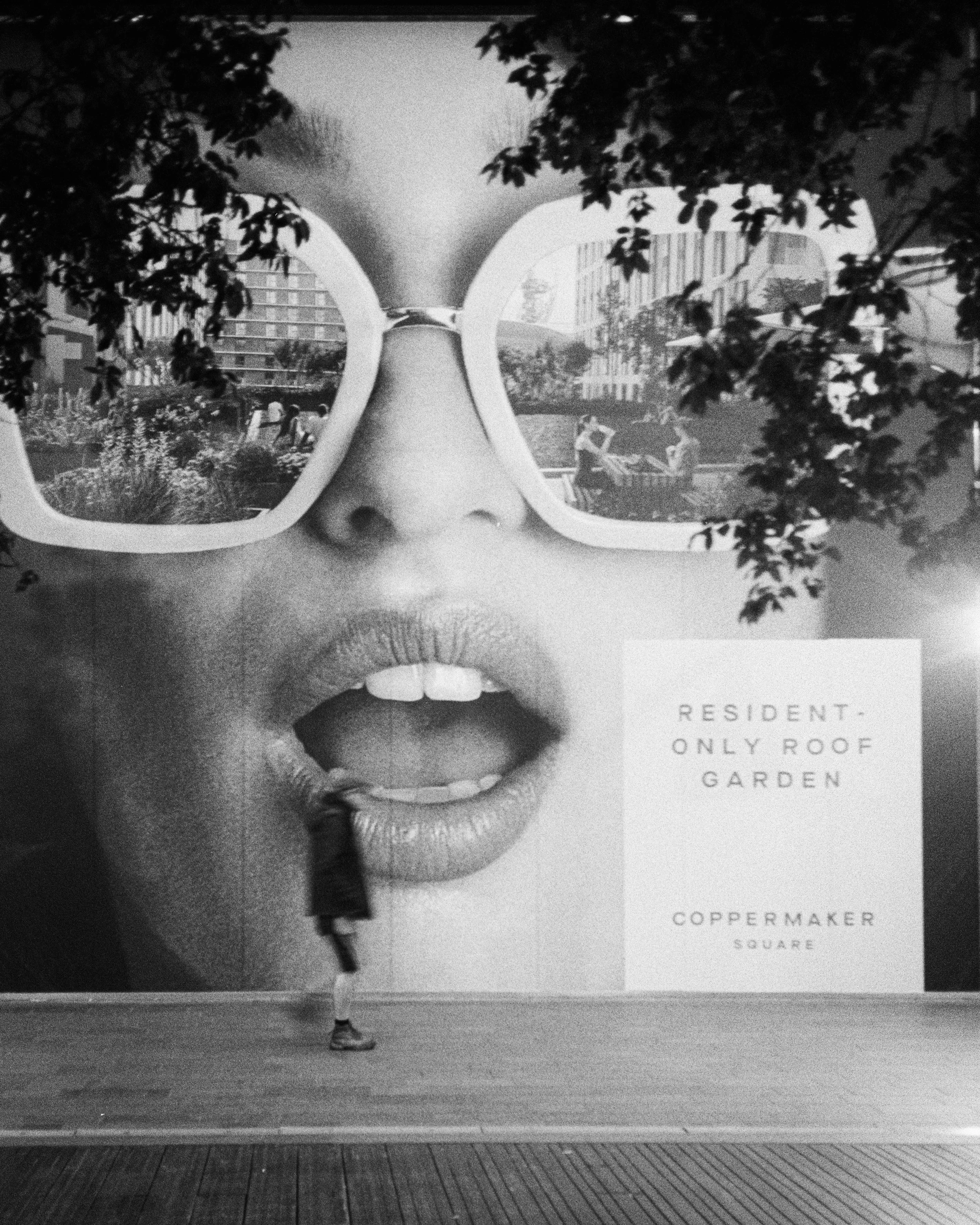
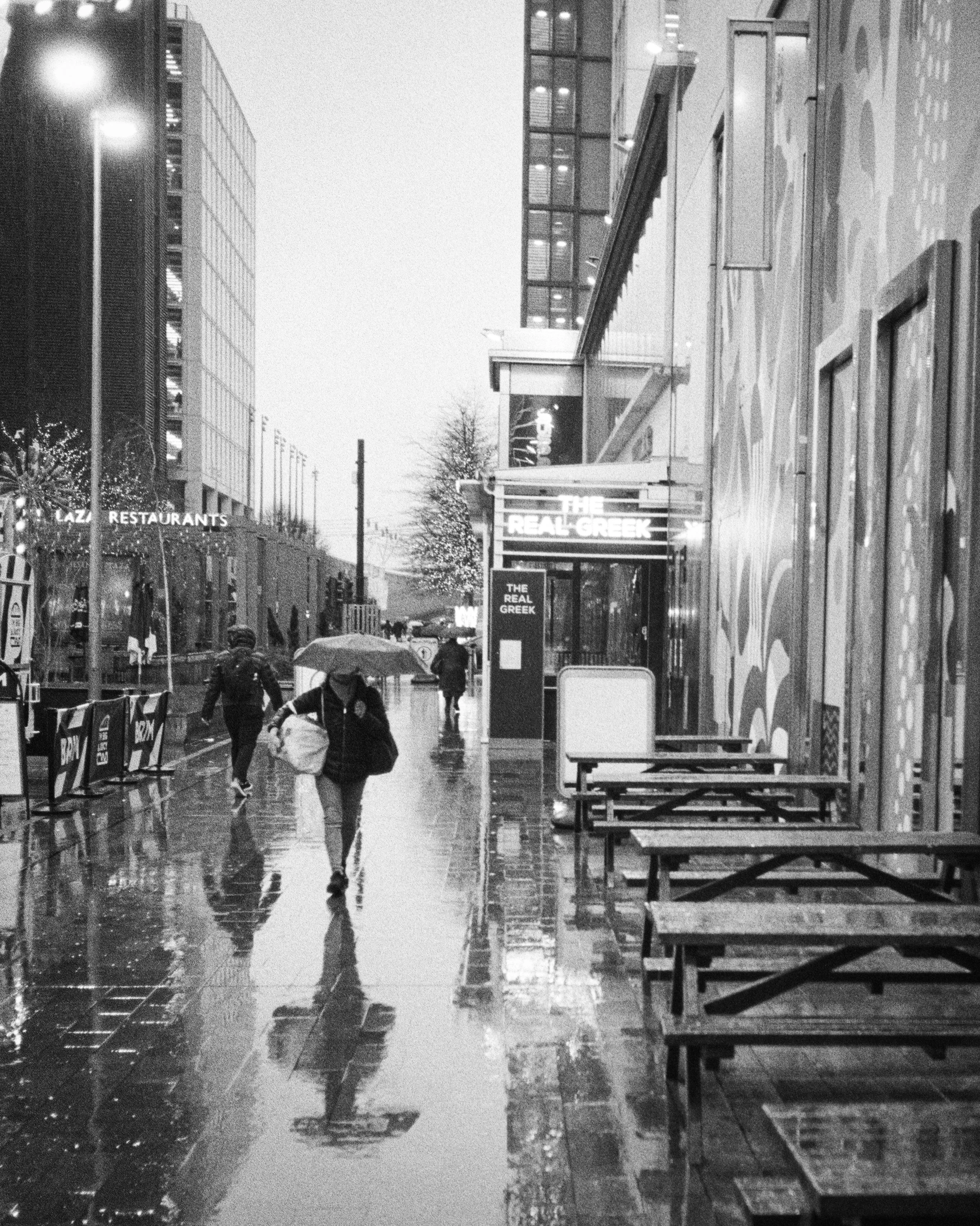
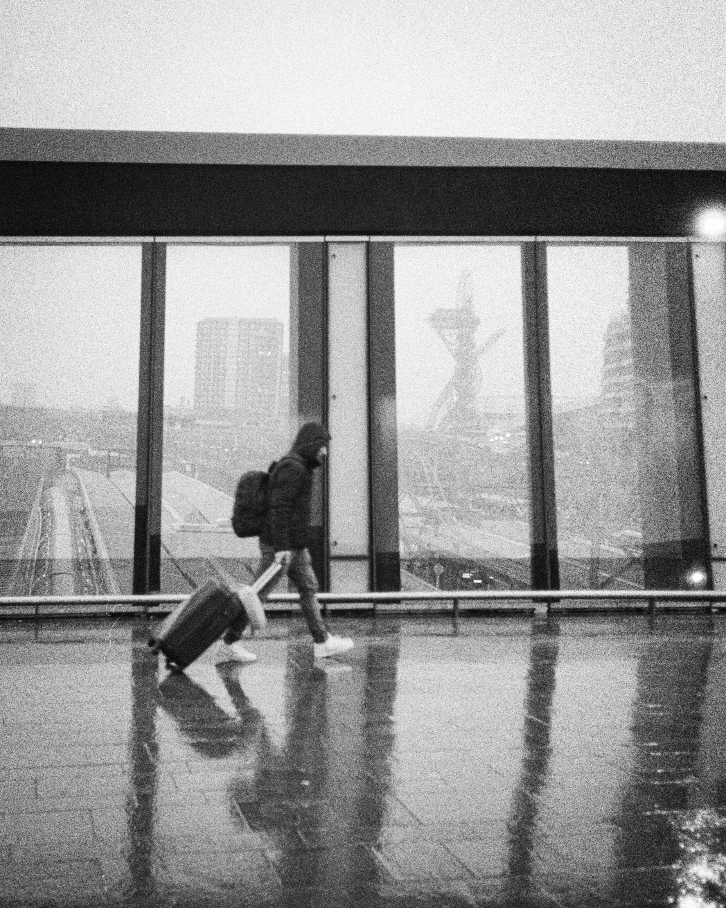
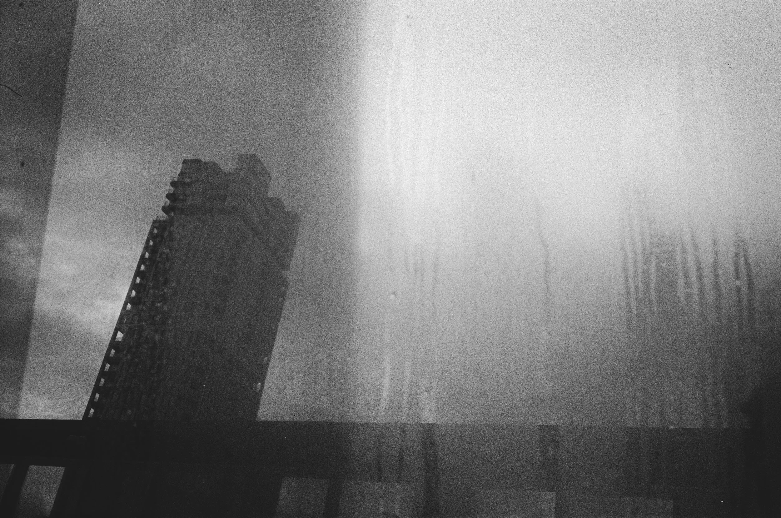
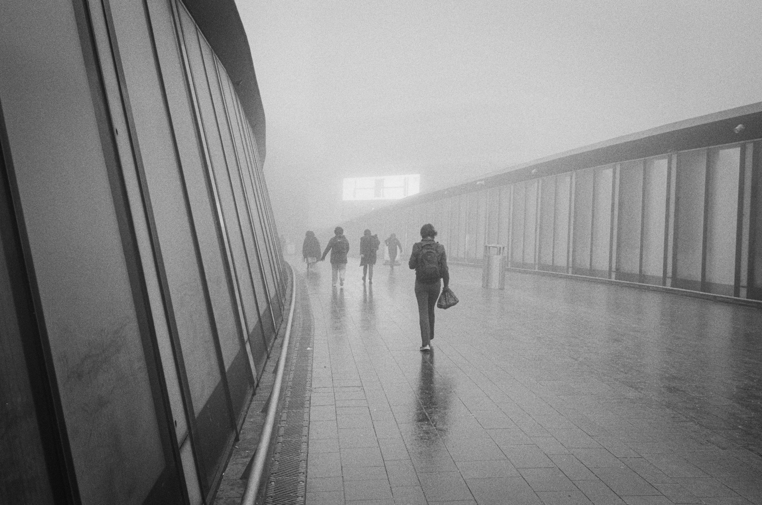
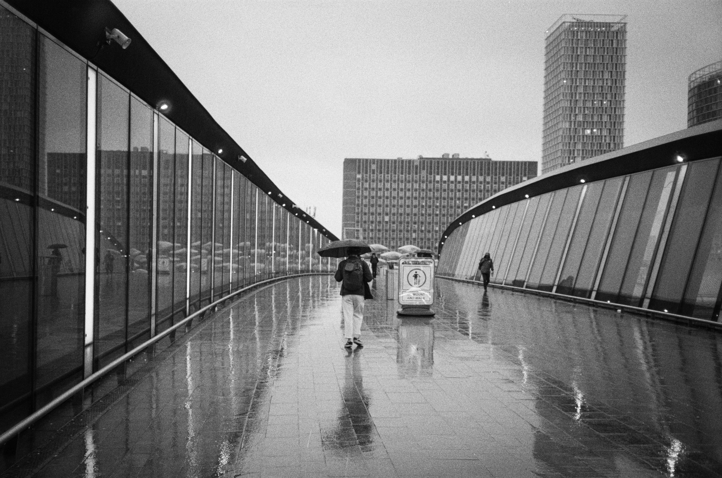
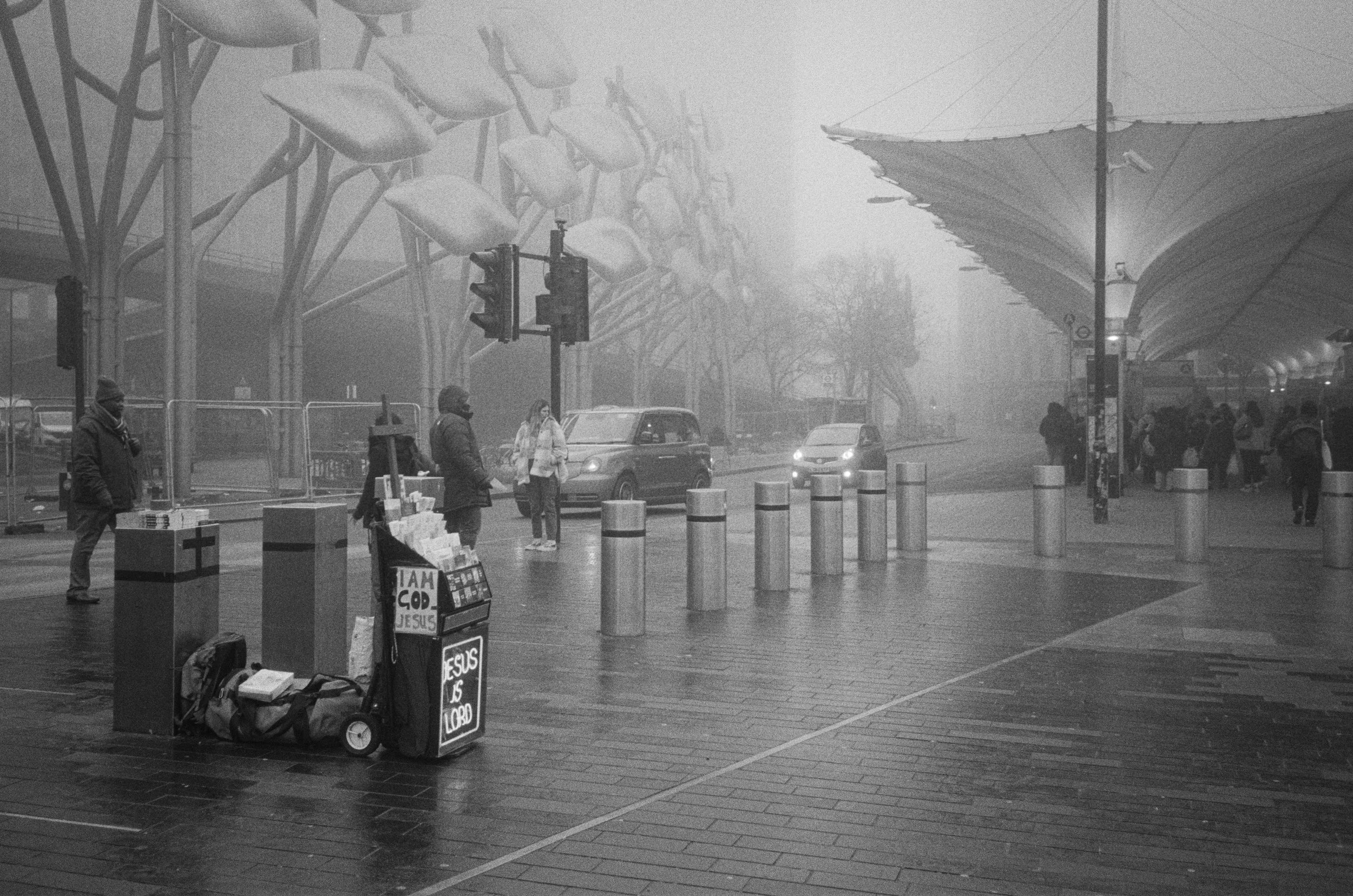
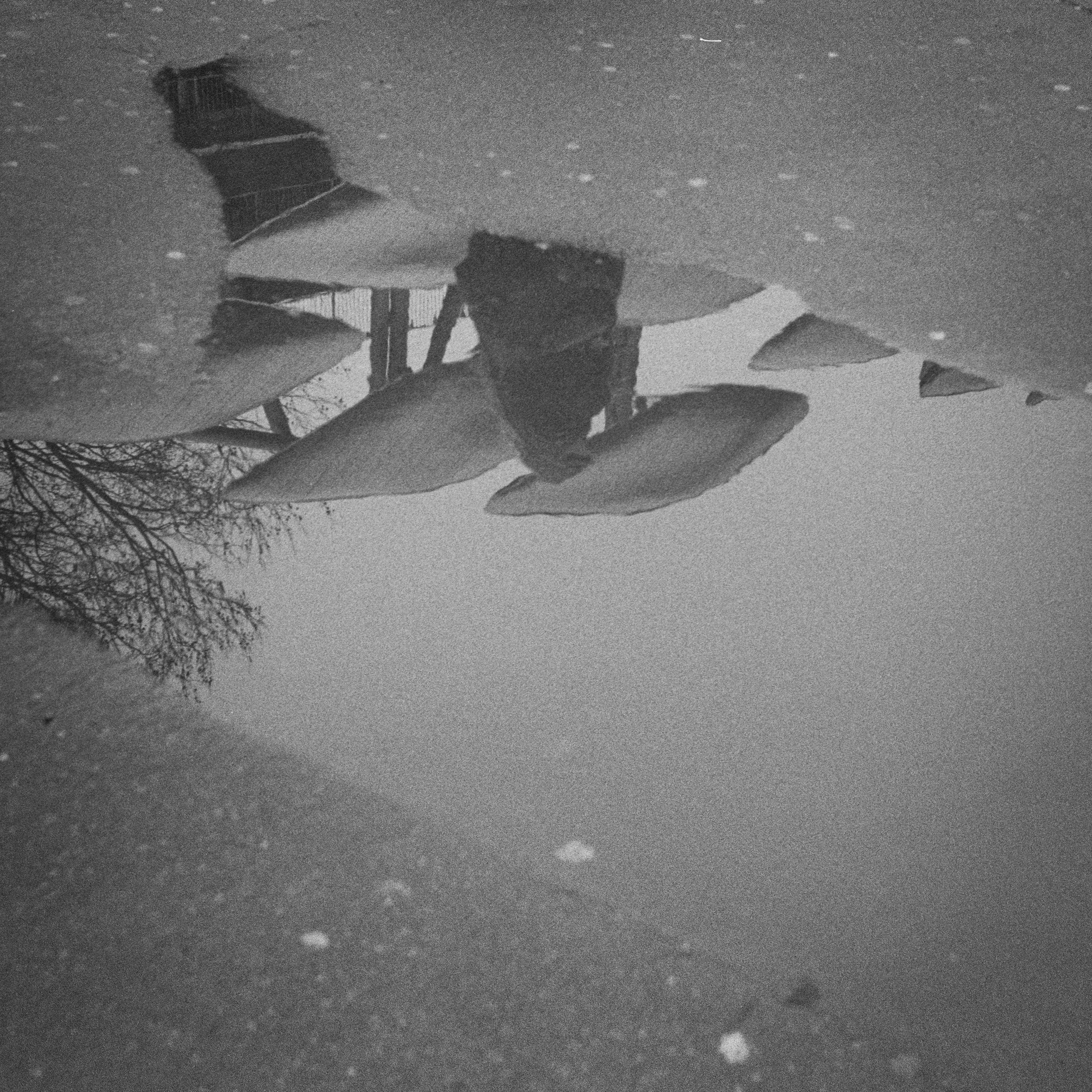
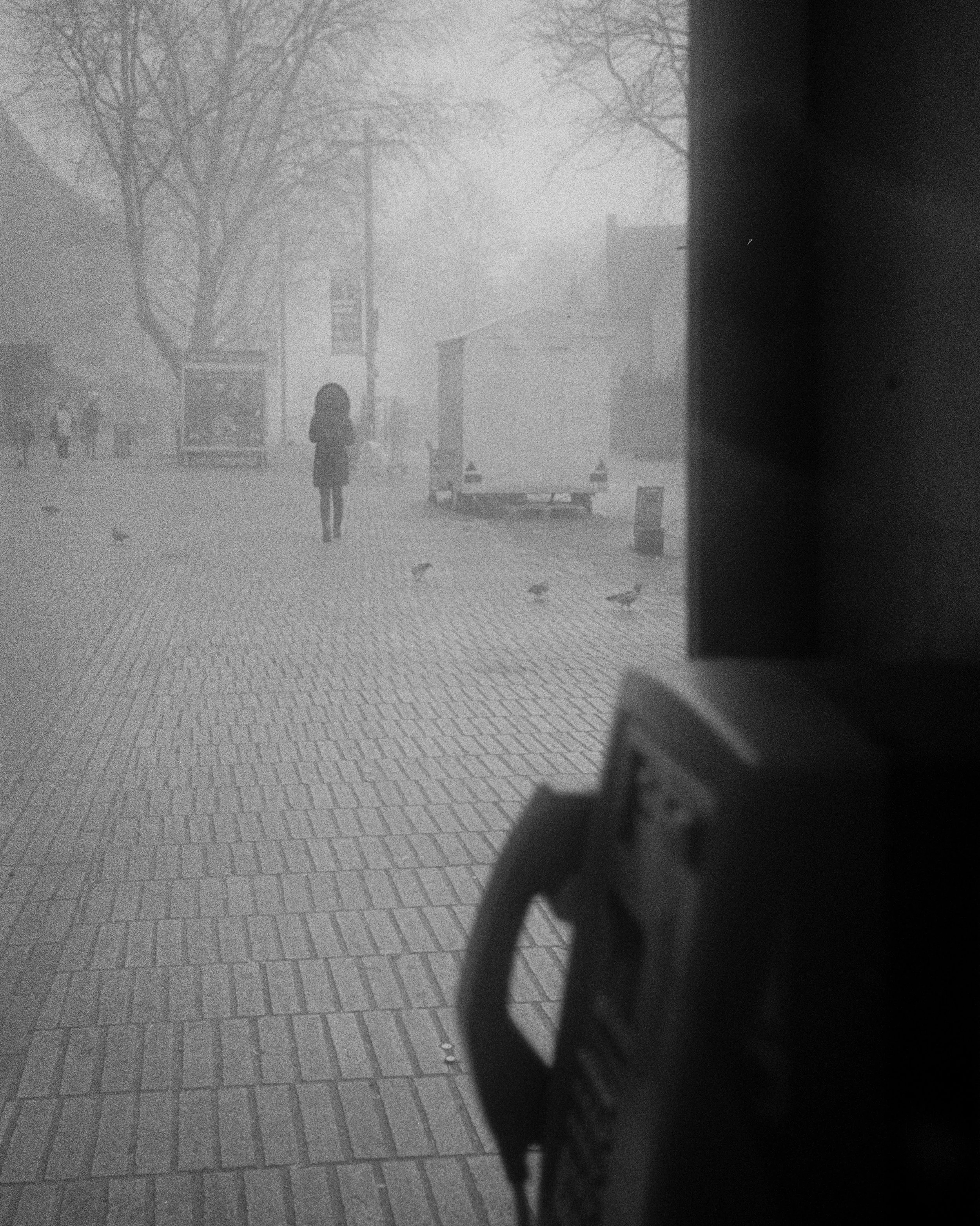
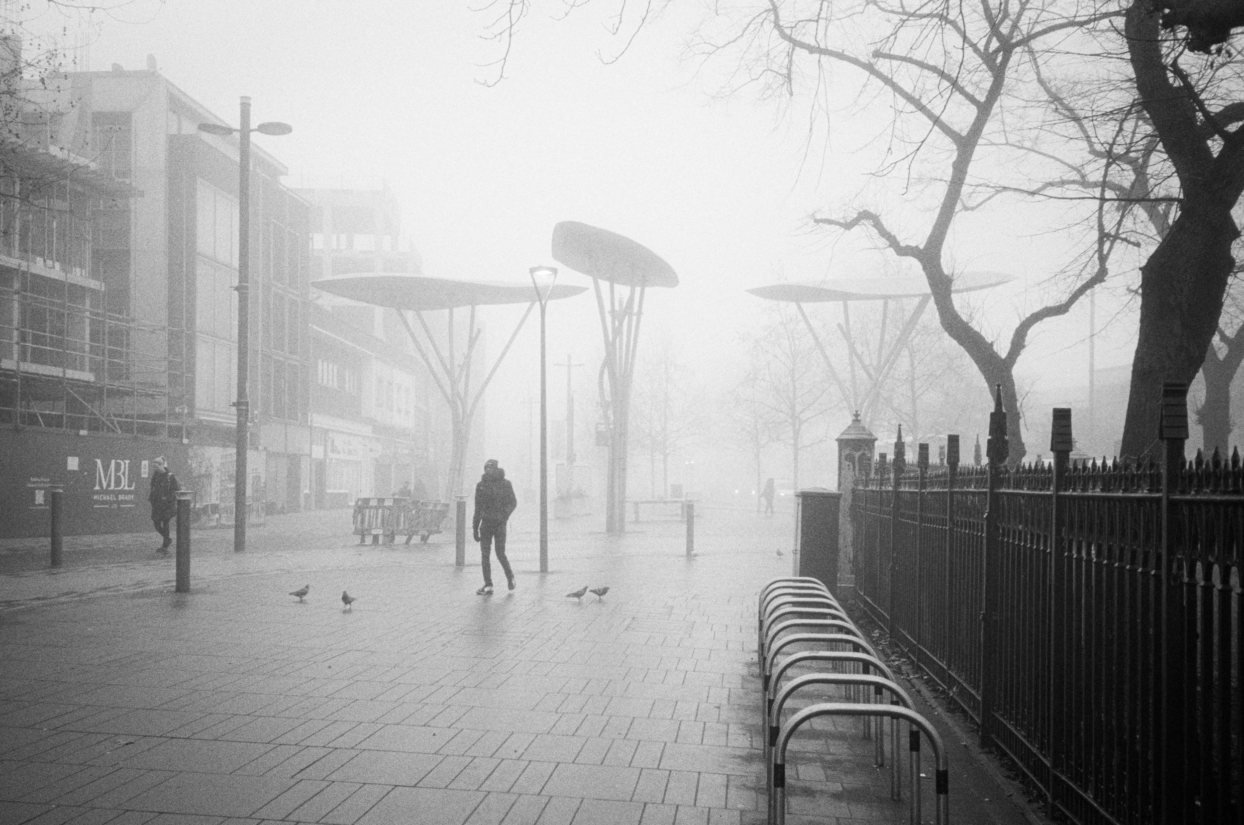
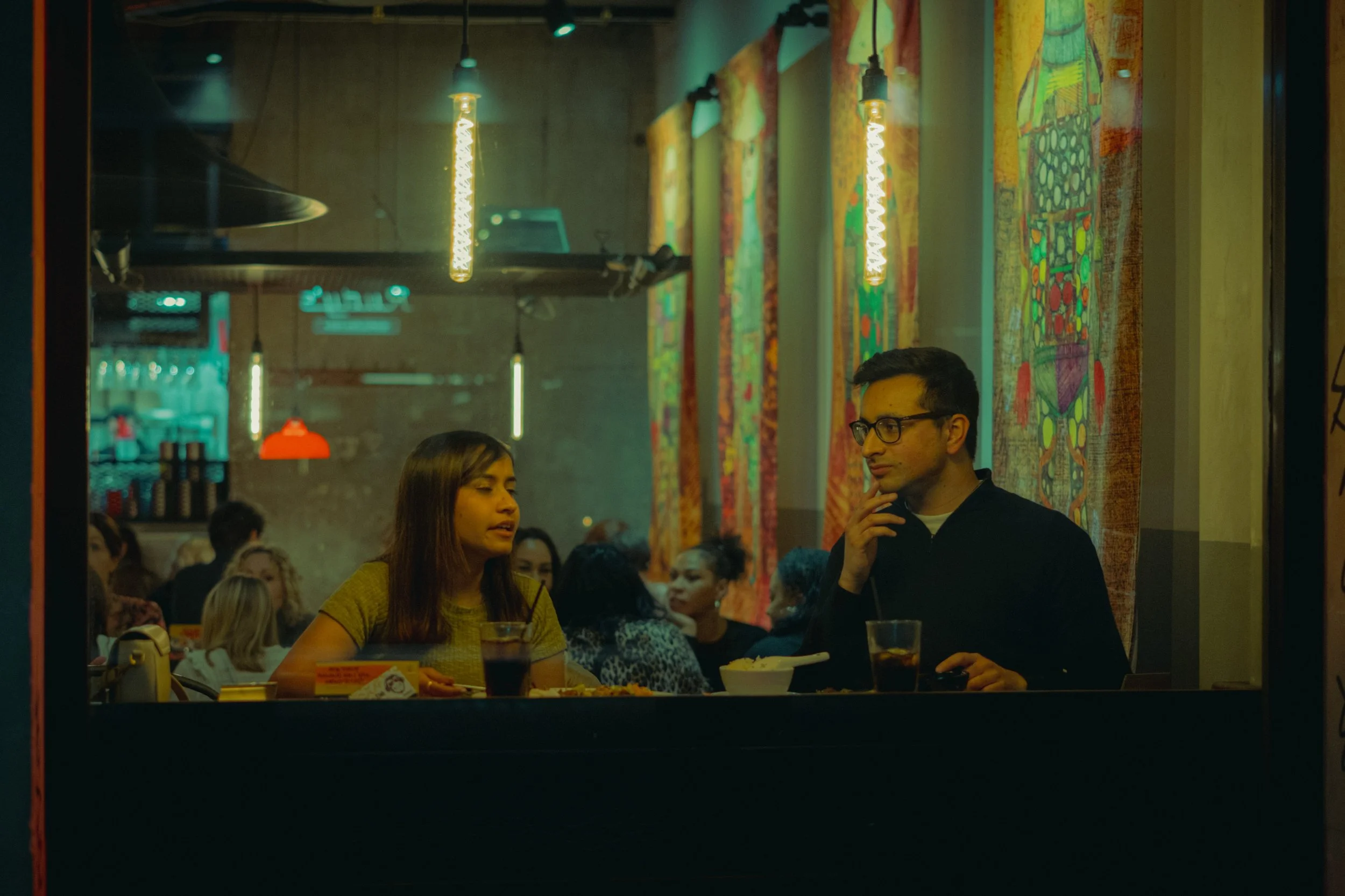
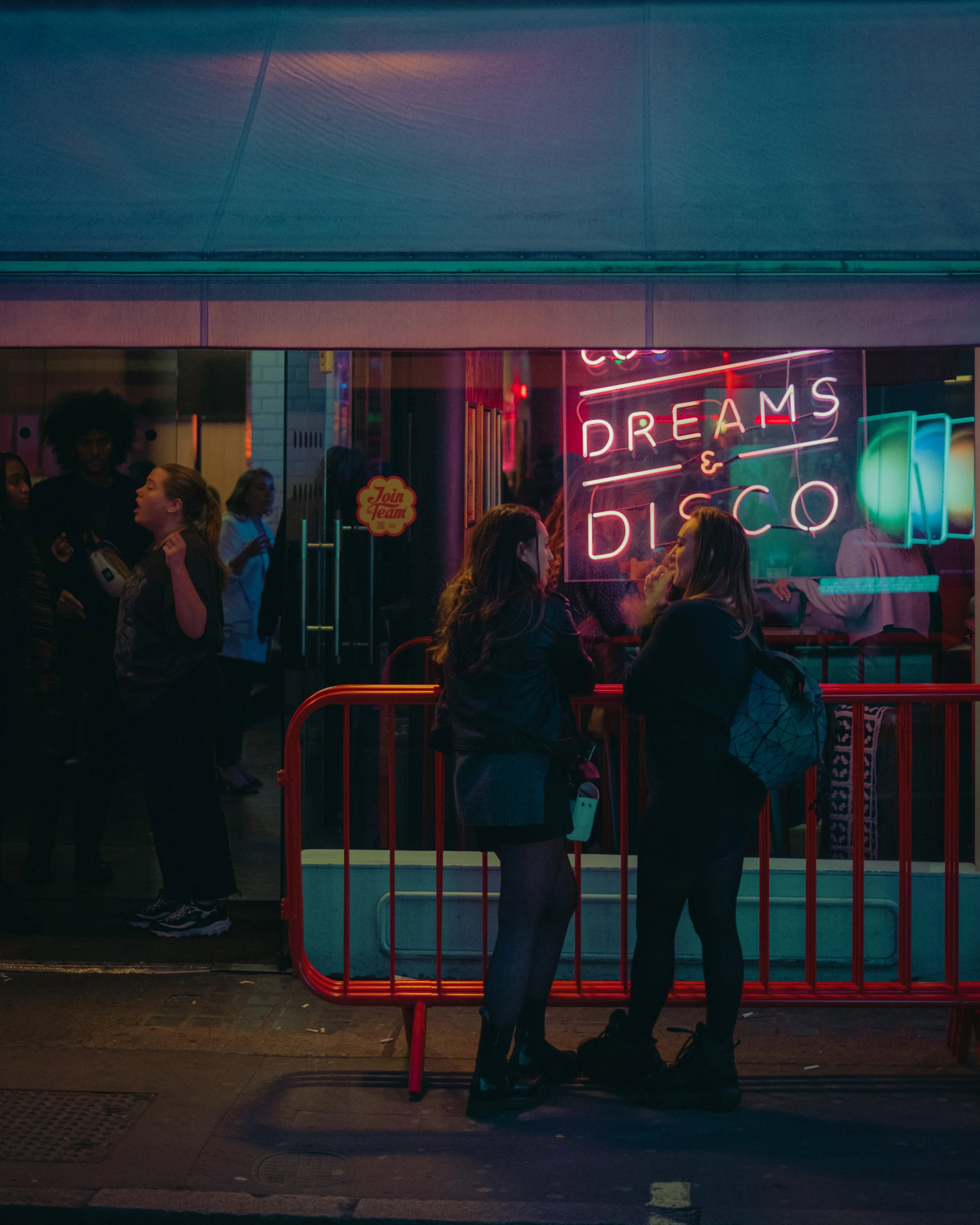
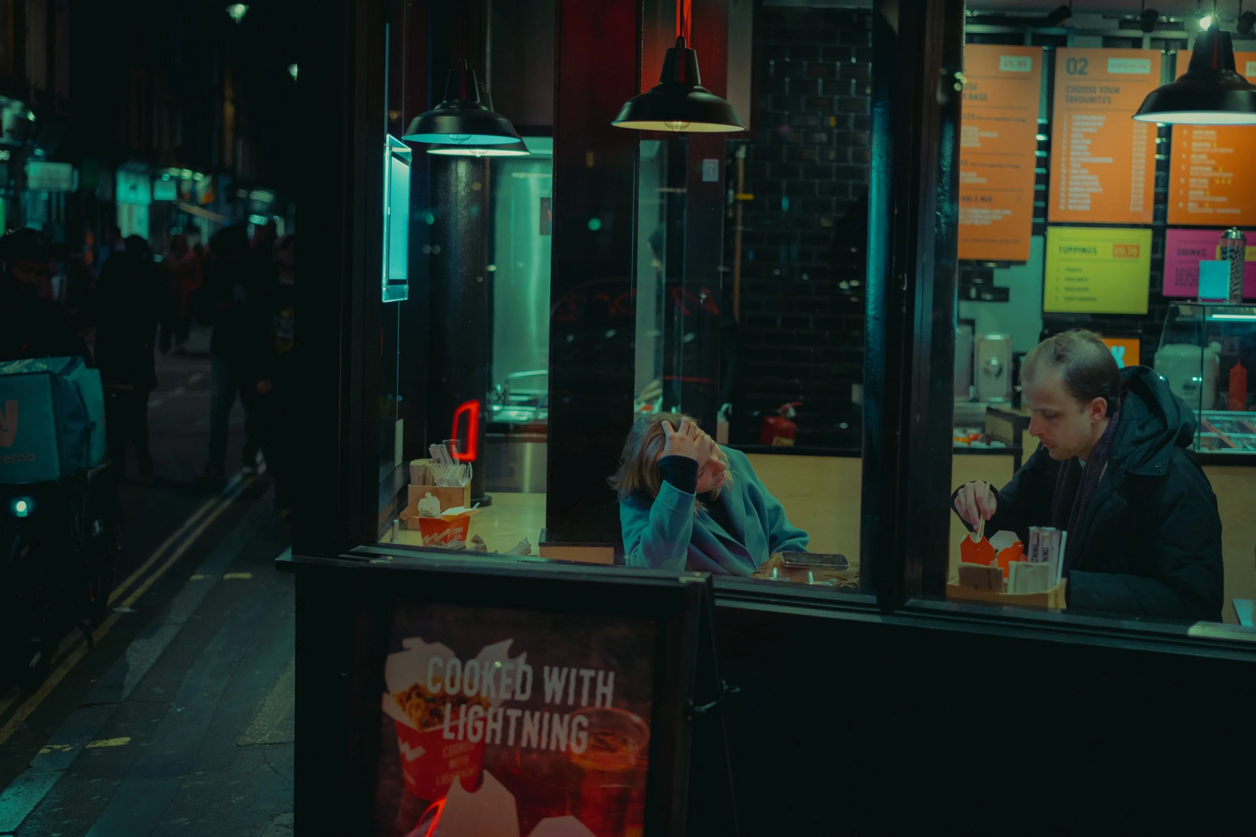
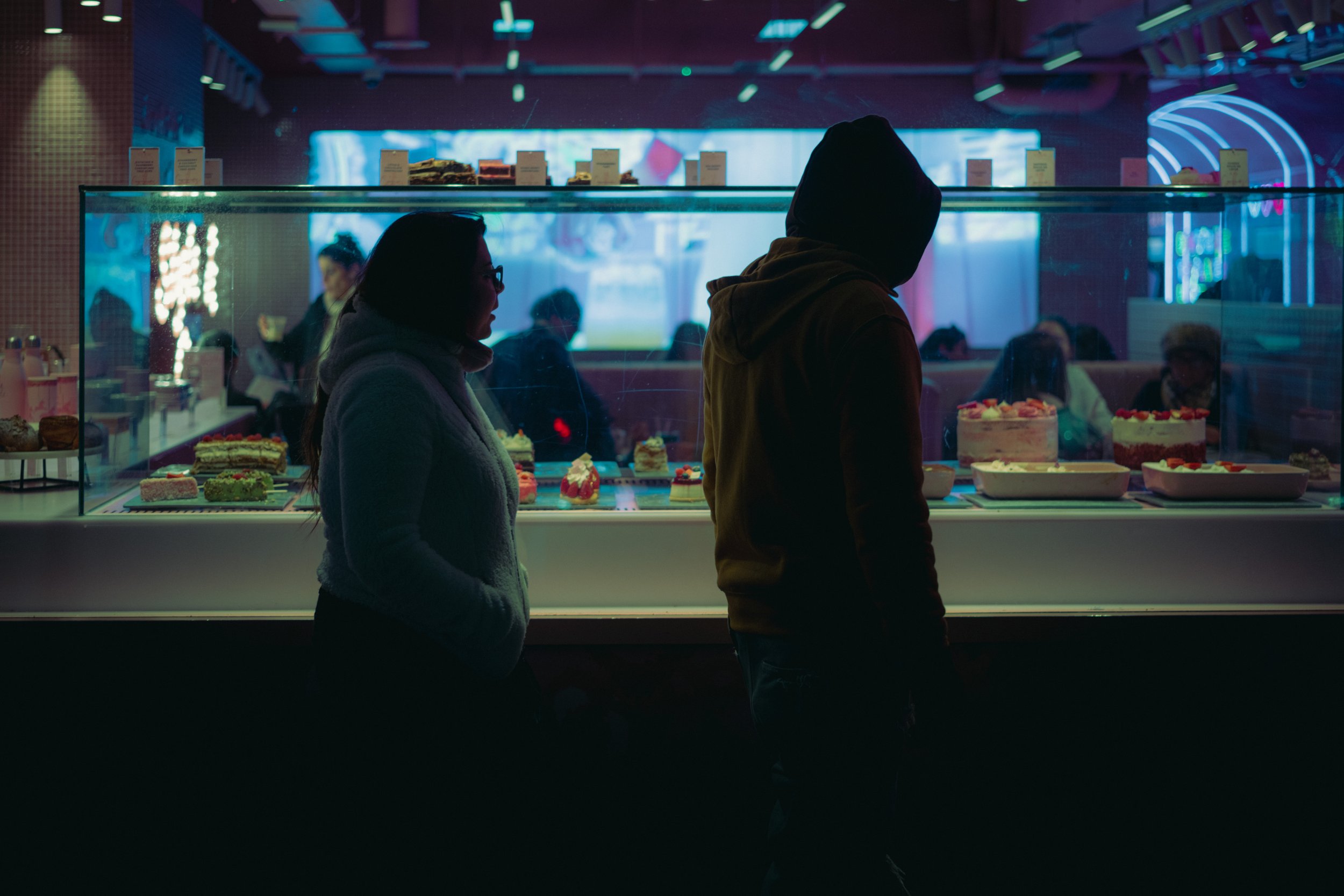
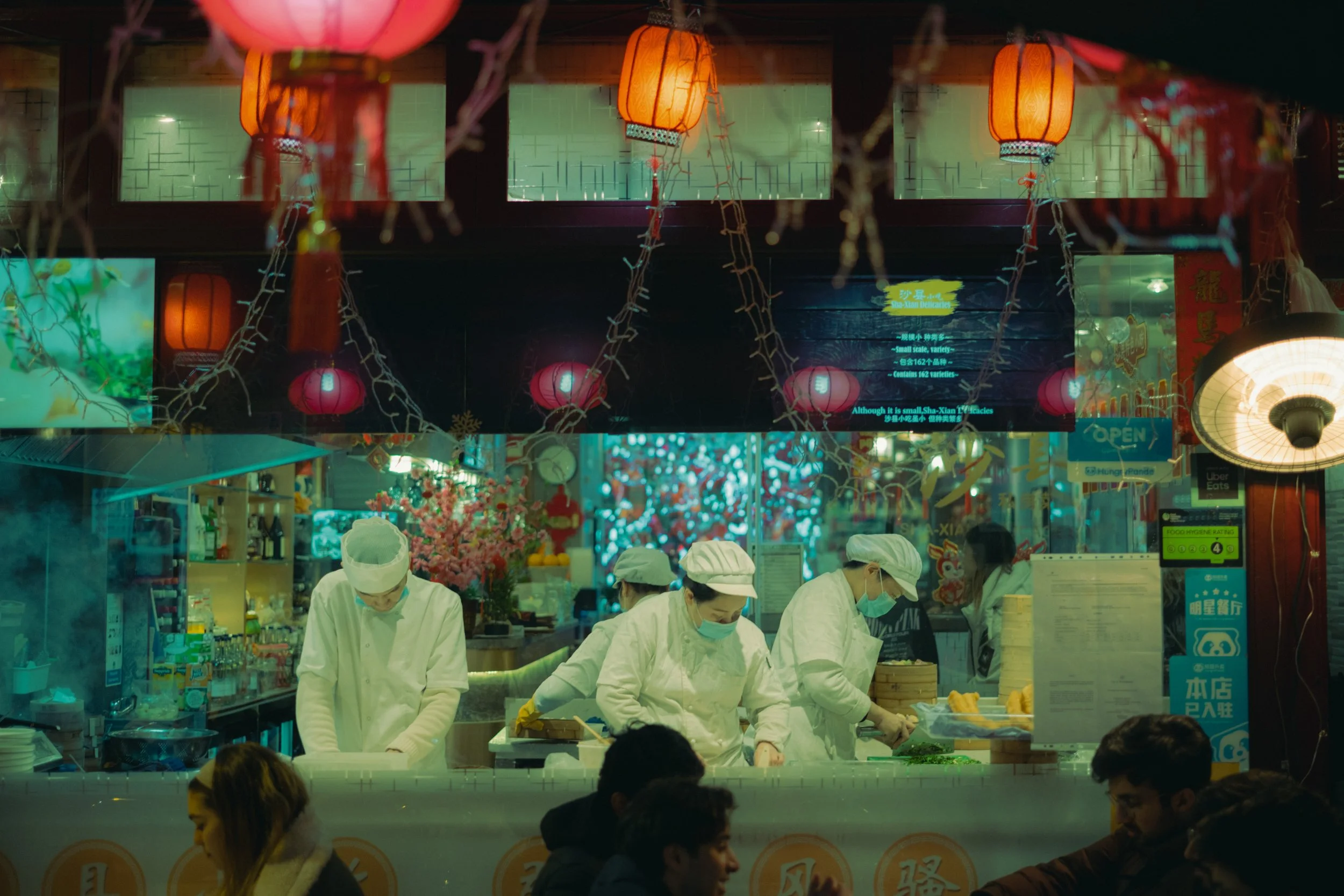
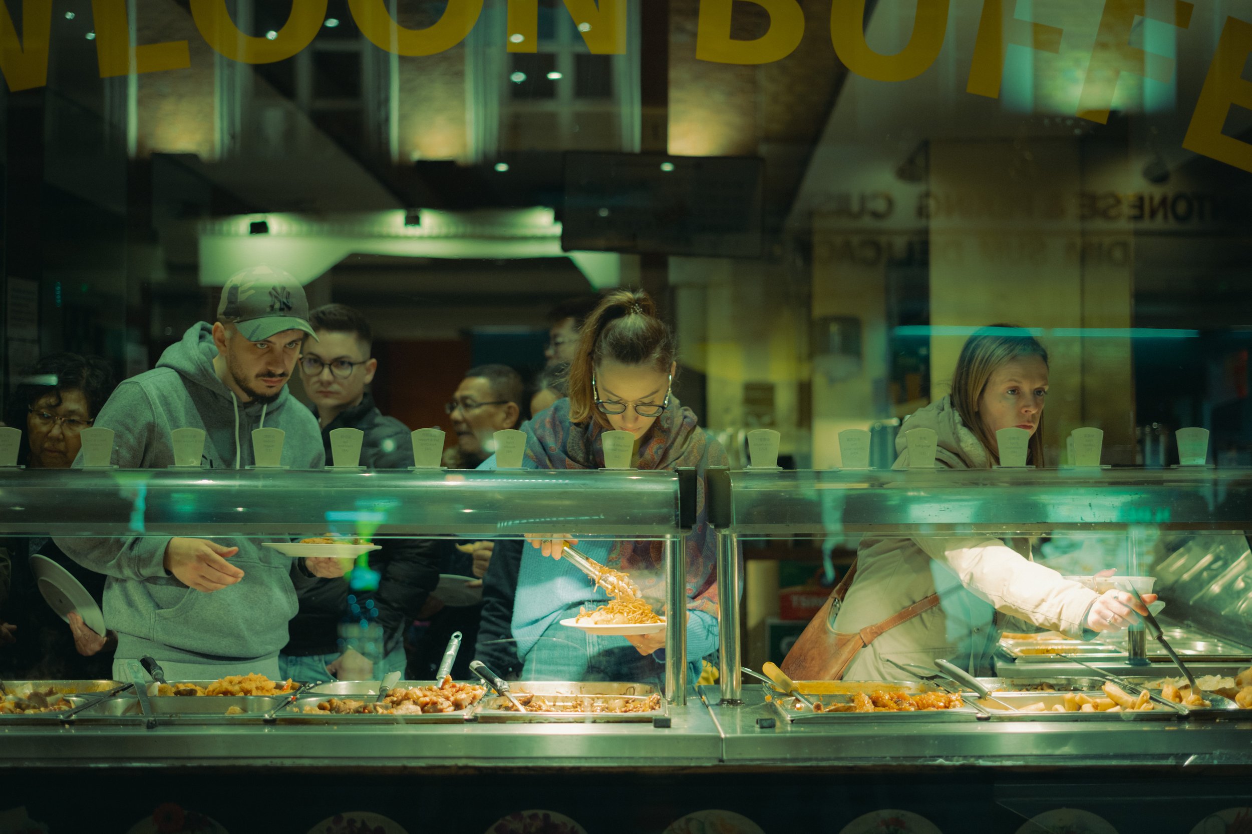
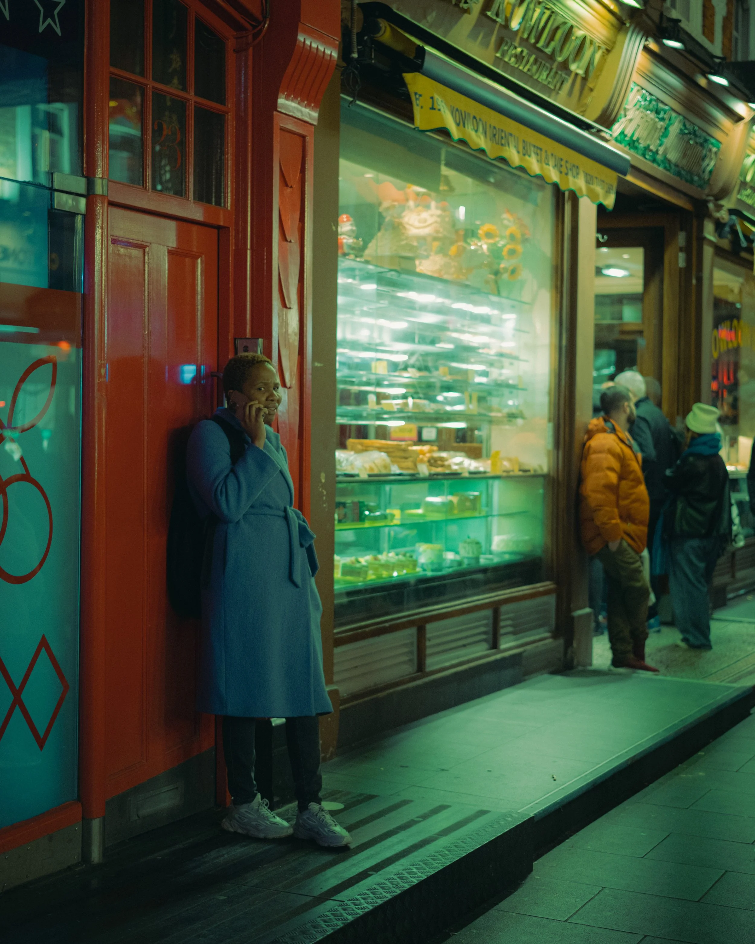
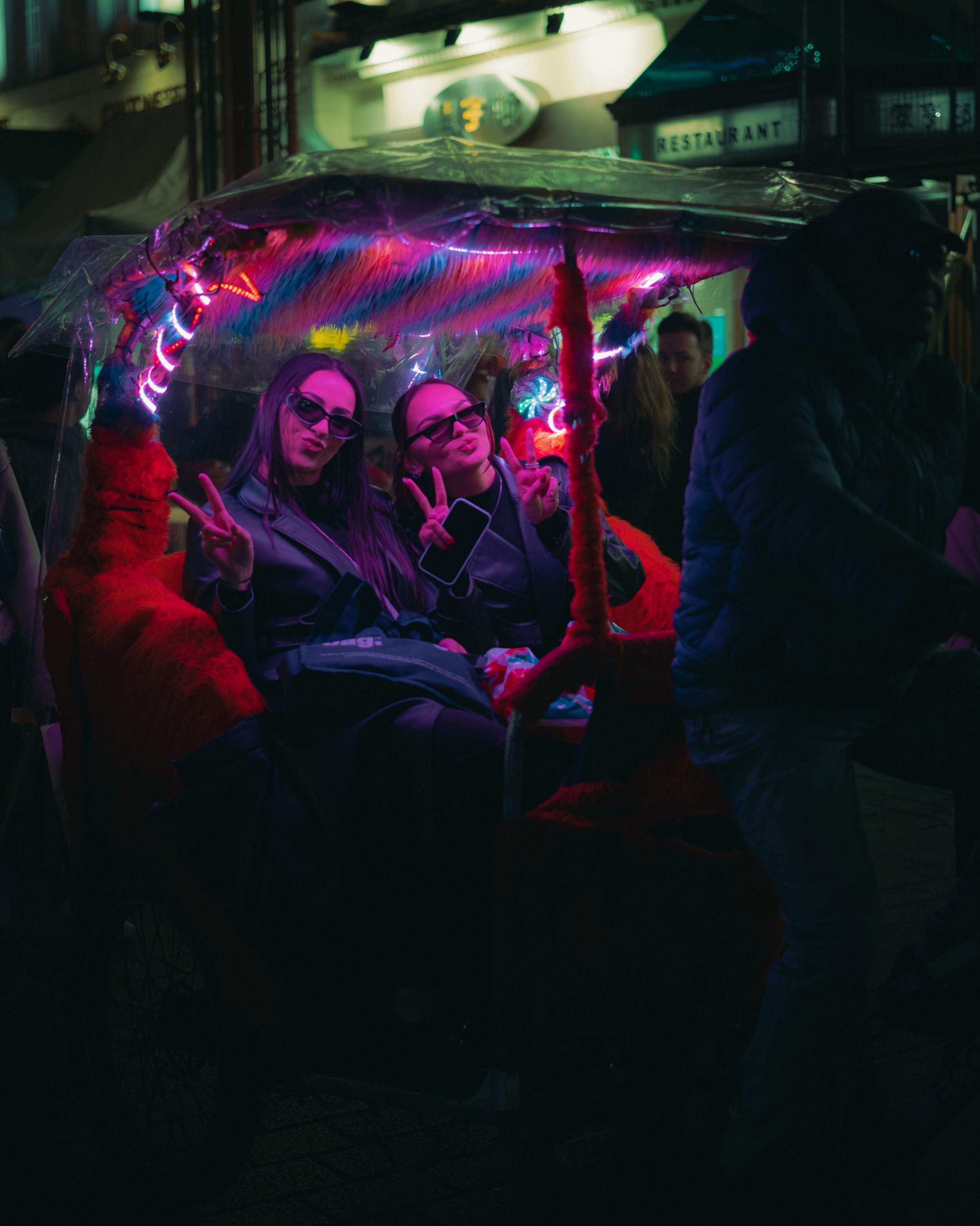
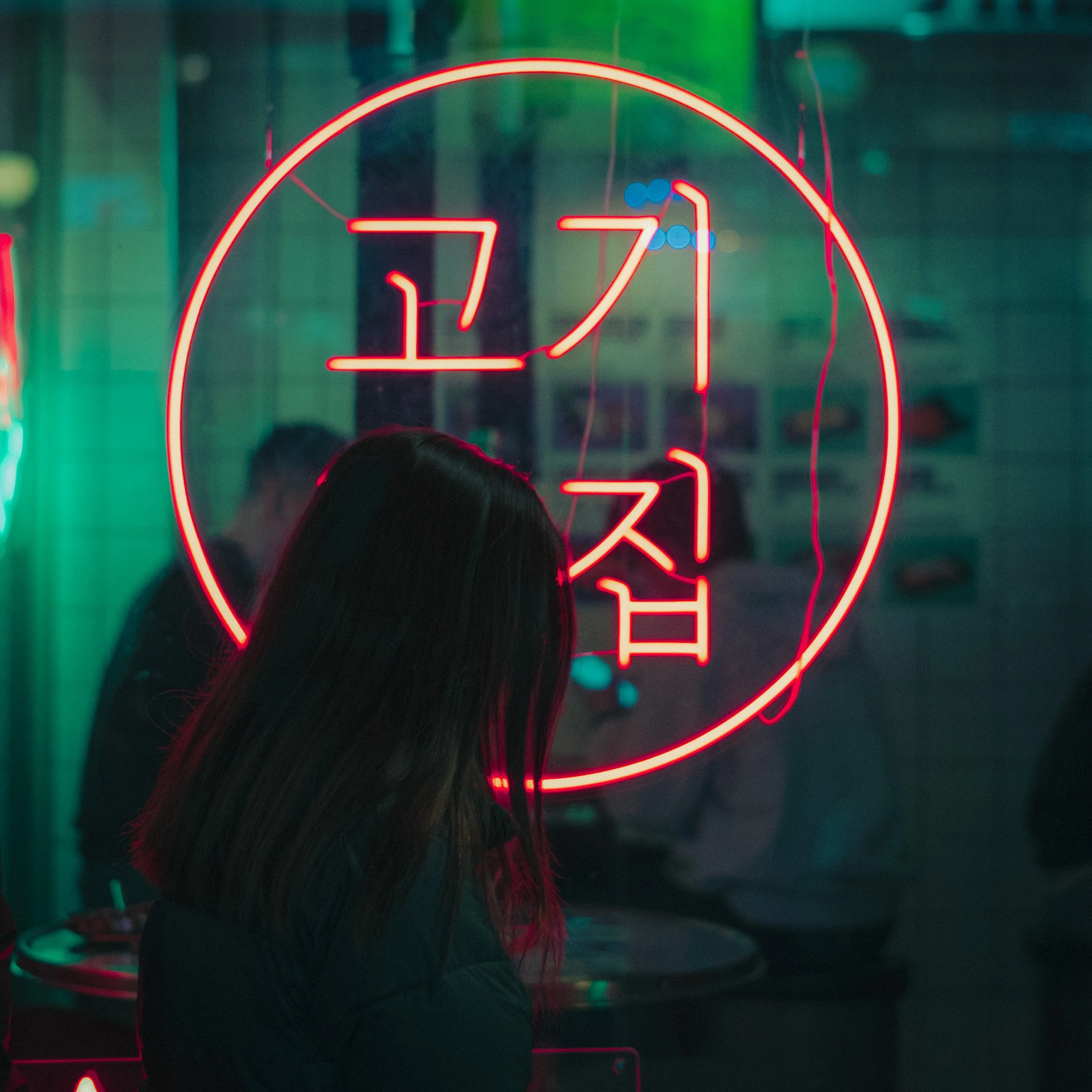
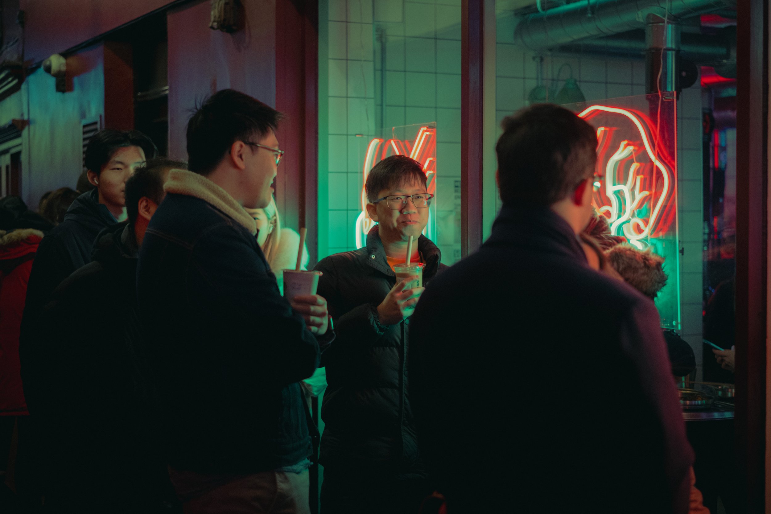
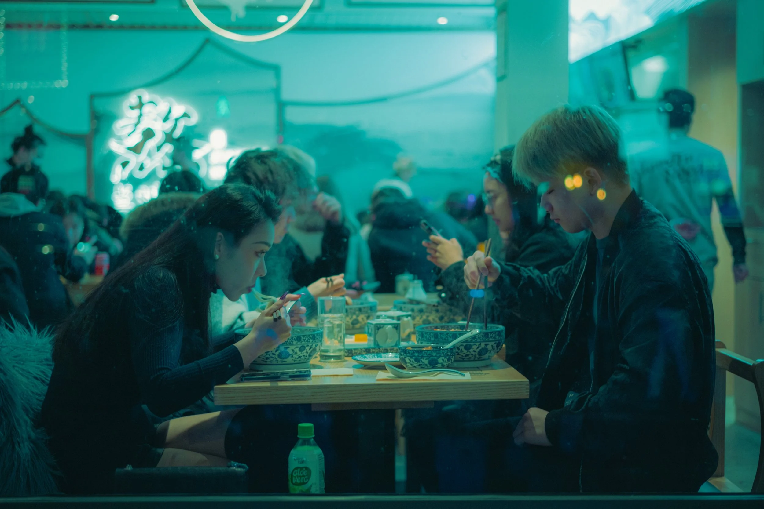
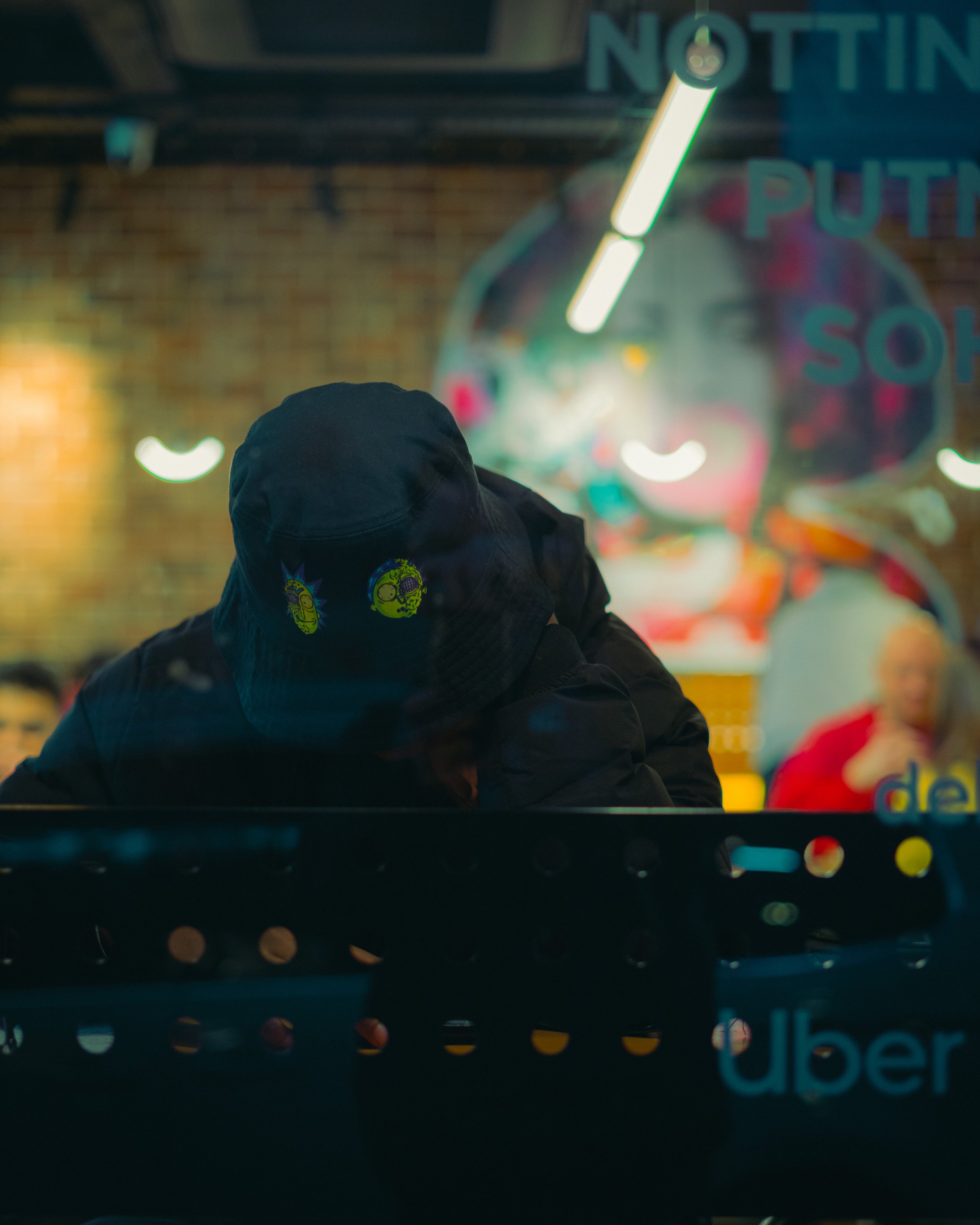
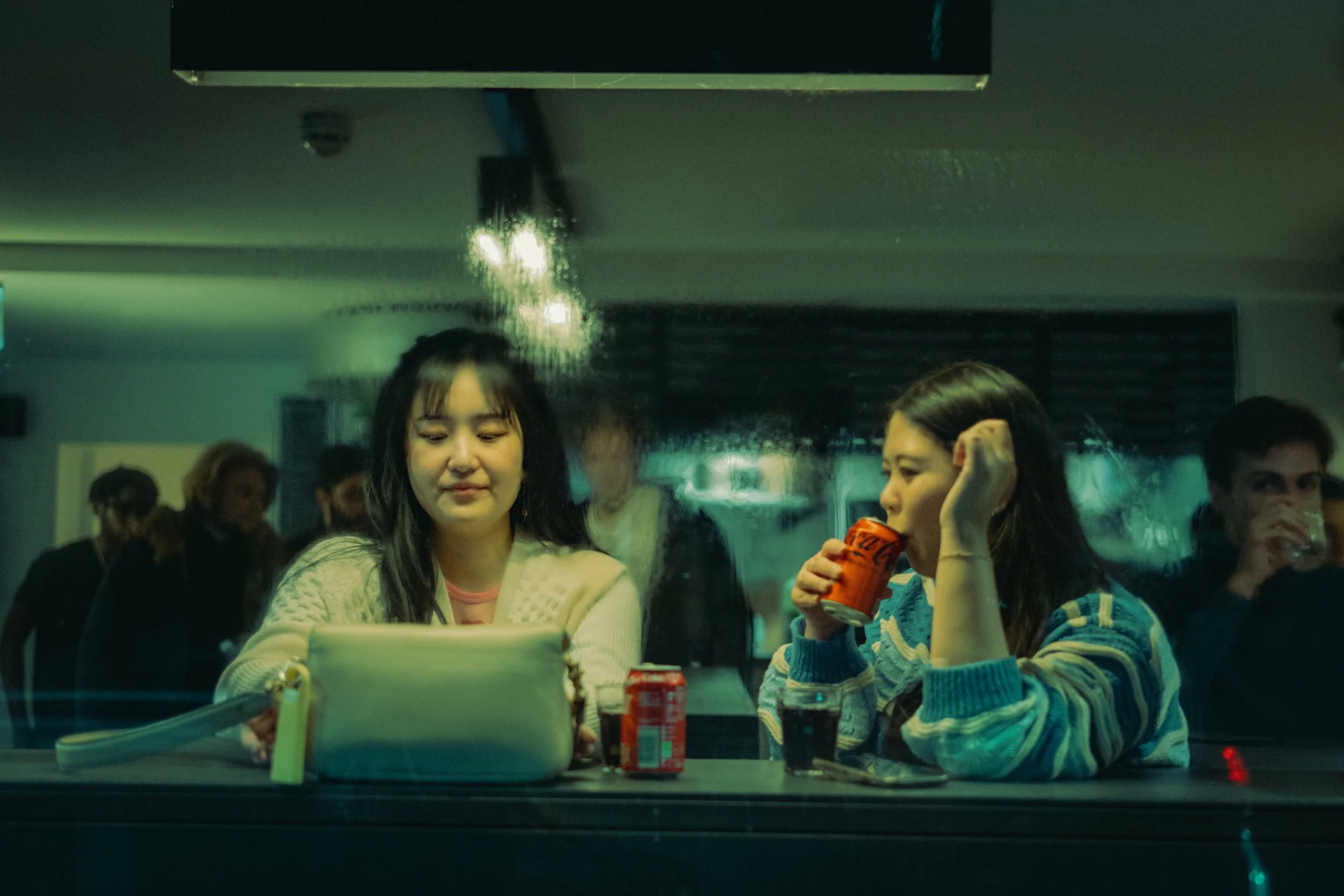
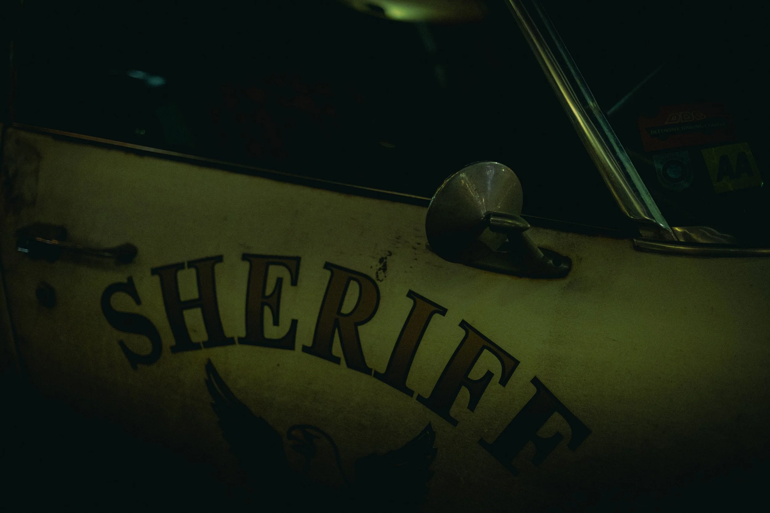
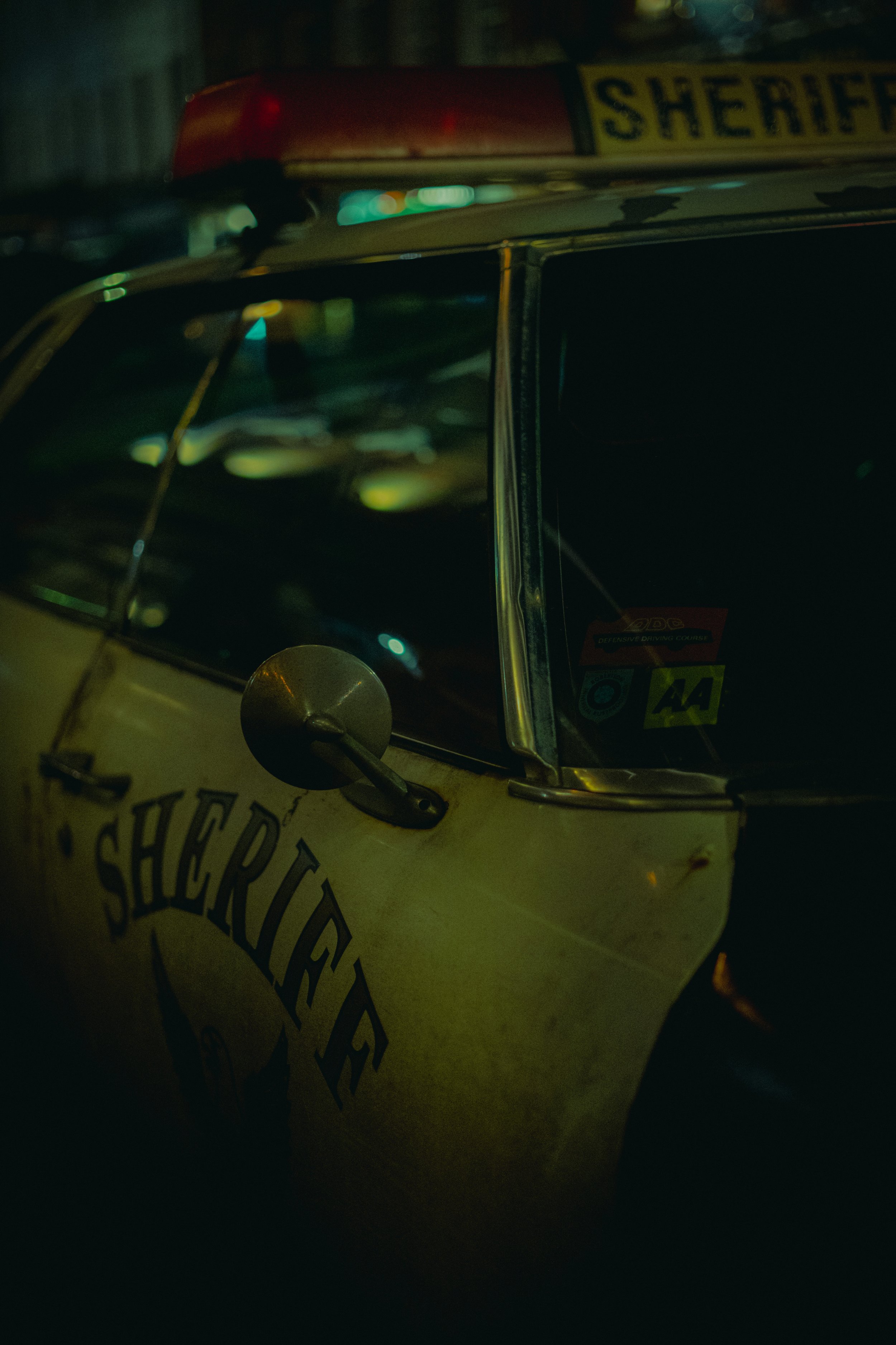
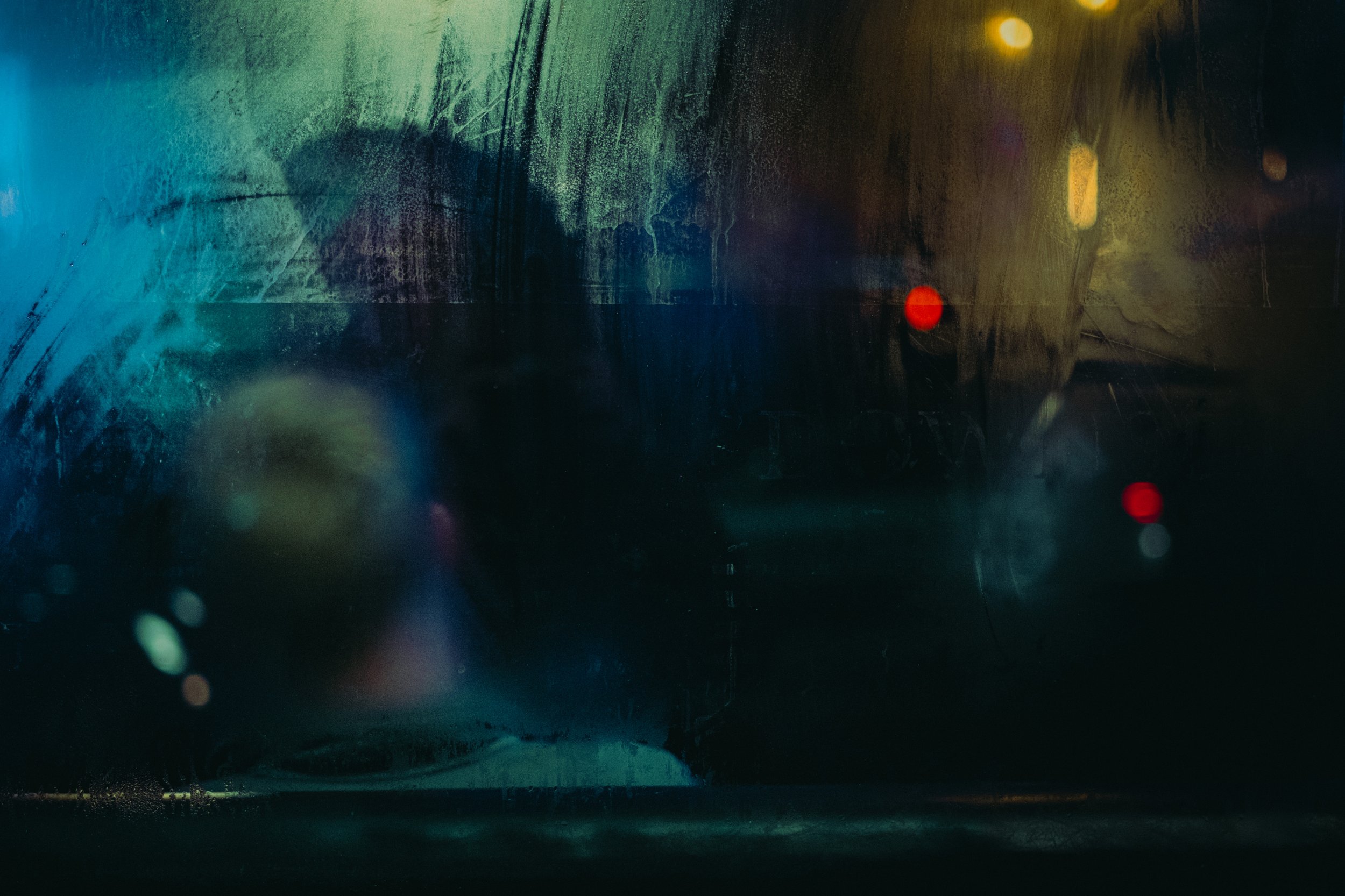
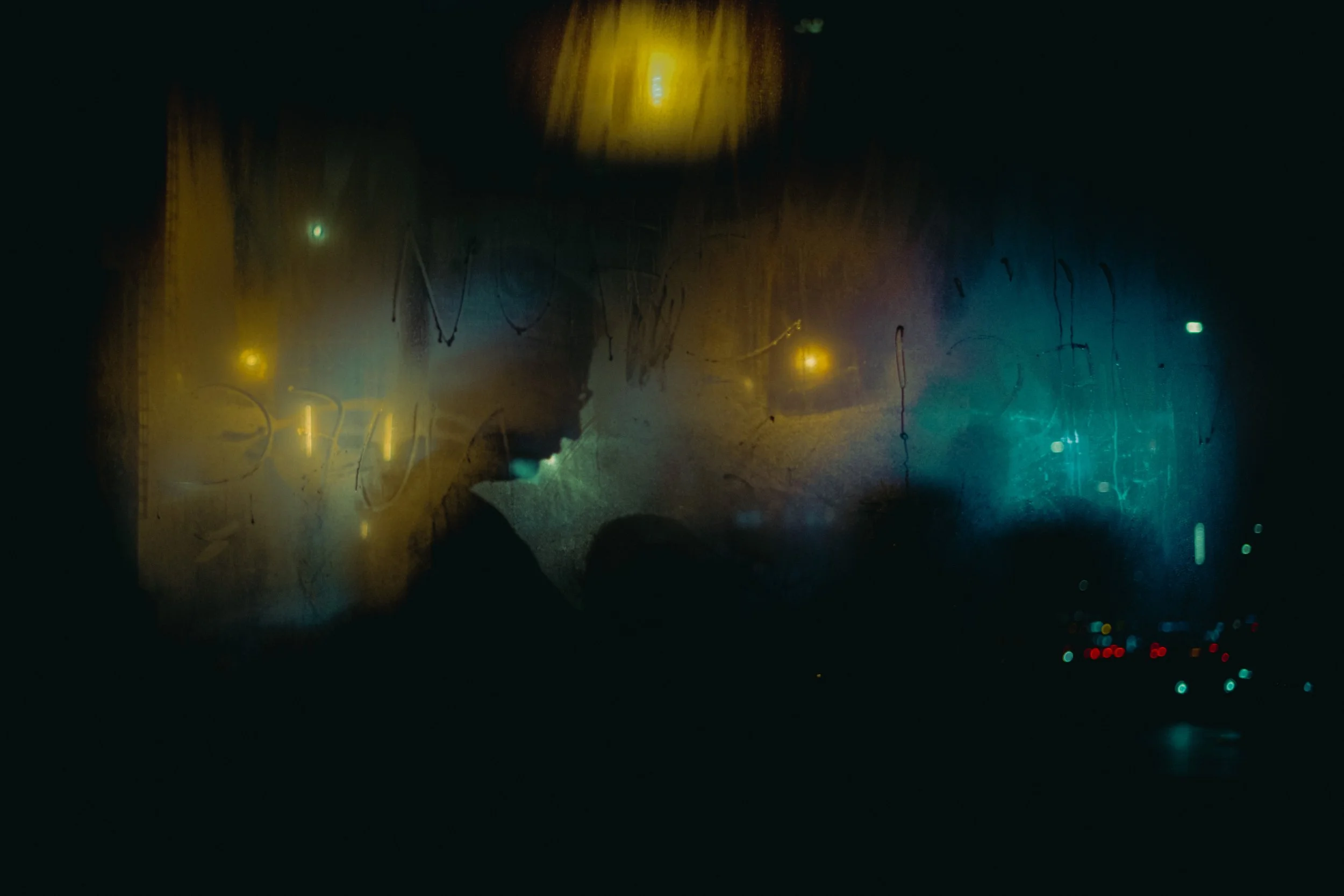
Talking of favourite albums…that’s really the story behind the name of the zine. All Night Thing is a song from Temple of the Dog’s eponymous album (Temple of the Dog was a collaboration between Pearl Jam and Soundgarden, led by Chris Cornell) and seemed a good fit for the zine. I sort of see the finished zine as a “thing” and all of the photos within it were taken at night…hence all night thing (I’m embarrassingly pleased with that, sorry, it’s not even particularly clever).
The Printing Stage
The next stage was the printing stage…the nerve wracking bit. The first thing I needed to do was make sure the saved PDF was in the correct format (pdf/x-1a - a high definition pdf format) and the correct colour profile (CMYK). The latter was particularly important as images for the screen tend to be in RGB, but for printing you need CMYK to ensure the colours are as close as possible to what they need to be. That said, one of the things that was flagged to me earlier on by the printers is that you need to be prepared for the colours to not quite match what you see on screen.
Once I was happy with the PDF and completed multiple checks (especially for typos, but also to double check every image was placed as I wanted), I got in touch with ExWhyZed to get a quote for my zine. At this point I asked for a quote for 1, 50, 100 and 150 copies. Given economies of scale, I took the scary decision to go with 100 copies (eek!). I probably should have started off small scale but, hey, in for a penny…
One thing I didn’t do, which is probably a good idea, is get some paper samples. Of course images look different according to the paper on which they are printed, and so that needs to be factored in. However, I’d already decided I wanted uncoated paper as I preferred the more natural look to the zine. I accepted this might mean the neon lights in my images weren’t quite as vivid as they might have been had I chosen a gloss paper but I also wasn’t keen on the reflective nature of gloss paper and, well, these things are all about compromises.
Following guidance by ExWhyZed on their website, I went with 300gsm uncoated paper for the cover and 115gsm paper for the internal pages. They seemed a good choice for the kind of zine I was looking to create. Something that feels more like a zine than an expensive magazine with thick paper throughout. It’s also worth adding that, as per their advice, I also went for matt lamination to the outer cover. This protects the integrity of the print and helps prevent cracking…particularly important given the pages were to be coloured black.
Upon receiving the quote, I went ahead and prepared the PDF for submission. Using WeTransfer, I uploaded the high res PDF (which was around 240MB) and sent it to ExWhyZed. After a few hours, I received a digital proof of the zine for checking to ensure that the text was fine, the images were good and everything was ready to go. I checked it a few times, left it alone for a bit, went away and did other things, then came back and checked it again. Once I was happy, I hit the approval button and that was it…the zine was on its way to the printer and it was now a case of waiting…
The process was remarkably quick. I approved the proof on the Thursday, on the Tuesday I received confirmation the printing had completed and it was now on its way via courier the very next day. Of course, by this stage I was incredibly nervous. I’d ordered 100 copies after all. What if they weren’t what I was hoping for? What if the colours weren’t right? What…what if my photos weren’t as good as I thought? The doubt crept in once more…I should have just kept the images in Lightroom and never even have considered a zine, right?
Then the box arrived…
I decided to hold off opening them until my lunchbreak. I wanted to shoot a little video to help me promote the zine, the kicker being my idea for a video meant I had to record the opening of the box. What if I set the camera up, started recording and the zines were crap? I went ahead anyway. Let’s just do this…
Camera set…
Pen knife in hand…
I sliced through the tape sealing the box…
Opened up the cardboard box…
Pulled the bubble wrap off the zines…
Shit!
There it is.
Oh god. Oh god.
This is it.
I picked the first one from the box and…
OH MY GOD.
It felt so good. It looked so good.
I’ve done it! It looks better than I could have ever have hoped for. Amazing printing. It looks like a proper zine. It is a proper zine. All those doubts and now I have this in my hands.
I’d already prepped the entries in my store in anticipation. I was so relieved to see that I was now able to publish the pages on my online store and make the zine publicly available. It was now…for sale! I did it!
The Selling Stage
Of course, now it’s on my website and you can order it with a few clicks which is great. But as well as a print version, I decided to make a digital version available too. Selling at half the price, I thought it might be a good option for those who want a cheaper option, but also want an edition that they can flick through on tablets, smartphones, whatever. This was not as easy as it appeared.
Obviously the original high resolution PDF was huge (around 240mb), far too much space for most people. So next came the question of how do I scale down the file size and make it a good quality product to view on screen? My chosen solution was to drop the dpi (from 300dpi for the print version) and therefore decrease the quality of the images and the size of the file. Ultimately, alongside space constraints for people, I don’t want to give away large high resolution copies of my photos, so I worked on a number of different options before I got to the point that both the file size and the resolution were good enough for sale. In the end I think I got a decent compromise (the file size is around 50mb), but time will tell as to whether people think it is a worthwhile option.
Then came the promotion, which takes us right back to the beginning and posting videos and Instagram stories all over the place to raise awareness. At the time of writing, I’ve had 595 visits to my website since launching the zine and sold thirteen copies (12 print, one digital). Frankly, I’m blown away - so pleased with how the zine has turned out and the response to it. It’s better than I could ever have hoped for.
So of course there’s a lesson here…stop procrastinating. If you’ve got photos you’re proud of and you want to try something different to showcase your work, consider creating a zine. Get a theme, create a sequence, a narrative to structure the images, get some quotes and get that zine out there. Ignore the devil on your shoulder giving you reasons not to. Shift that mindset from Why Should I? to Why Shouldn’t I?