I figured, as I’ve been posting a lot of night street photos lately, maybe I should put together a quick post on how I edit my photos. I’ve had a few comments in recent months about the look of my photos, so now seems a good time to run through how I take my photos from this…
to this…

In Camera Settings
Before getting into the edits, a bit about the settings I use when shooting with my XT3. I generally stick to as wide open as possible, and so I tend to exclusively use my 33mm f1.4 lens. In terms of shutter speed, I hover around 1/125 and 1/250 depending on whether the subject is stationary. I leave the ISO on automatic (with an upper limit of ISO3200) and exposure compensation around -1 to -2 to protect the highlights. I also always shoot in RAW.
I should also add that all my edits are done on an iPad Air. I tend to find with street photography I don’t need to do heavy edits, use layers and layer masks and whatever. Photoshop isn’t something I find myself needing. What I want is a convenient way of editing that enables quick edits on the fly. Lightroom and the iPad do this perfectly for my needs.
Light

As you can see, I push the exposure up quite a fair amount when editing. This is largely due to the exposure compensation I apply in-camera. It doesn’t impact upon the image quality and, crucially, it ensures I protect the highlights. The highlights too are dropped right down, although in some scenes I might lift them up, depending on how I want to work the light in the scene. Mostly though, I drop it down. I also drop the contrast to soften the image so it’s not too crunchy, I prefer a softening effect in my images where possible (although, again, I may do otherwise depending on what I want to achieve with the image). I also drop the whites, drop the blacks a tiny amount and lift the shadows a small amount (in this case to show more detail from the person’s clothing).
In terms of the tone curve, I tend to lift the blacks a little to give it that filmic quality and very slightly drop the whites. Again, I may lift the blacks on the tone curve or drop them down depending on the image itself.
Colour

With Colour, I drop the temperature right down. Typically my night shots are taken during the winter, and so I find they work best if they are cooled down a bit to around 3200k, adding in more blue tones. I then tint towards the purple and add some saturation and vibrance to the image.
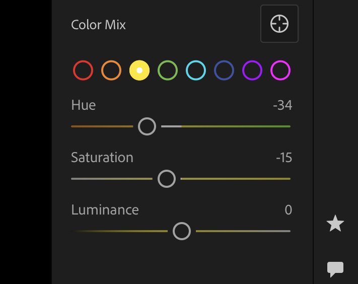
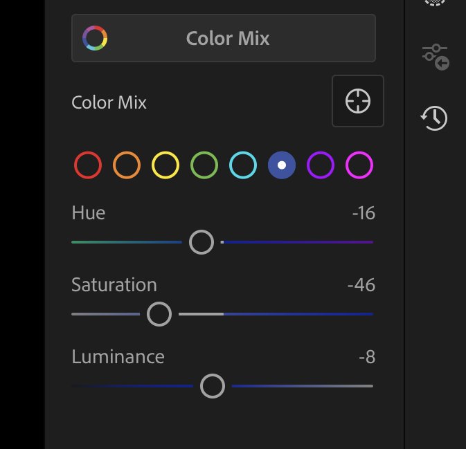
Where I really start to get the colours I want is in the HSL area and the Colour Grading (more on that below). I particularly like my blues to be pushed towards the green/blue and quite desaturated, making for a softer blue that I find more appealing. I also push the yellows more towards the orange and also desaturate slightly. The combination of the two together helps to get the colour palette in the kind of place I would like to be before I move on to Colour Grading.
Colour Grading
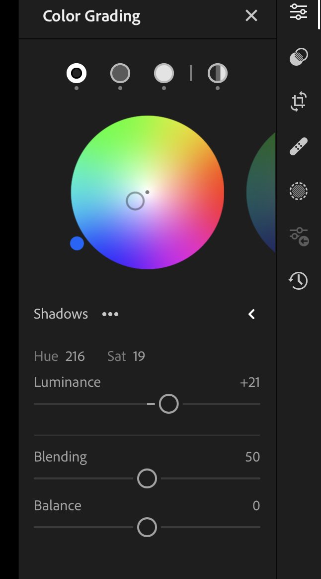
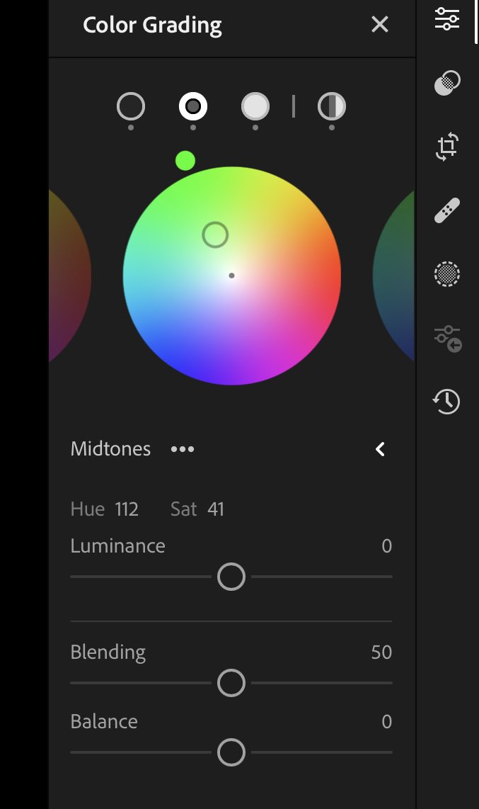
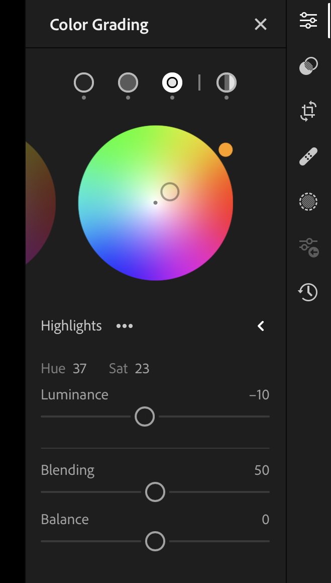
This is where I think I have the biggest impact on the look of my images. As you can see, I tend to grade the image with blues in the shadows, oranges in the highlights and, most importantly, I add green to the midtones. I think this is the single most important element in terms of getting the tones I like across the whole of the image. By pushing in those greens it gives the image much more of the kind of atmospheric (futuristic?) look that I like in my night photos. It just seems to really work to lift the images above being a straightforward, “as it looked to my eye at the time” type edit. I think that in combination with pushing the blues towards the green-blue and pushing the white balance to the colder end of the scale really seems to work for me. Of course, I may take a different view in years to come, but for now it gives the night photos a look that I really like.
Effects

When it comes to the effects, in most cases I tend towards negative clarity (-10 to -20 typically) and negative dehaze (-5 to -10). This is largely because I want to soften the image rather than give it harsh, hard edges. In this case, I’ve slightly nudged up both just to add some detail to the hair in the ponytail. Again, it’s about the specific image and what I want to achieve with it. Either way, I tend to be fairly cautious with both clarity and dehaze as pushing them too far either way can lead to some odd looking images. Texture I always increase to add a bit of fine detail to the images.
I also always add a vignette, and quite a heavy one on night photography by my usual standards (around -15 tends to be my default). I sometimes also add a radial vignette over the subject and invert it to darken around the subject and draw more attention to it. Finally, I add a bit of grain just to add to the atmosphere of the image and help to push it towards that more filmic look.
Anyway, that’s pretty much how I edit my night photos. As I’ve kept saying above, some of the specifics are very much dependent on the image itself. Generally speaking I apply a preset then adjust according the image itself (I always see a preset as a starting point rather than a one-click solution to an image), but these are broadly the kinds of settings I go for. The things that never really change are the white balance and the colour grading, other than that, I shift things around to suit the image.
And that’s my photo editing of night street photos regime! Hope you found that useful/interesting!
ian


