A Trip To Spain And Pleasant Surprises

Note: I was supposed to publish this a month ago…better late than never!

Well, it’s been nearly four months now since I last wrote a blog post on here, so I’ve not been doing great at keeping things up-to-date. Best laid plans and all of that…so let’s put this right and put together at least one blog post for summer 2023.

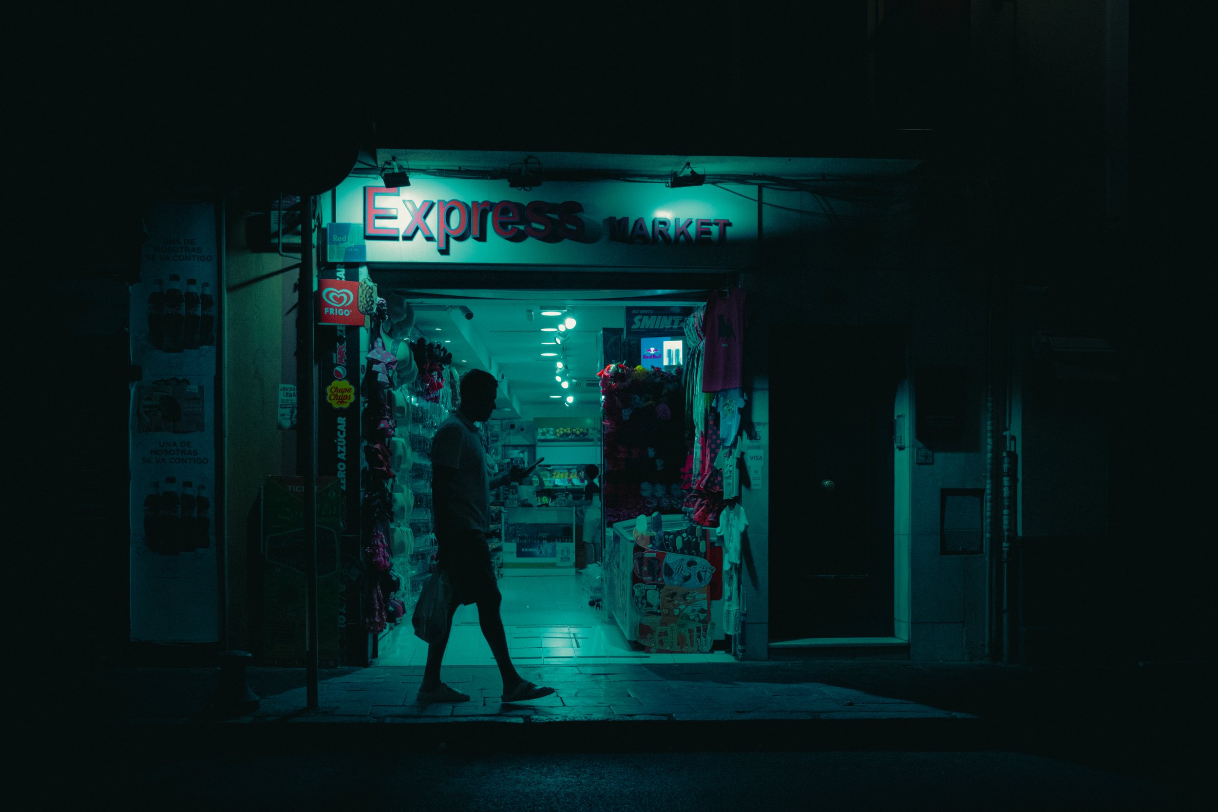
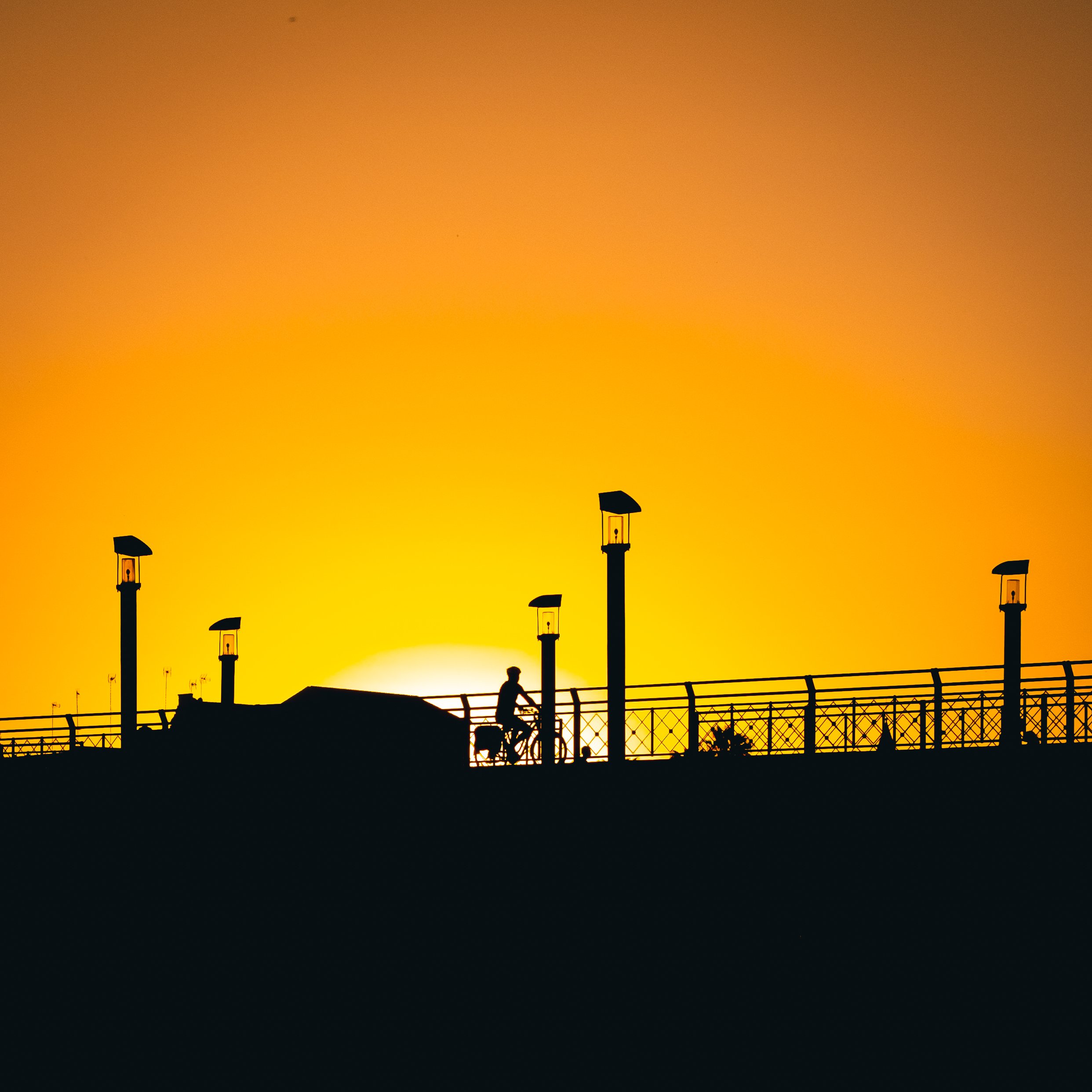
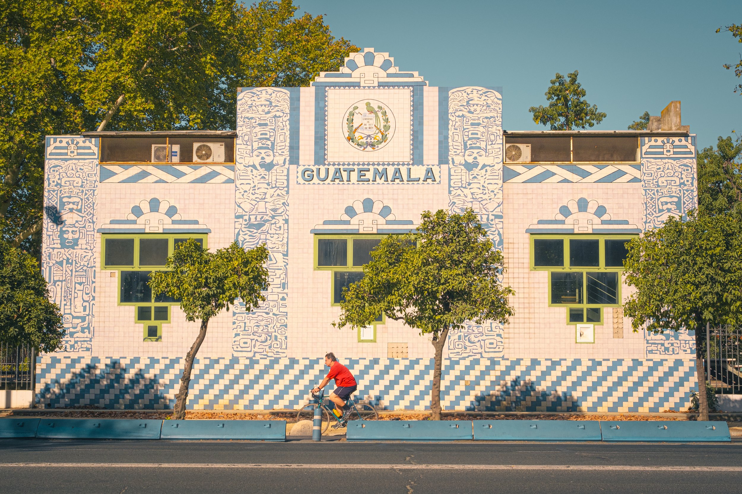
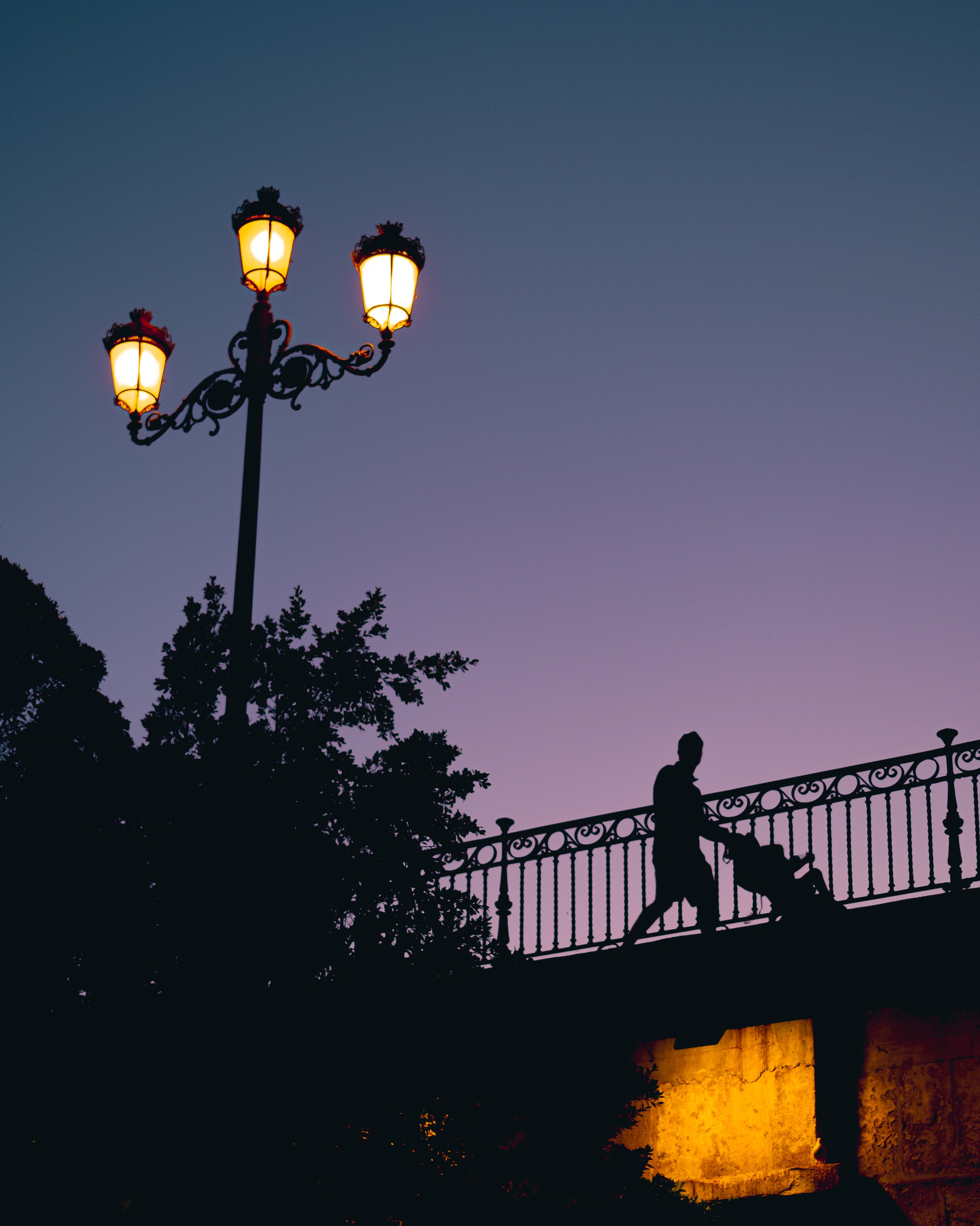
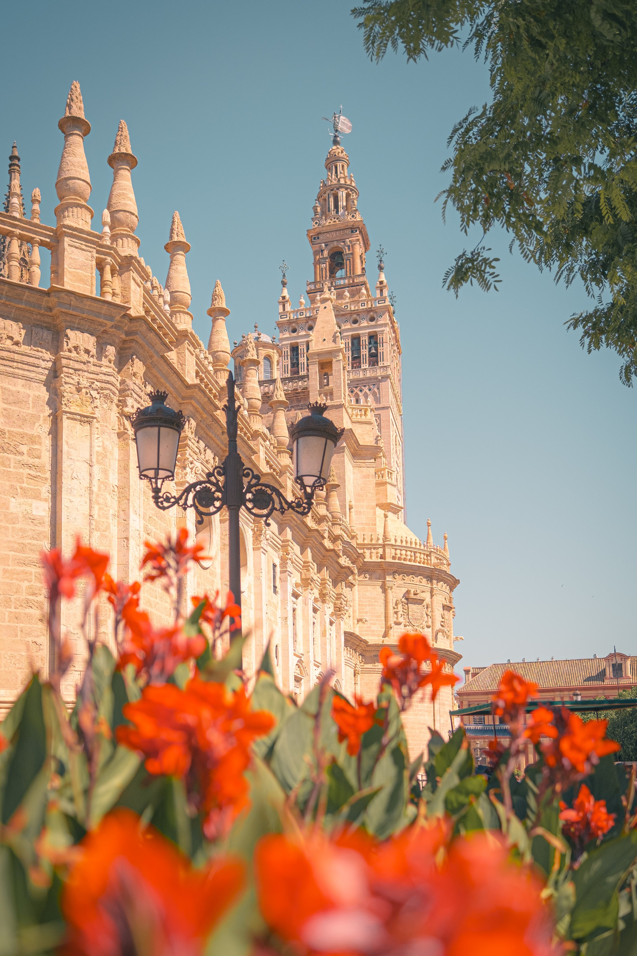
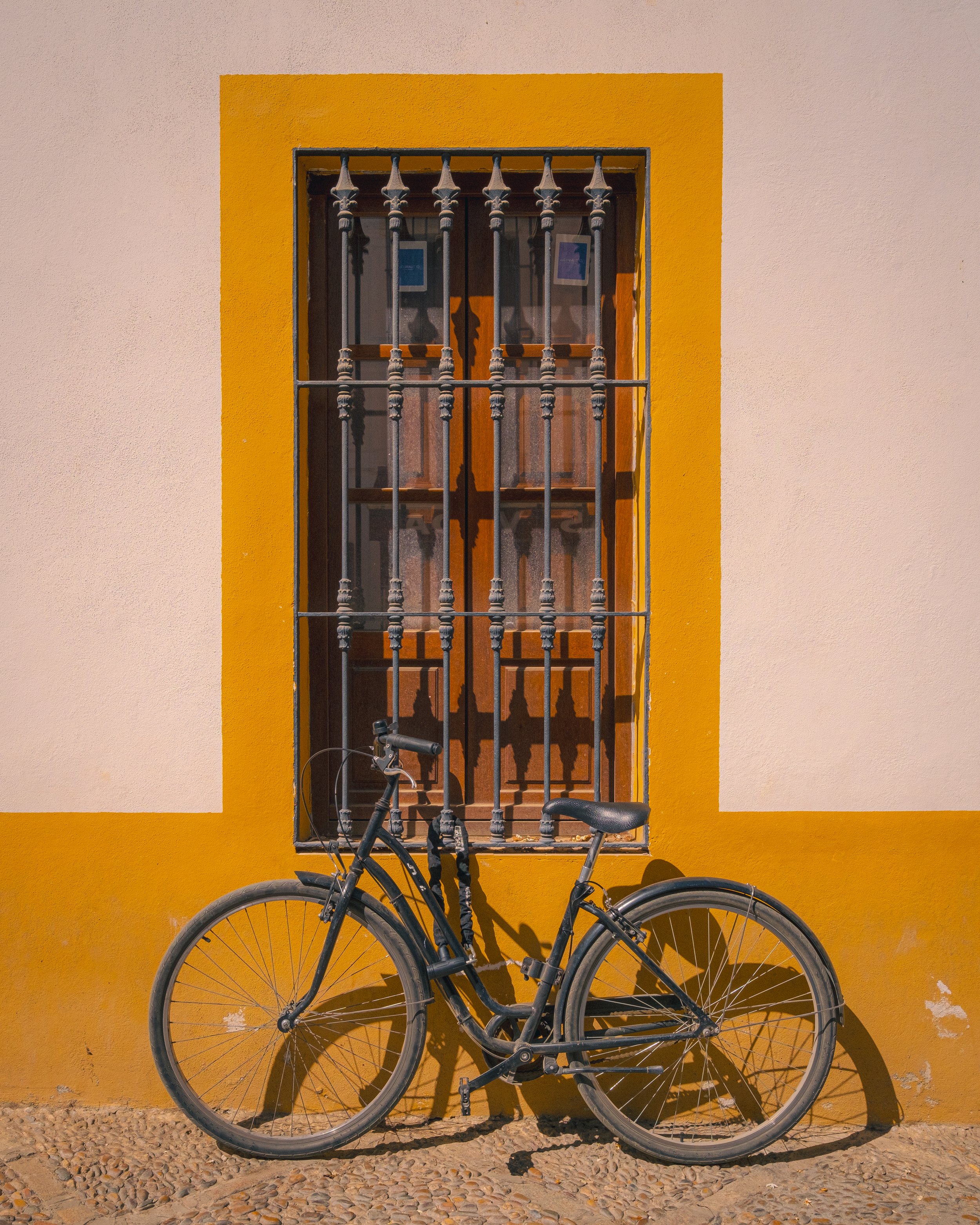
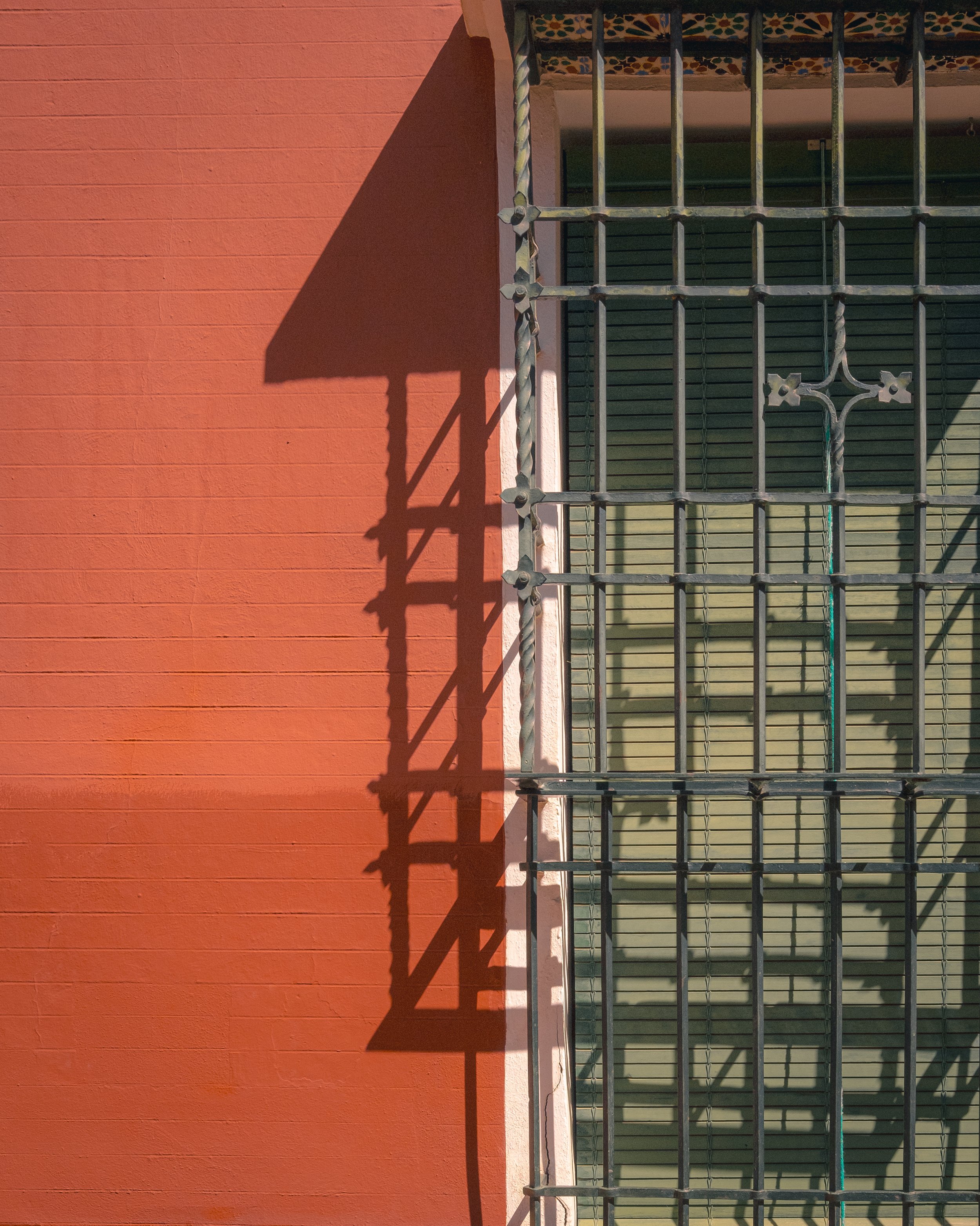
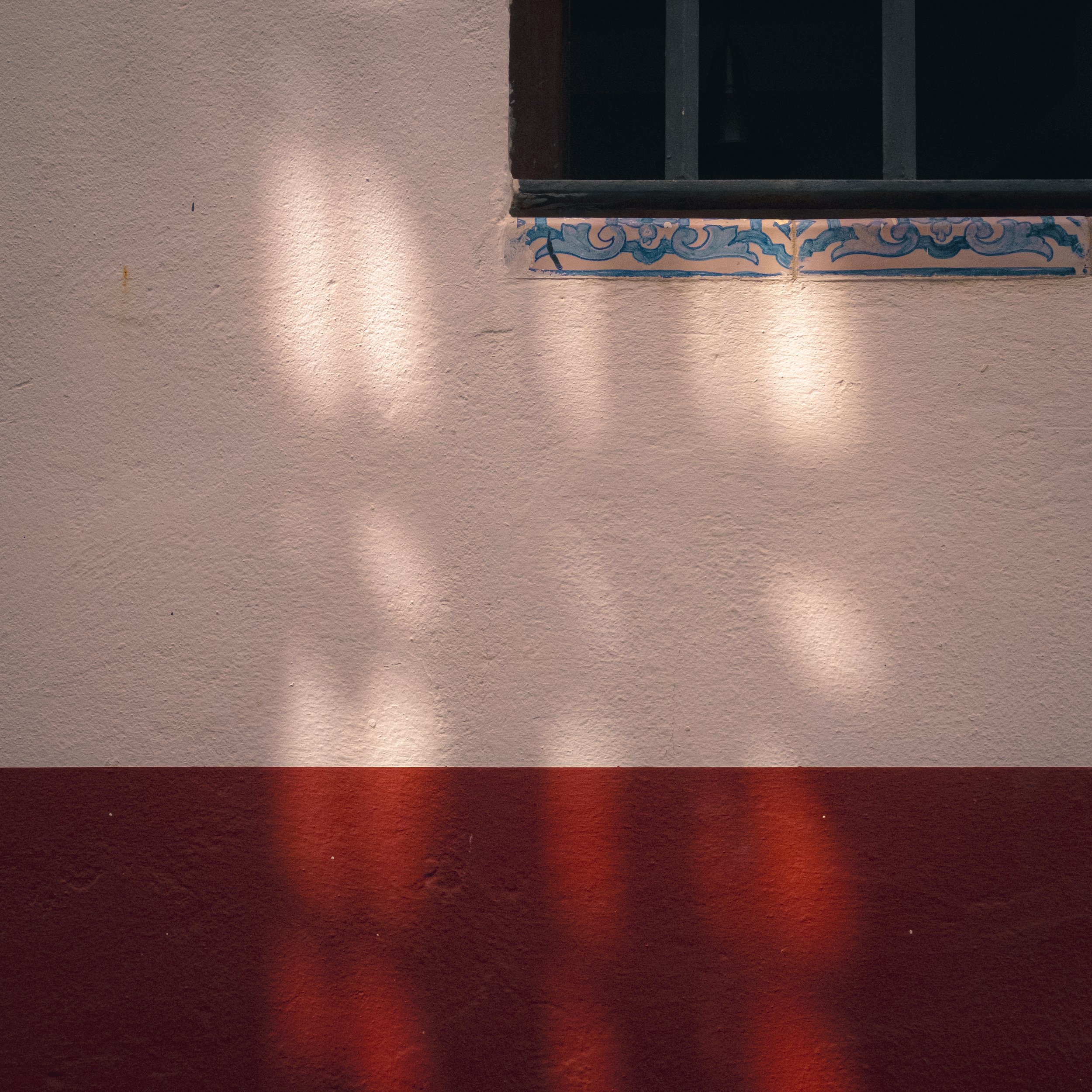
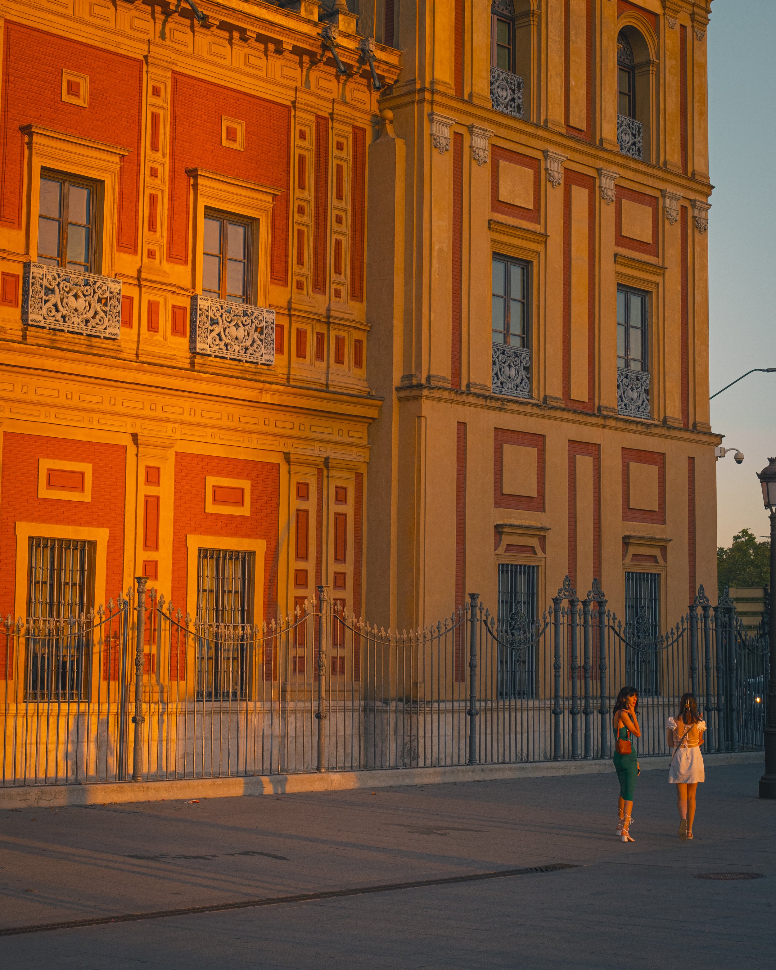
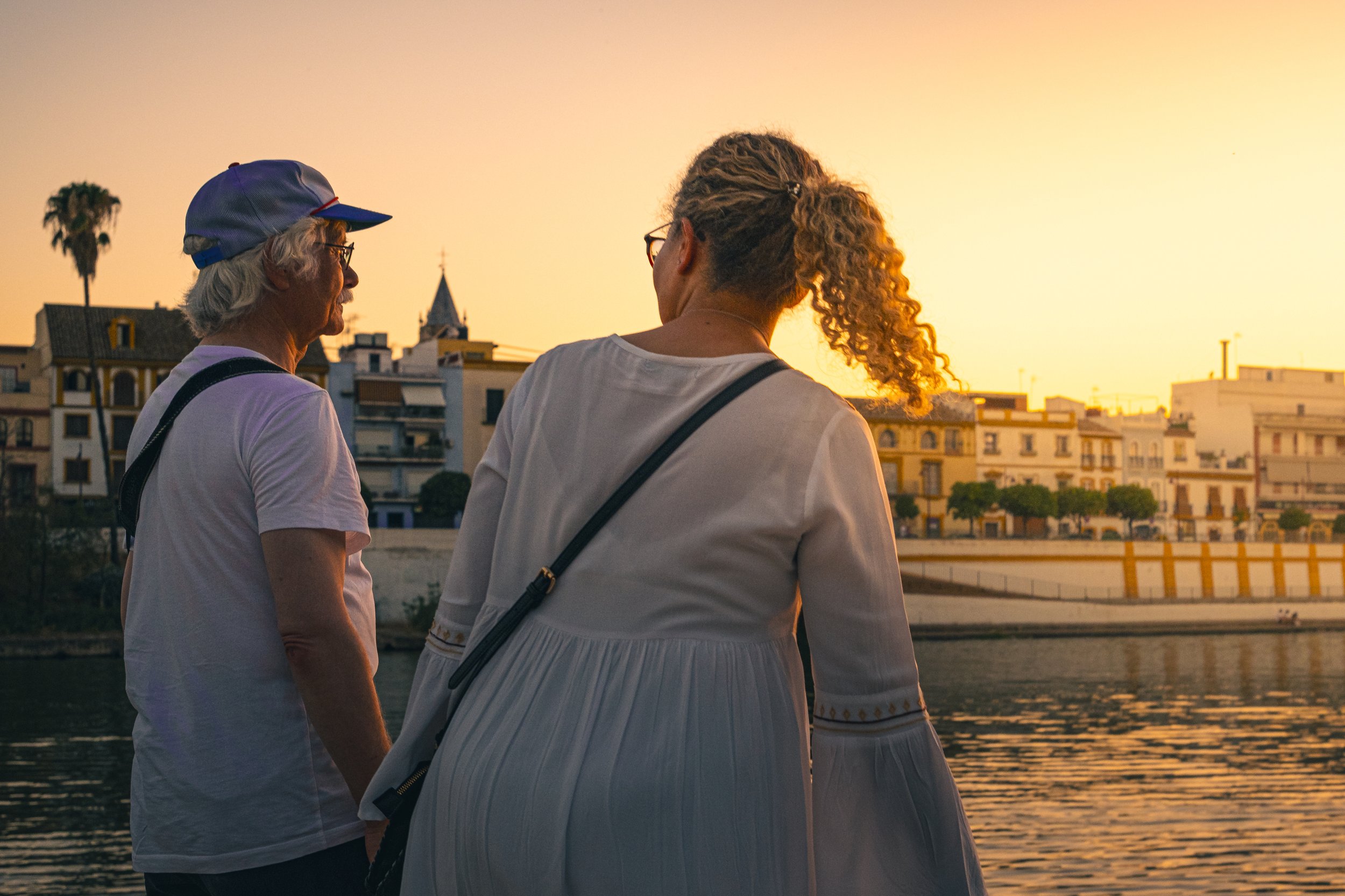
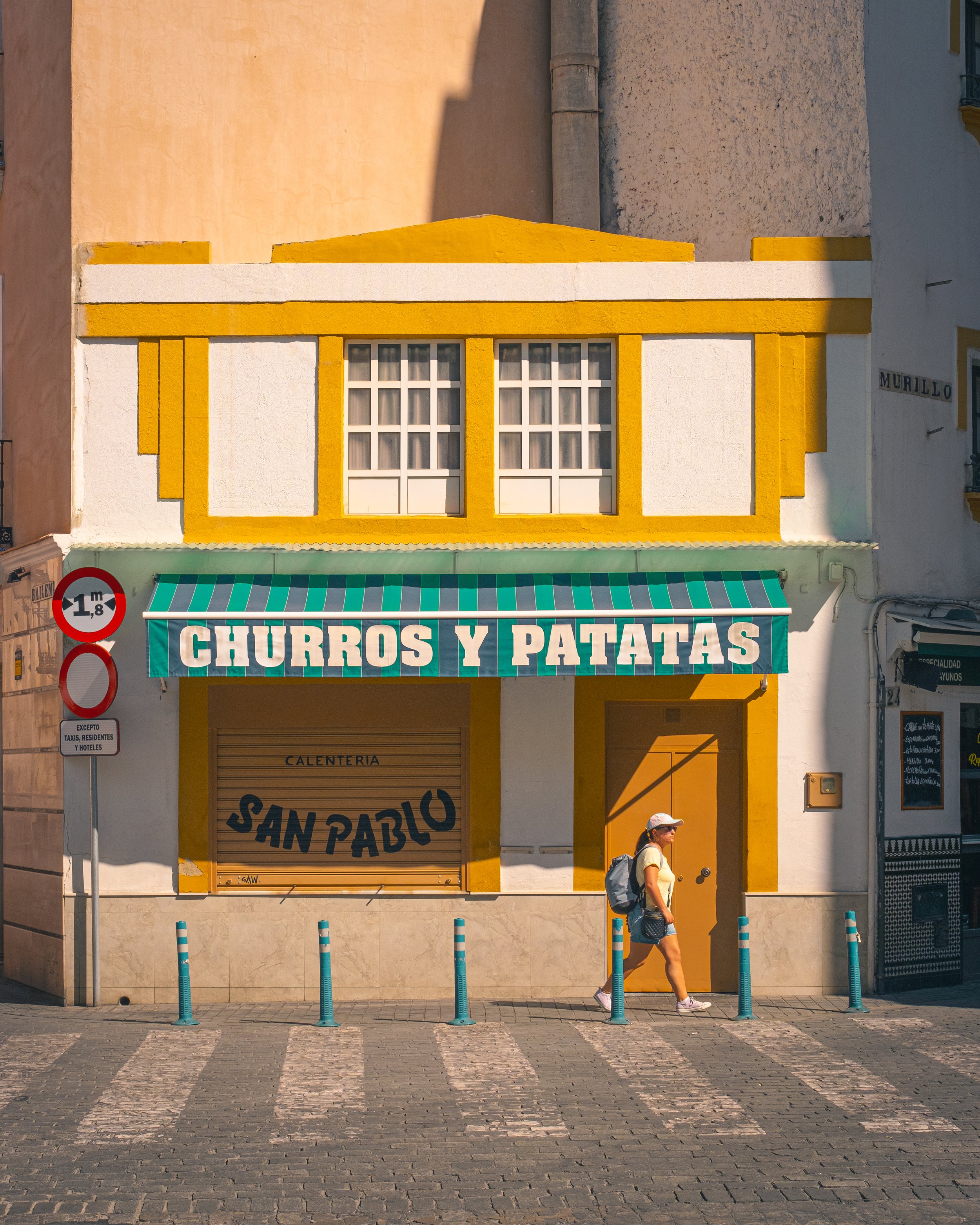
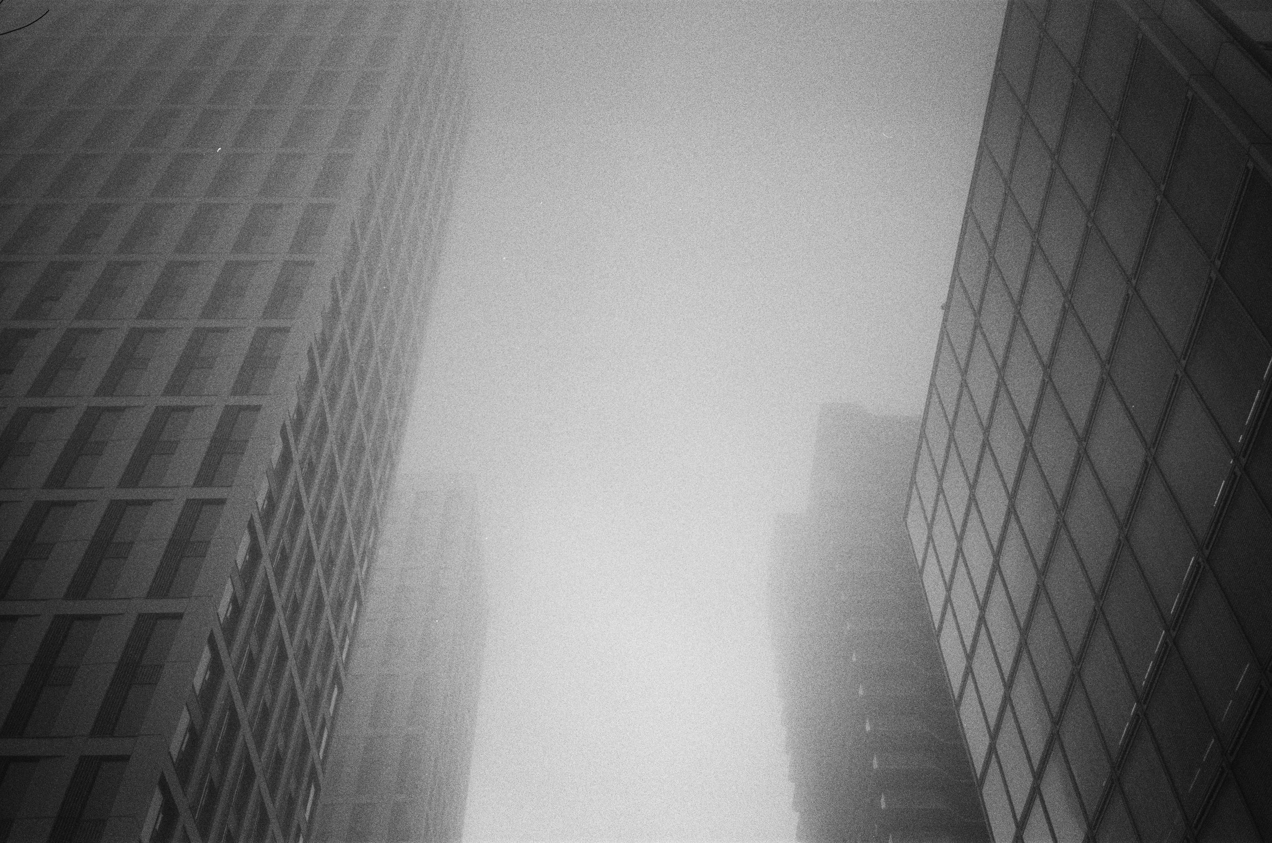
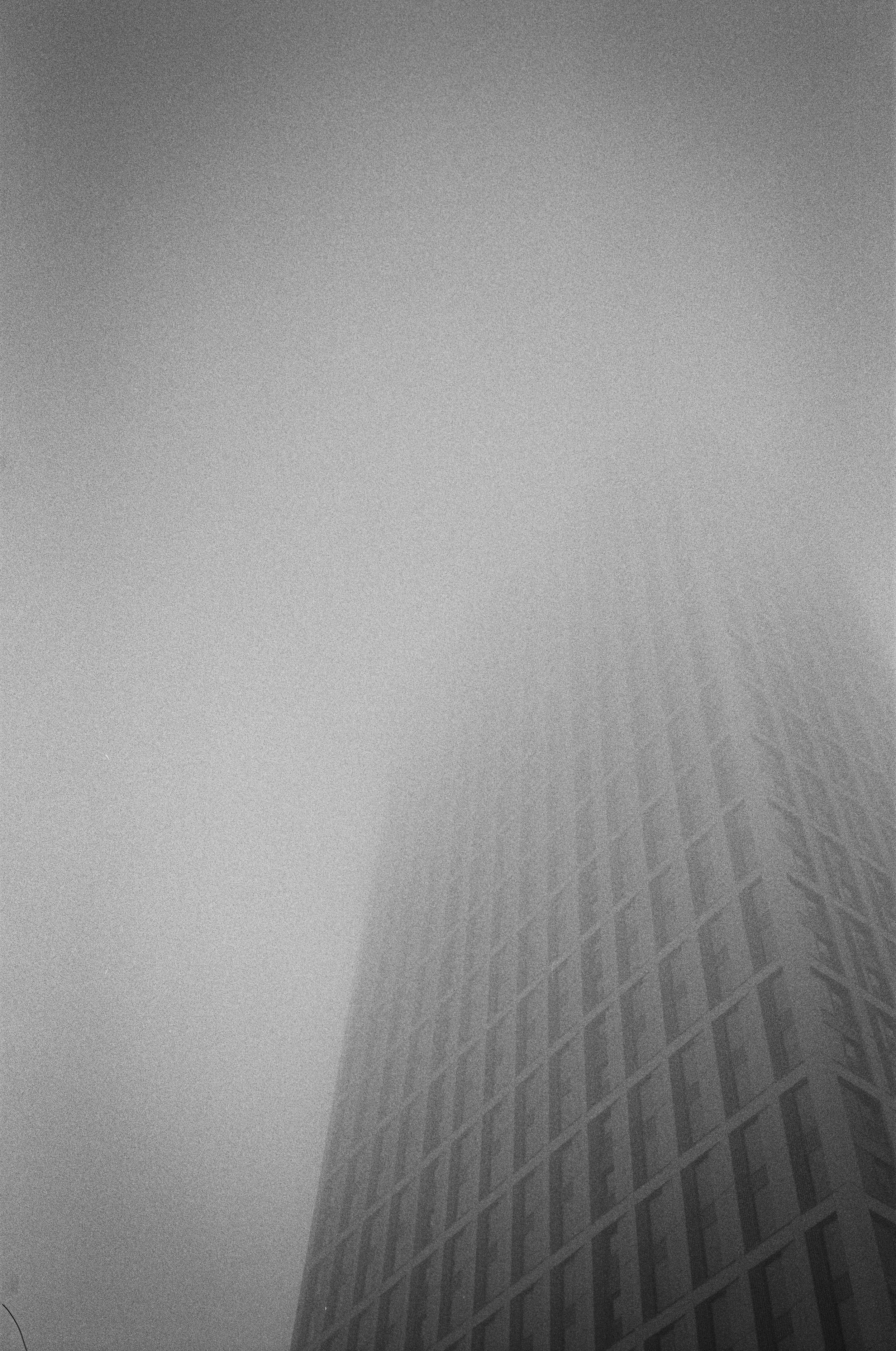
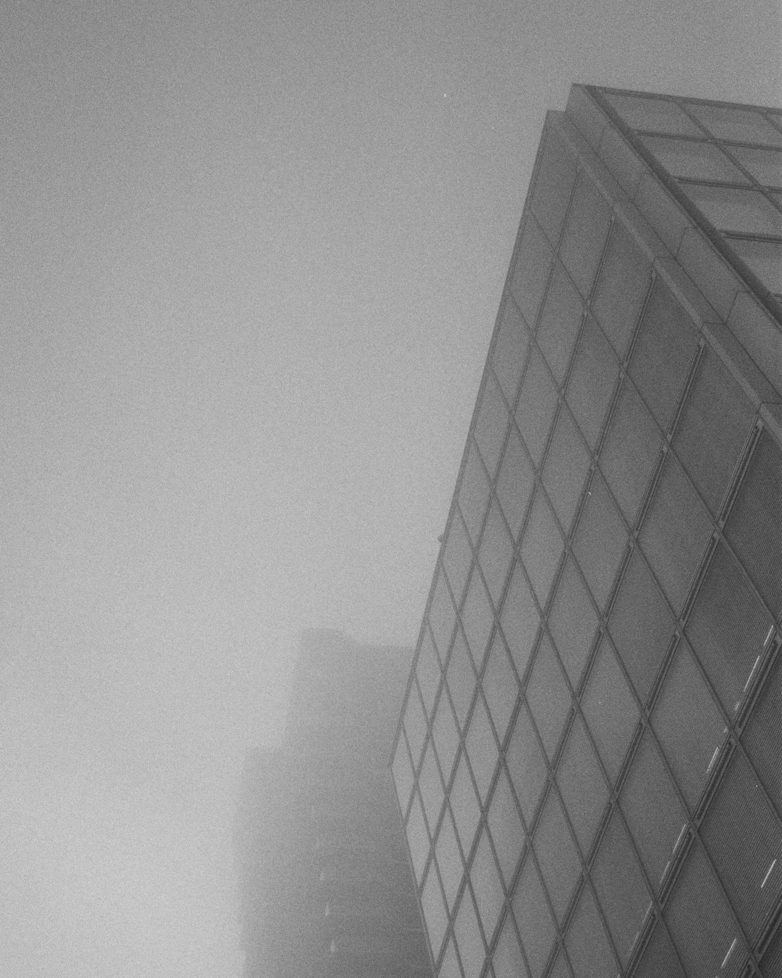
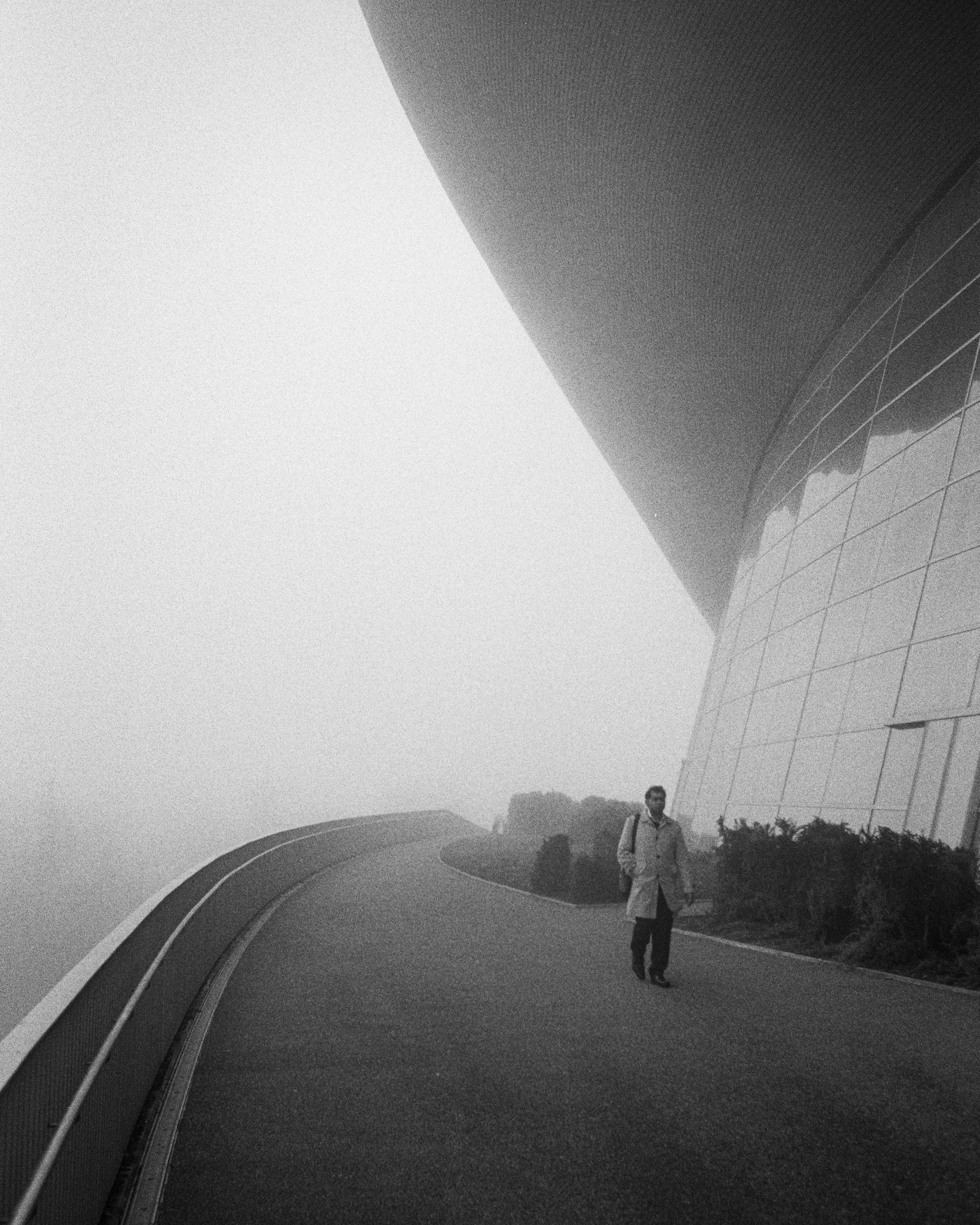
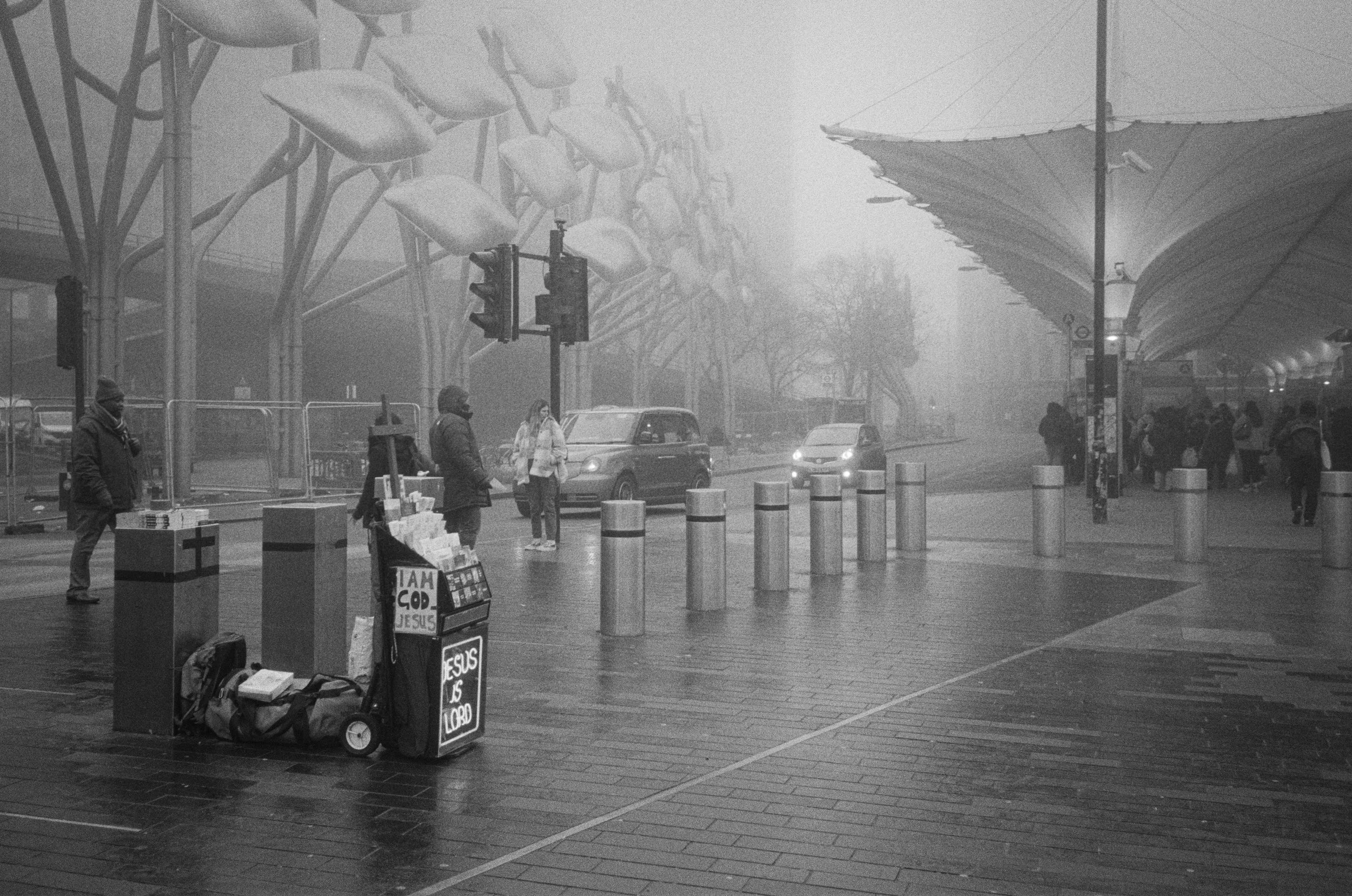
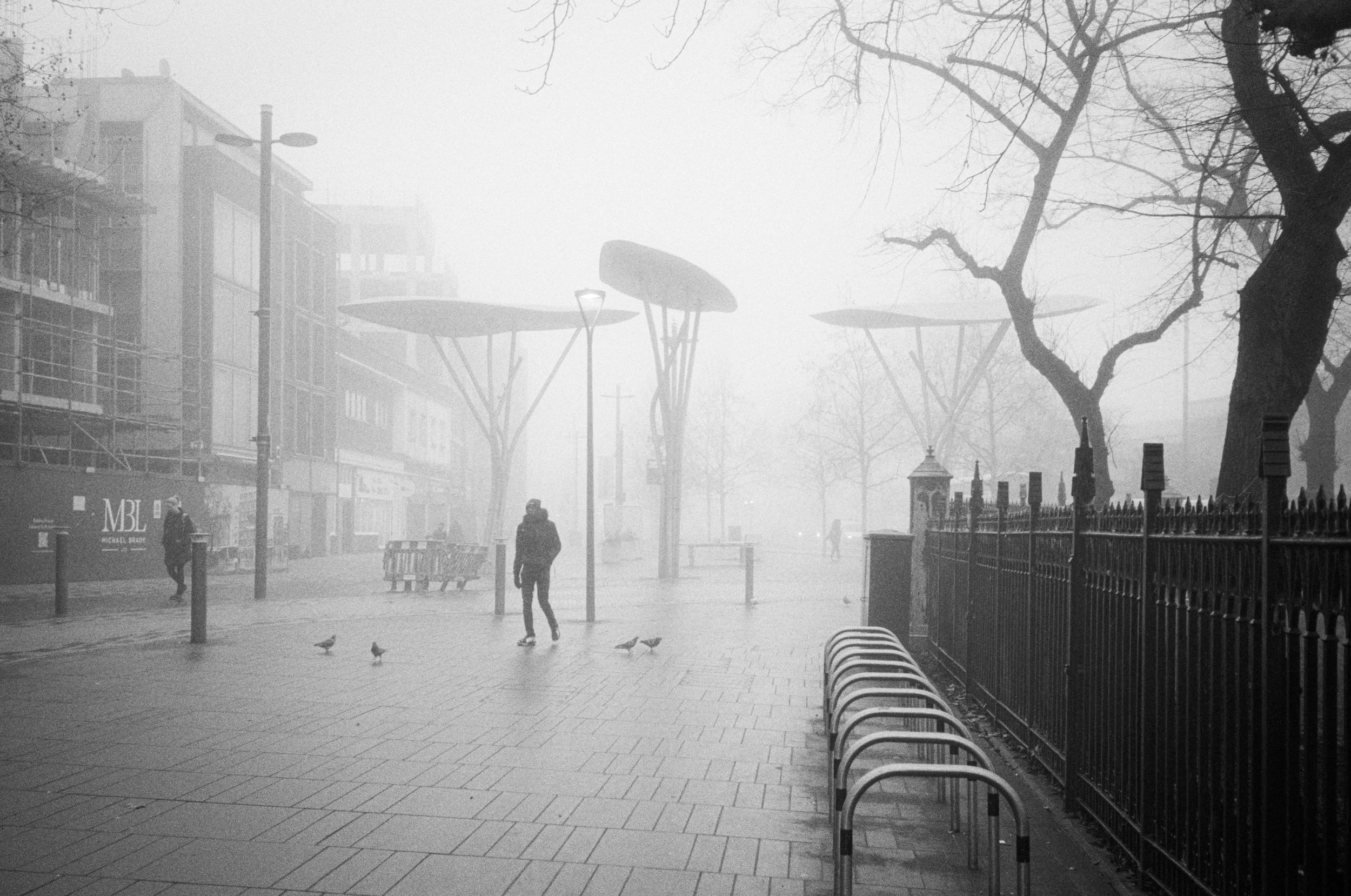
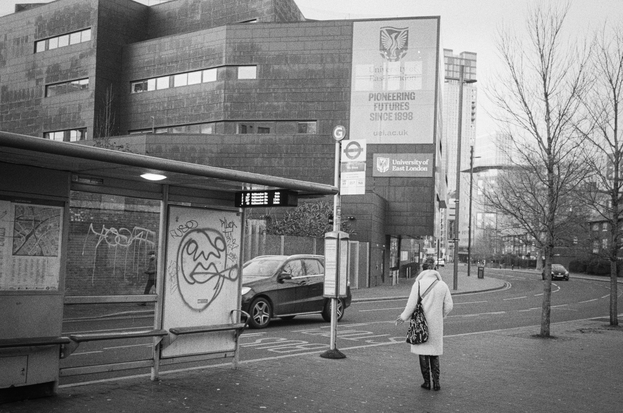
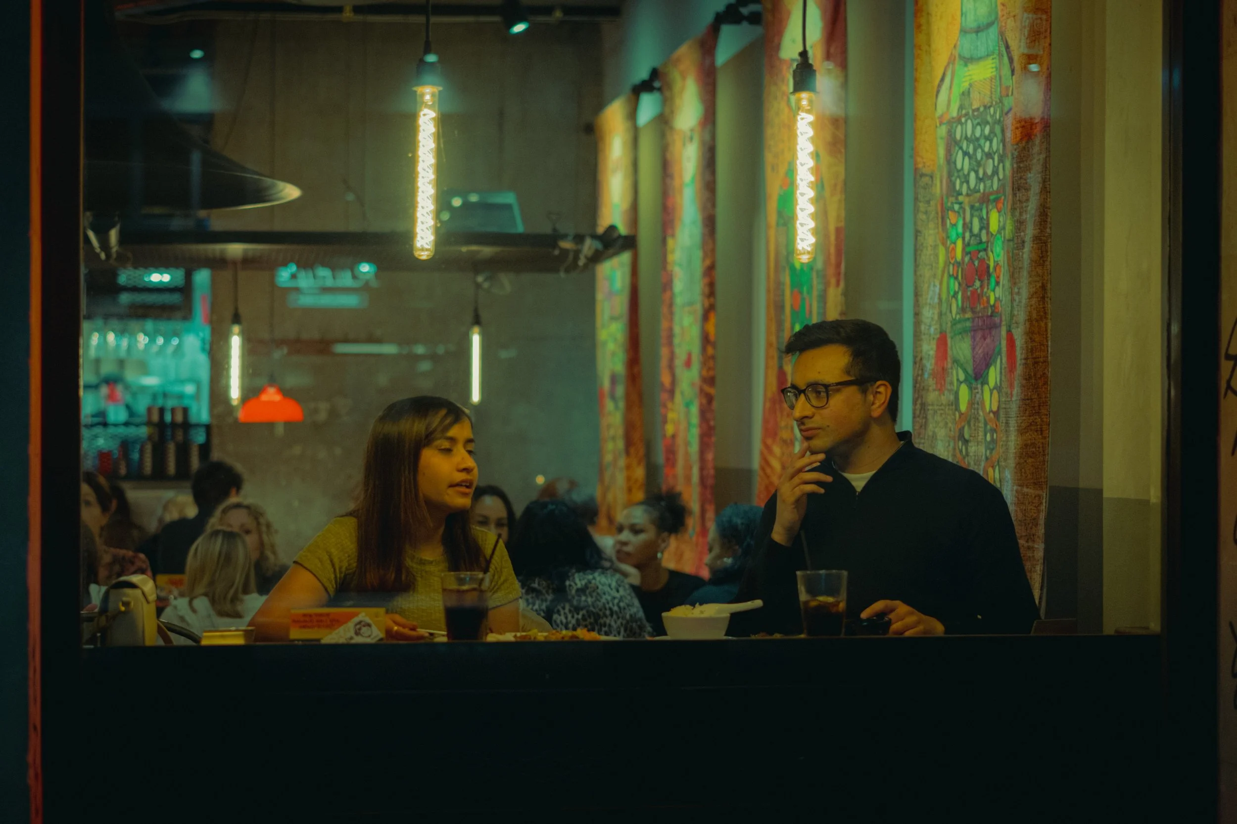
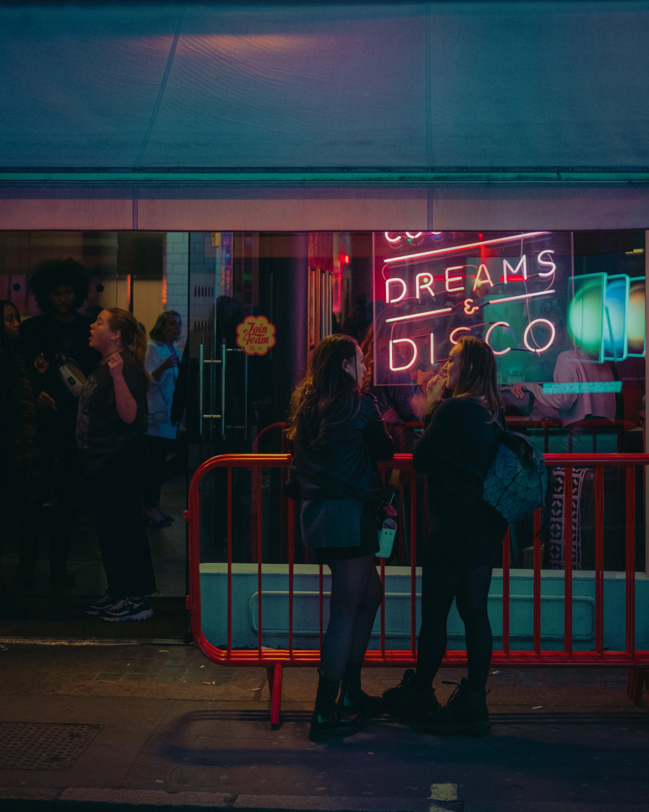
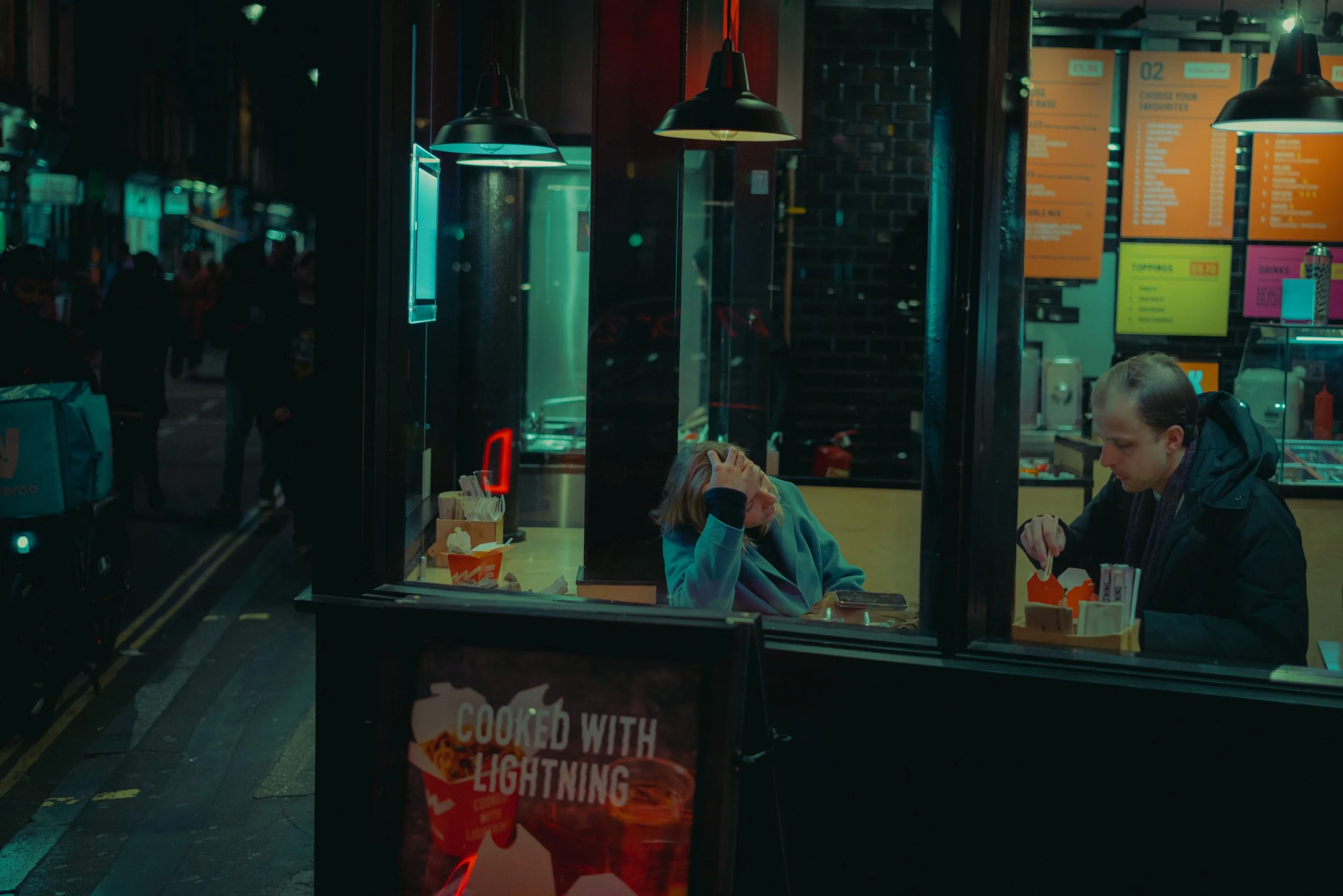
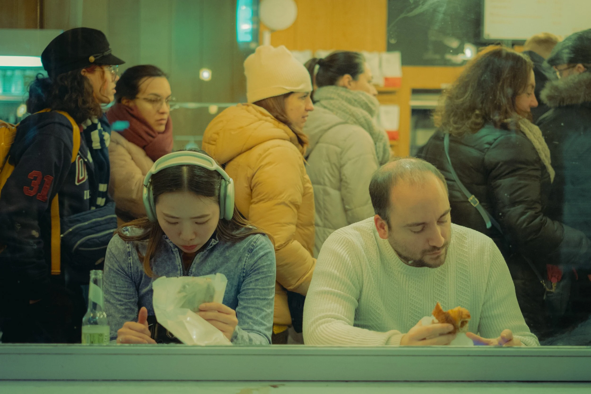
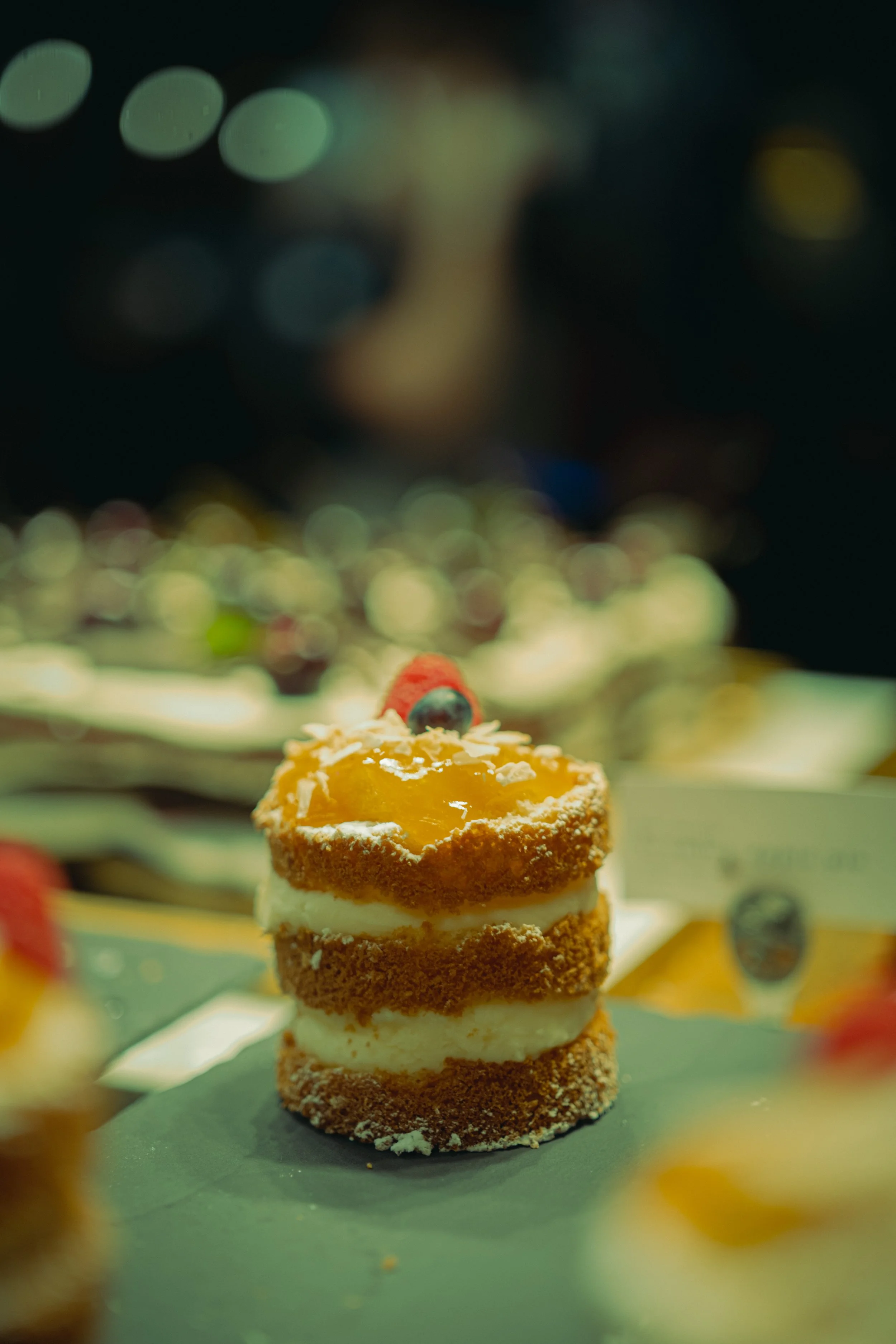
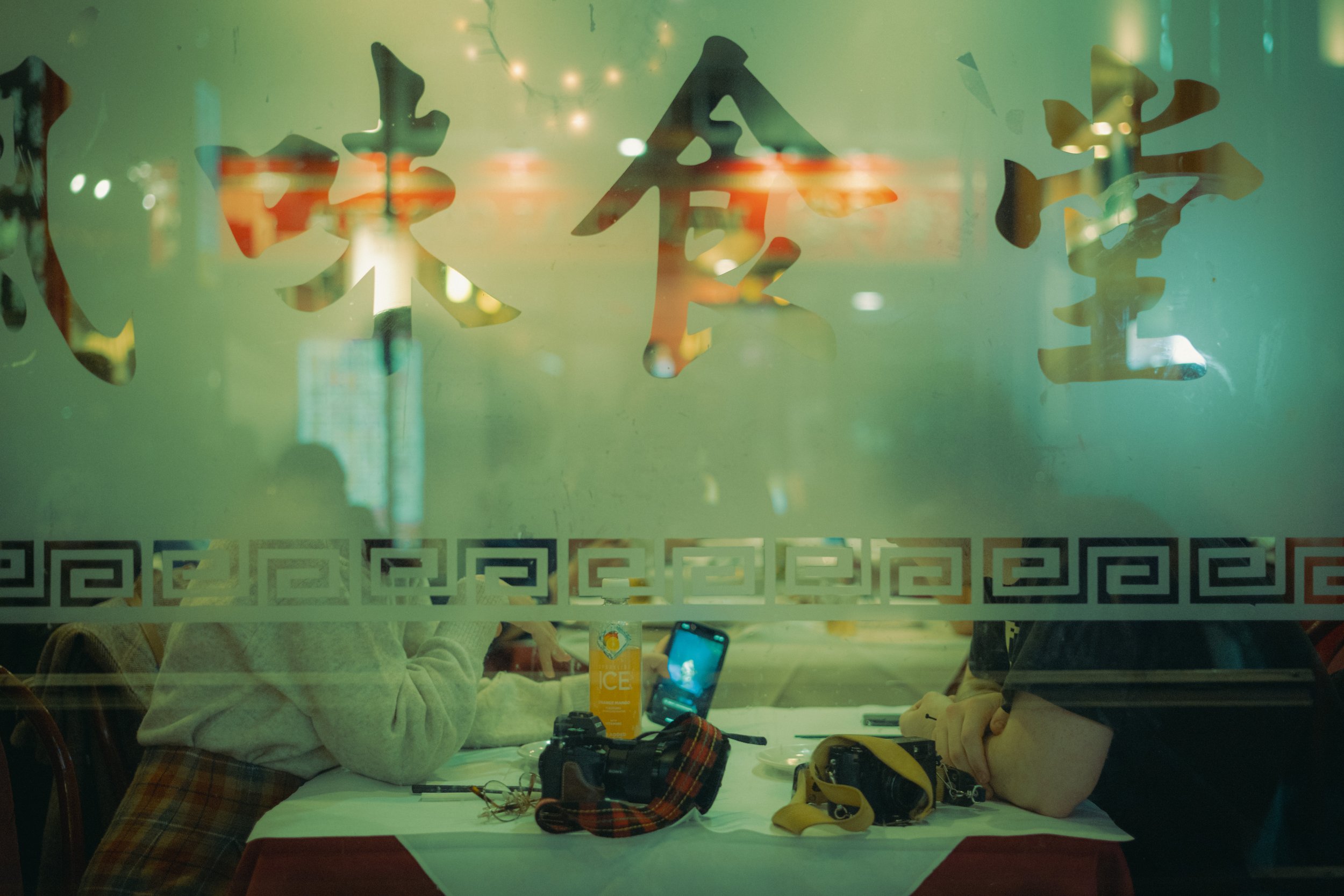
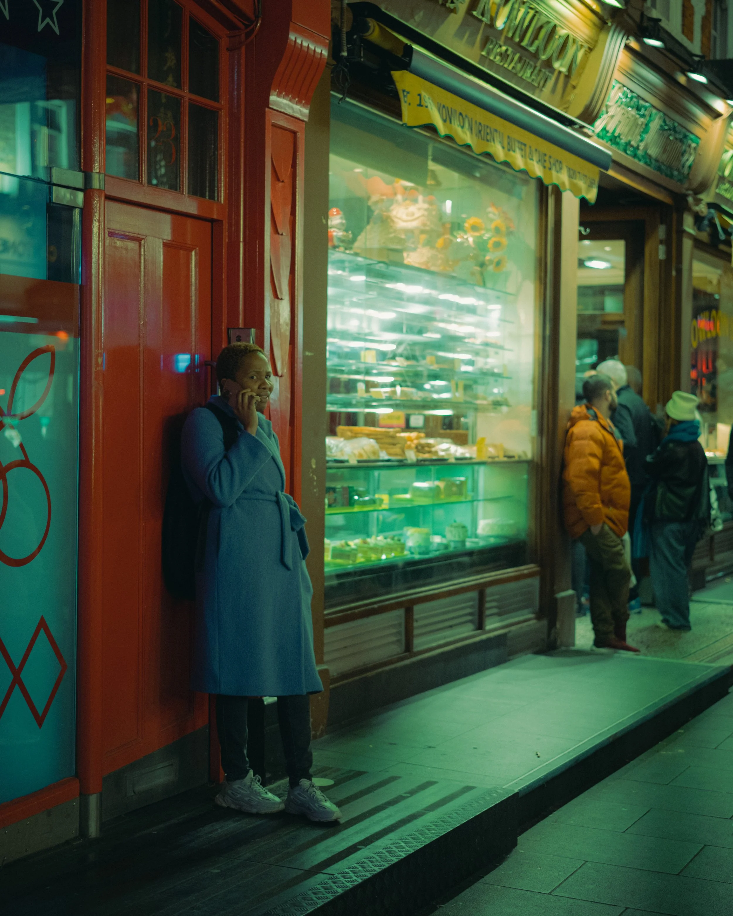
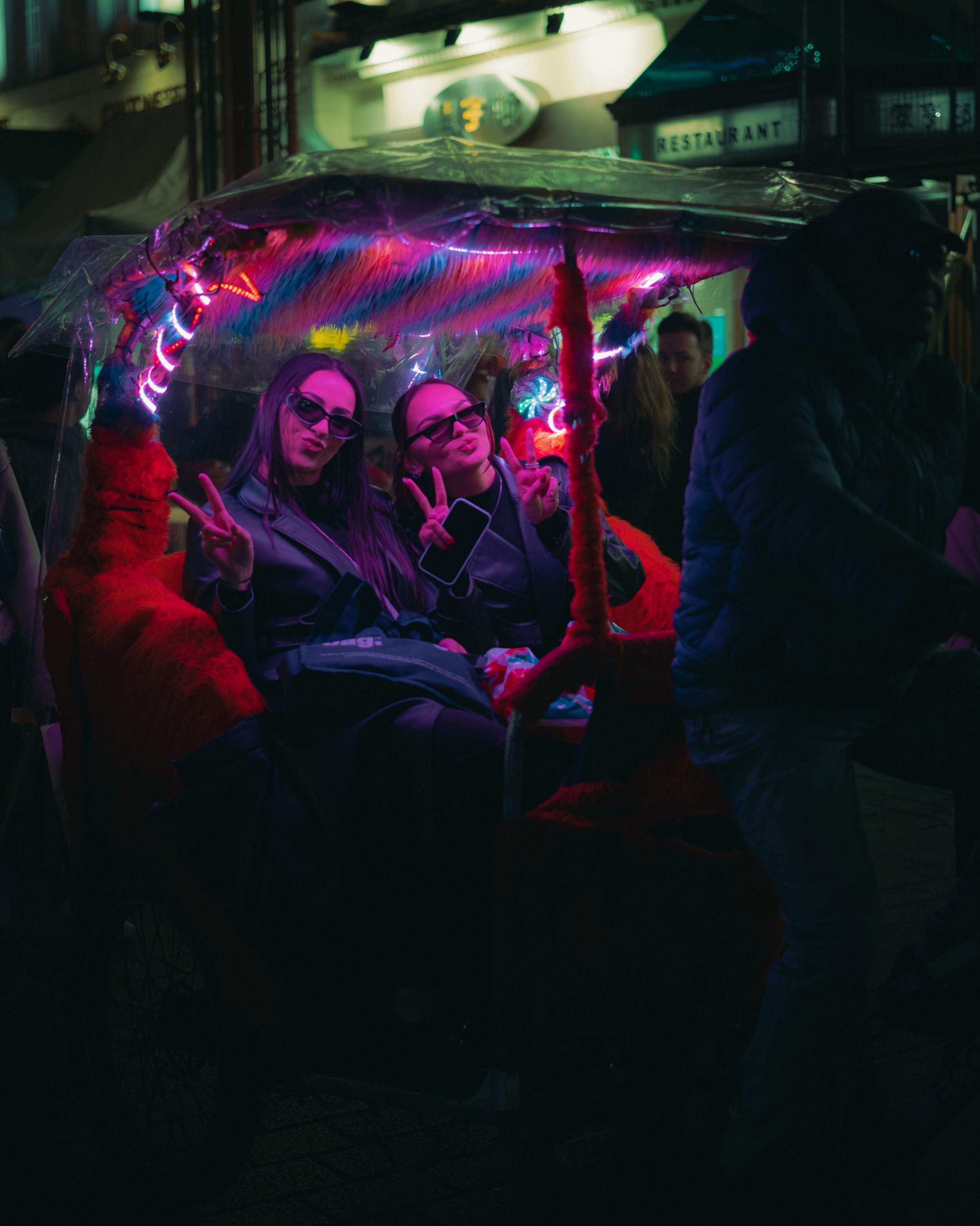
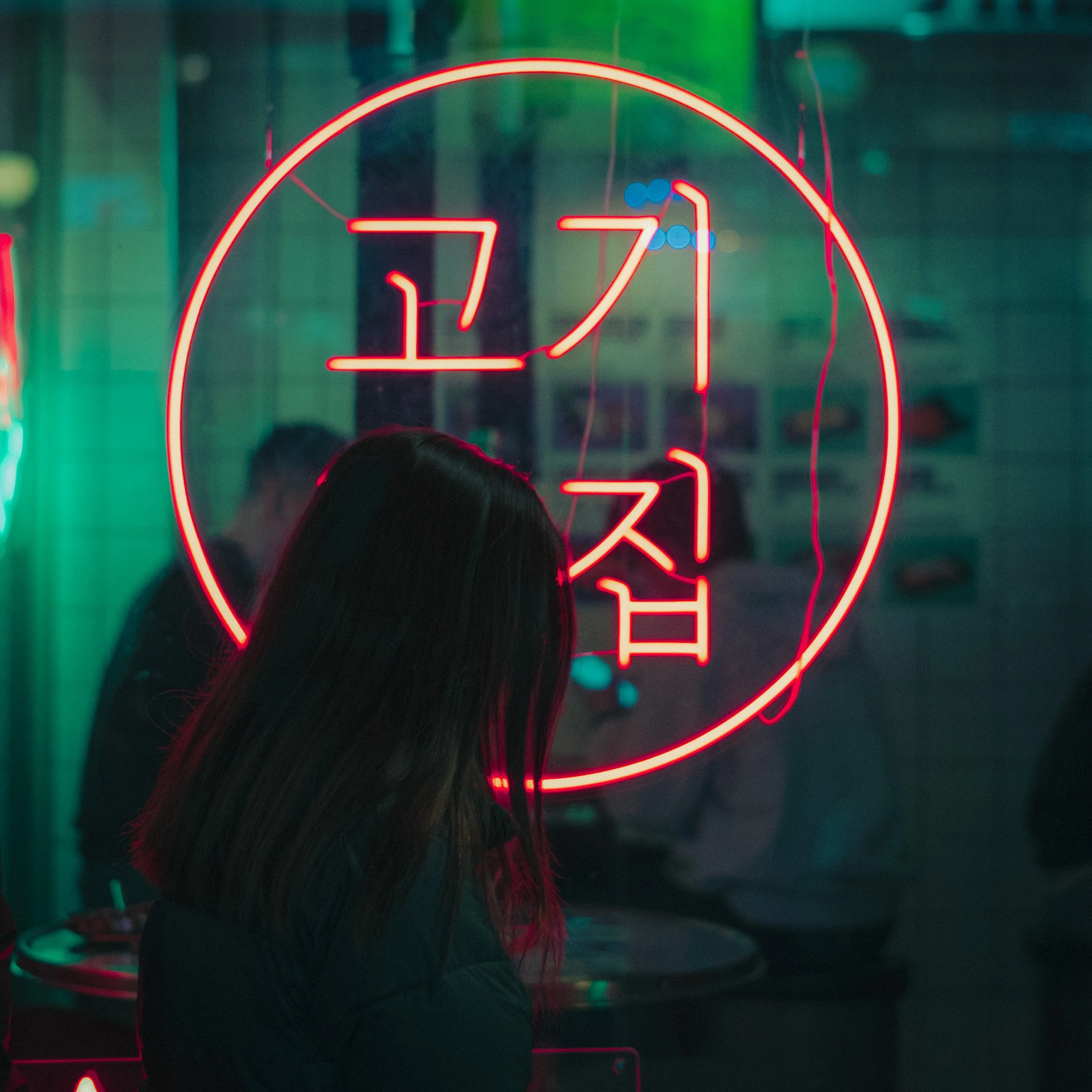
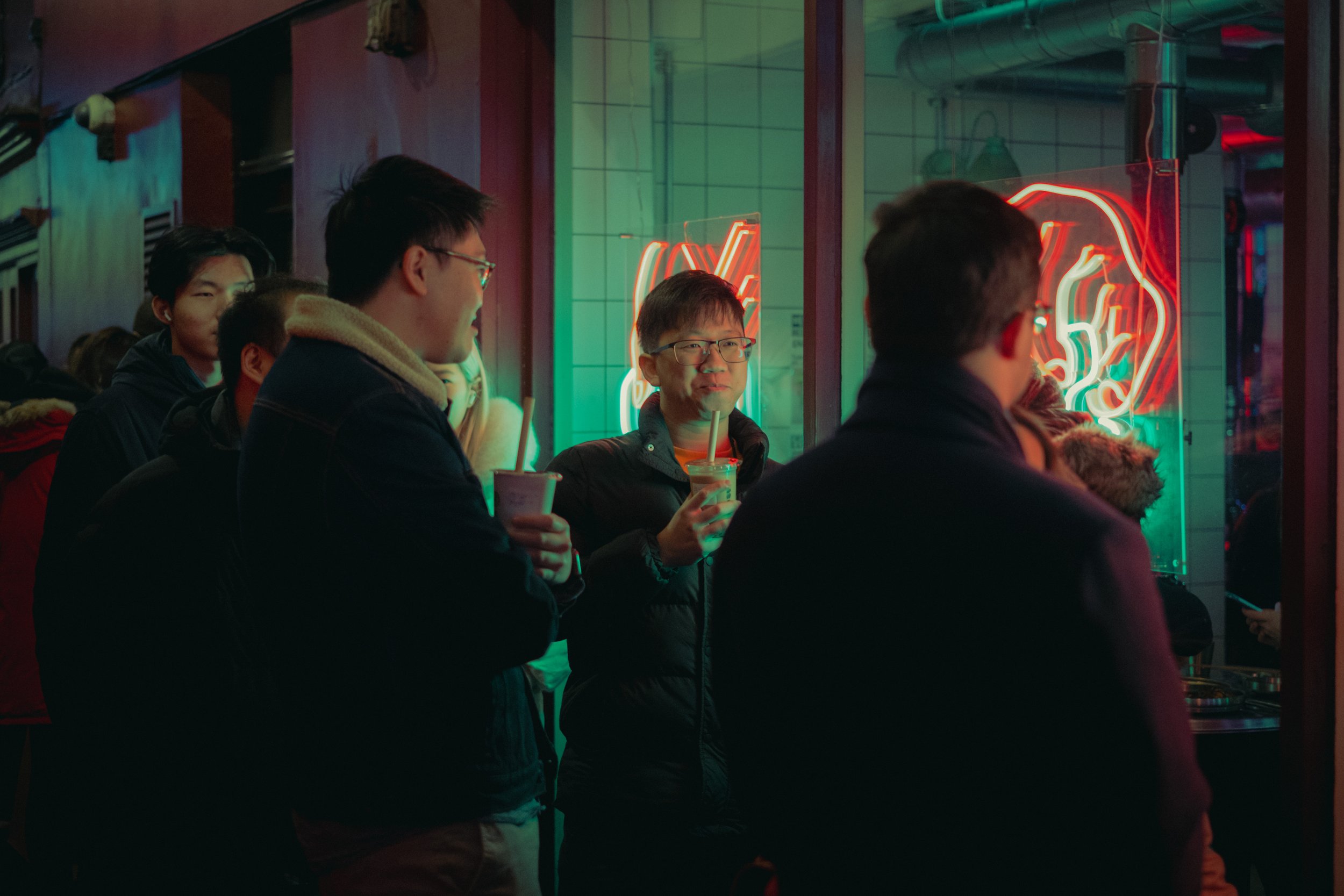
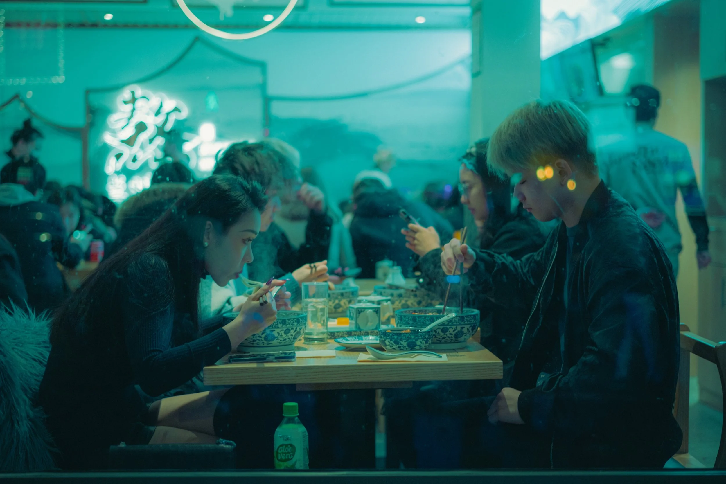
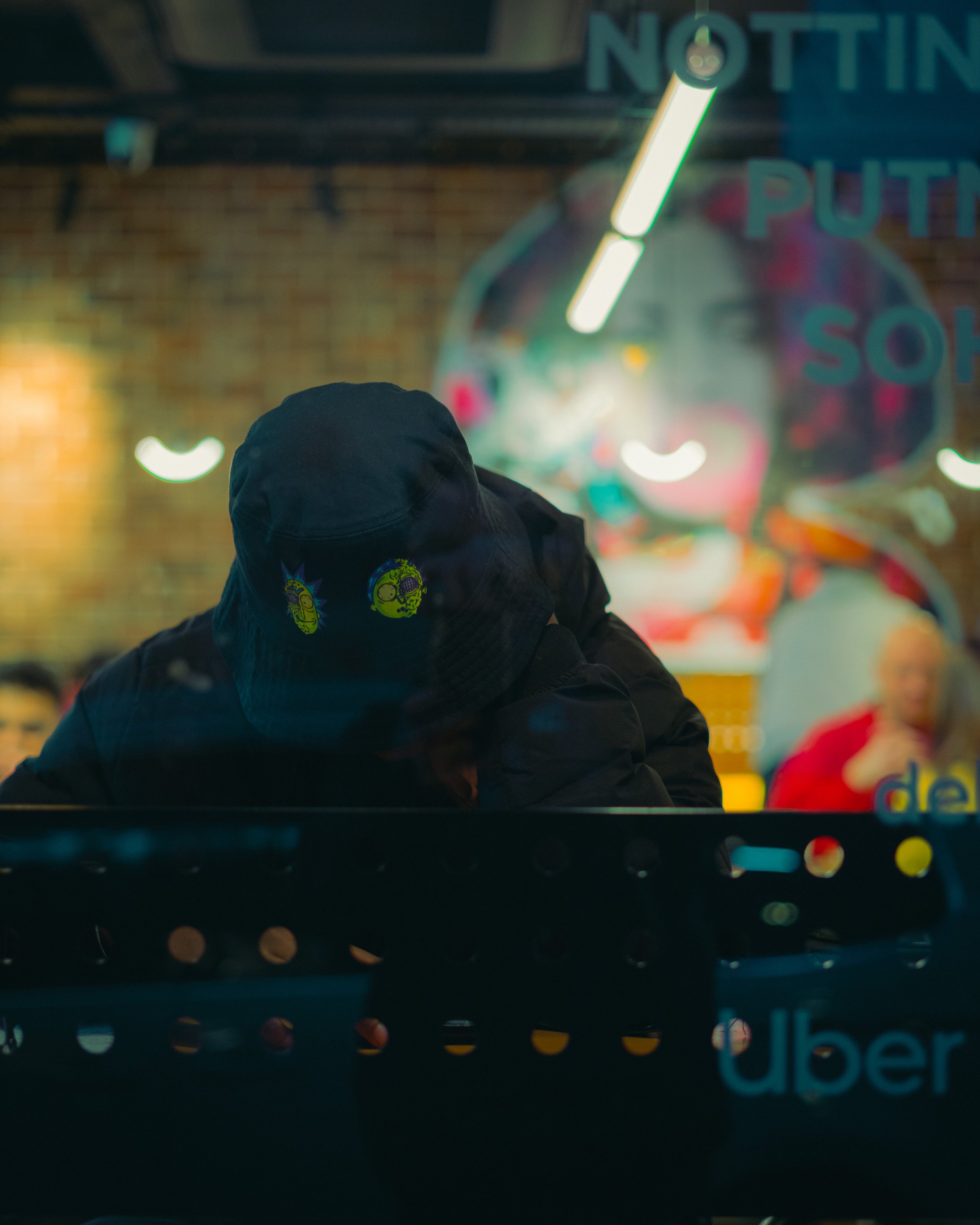
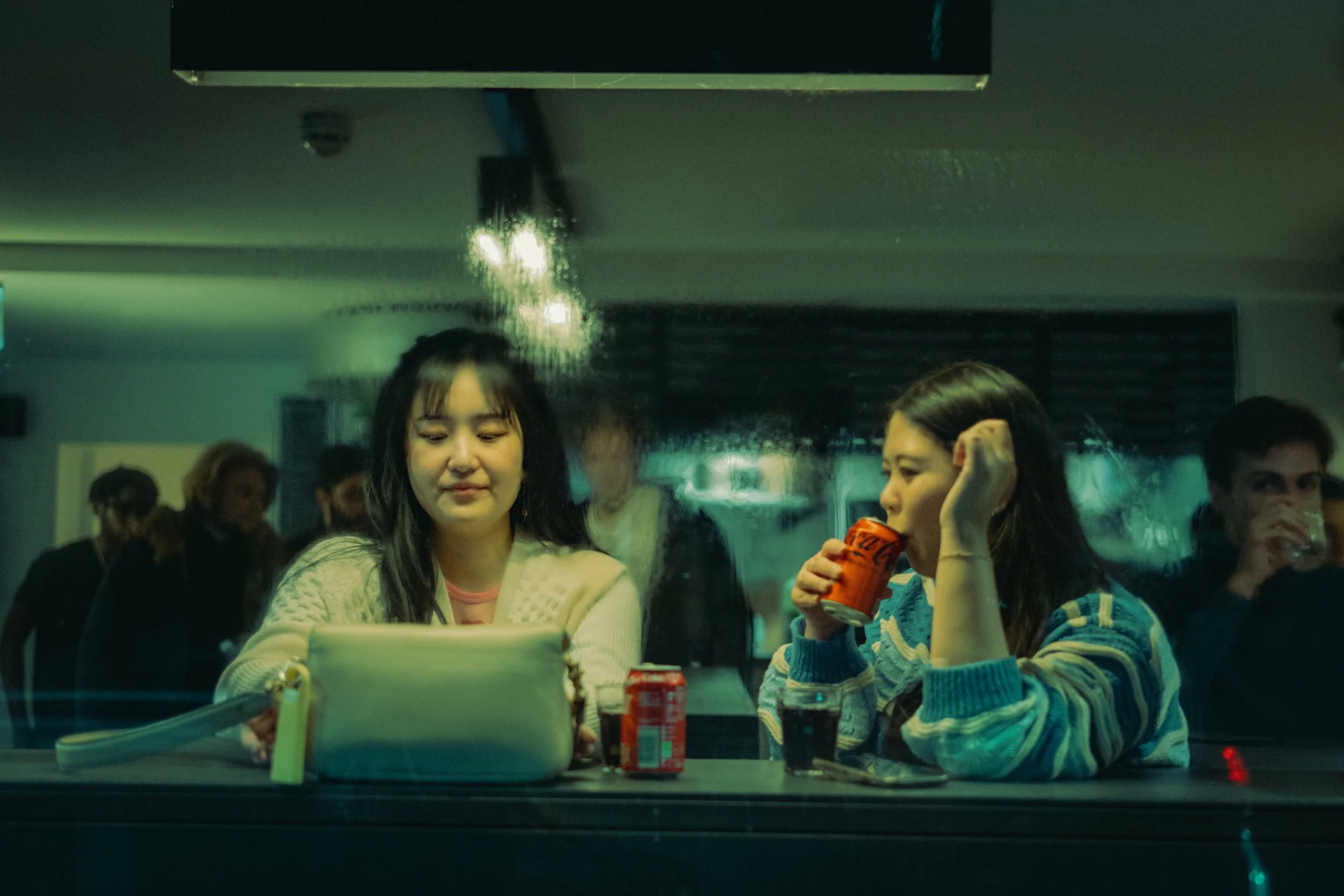
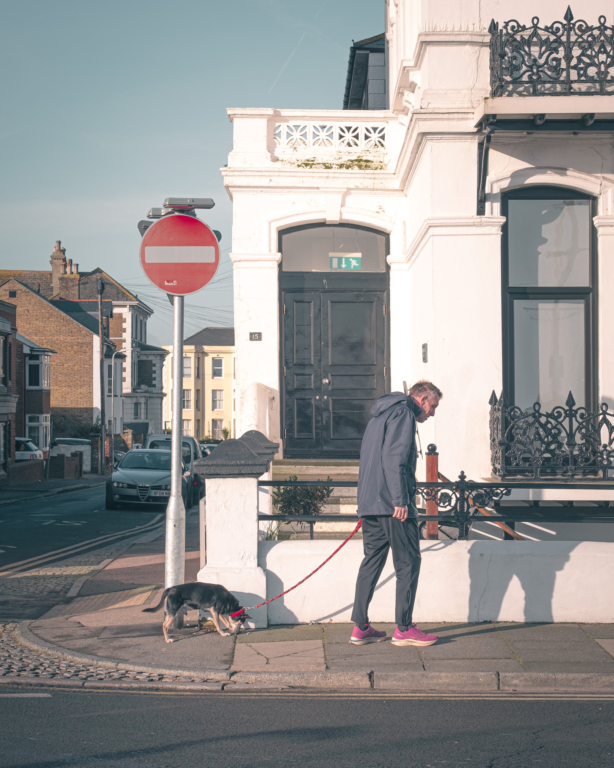
I’ve not long been back from our annual two week holiday in Seville, and aside from the usual complaint that the holiday just wasn’t long enough, we had a great couple of weeks and I managed to get out to do a lot of photography. Better still, I got to do a lot of photography and didn’t once get shouted at for doing so. Long-term followers/readers will know this is an unusual experience for me when I go to Spain.

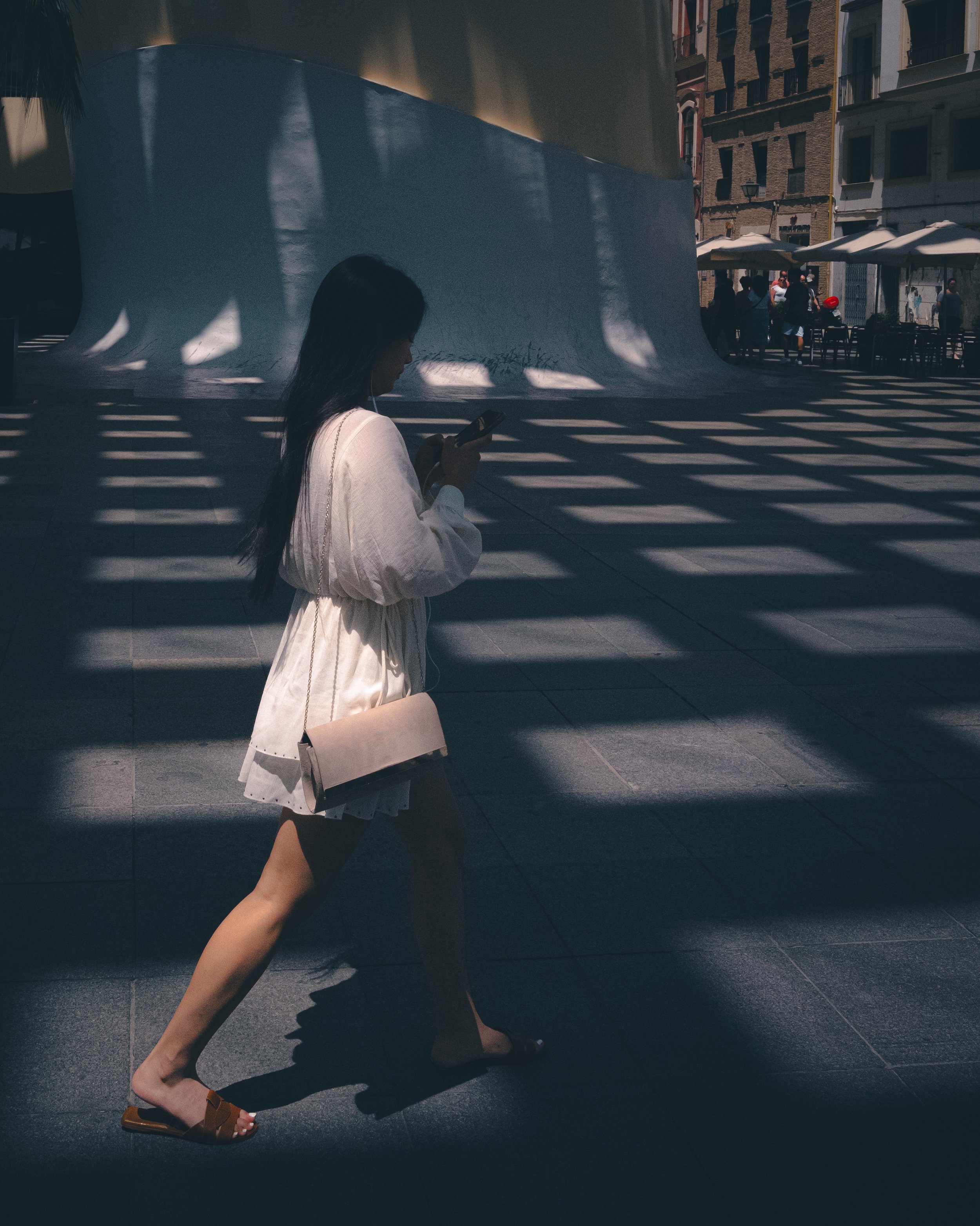
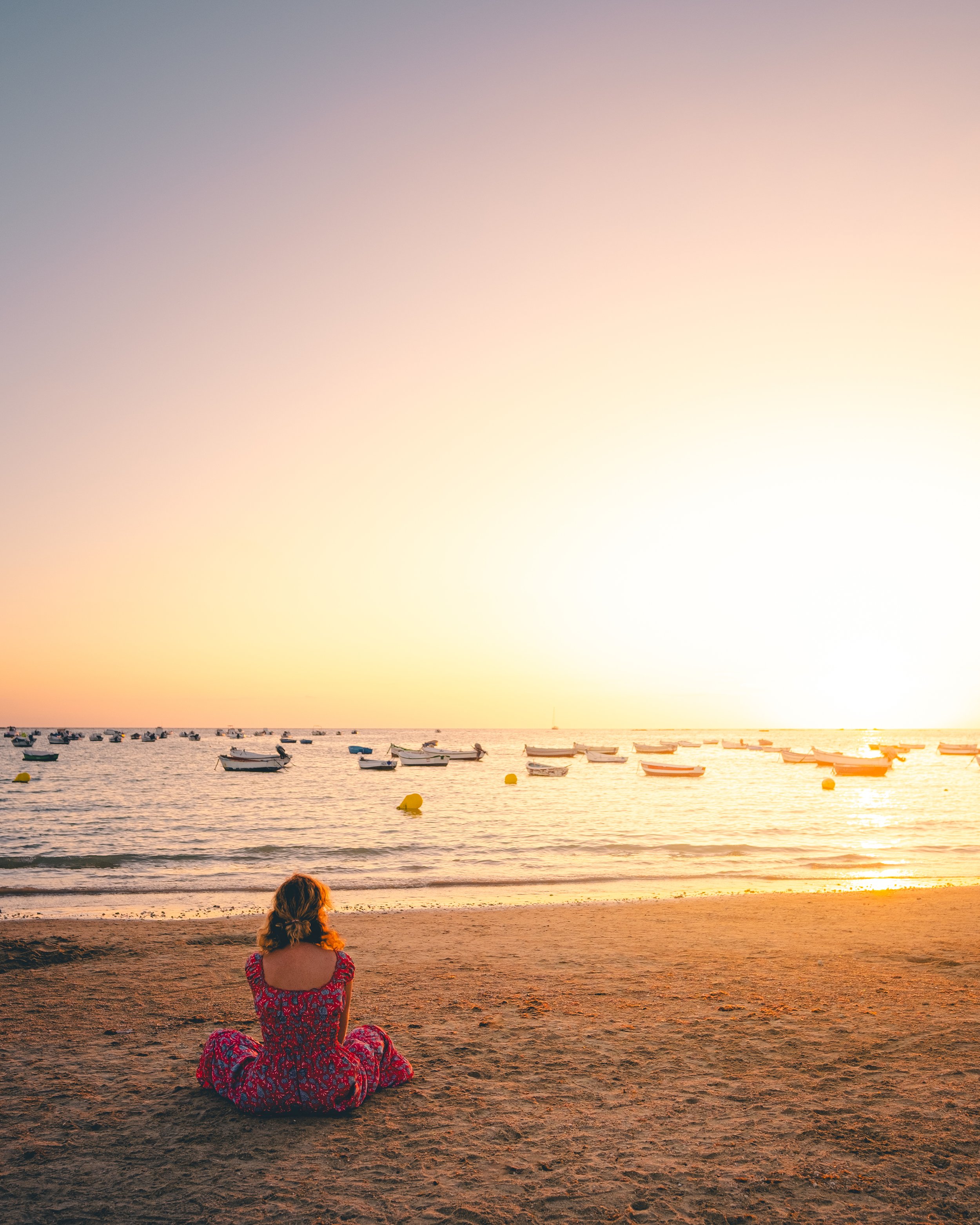
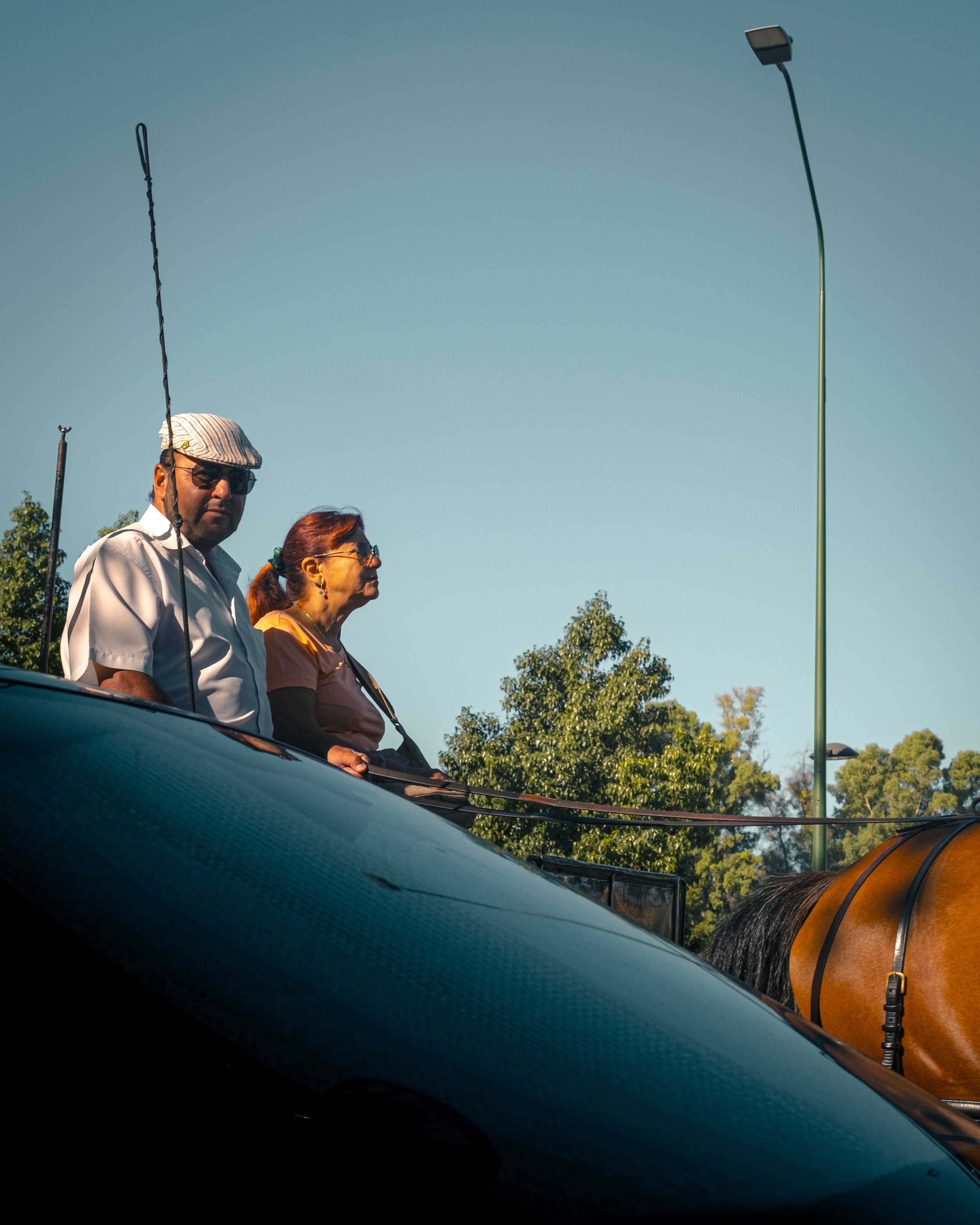
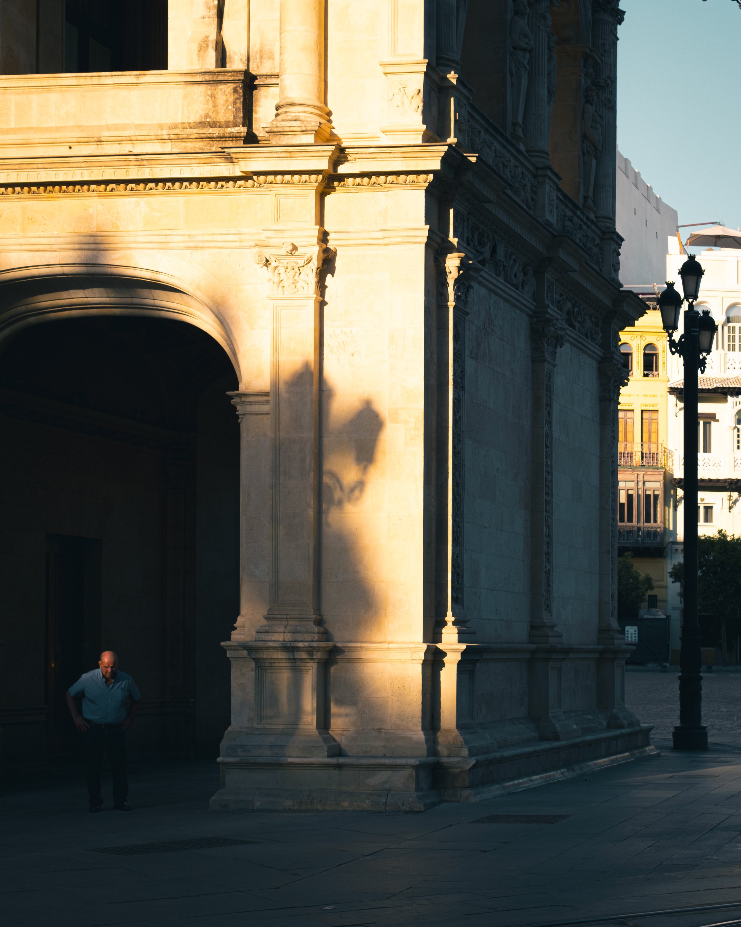
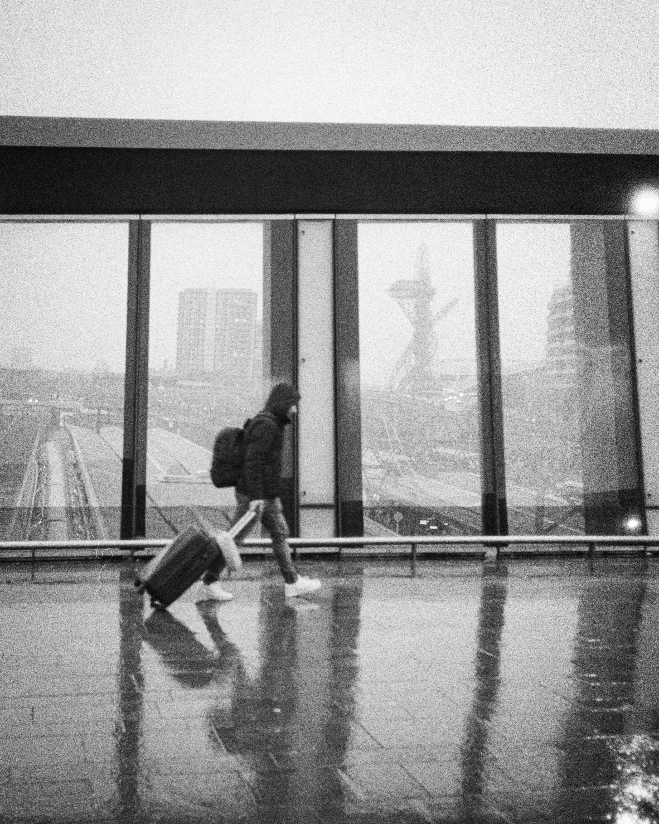
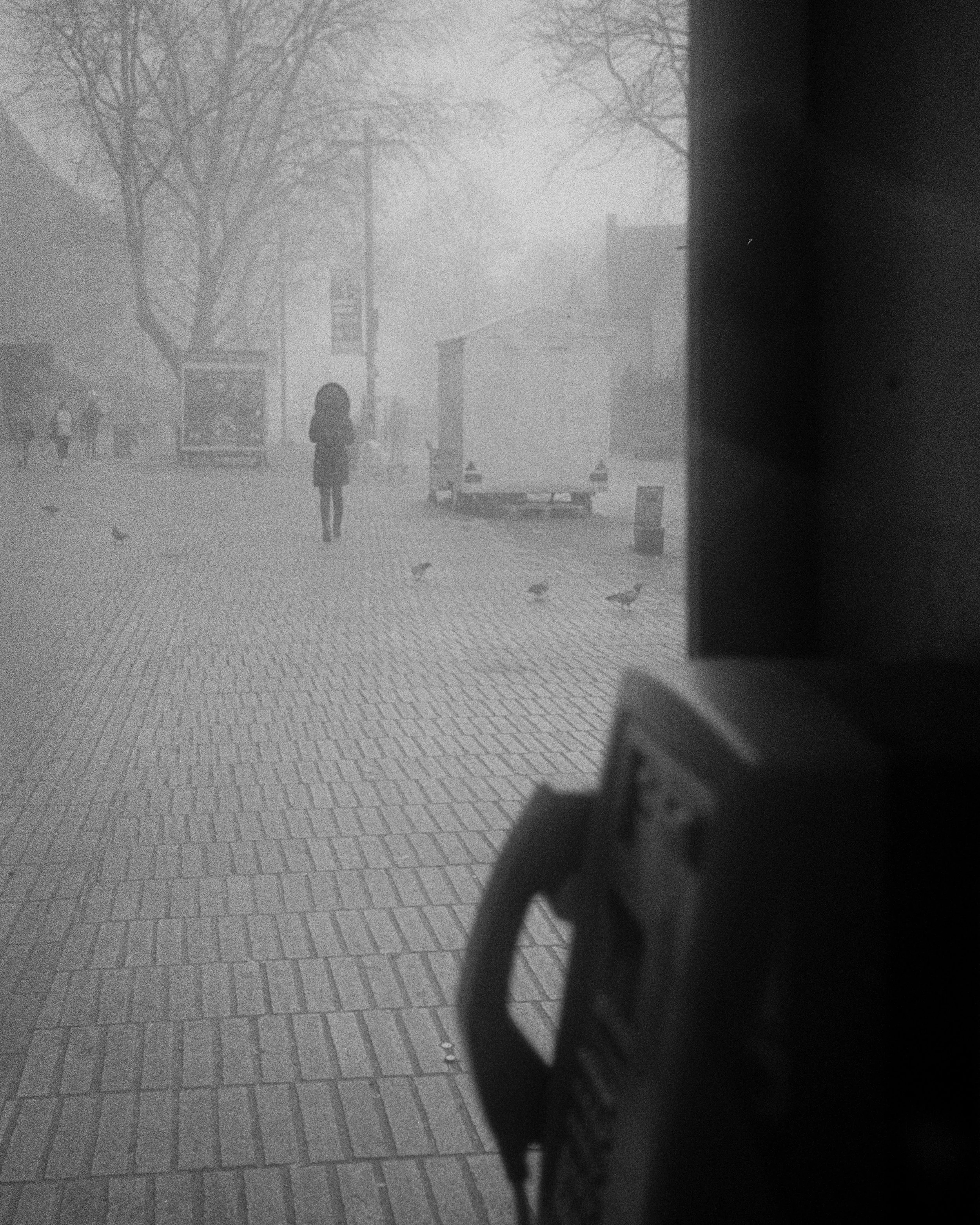
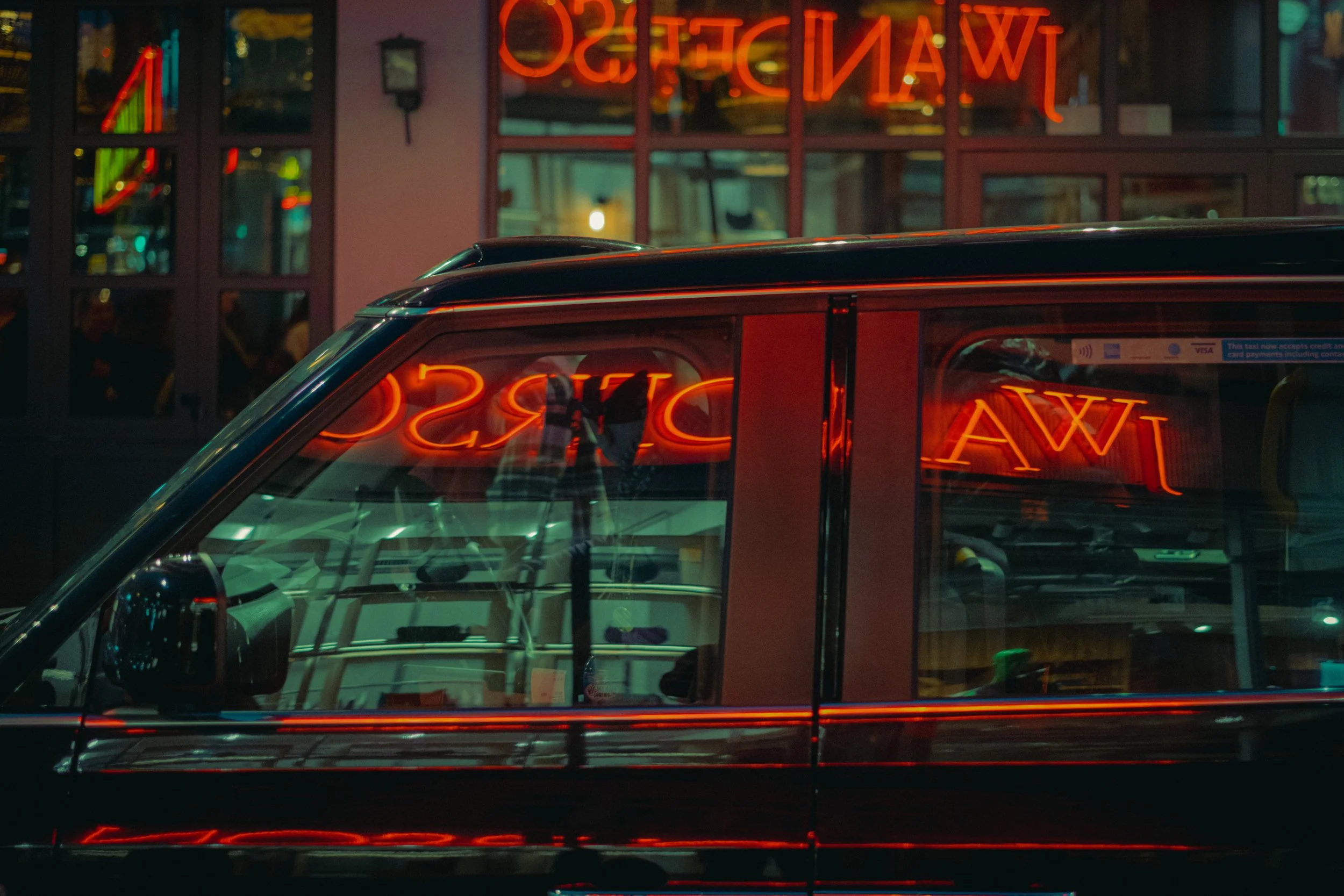
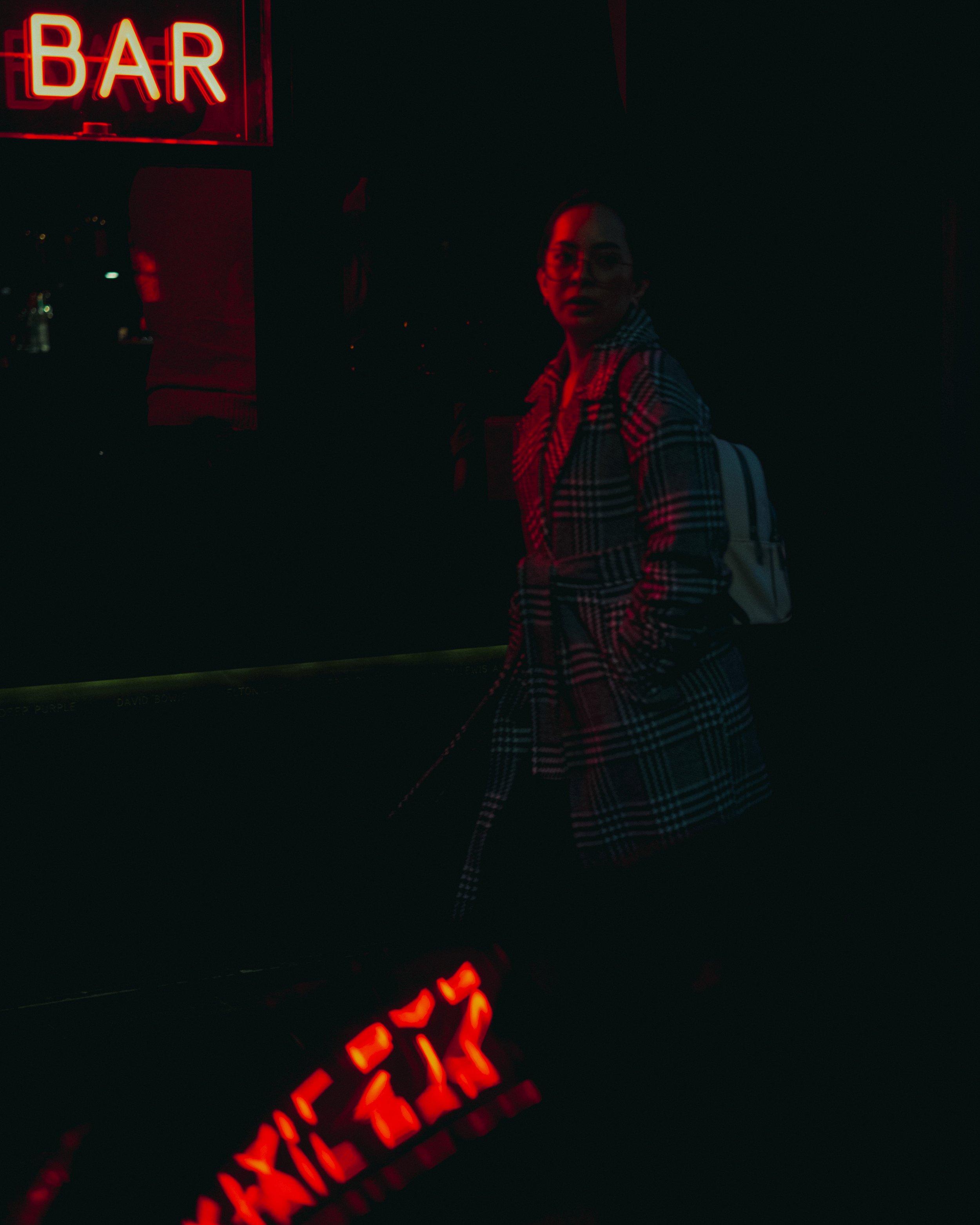
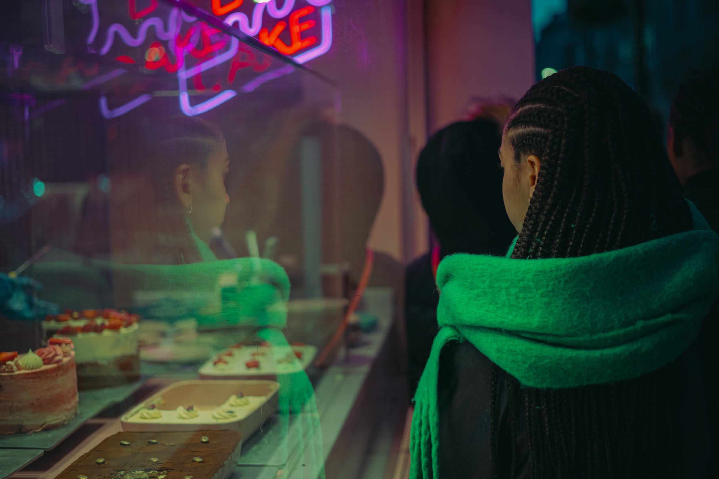
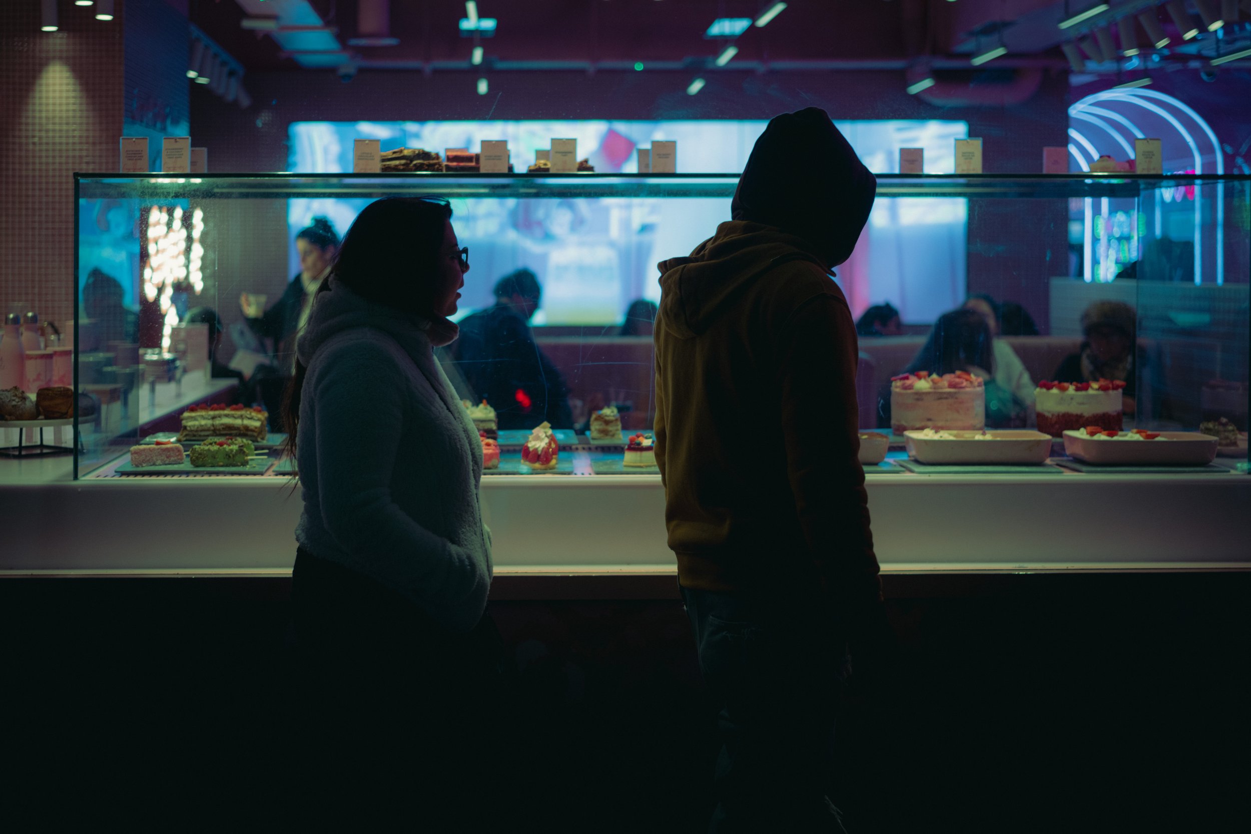
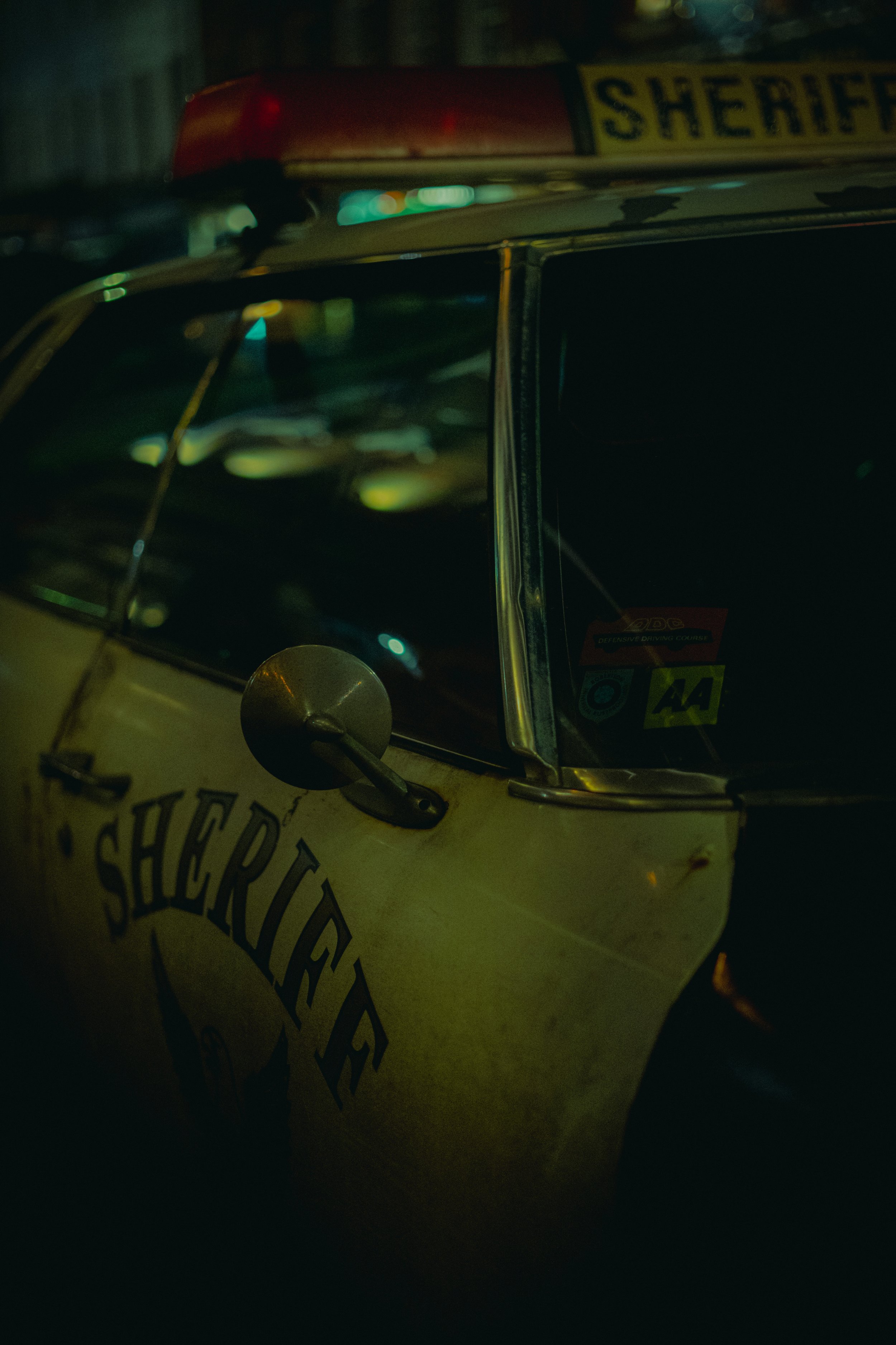
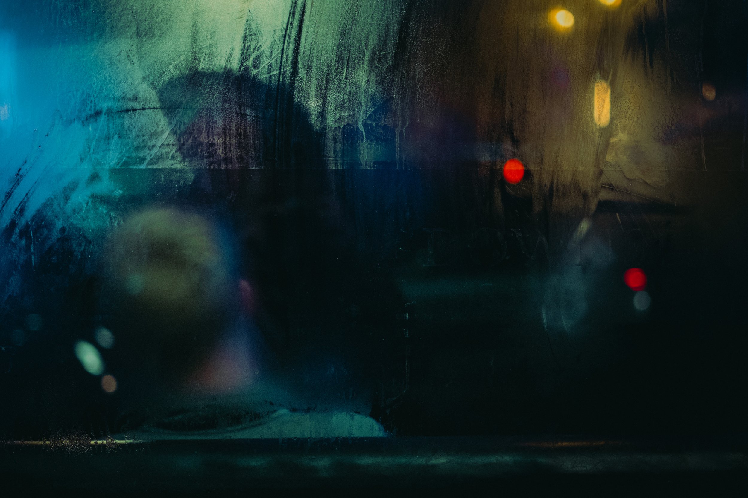
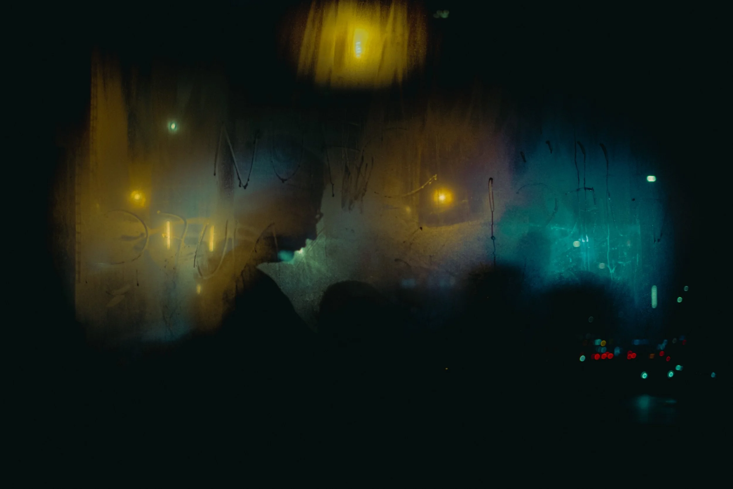
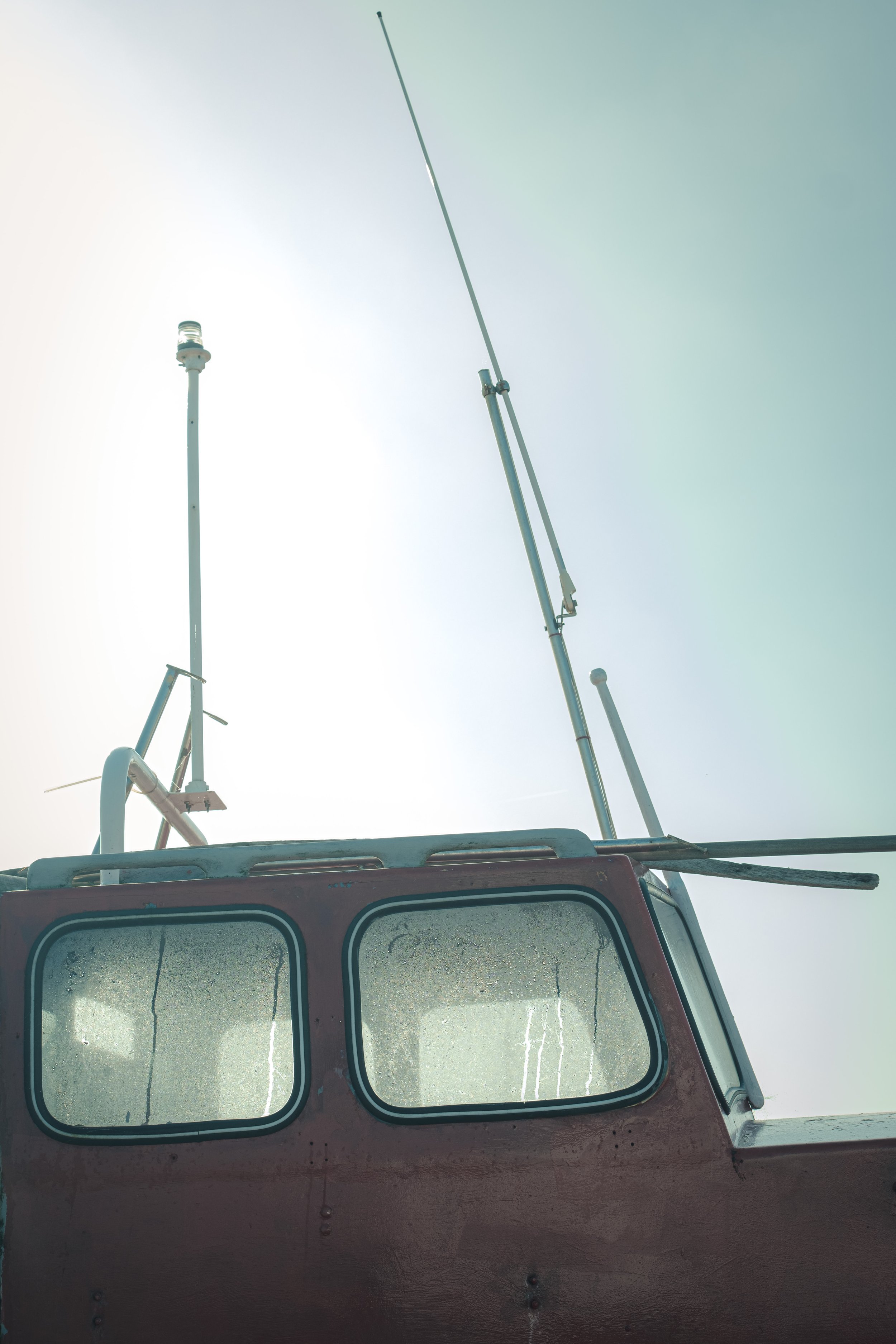
Unusually for me, I went out and did a lot of solo trips into the city centre. Both during the mornings and in the evenings for some evening golden hour/sunset shots. I’ve always been a bit hesitant about doing this, partly because of carrying expensive camera equipment around in the city centre, but also because, well, we are supposed to be on holiday as a family, so…

For whatever reasons this time it worked out that I had more time to go out and shoot and so I took the opportunity every chance I could. Before we went I bought a couple of additional 64gb SD cards and I obviously had to fill them to capacity before we returned. And so I did. Which on the flip side meant a lot of photos to edit but it’s better that than having nothing to work with.

Prior to this trip I had also invested in an iPad Pro M2. I’d been mulling this over for a while, because I really wanted more storage and more processing power. Not just for editing photos but for other tasks too (editing video for example). For the past few years I’d been using a 2019 iPad Air, which I’d been really pleased with, but the small storage space and some other limitations (not compatible with the new pencil for example) finally got me to the point where I felt an upgrade was in order. With my recent promotion at work too, I felt I could justify the outlay as it would benefit me at work as well as at home. So far I’ve been really pleased with the investment and it’s been a dream to edit on. So that’s been great.

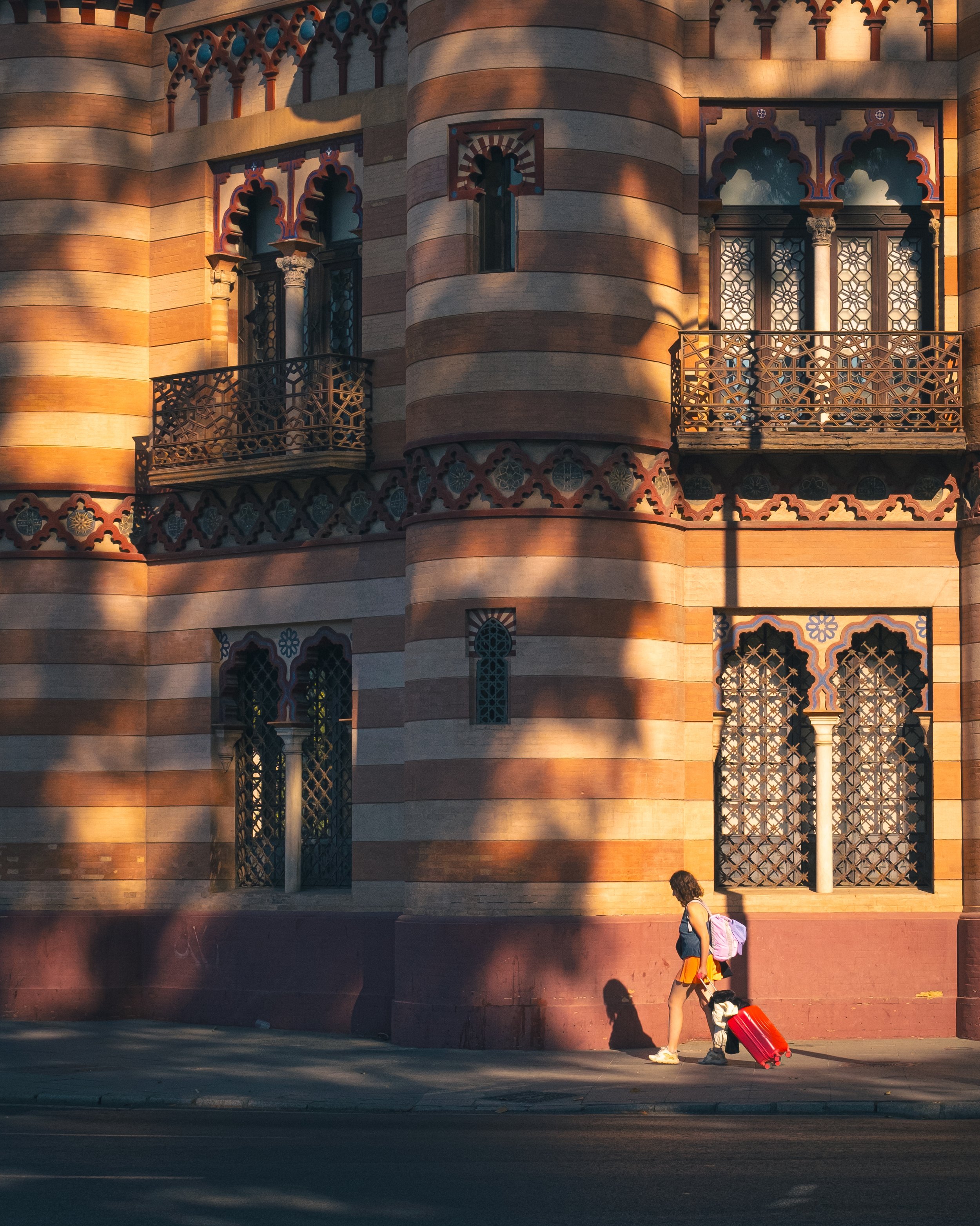
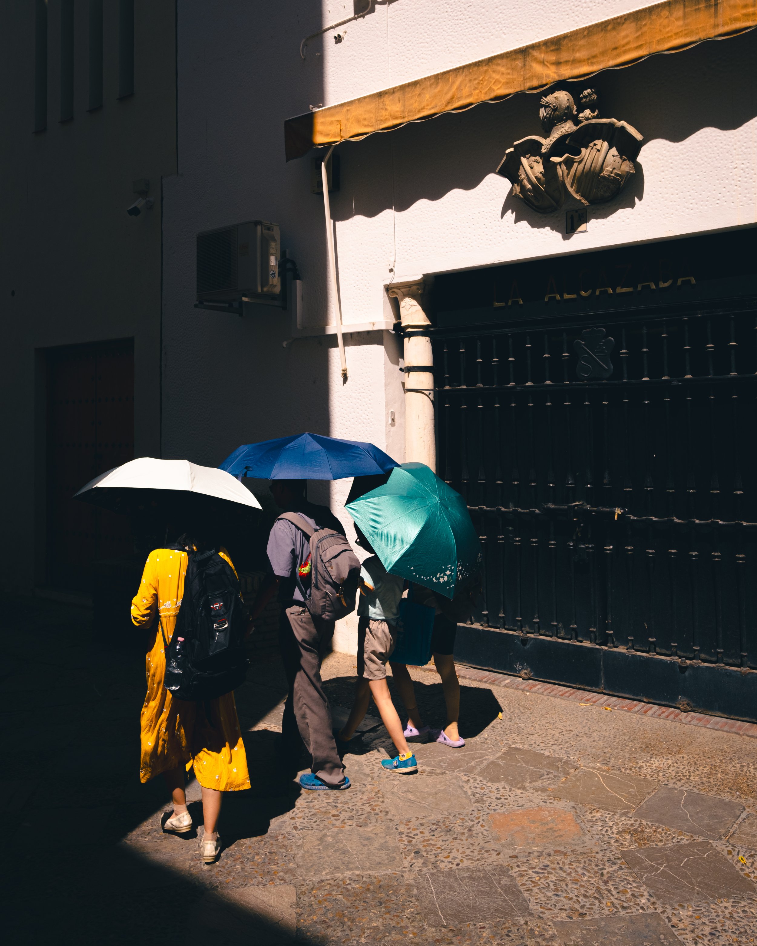
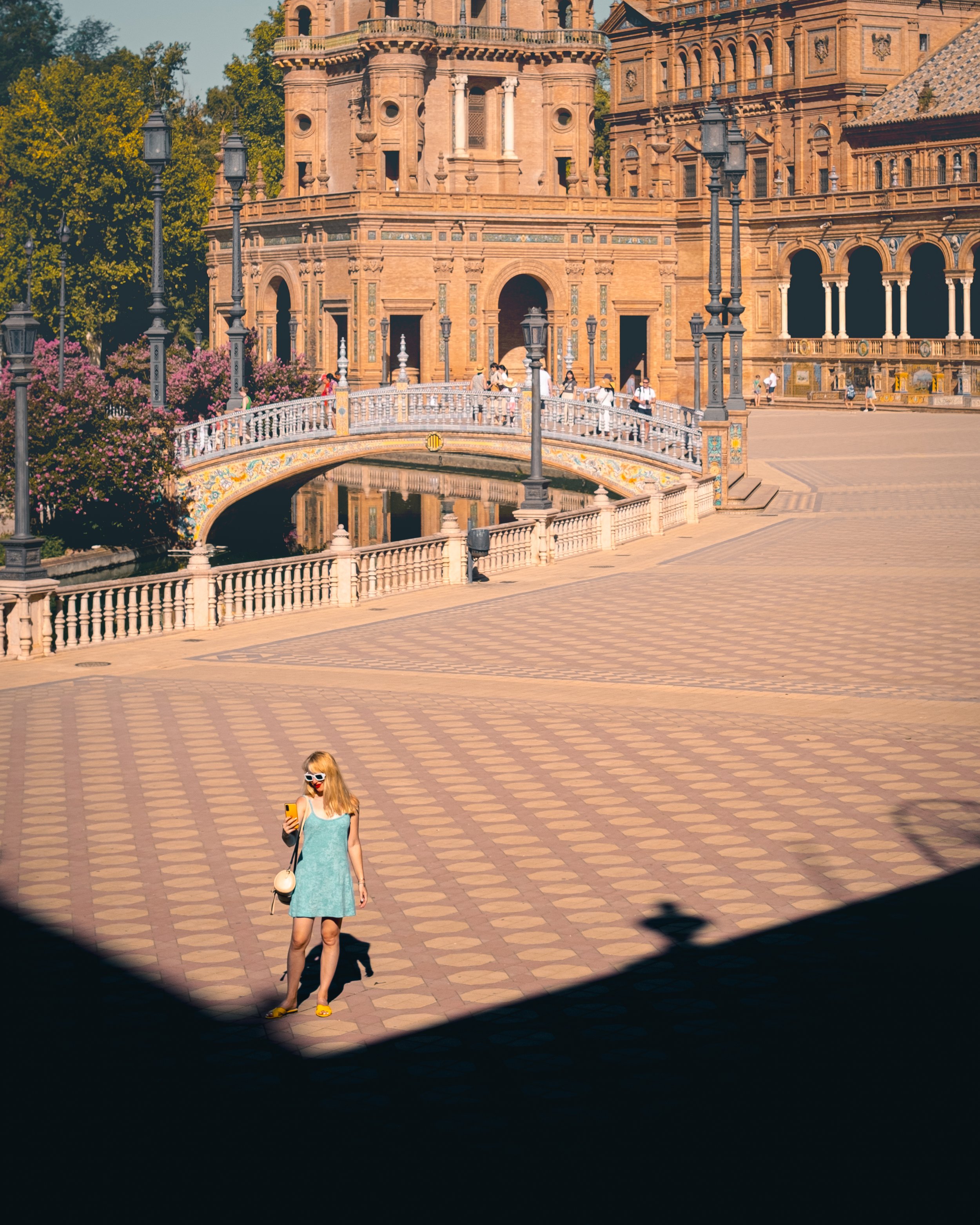
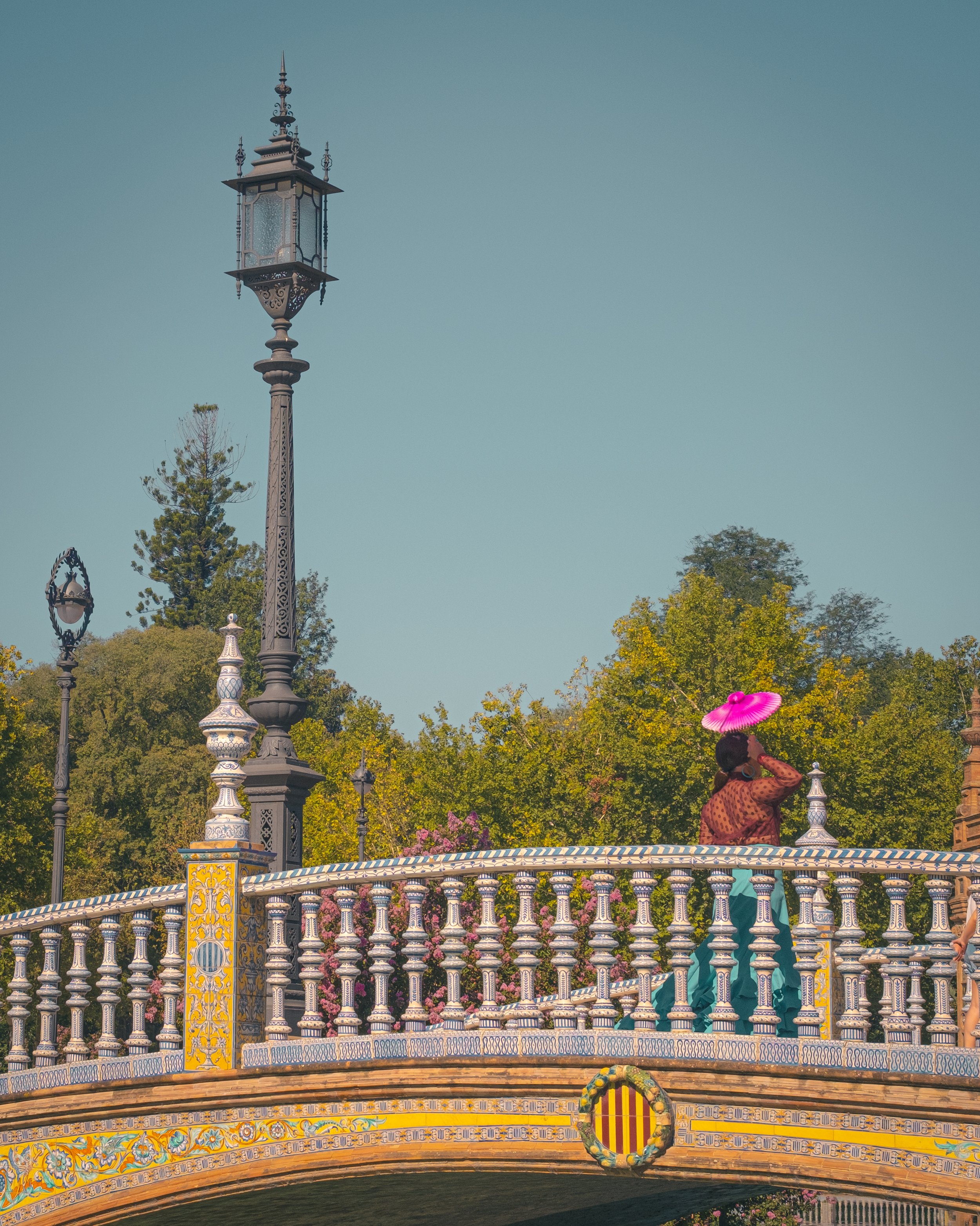
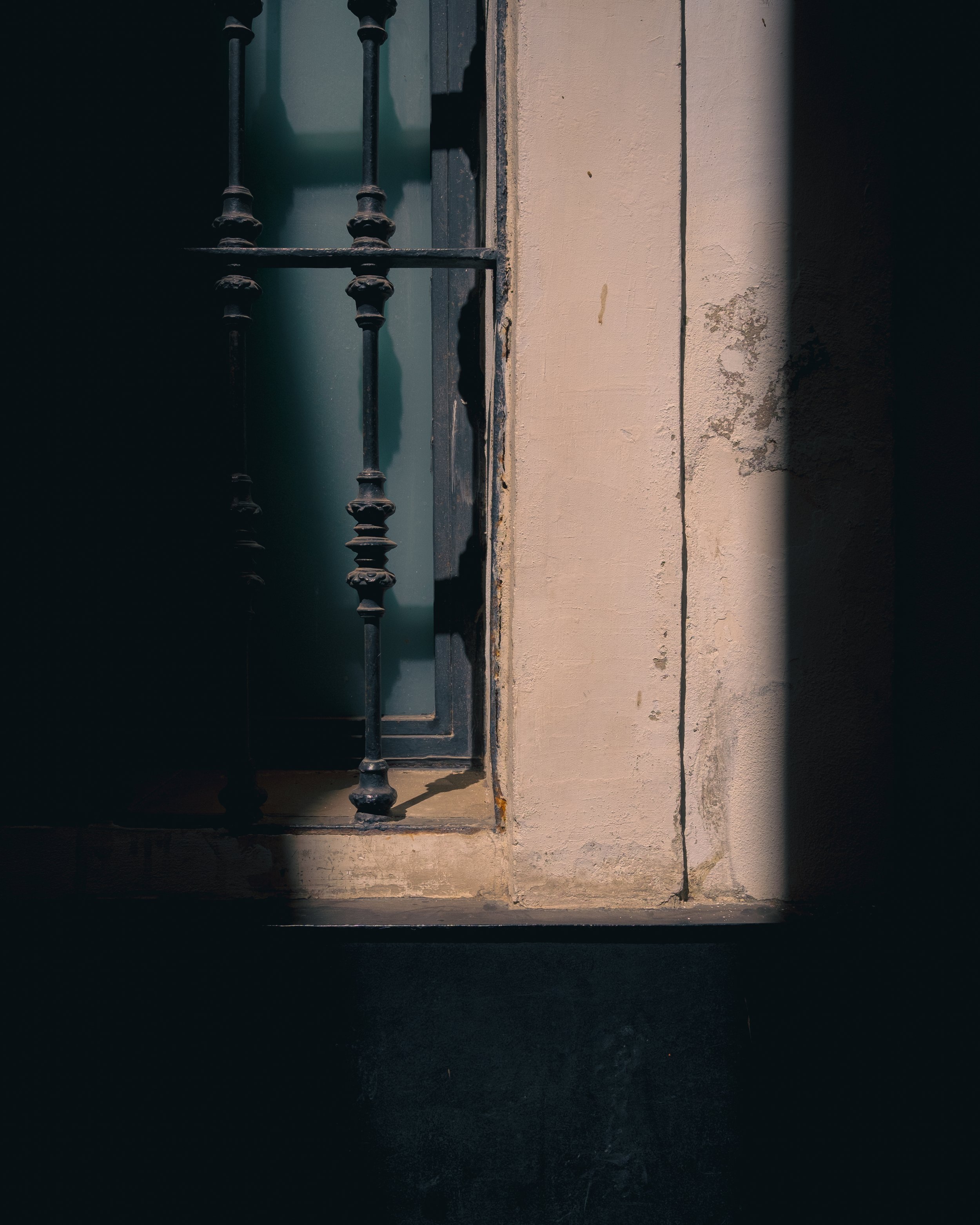
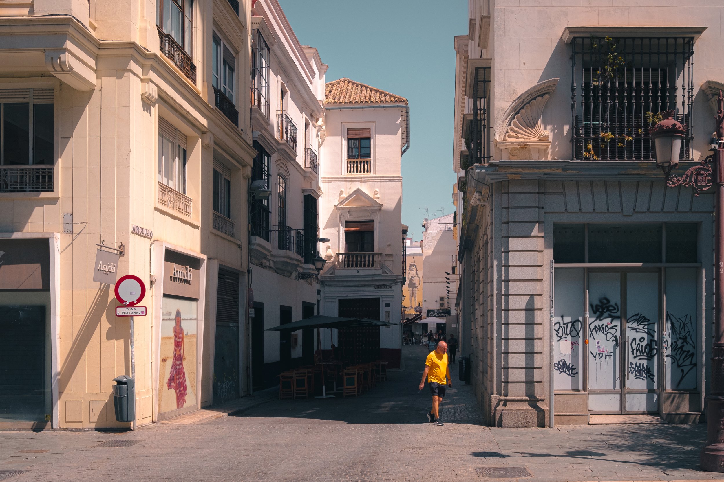
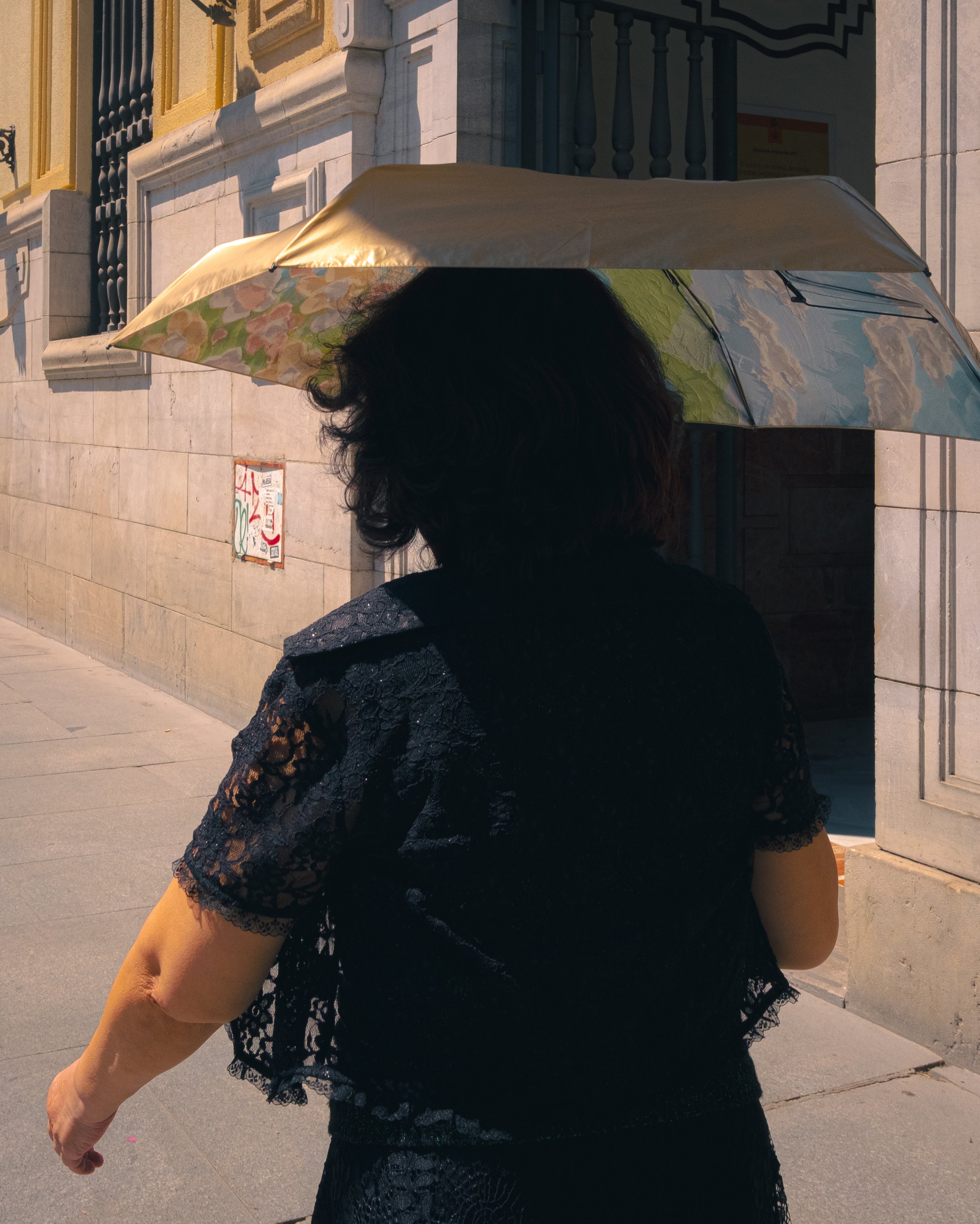
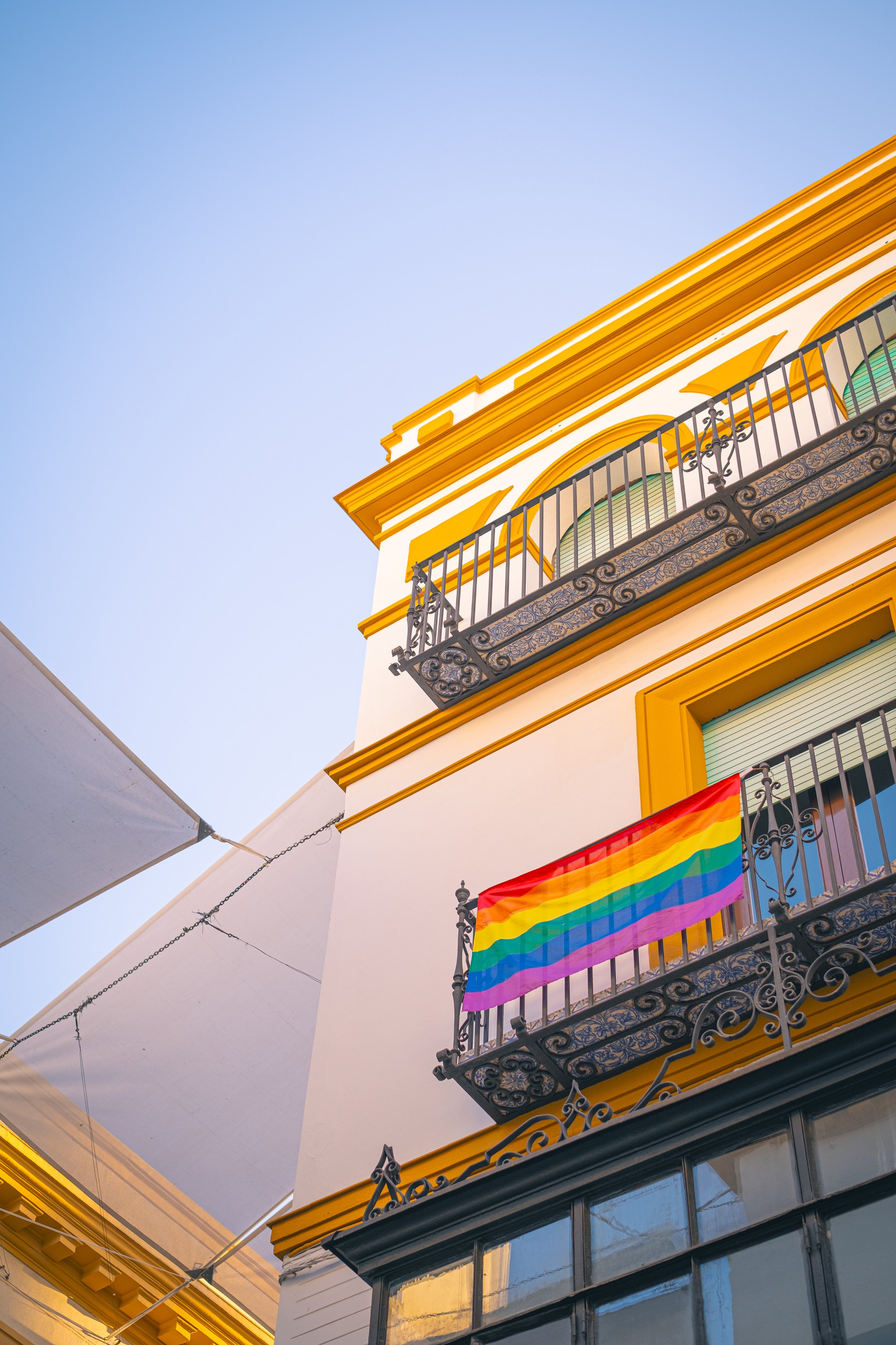
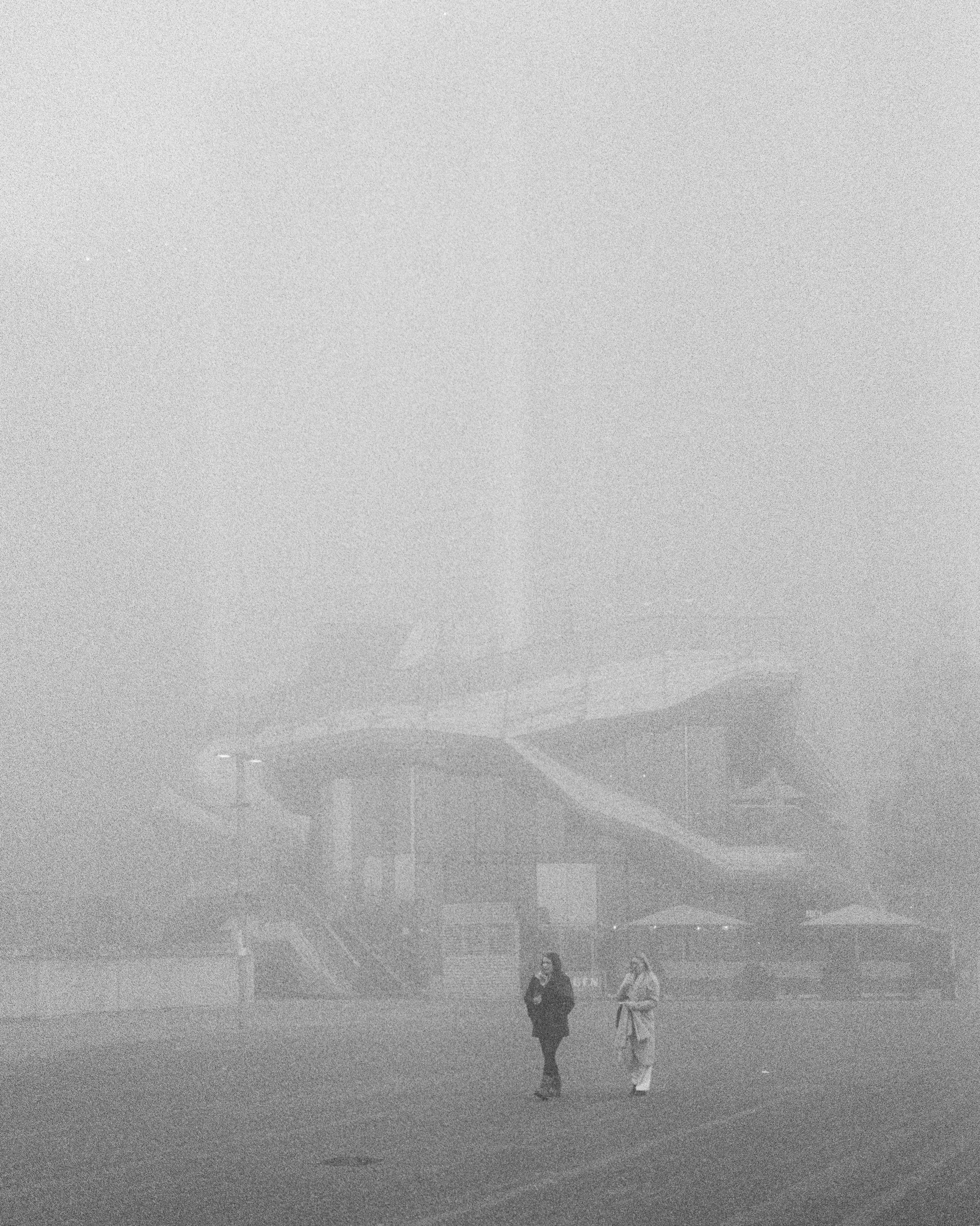
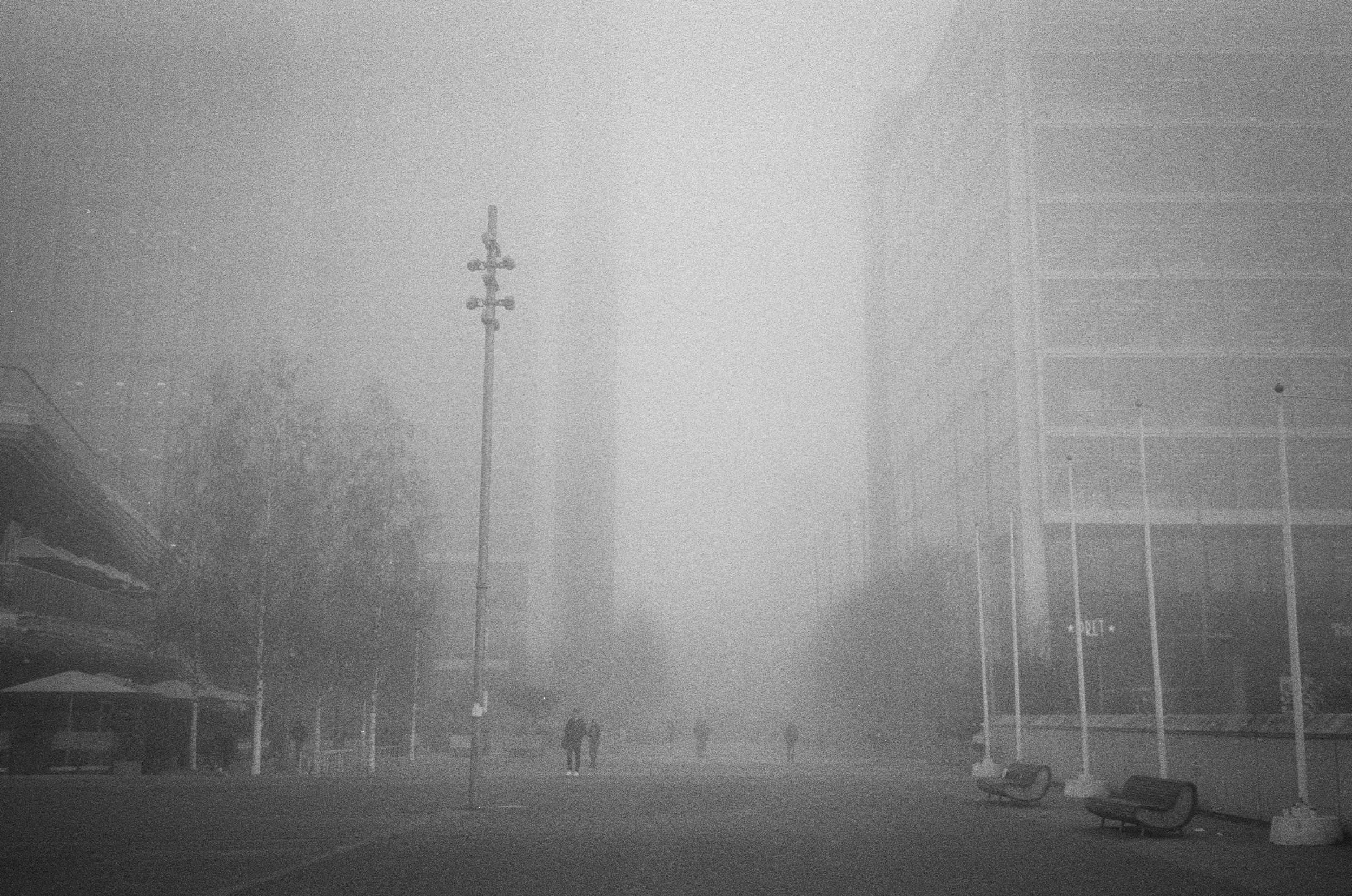
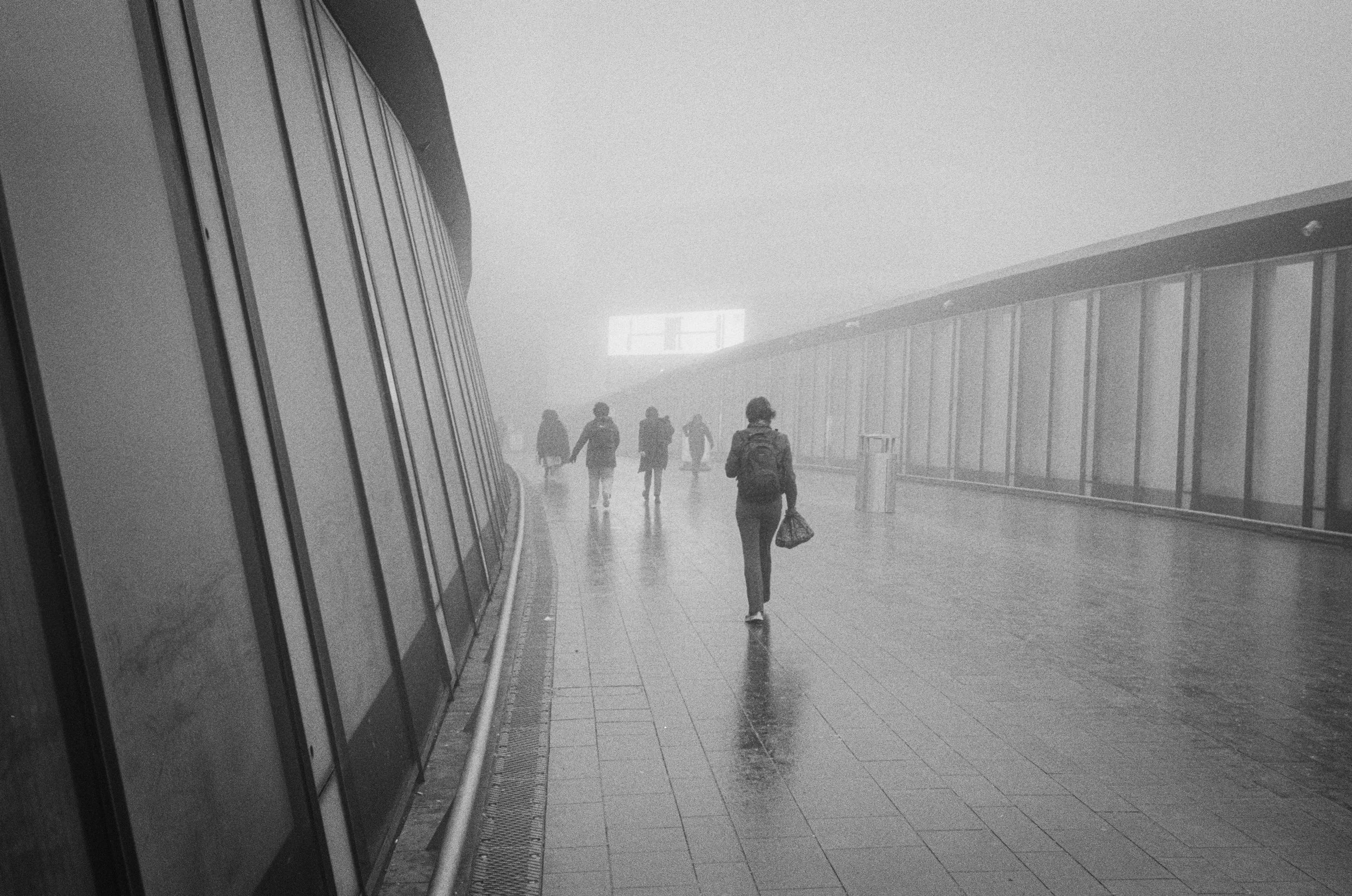
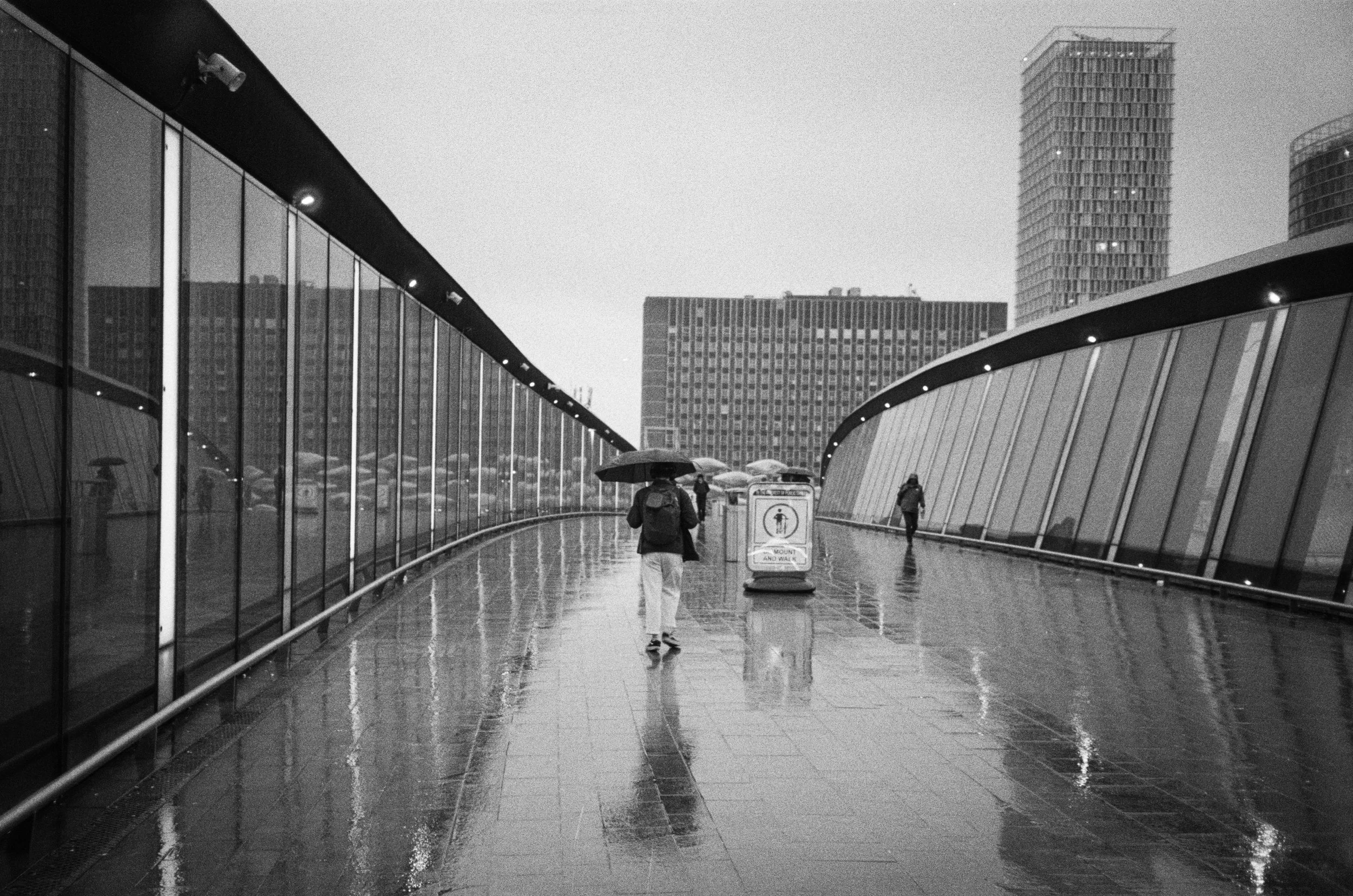
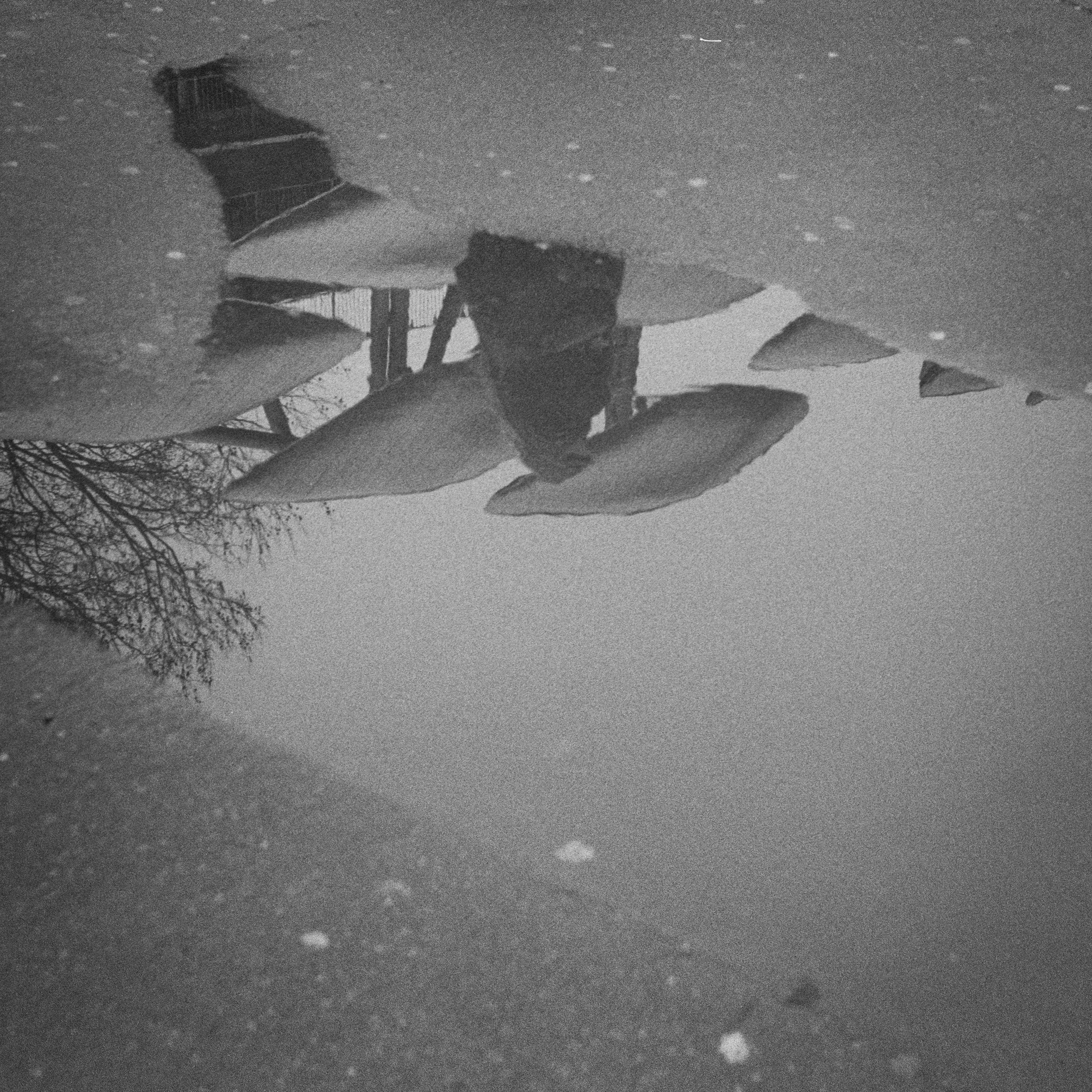
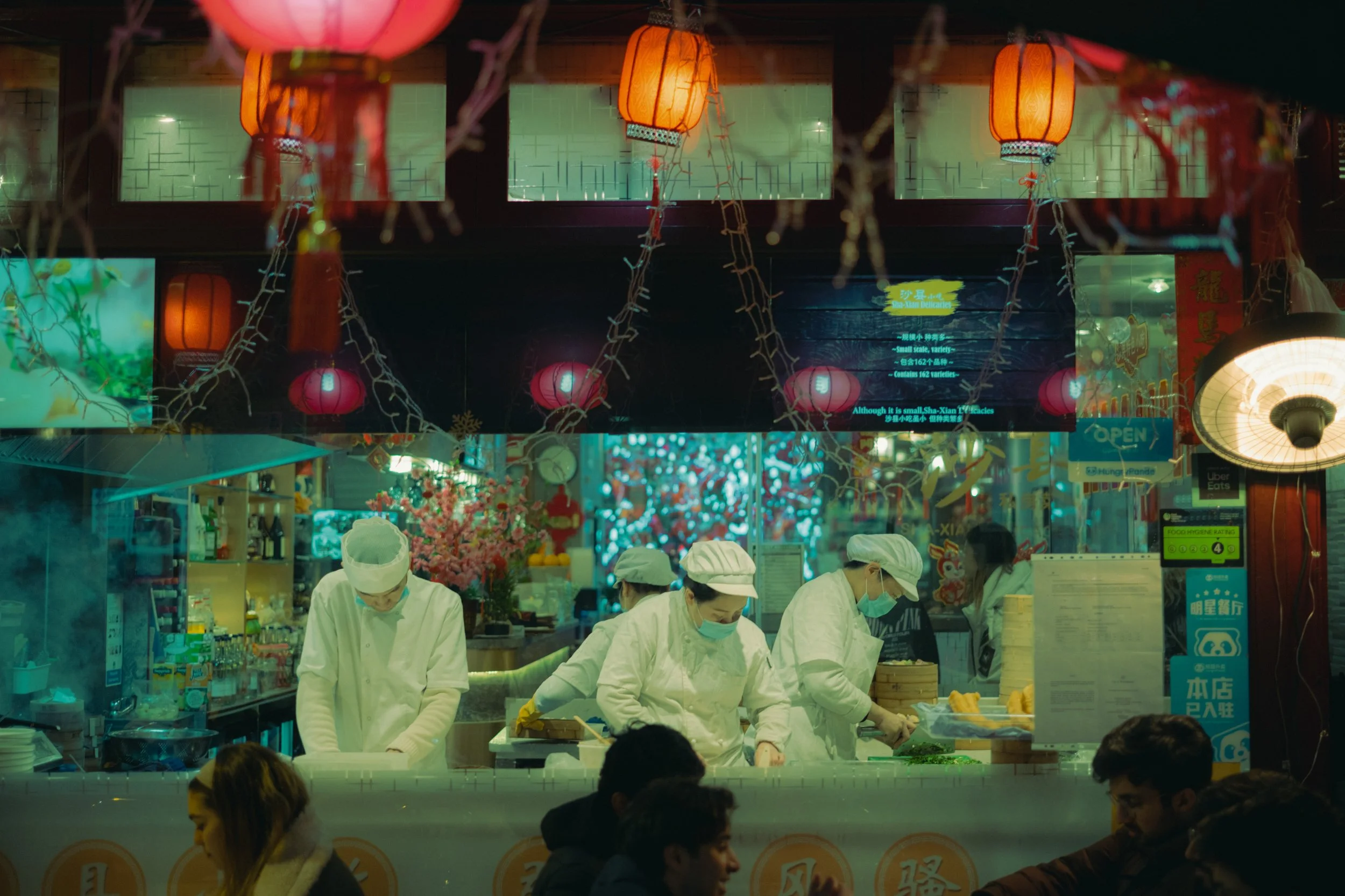
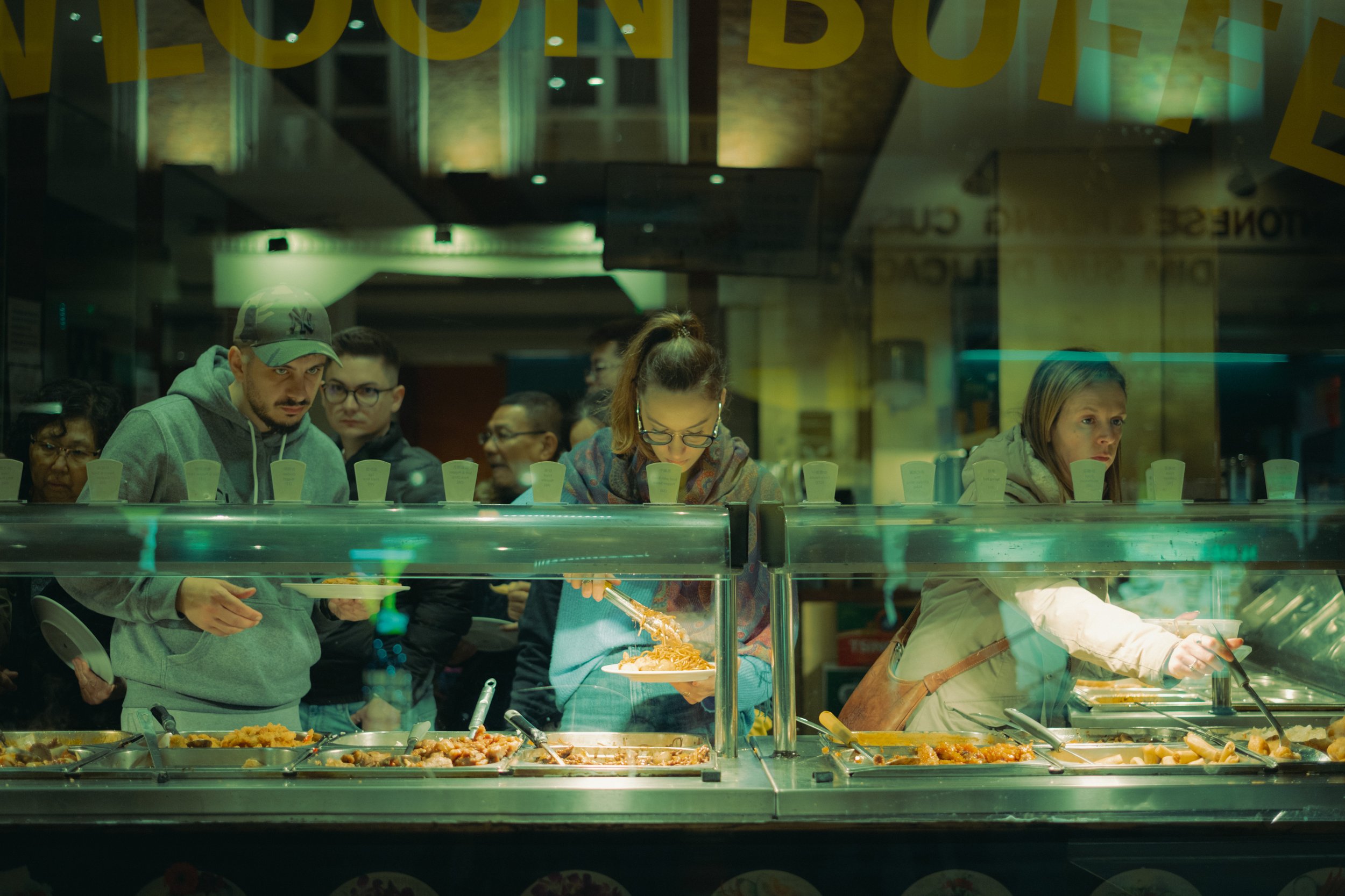
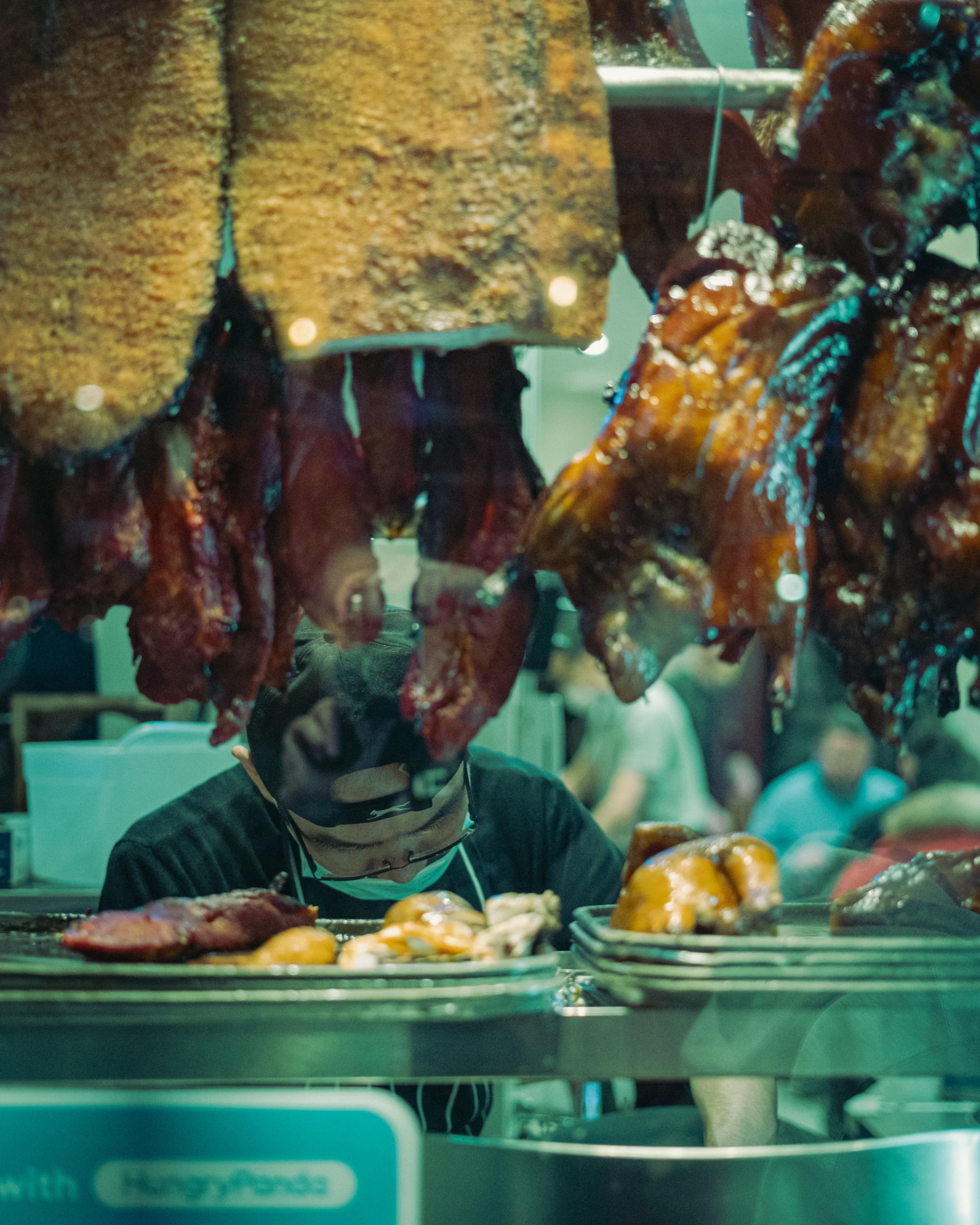
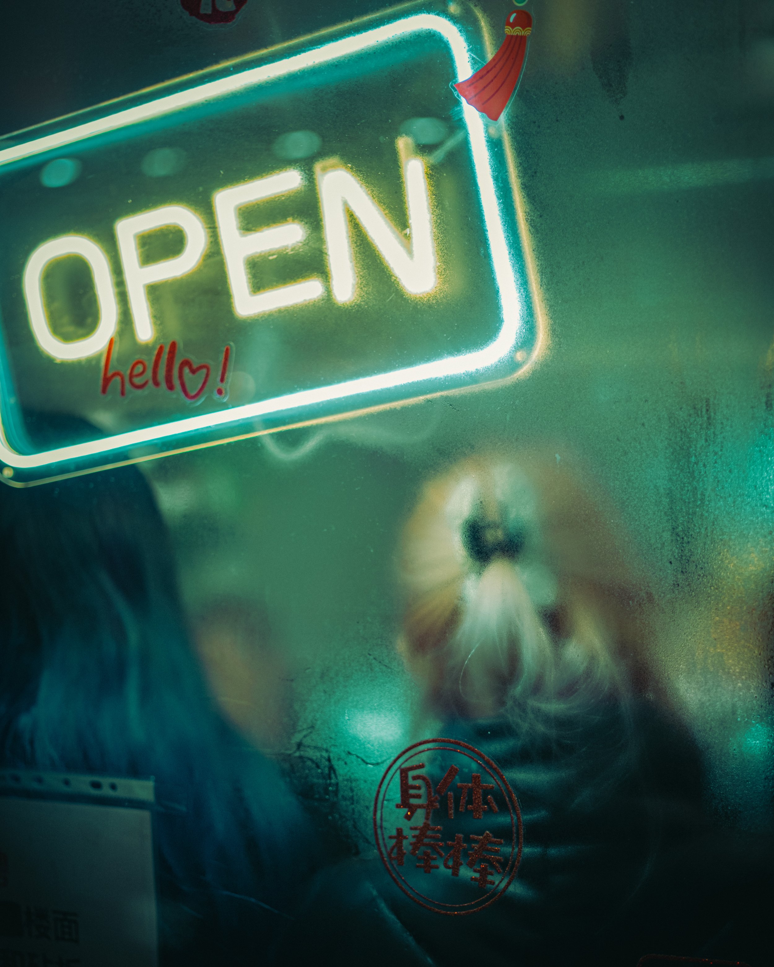
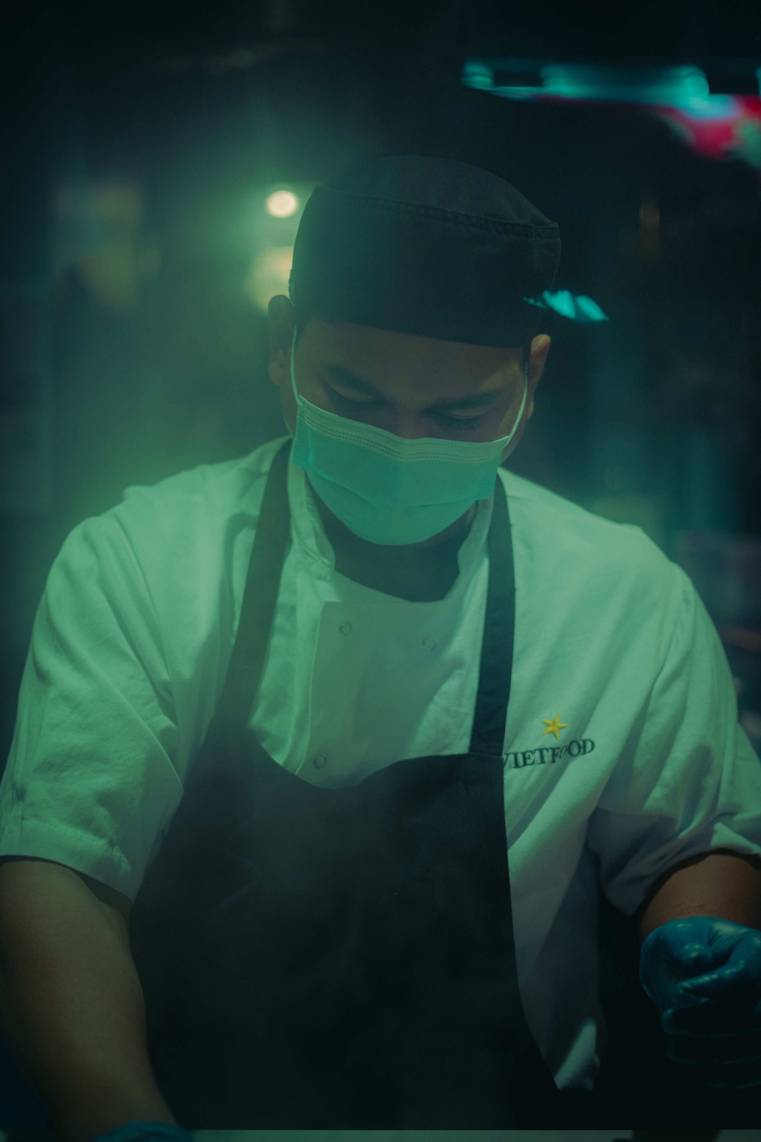
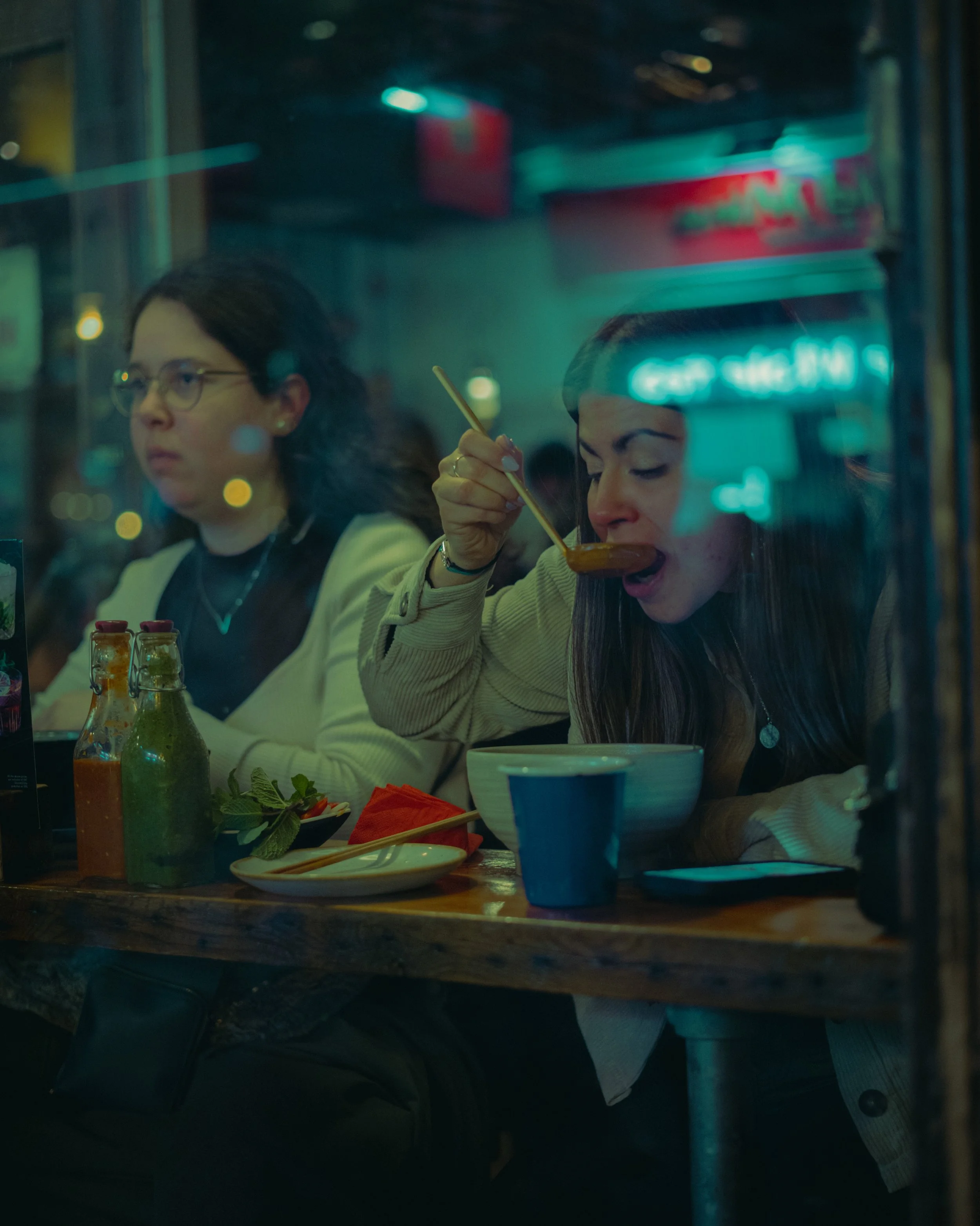
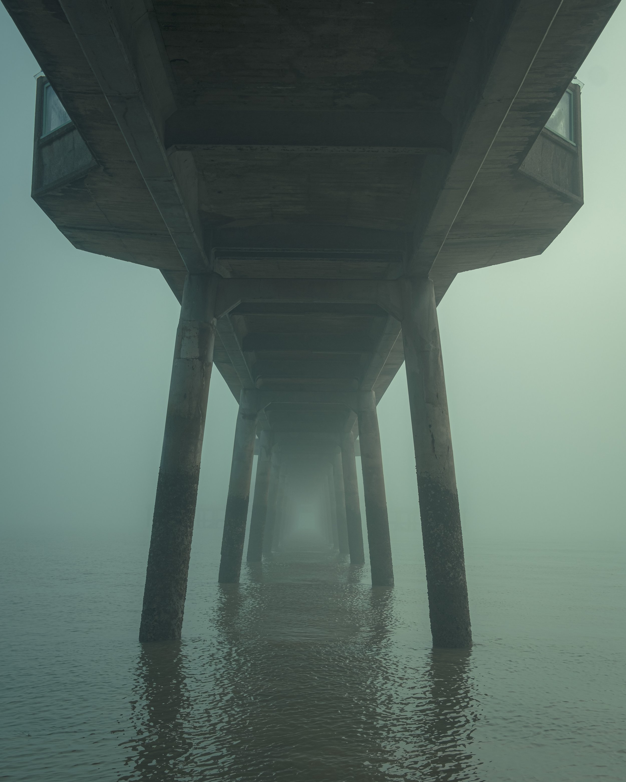
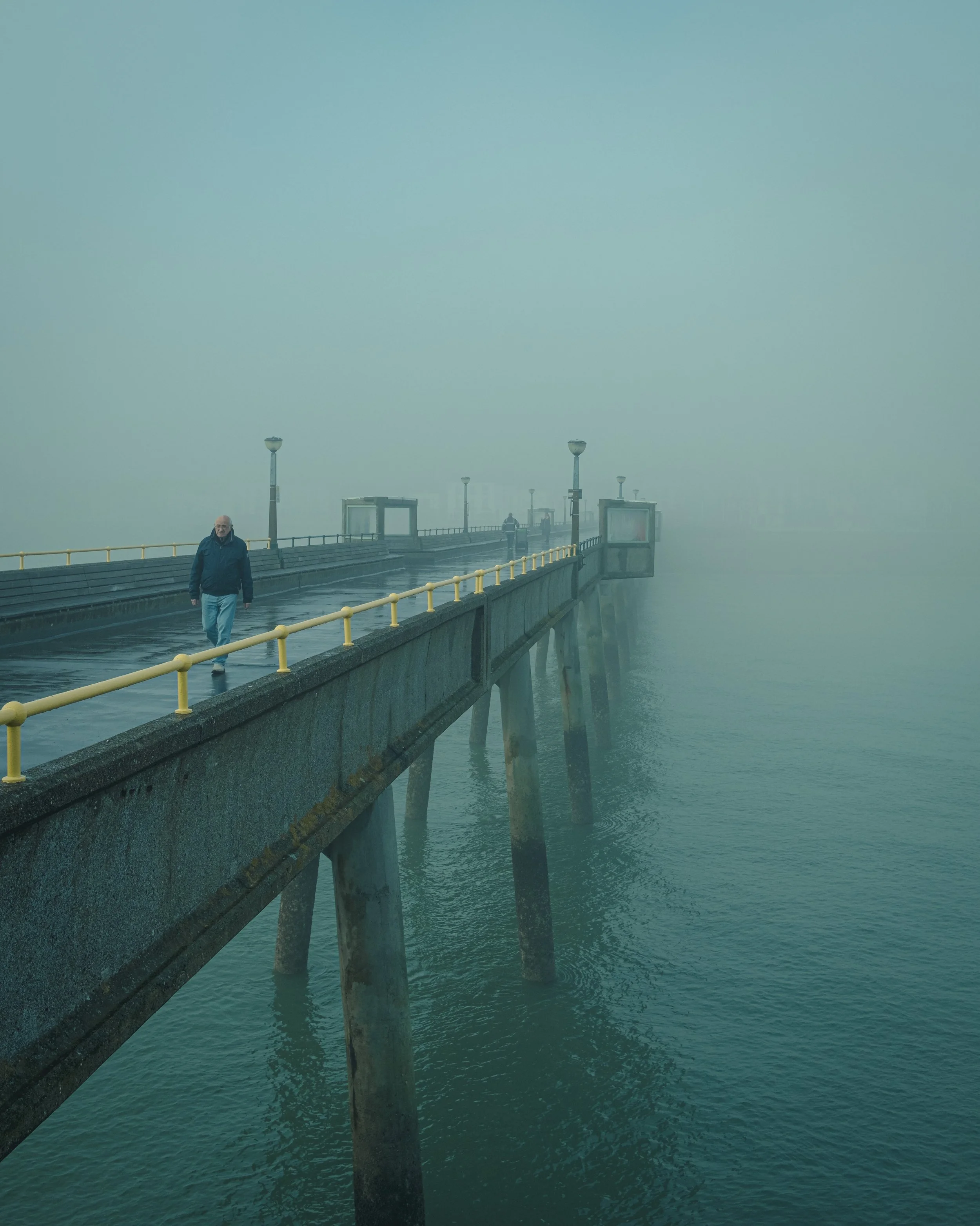
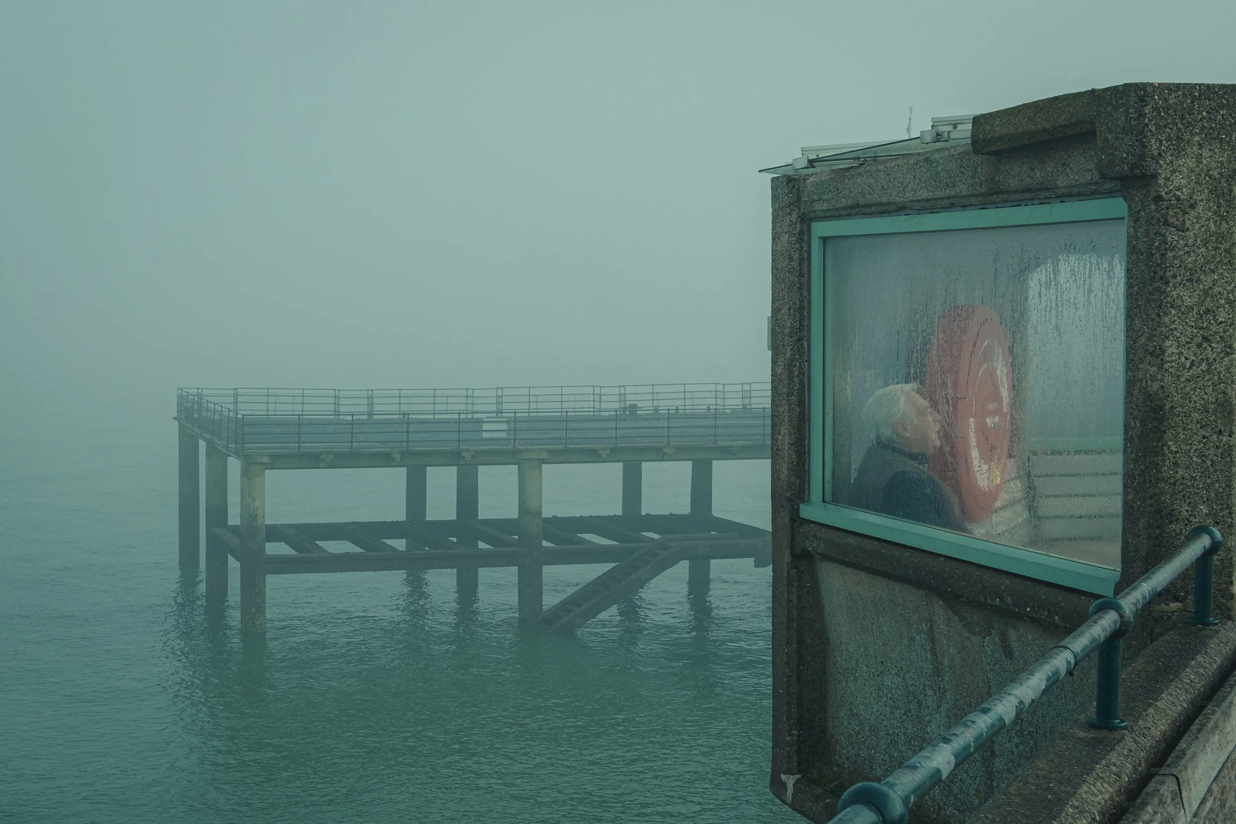
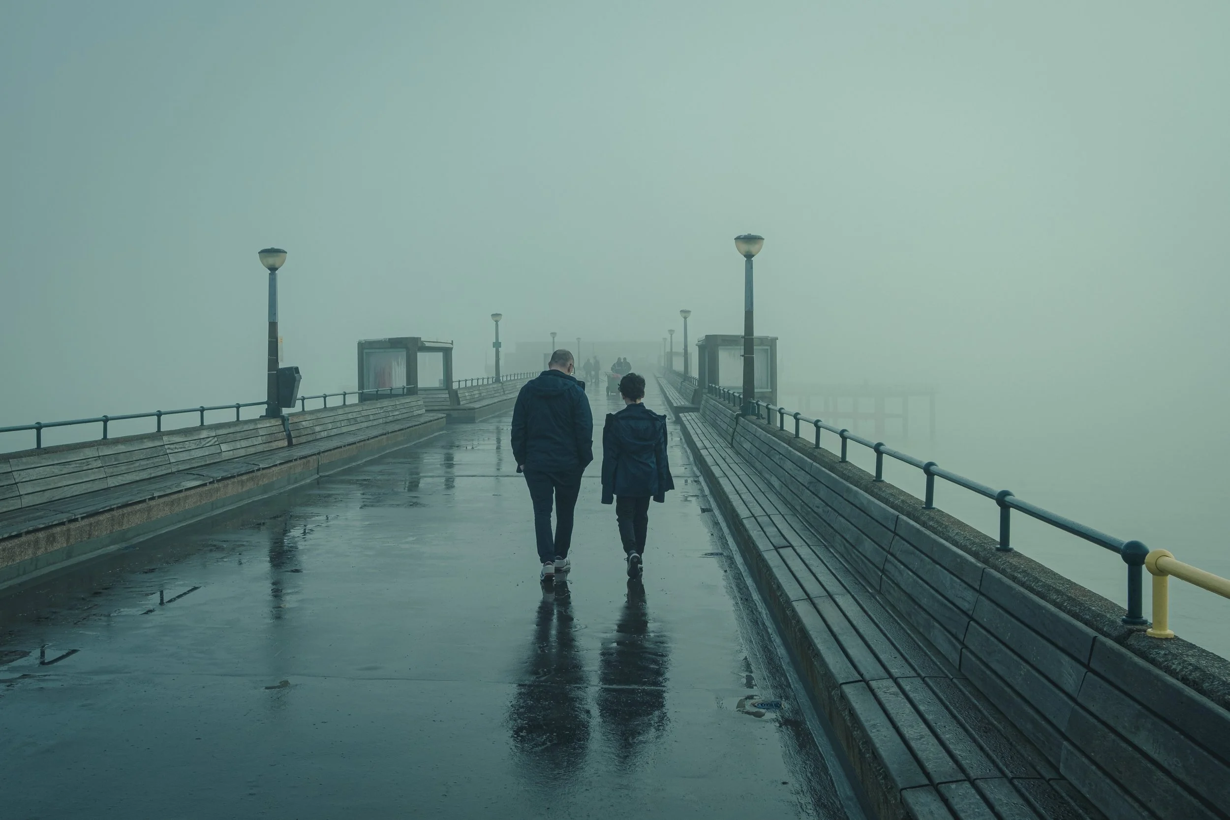
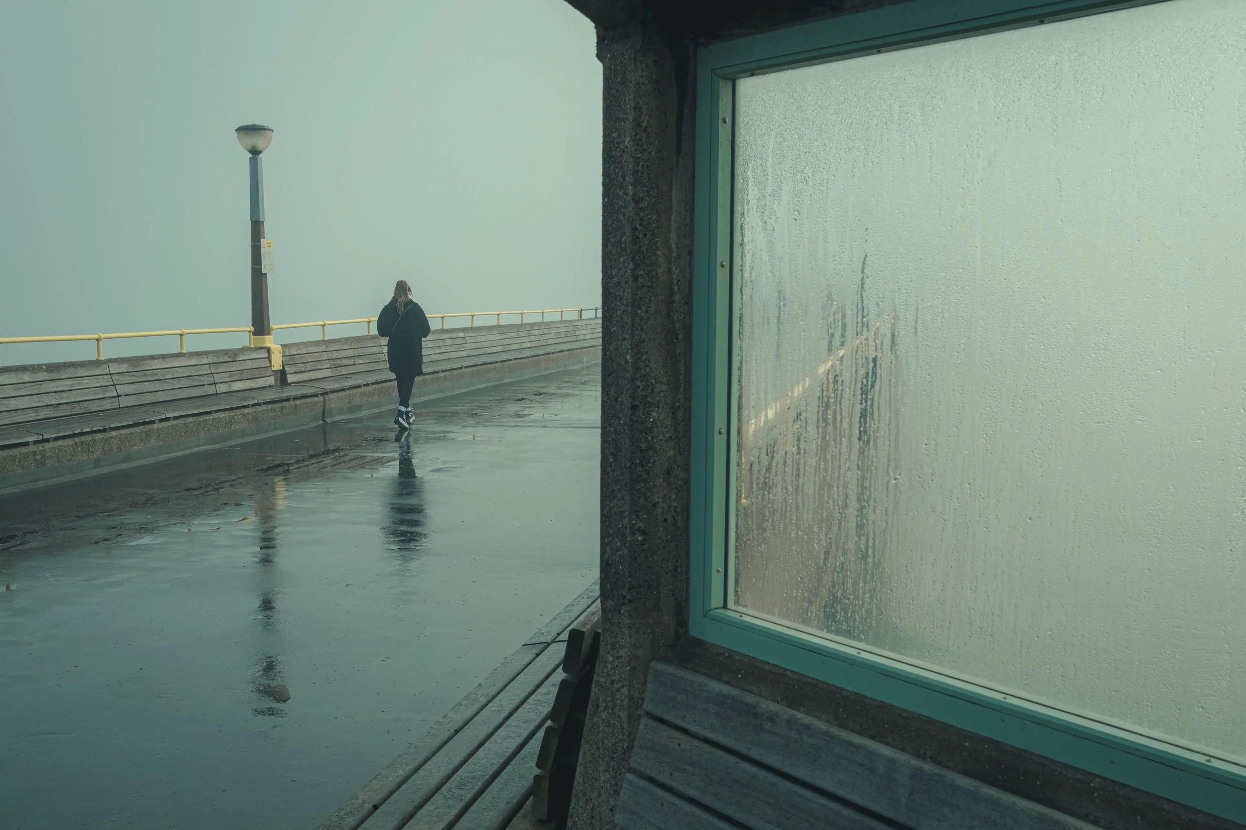
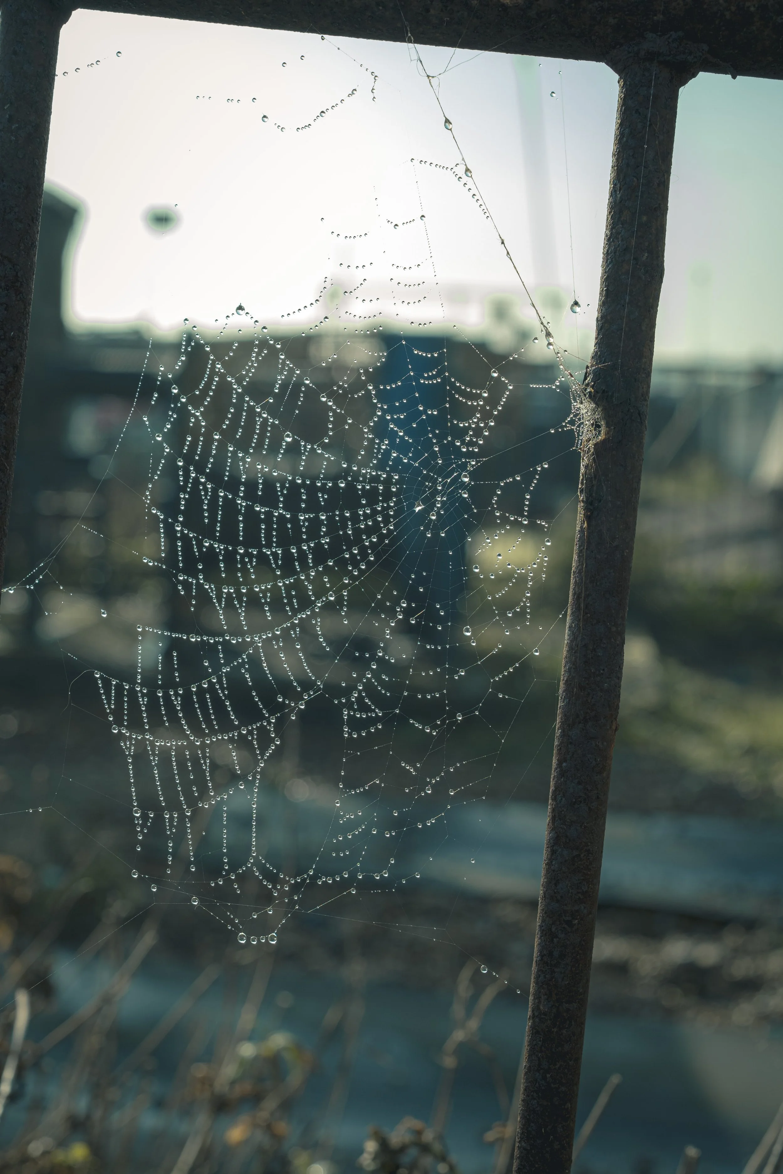
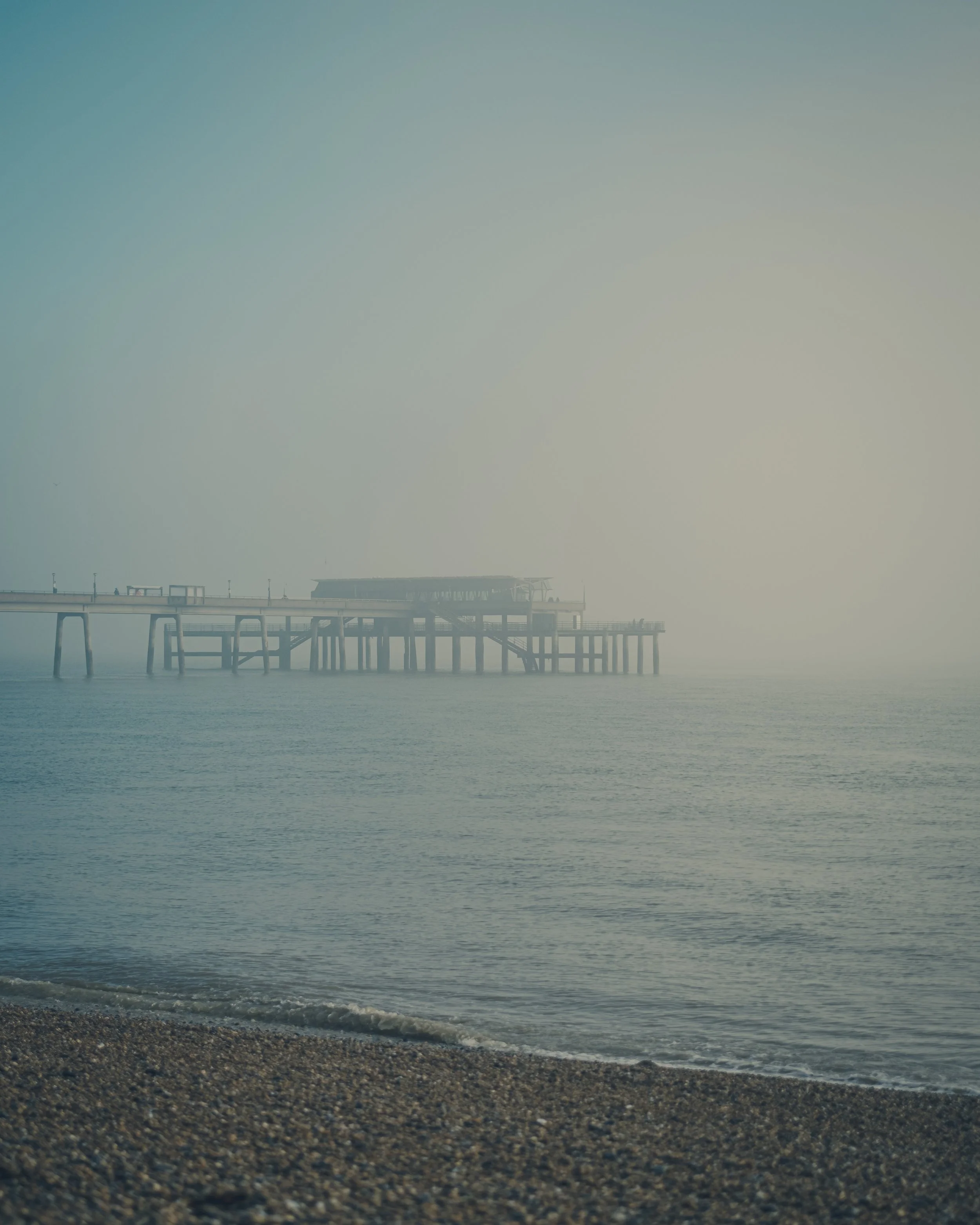
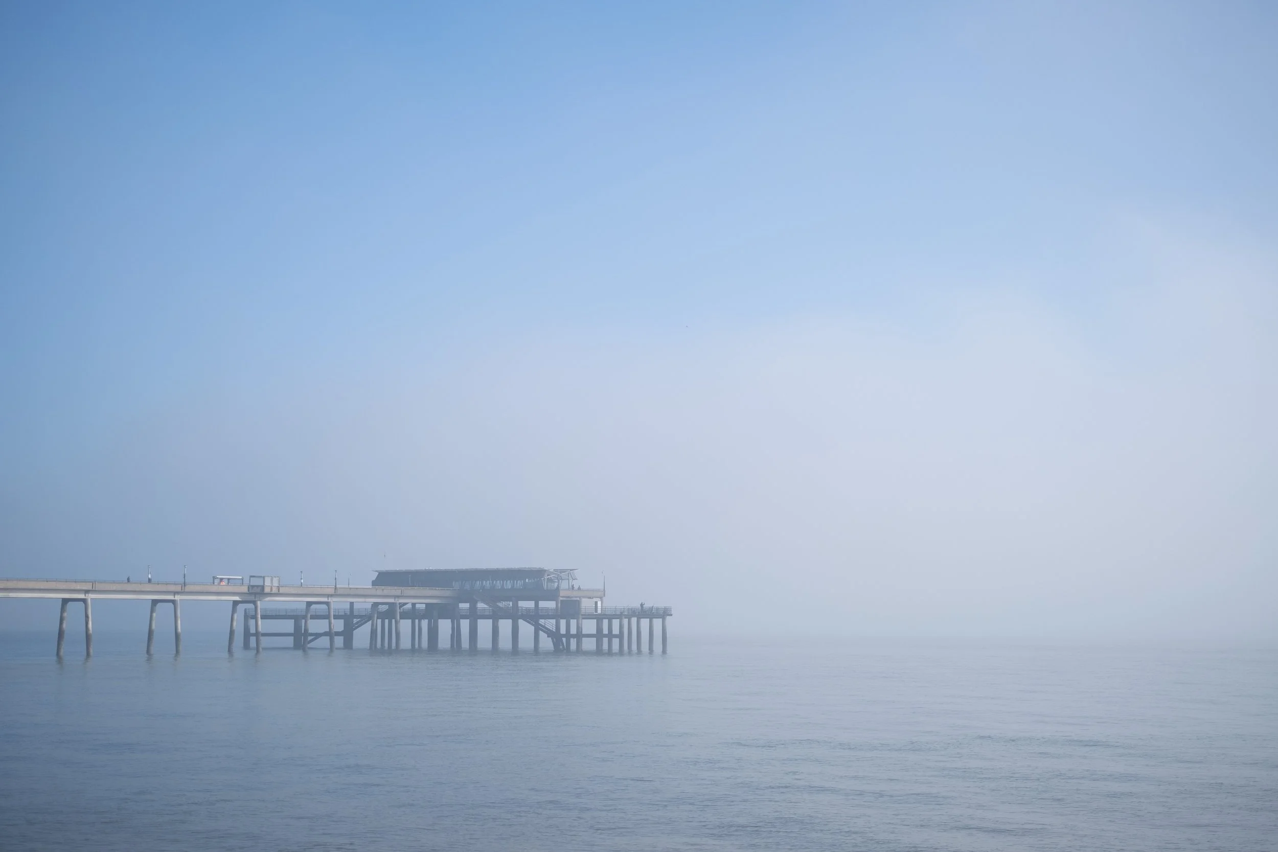
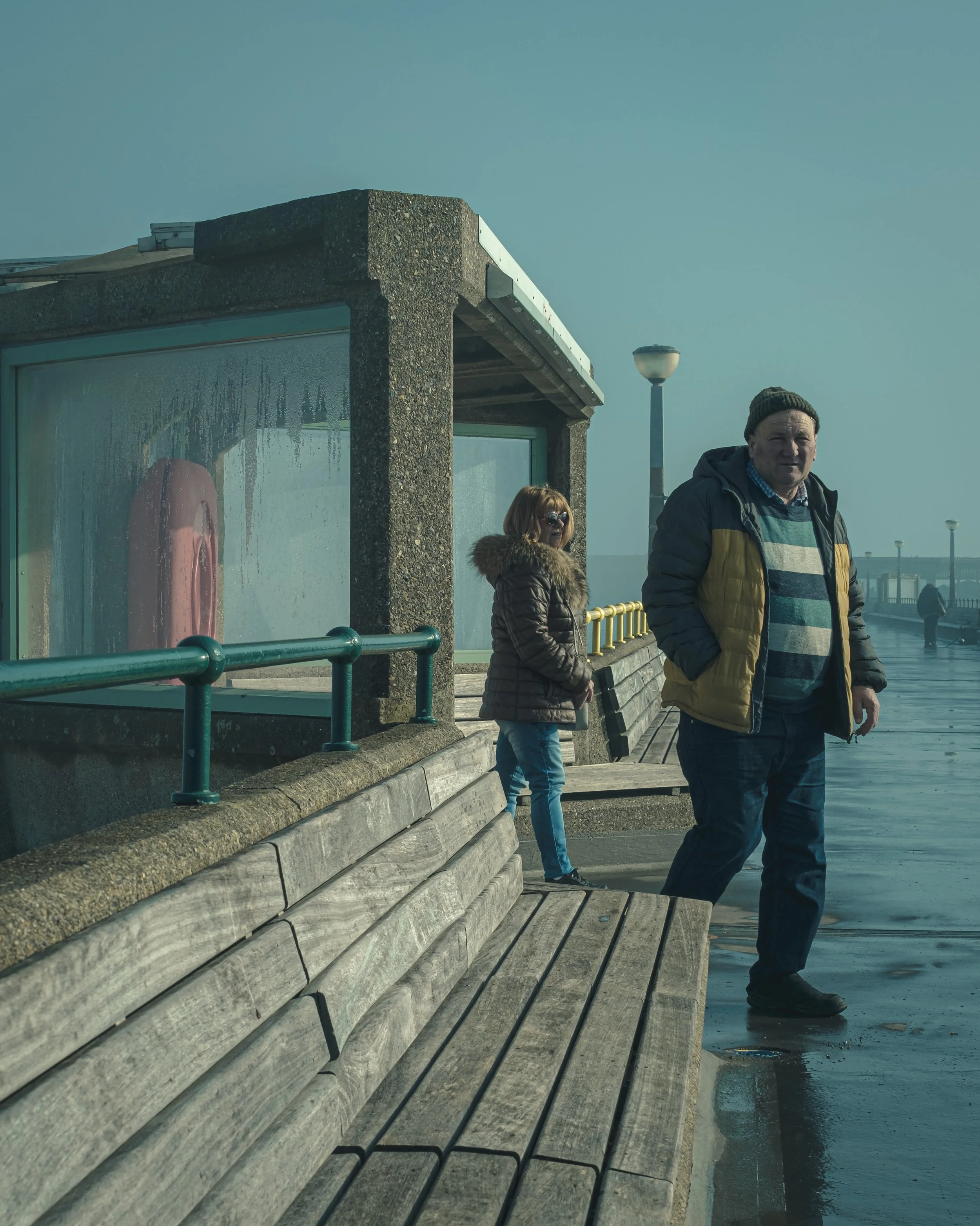
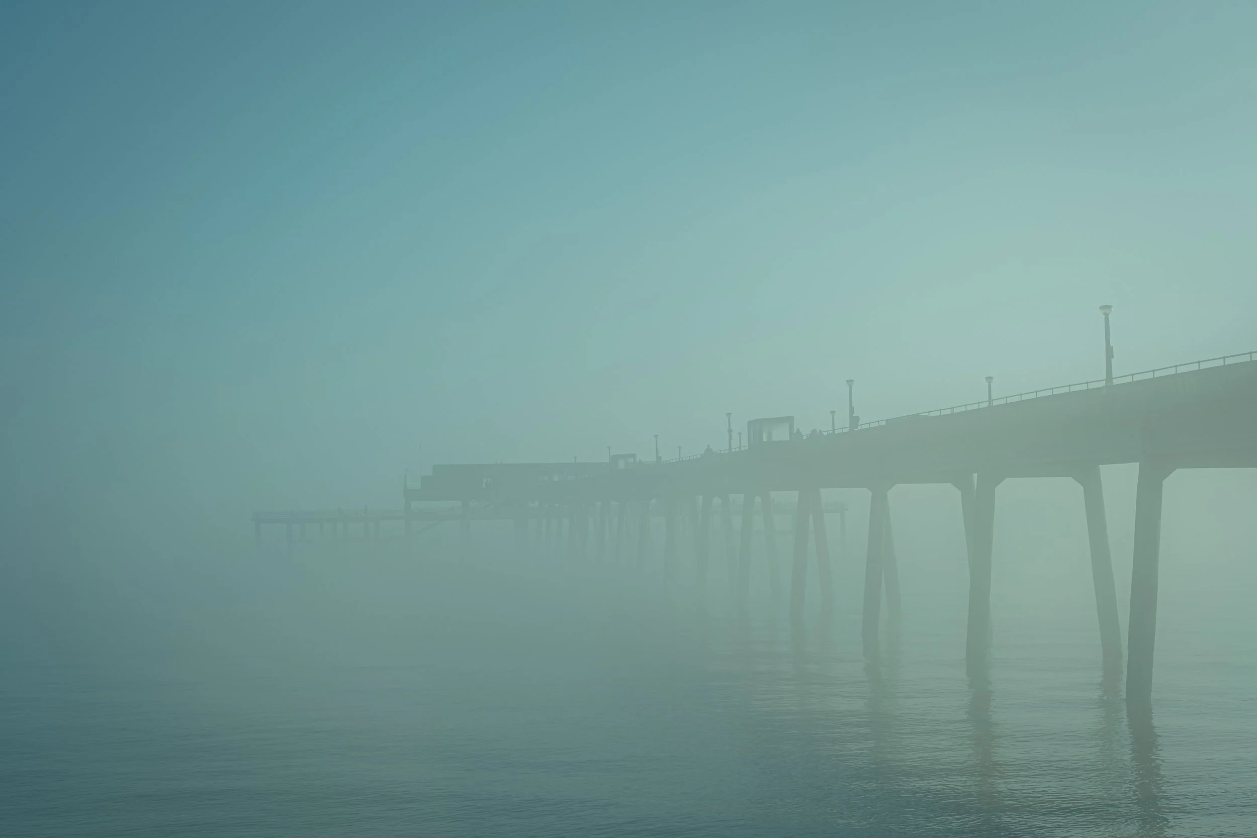
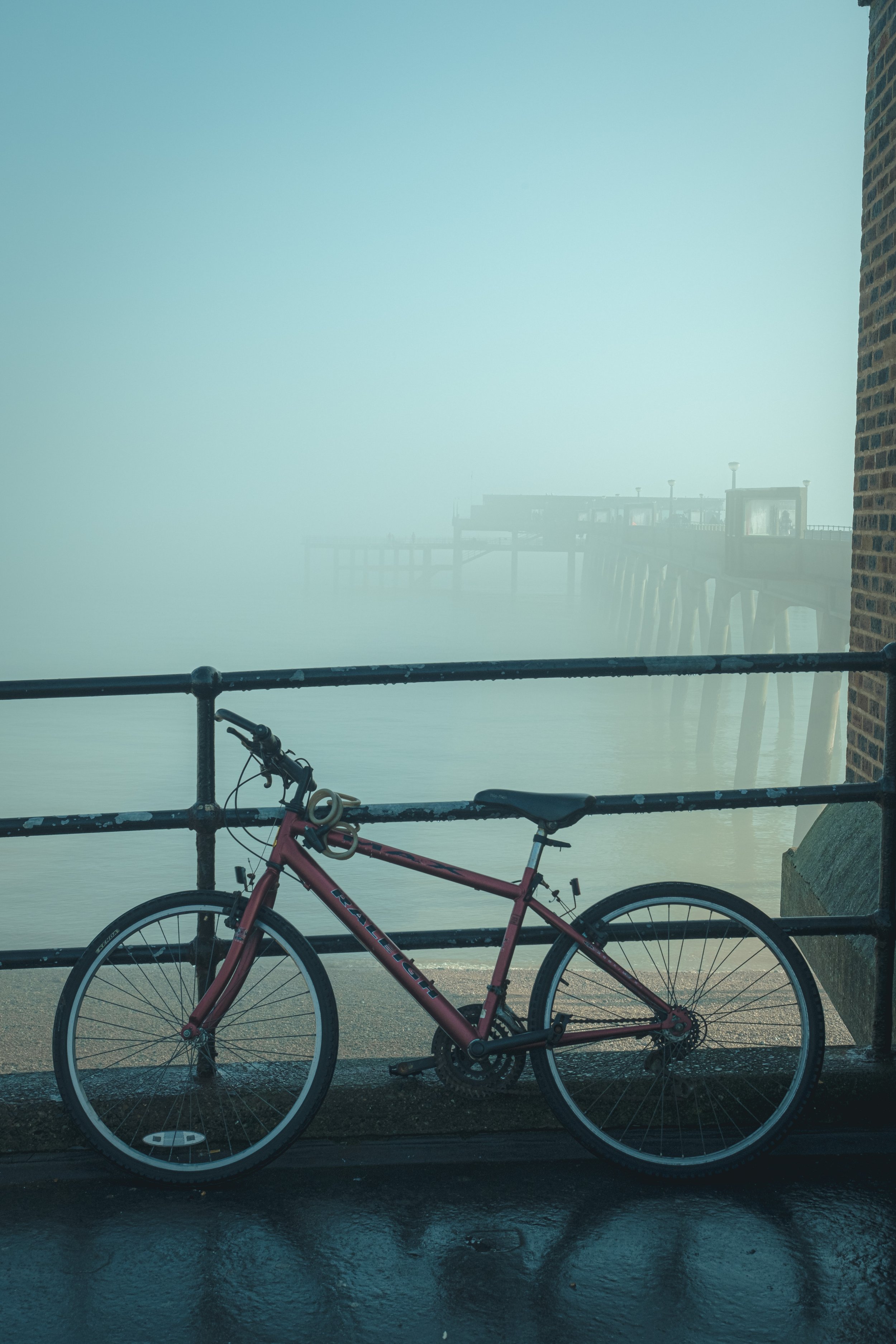
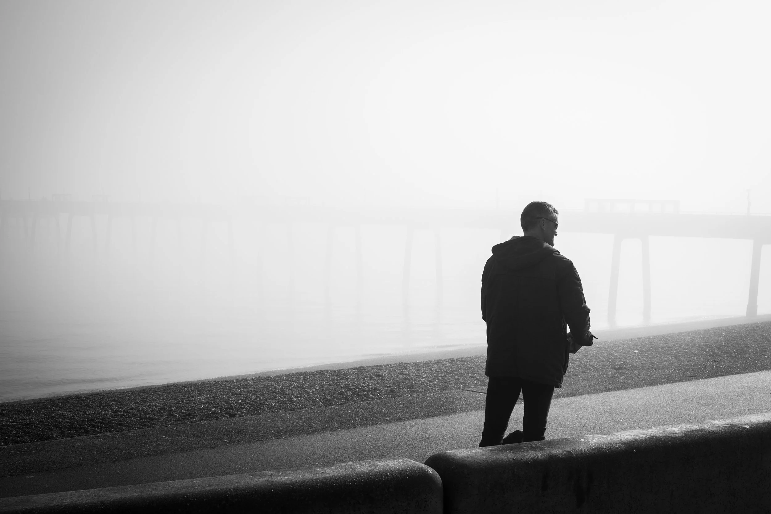
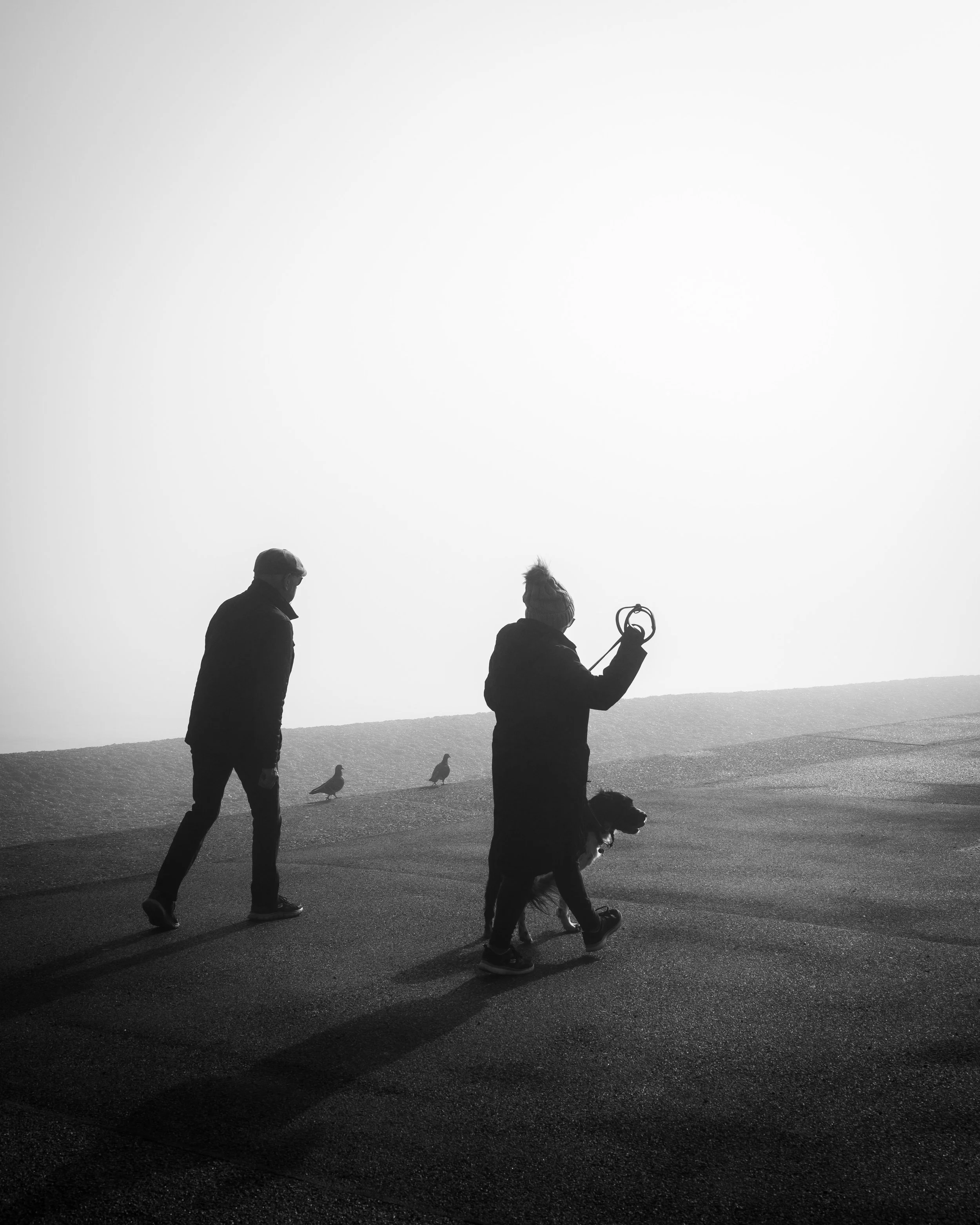
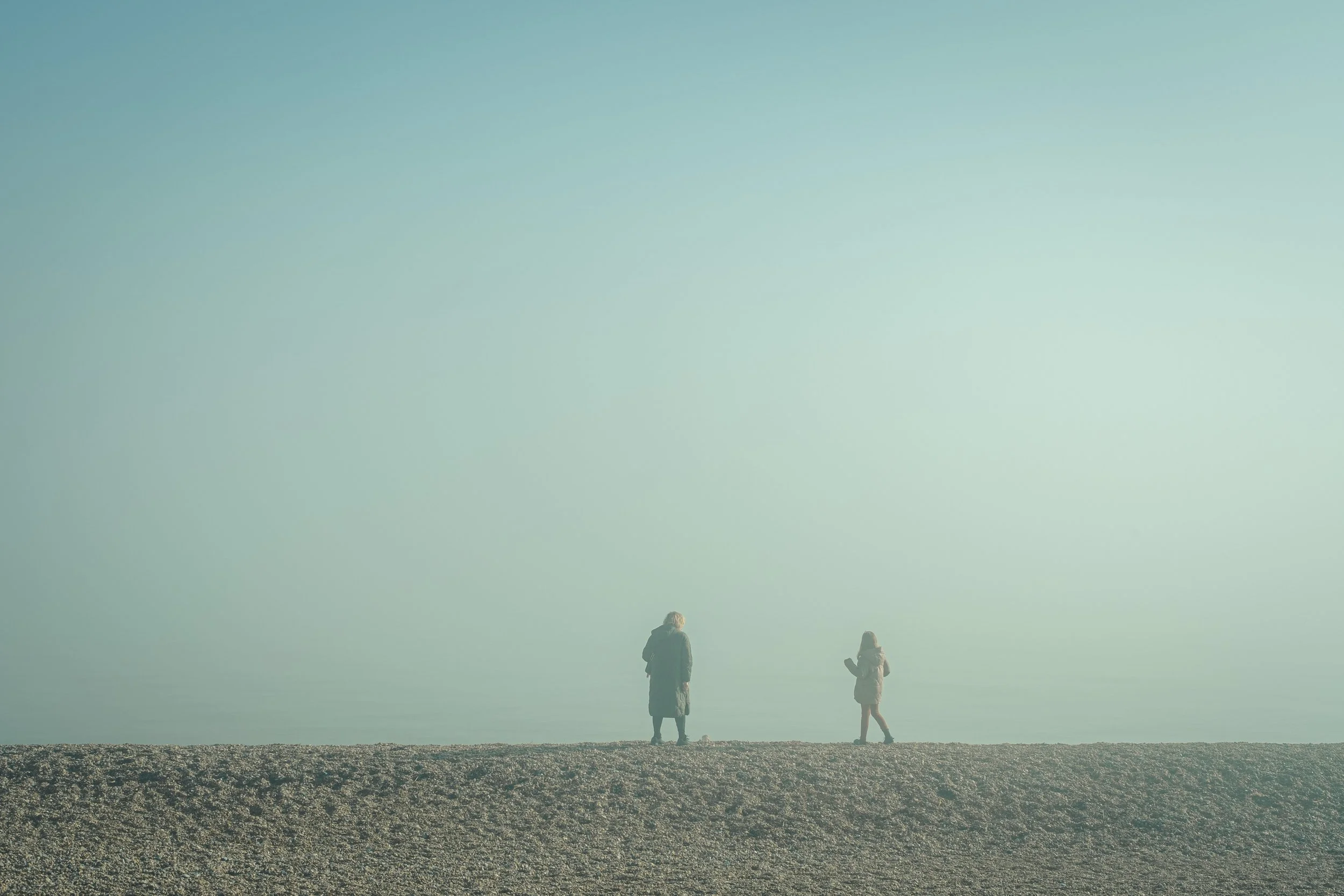
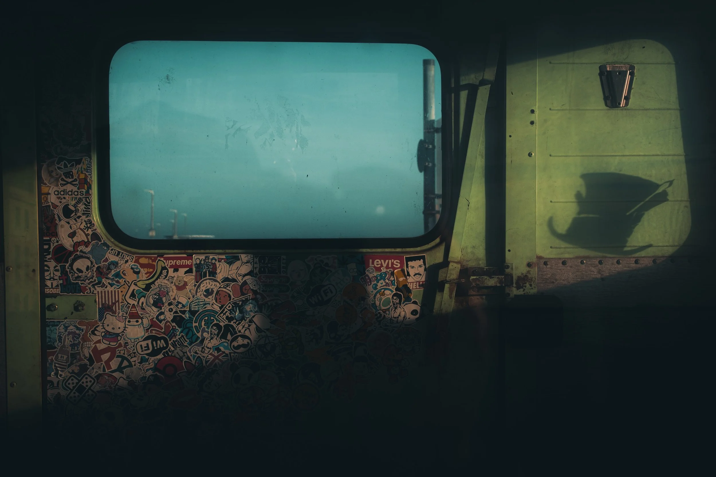
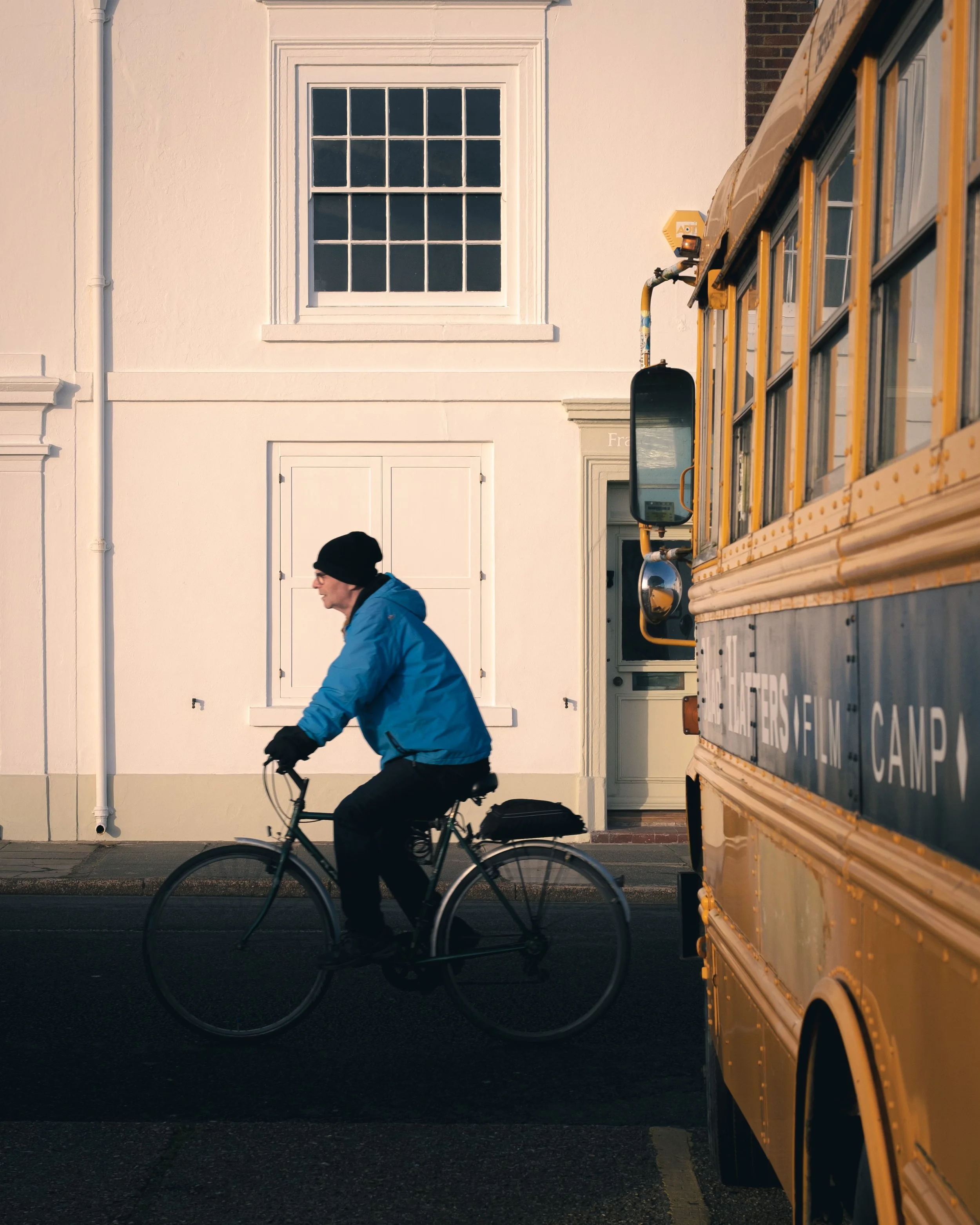
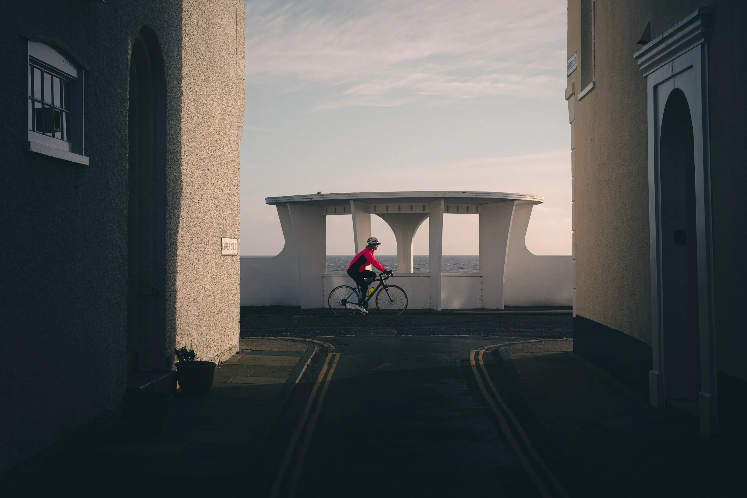
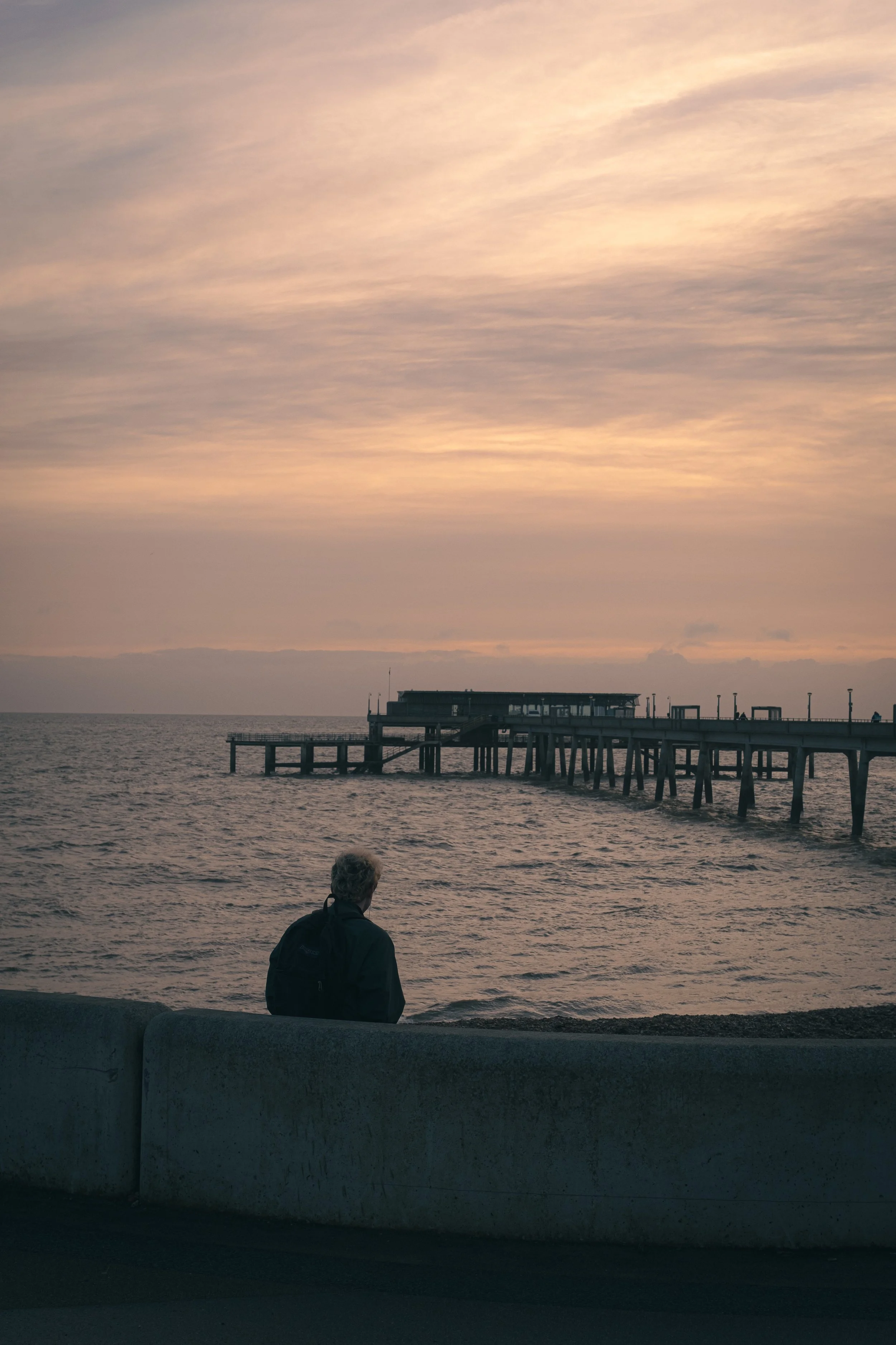
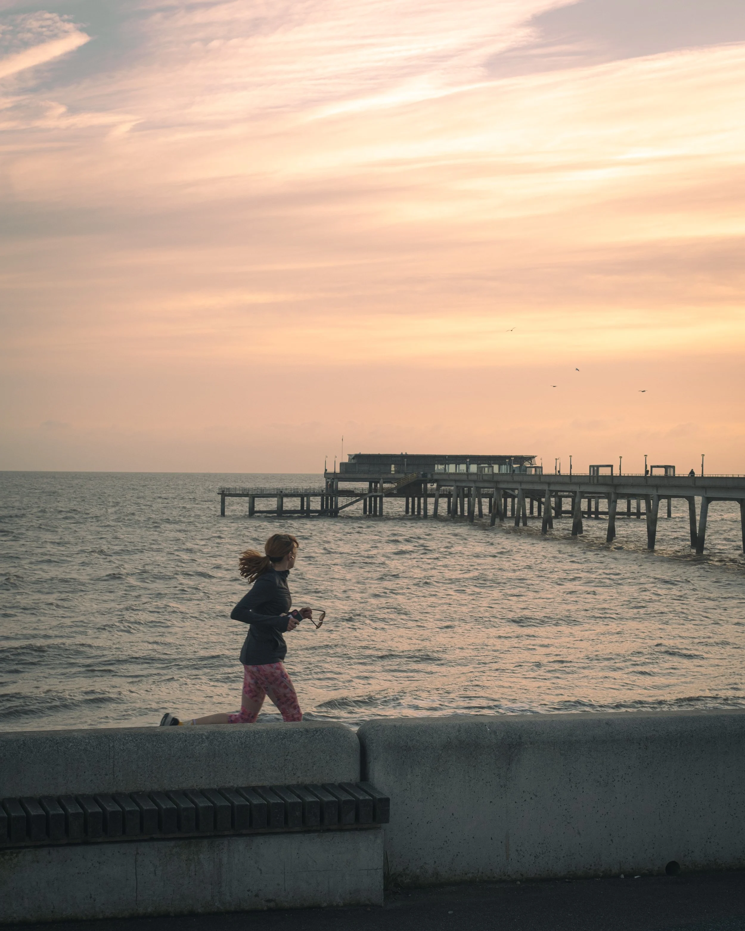
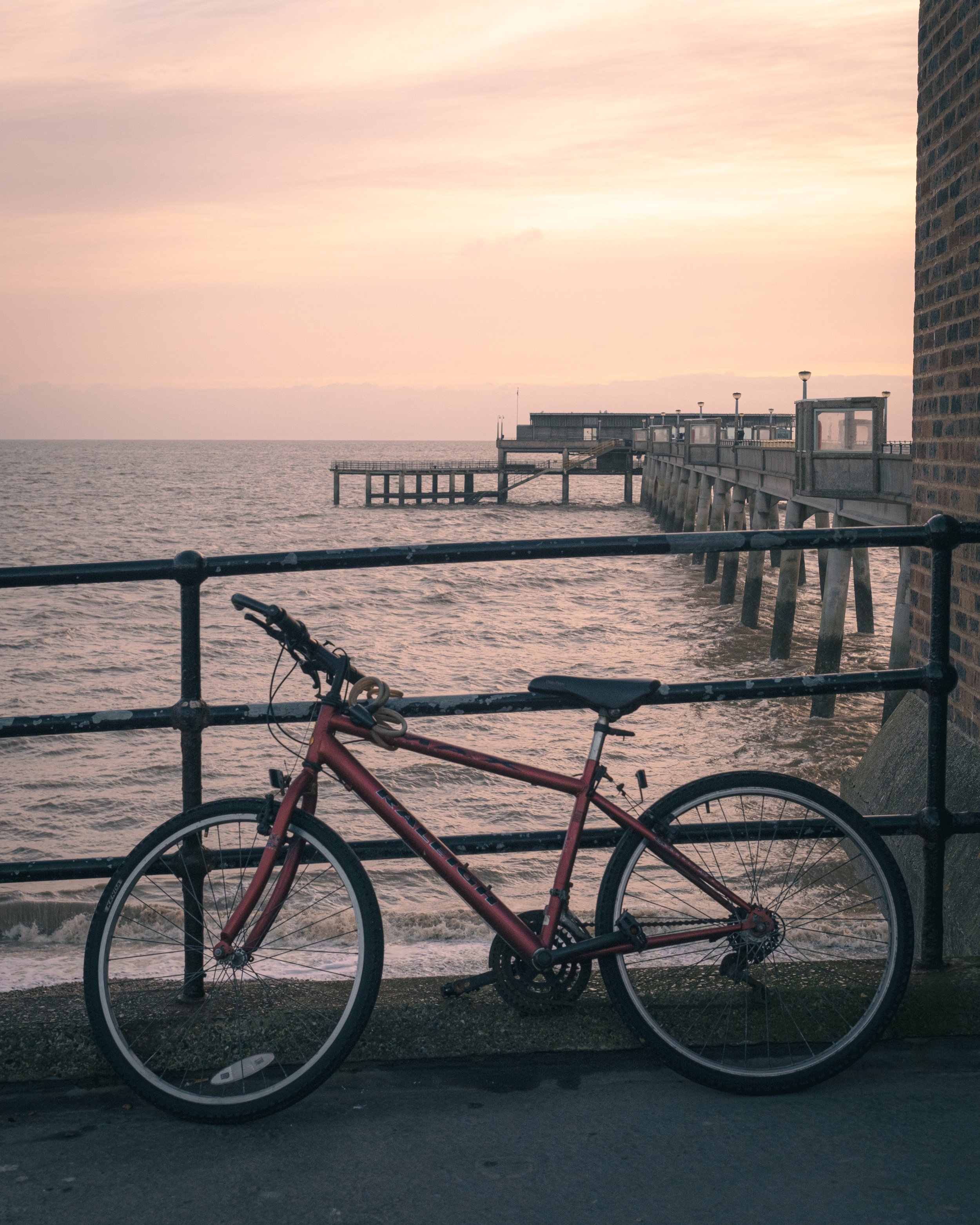
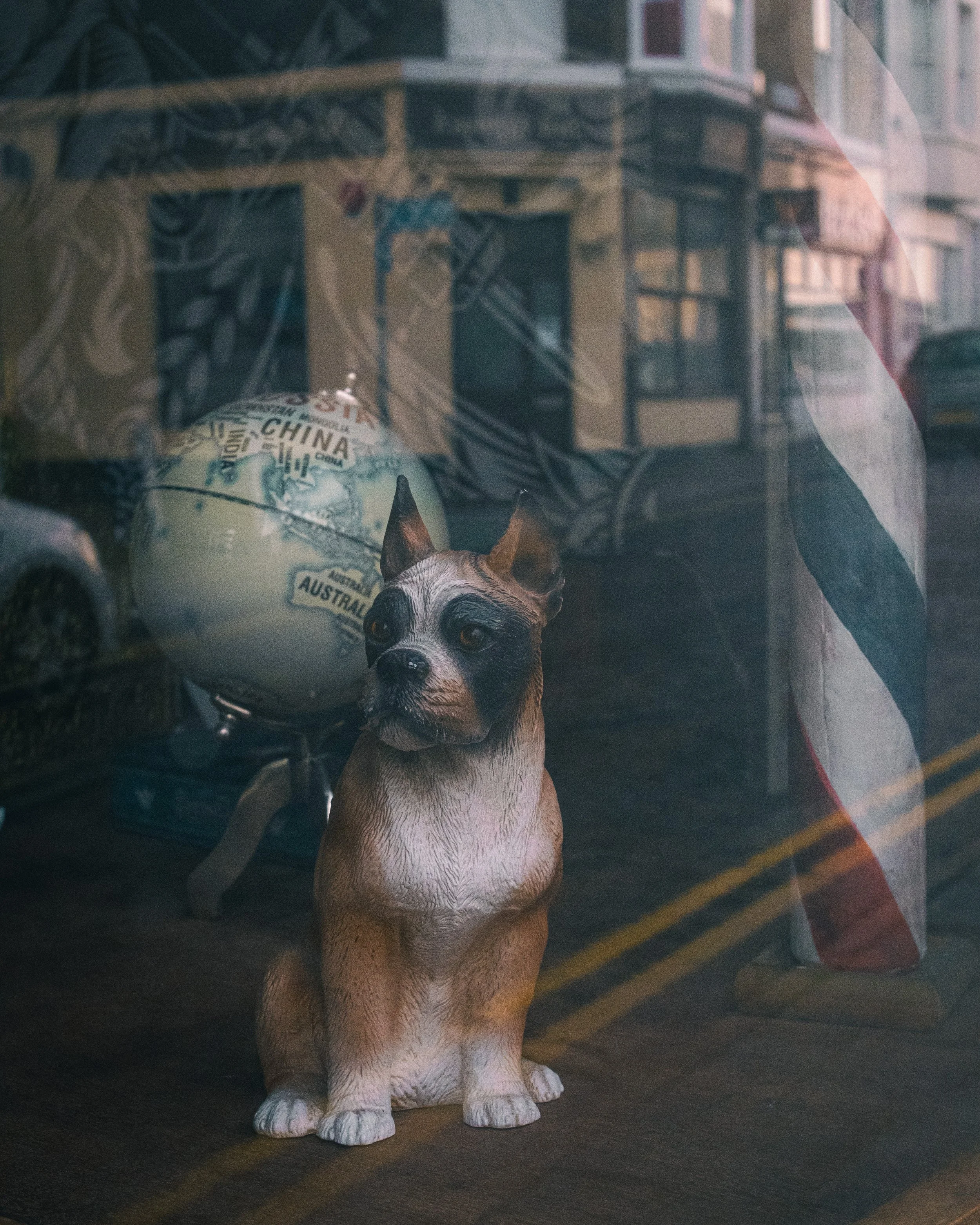
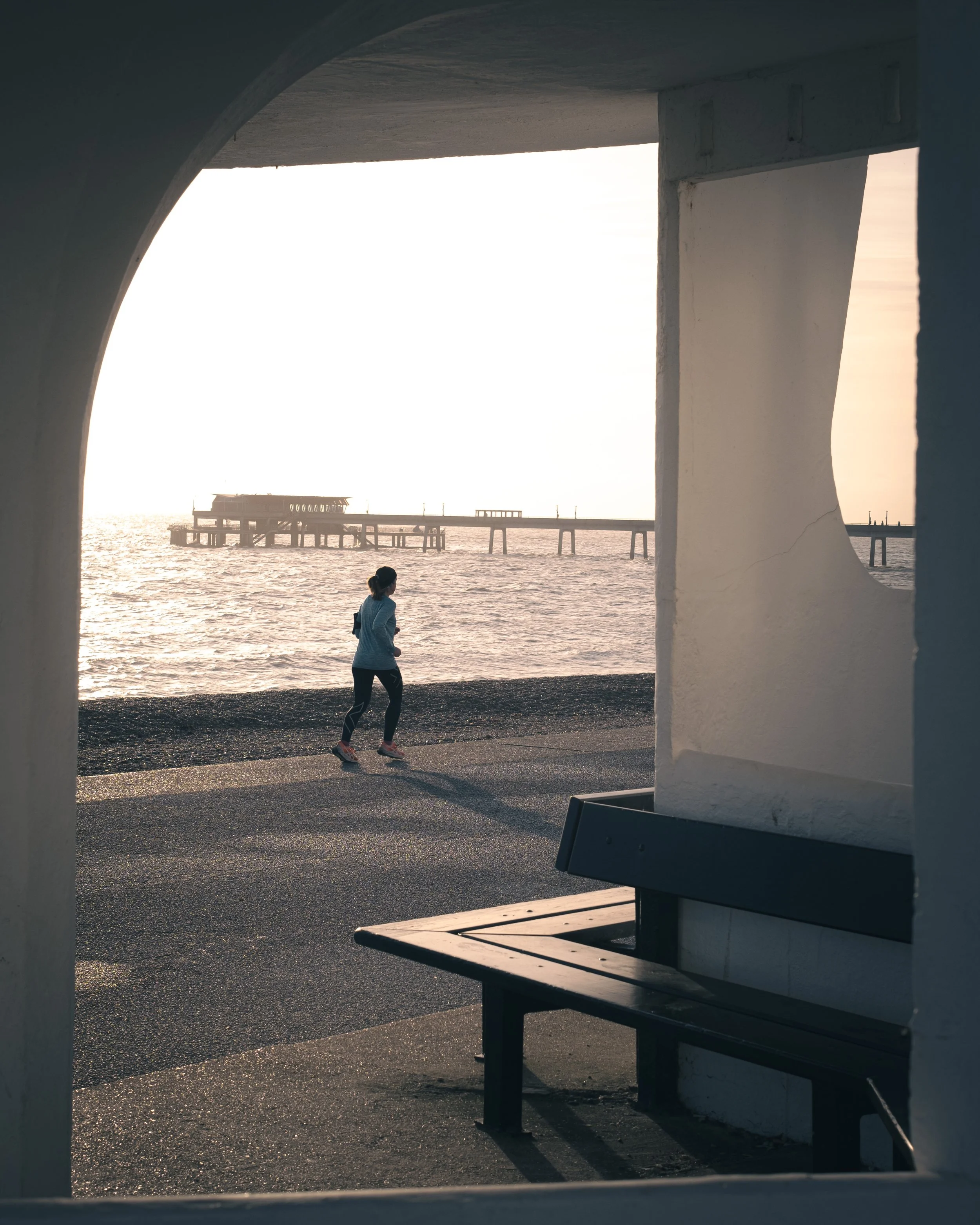
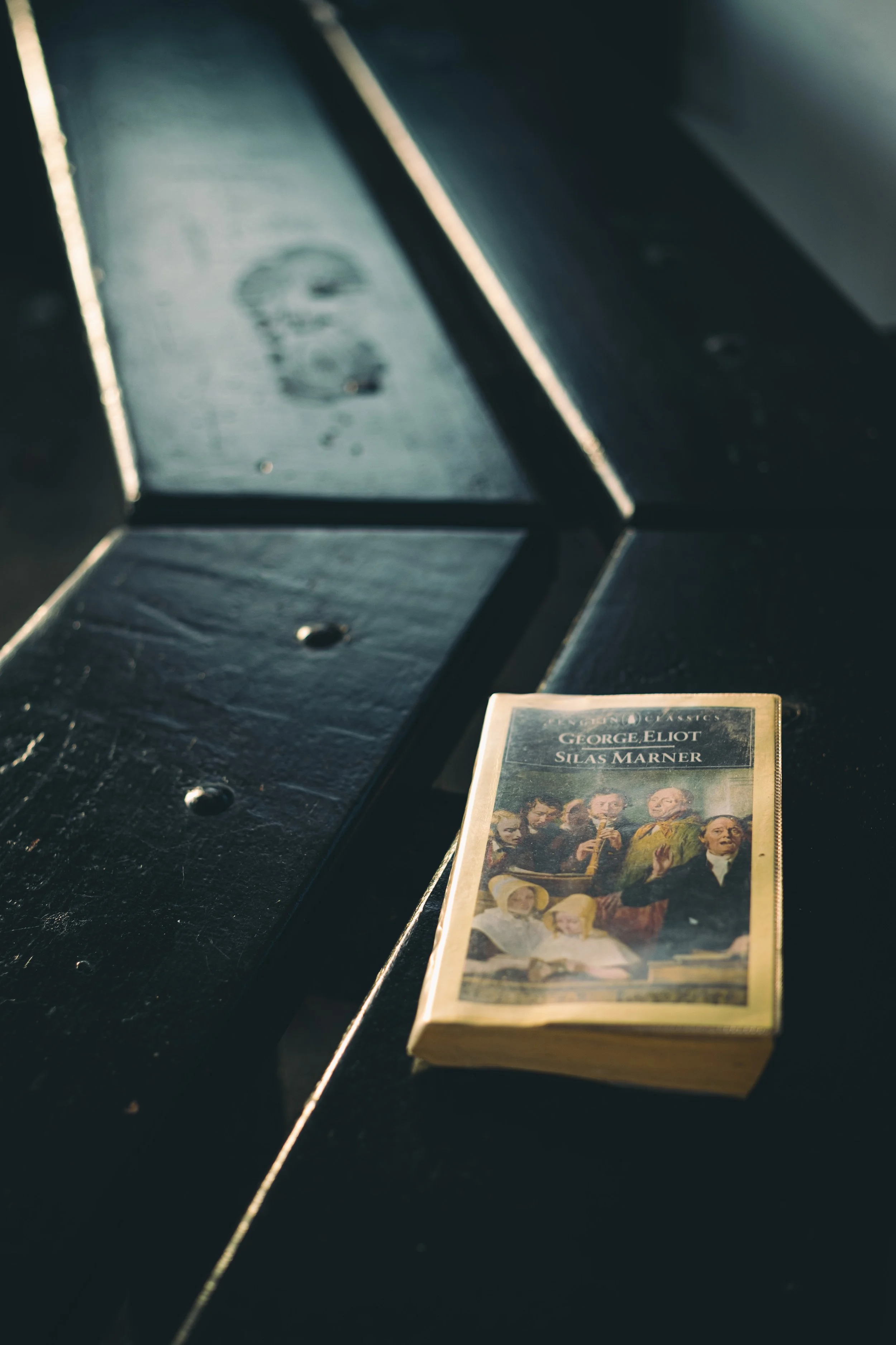
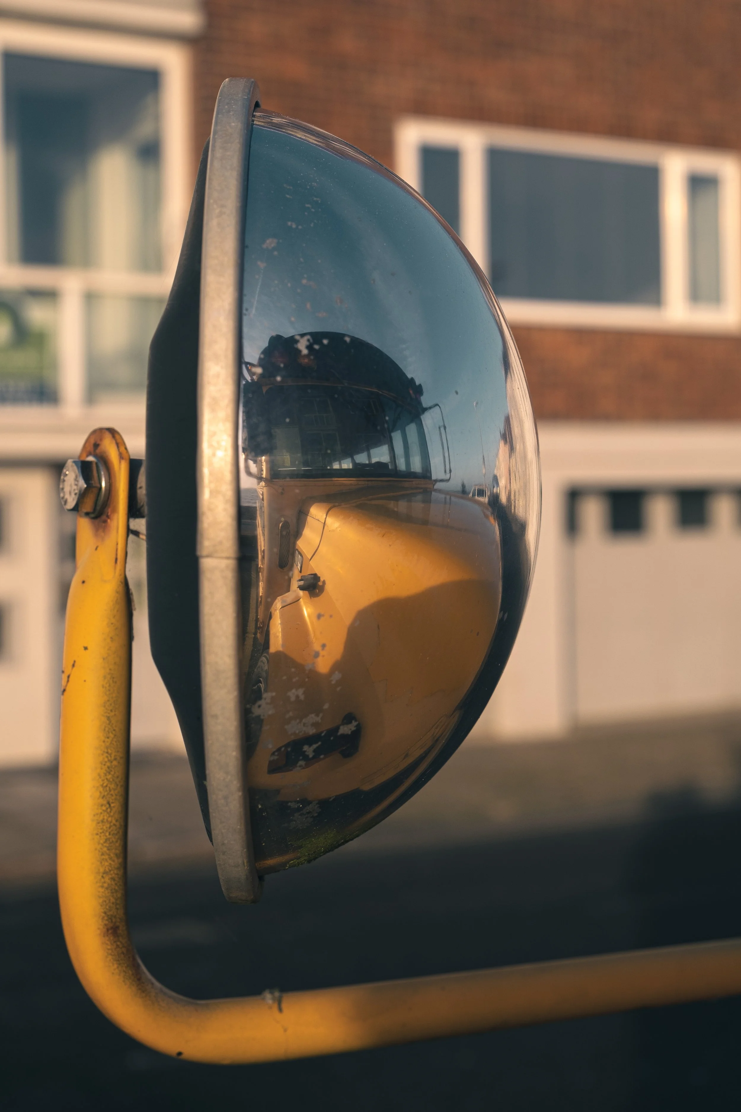
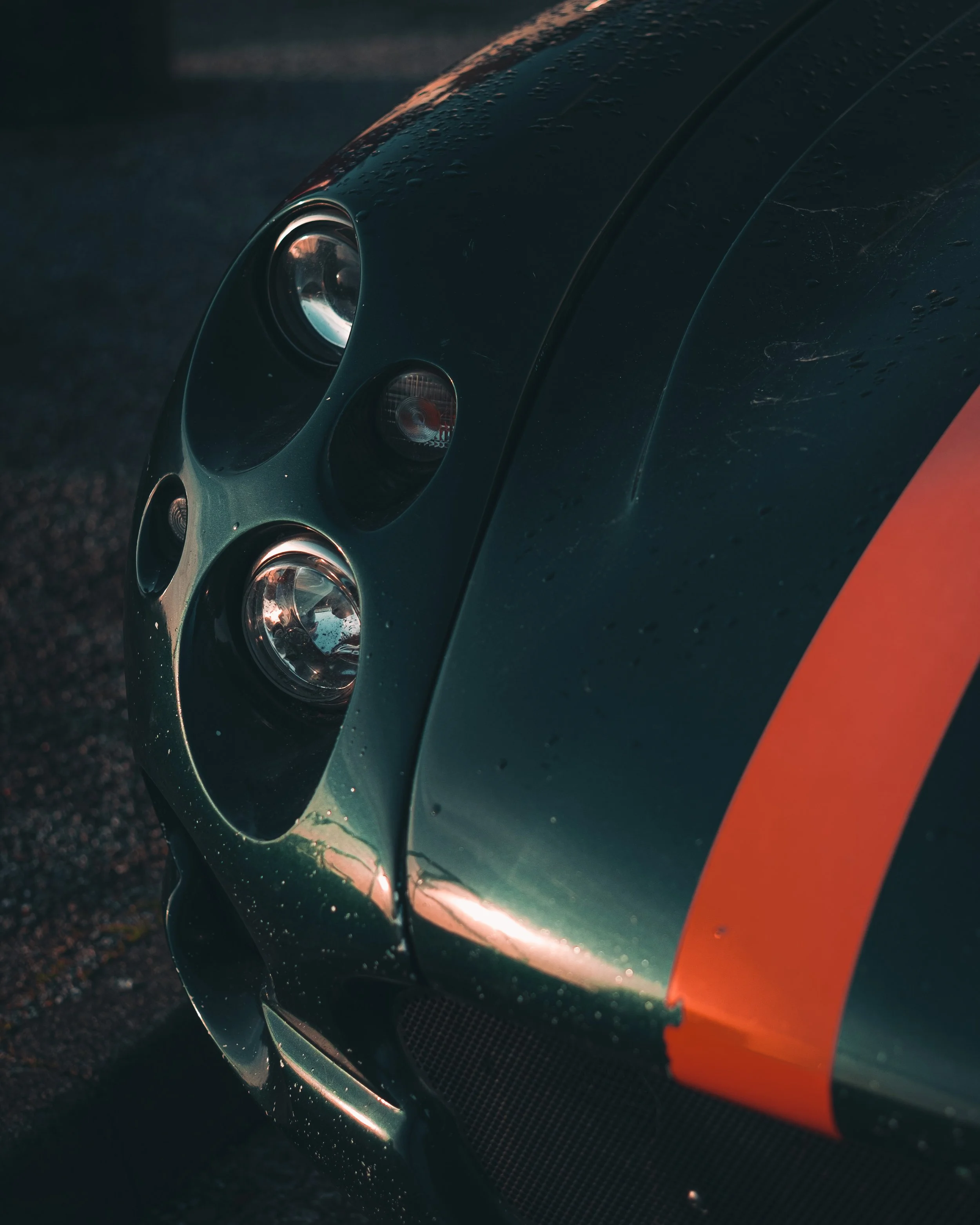
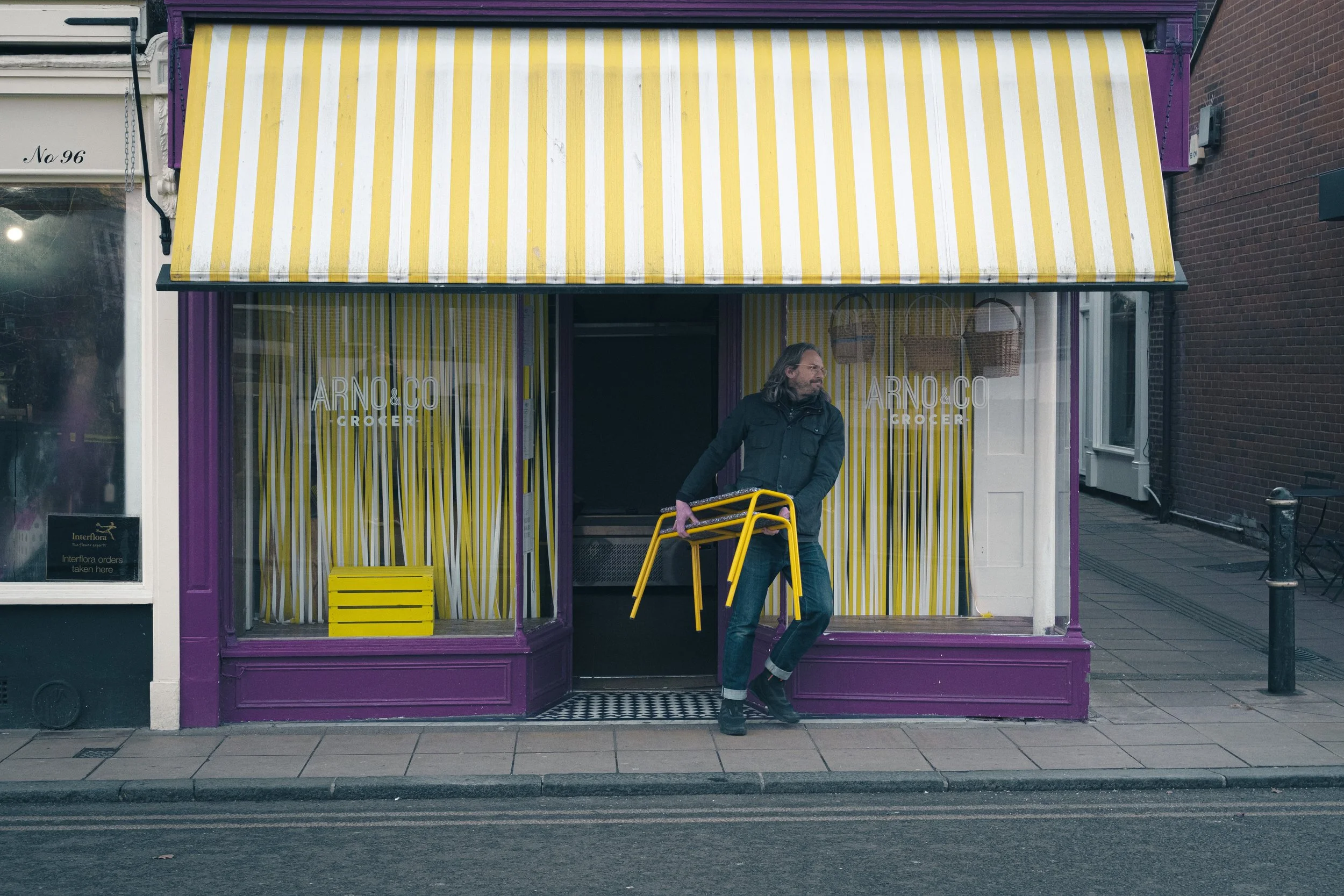
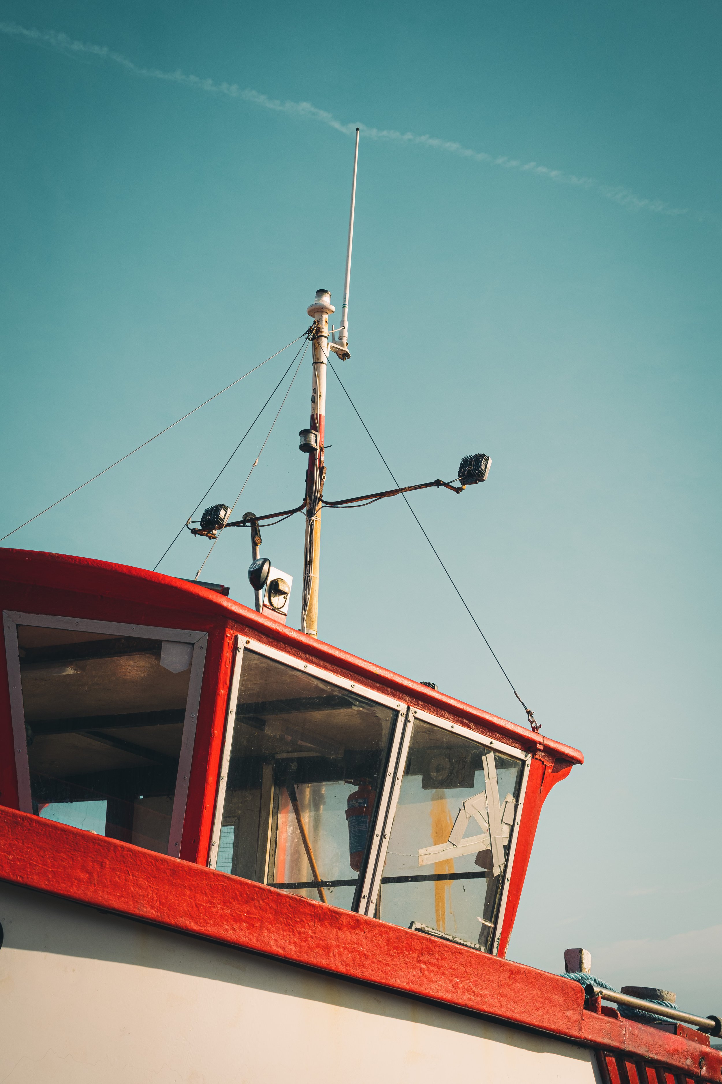
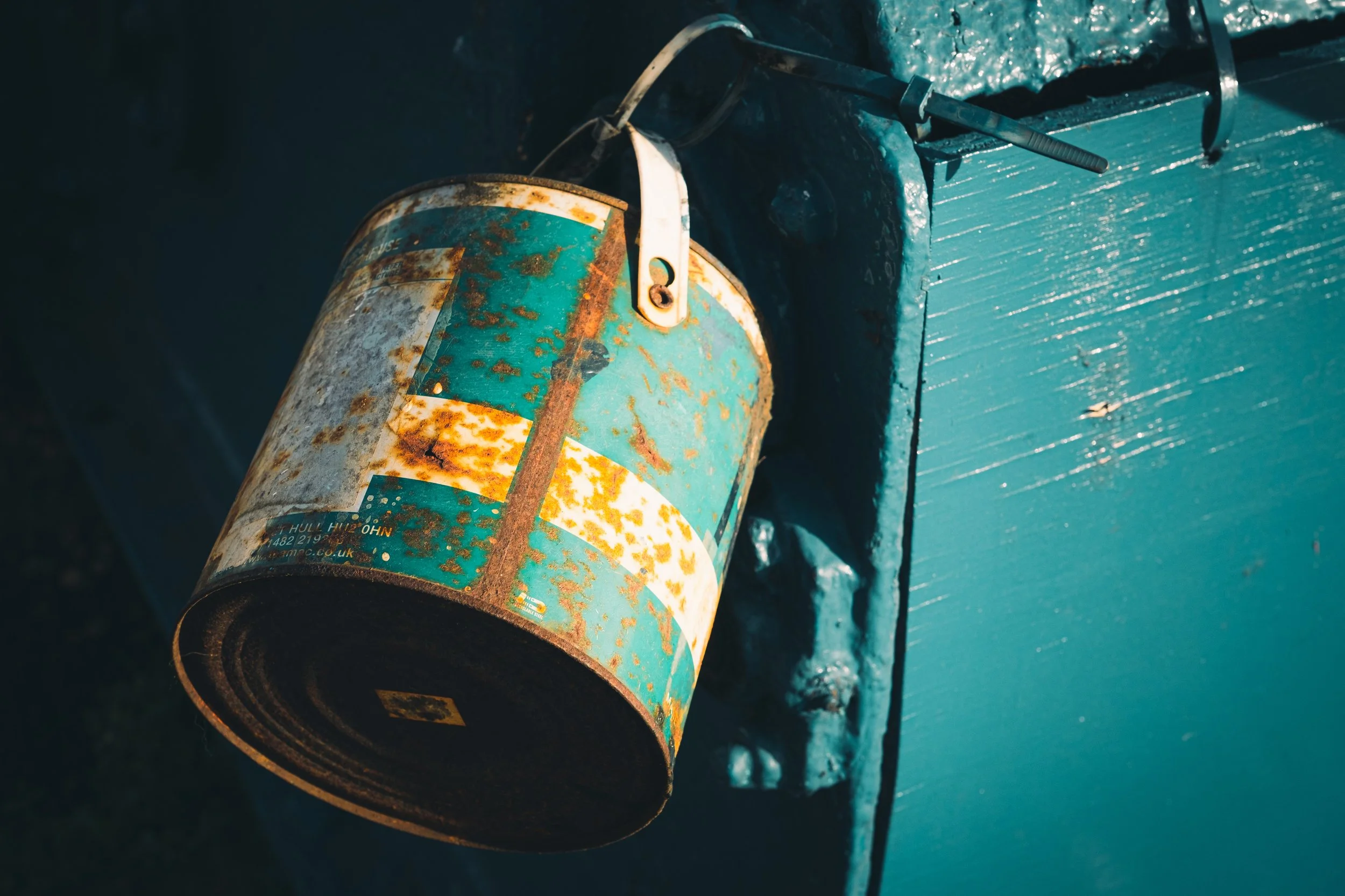
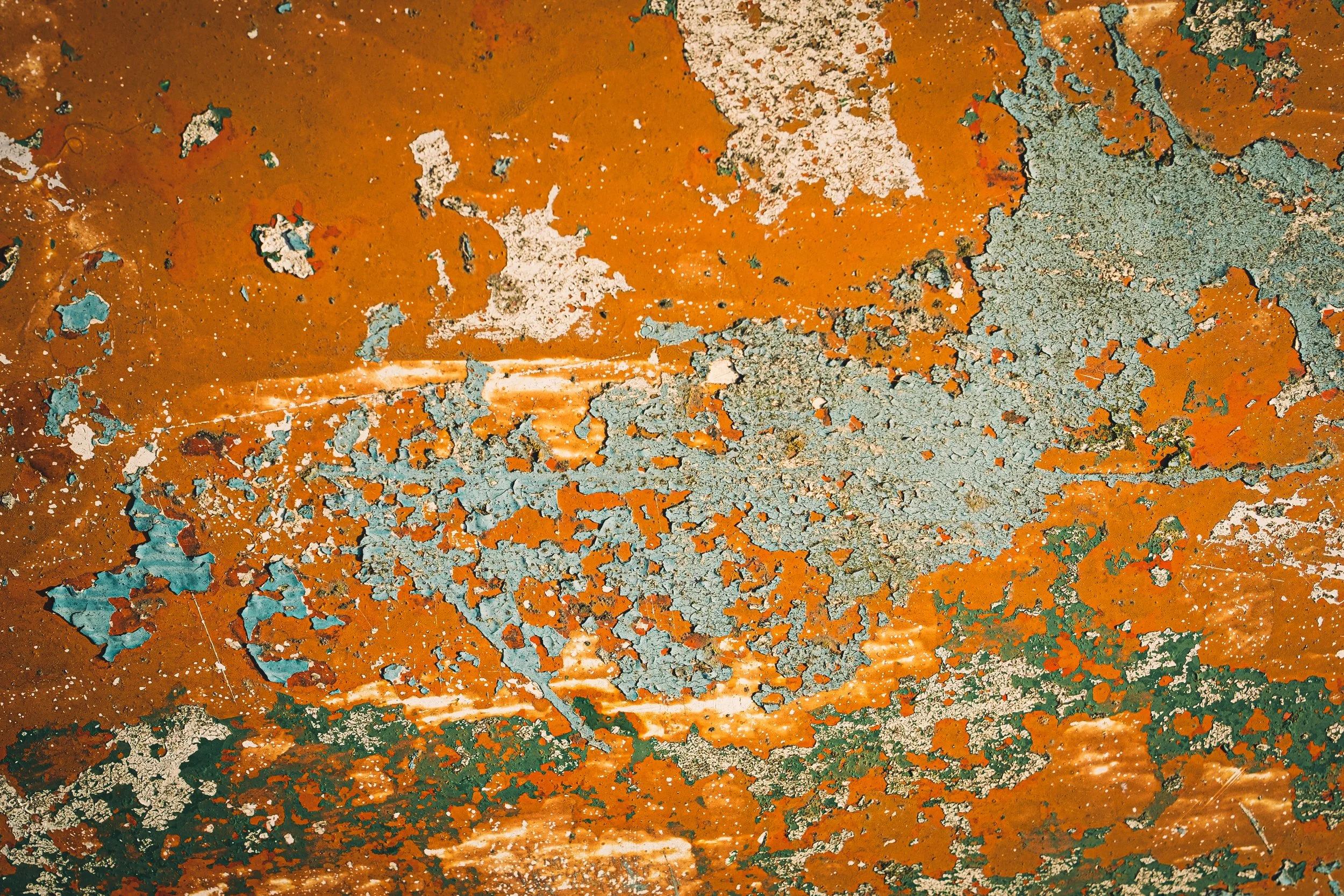
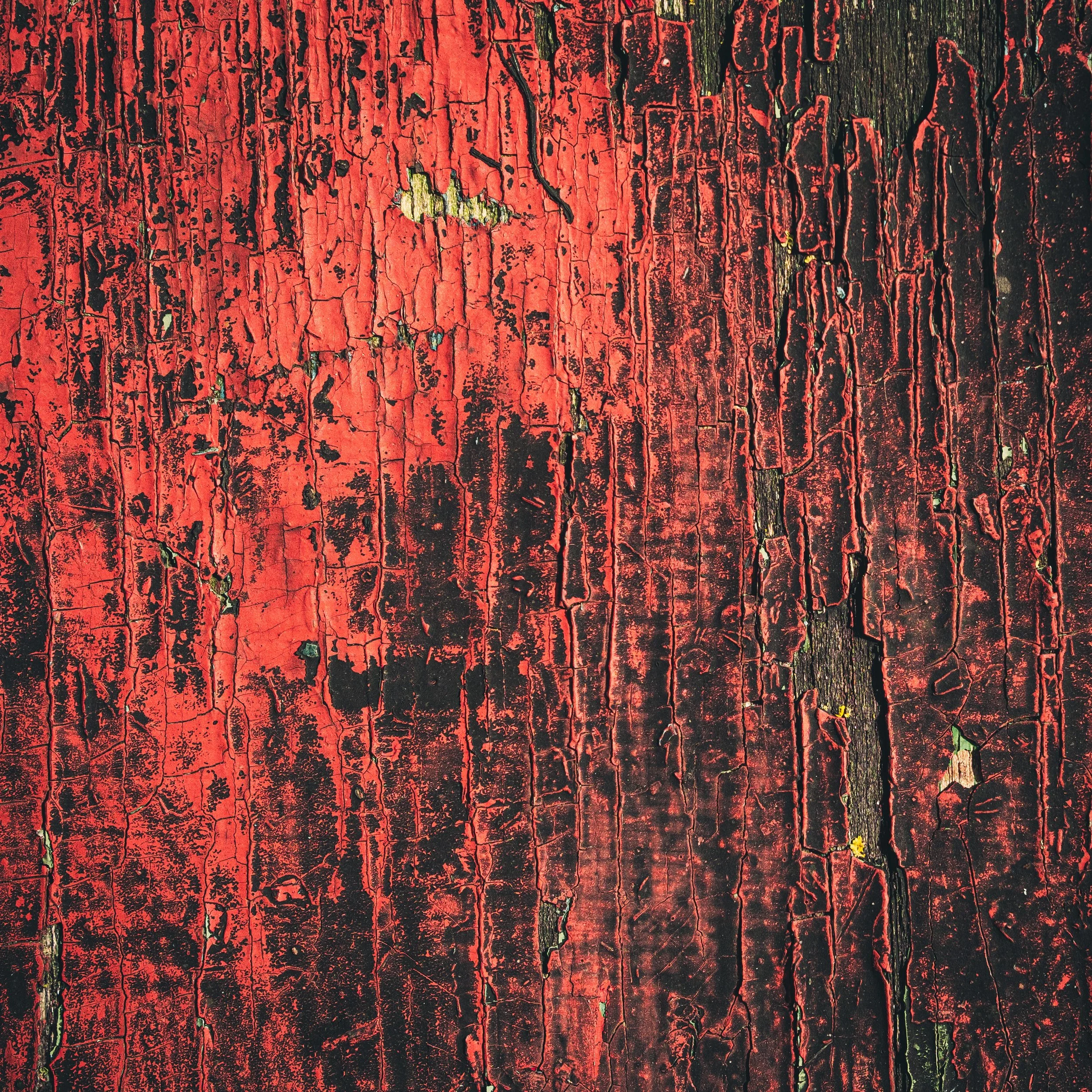
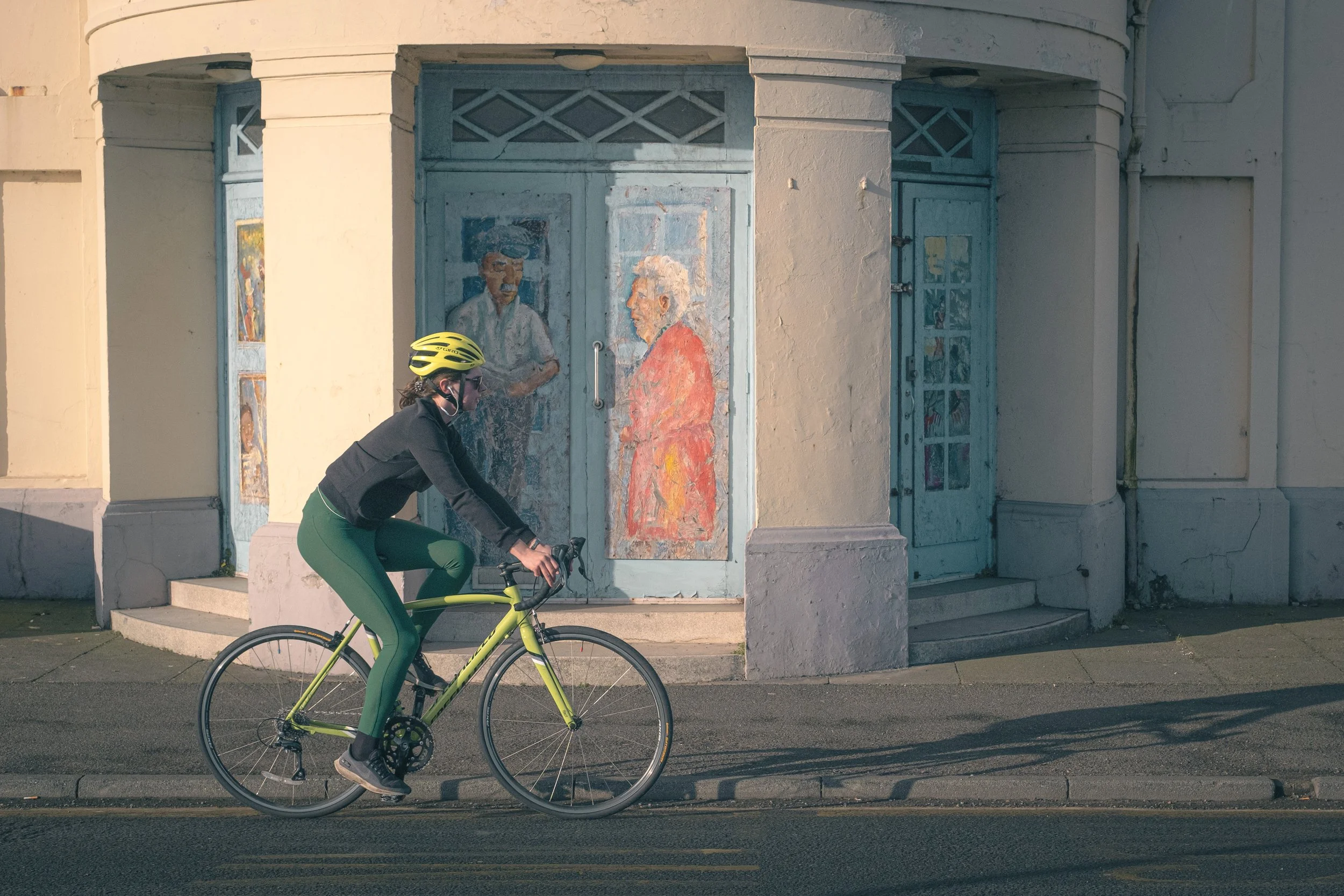
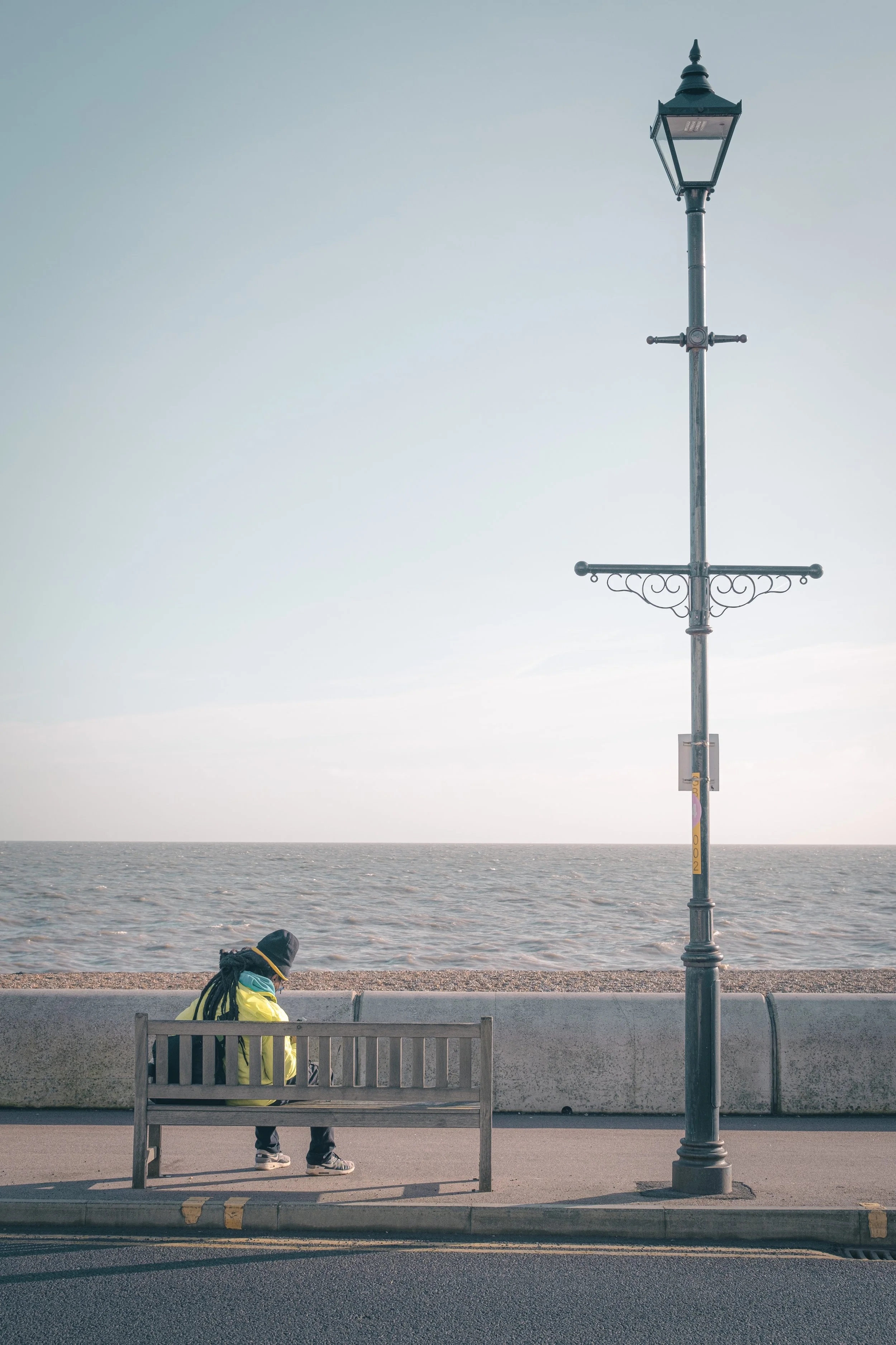
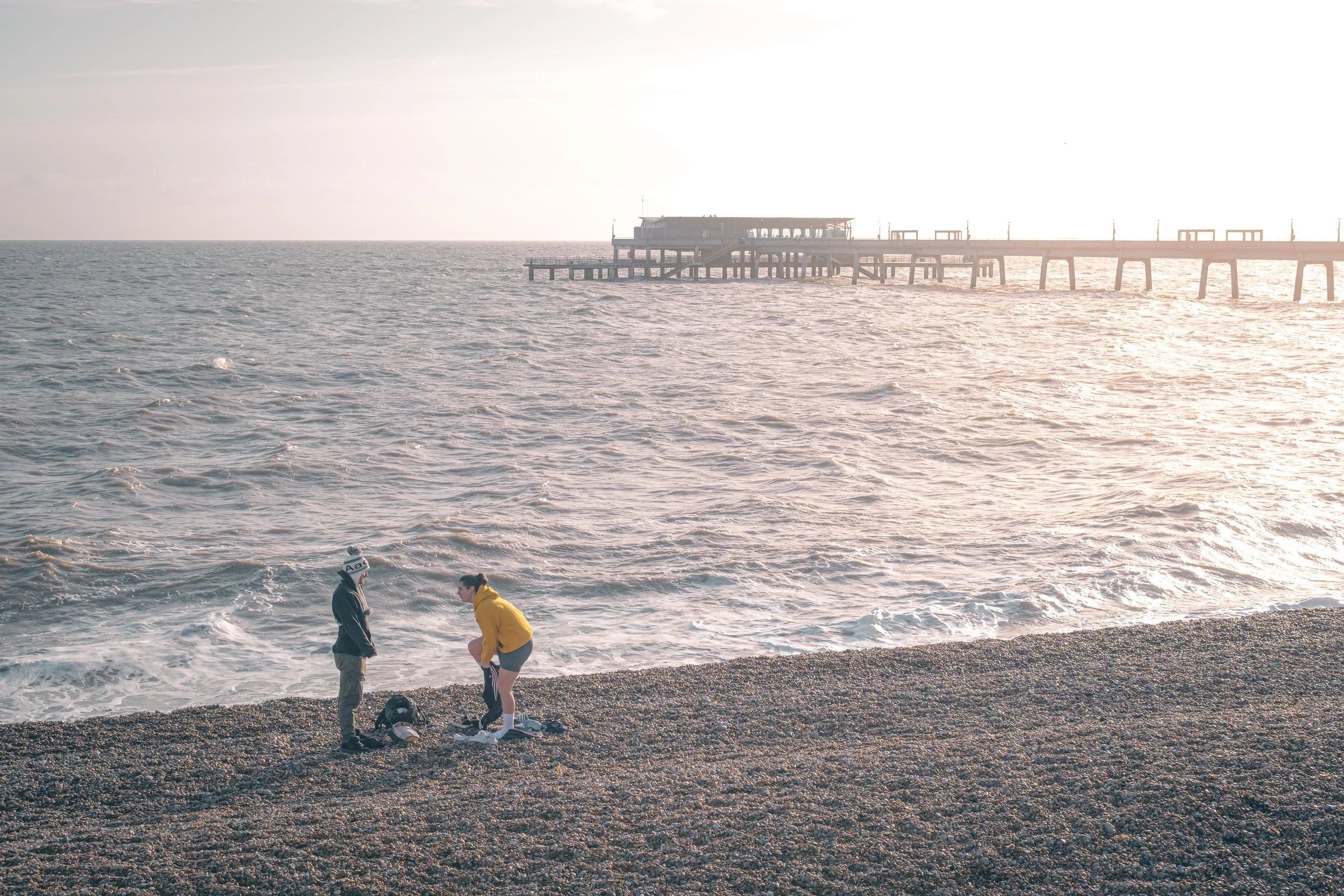
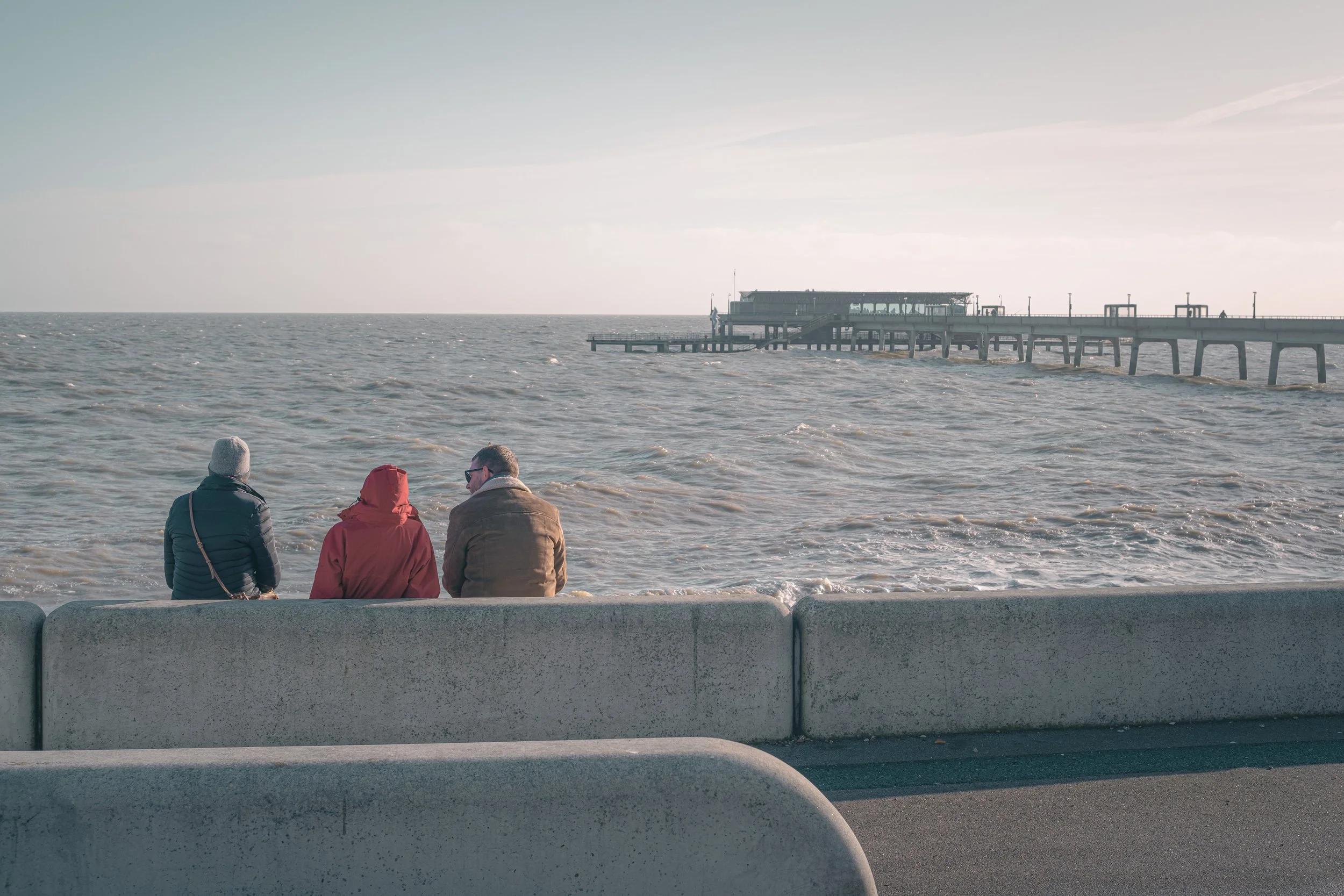
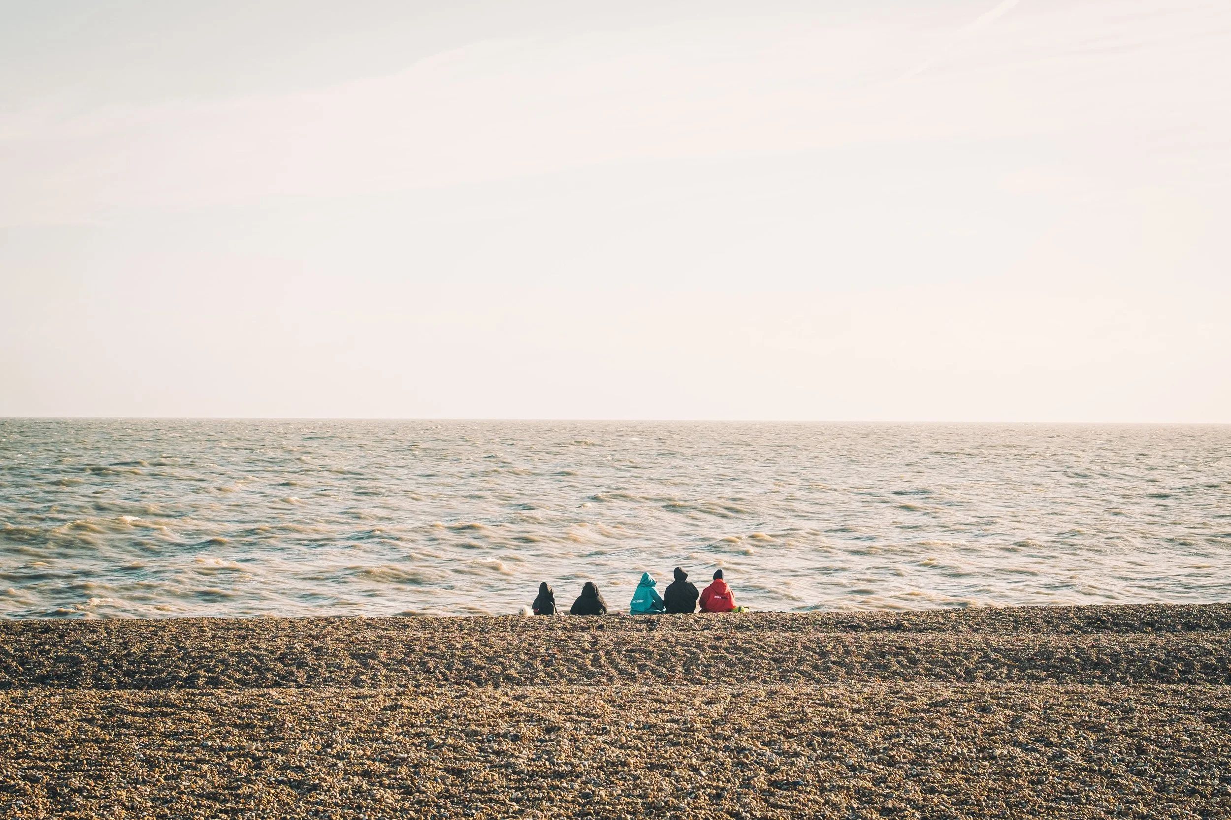
Photography-wise, I got some nice shots whilst I was away. Probably not much in the way of absolute bangers, but some shots I was at least happy with. Of course the light was great (if you want strong shadows obviously) whilst we were there…because it was just blue skies and sunny every single day. However, it wasn’t without its challenges. Once it got to late morning, the heat became unbearable. Whereas in the UK I’d be happy to stand at a composition and do a bit of “fishing”, in Seville I tend to find standing around for more than five minutes in the sun very uncomfortable, particularly if you need to stand in the sun to make the most of the composition. I also struggled with golden hour street photography as I very quickly realised you have time for probably one or two compositions and that’s your lot. You don’t have time to wonder around and find something. You either decide on a composition and stick with it, or inevitable end up getting nothing at all. On more than one occassion I got nothing at all.

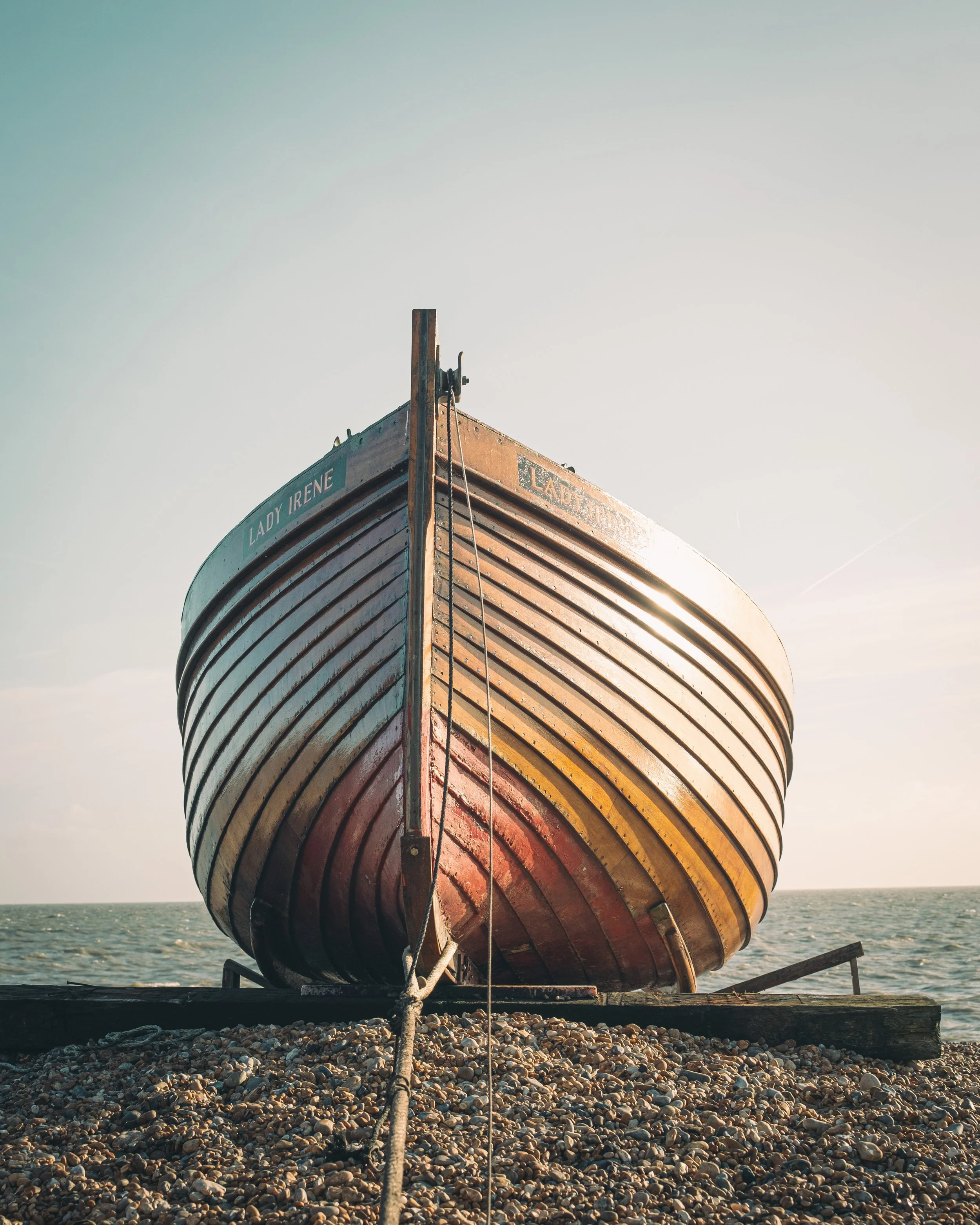
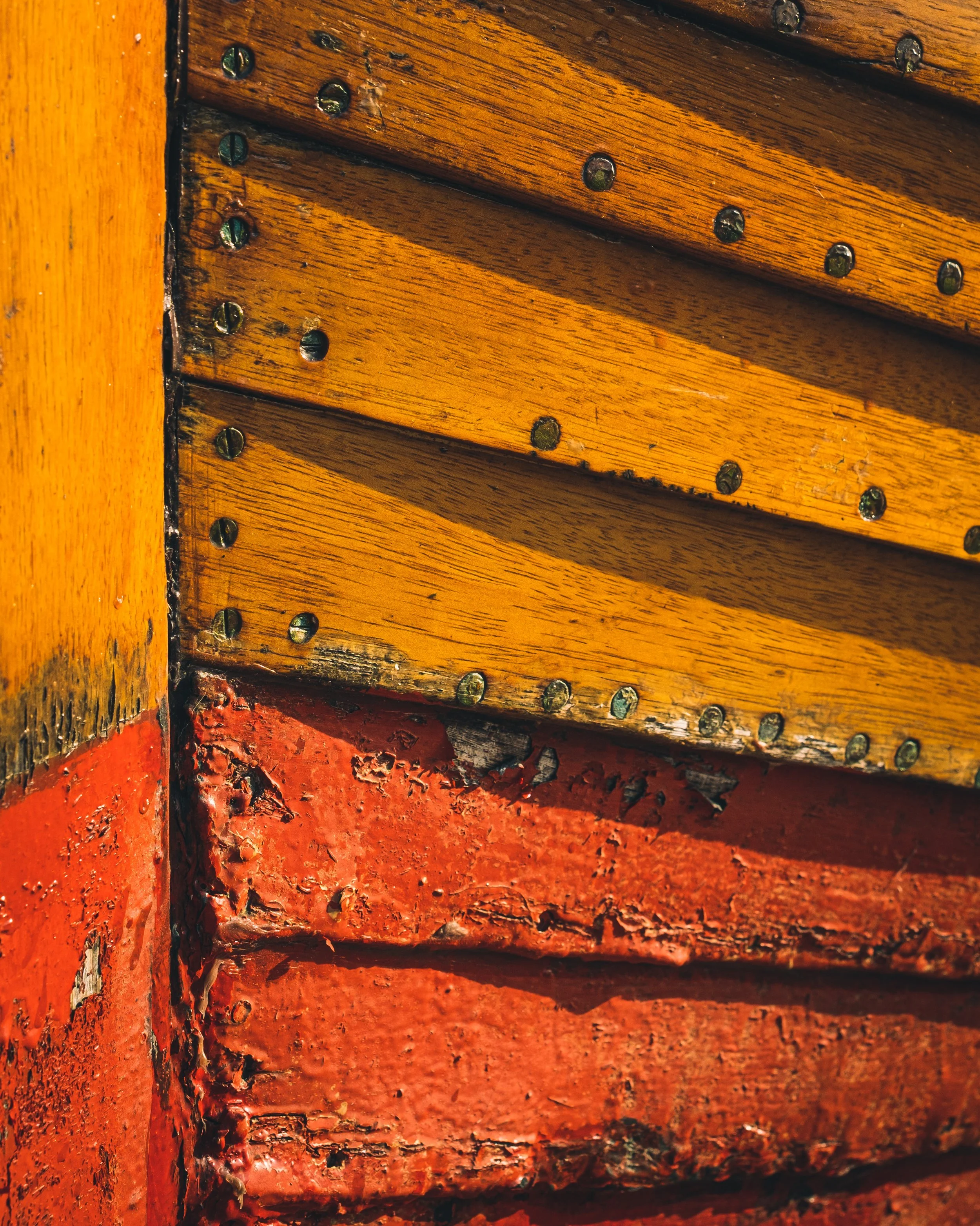
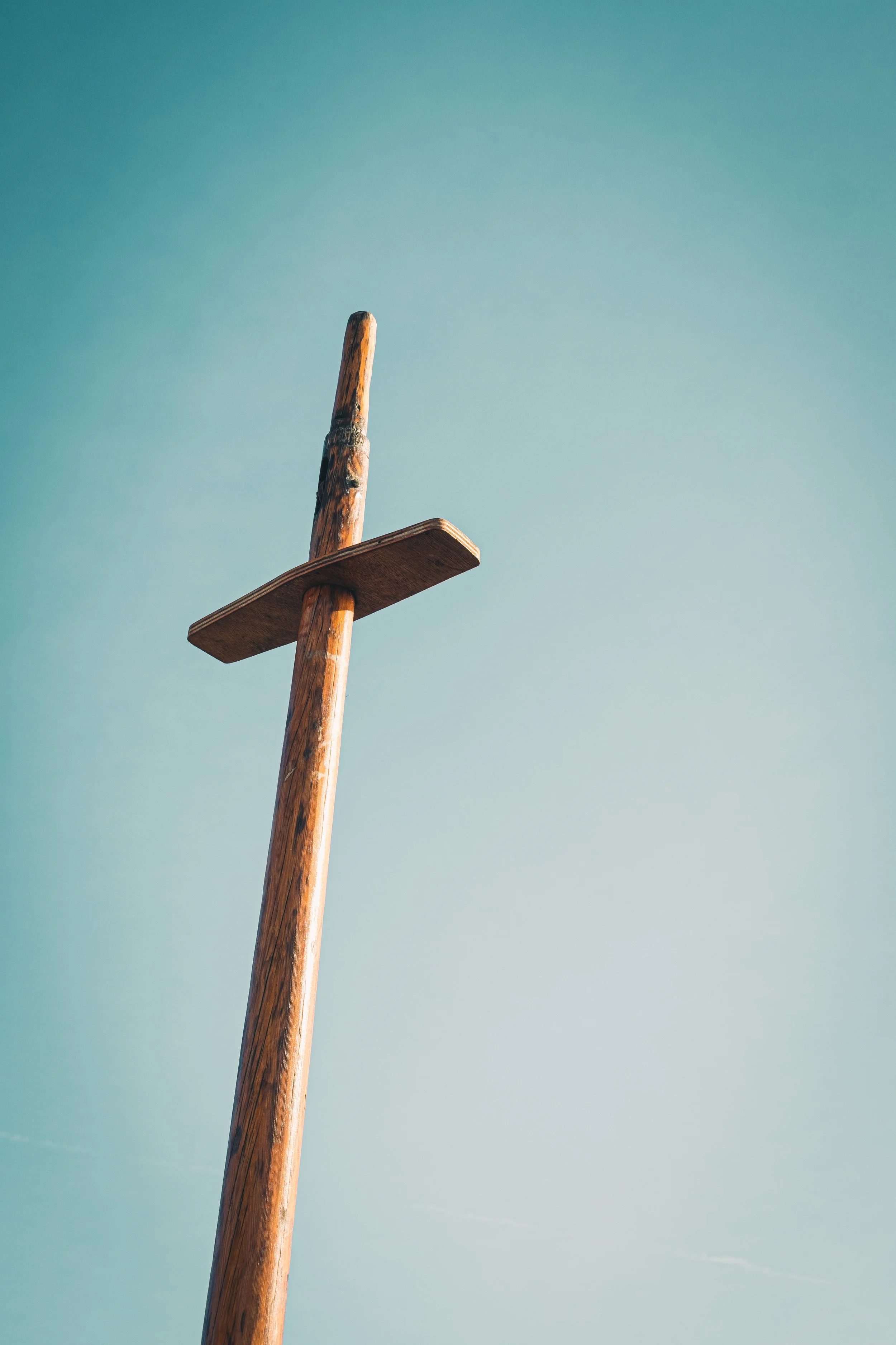
Anyway, I’ll post some shots below in a gallery…

Now for the “pleasant surprise”…

Before I went away I took my shop offline. I wasn’t going to be in a position to process orders and figured rather than have delays for people, I’d just take it down altogether. Seemed a sensible move…at least until I frantically tried to put it back online using just my phone and a data connection…

Some time before we went, I decided to send a copy of my zine to Ted Forbes of The Art of Photography. I’ve followed Ted for sometime and he’s been quite an inspiration as I’ve got to figure my way around photography. Whether it be technical tips, theoretical discussions or sharing the work of others, there’s been much that I’ve gained from his channel.

Anyway, Ted regularly does a round-up of some of the books and zines he’s been sent in by viewers, which I find to be valuable in terms of seeing the work of others and also in providing some additional motivation to get those photos off the computer and into something much more tangible, something that feels more…real. So I decided to send mine in and…well…he picked it out for showcasing and critiquing on his channel which absolutely blew me away. I mean, of course I sent it in hoping for such an outcome, but I never imagined it actually would get on the channel.

As for Ted’s thoughts on the zine itself, I was pretty chuffed with his take, and it’s certainly not dissuaded me from honing what I learnt from the first zine and putting together a second. I particularly liked his comments about the colour palette (I’ve developed a preset which I use across my night images). His criticisms were entirely fair (and something I had actually been thinking a lot since publishing the zine), and will certainly help me when I’m looking across my images and trying to pull something together. Anyway, you can view the full video here (my zine features from 11:04 onwards):

Thanks Ted, much appreciated!

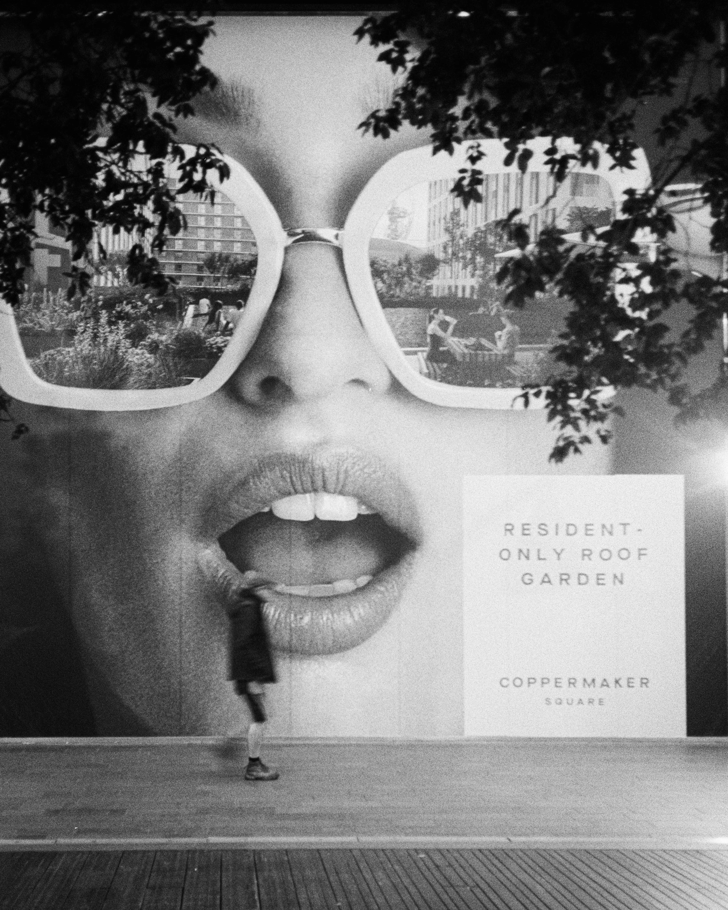
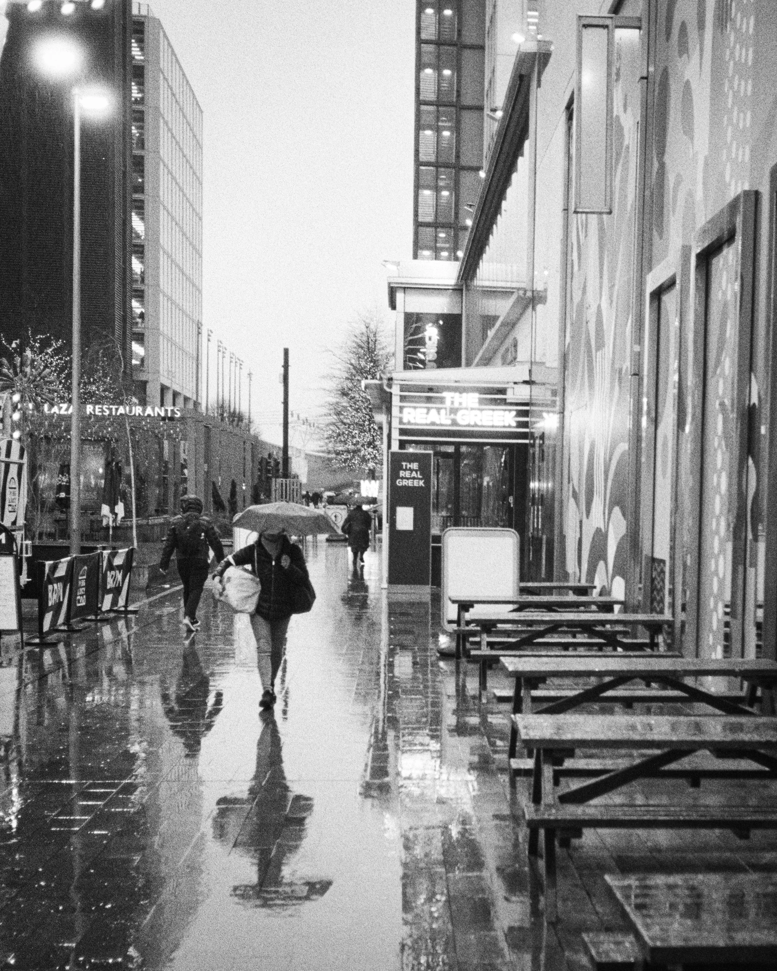
And so…back to that gallery of Spanish photos I mentioned…although admittedly it’s going to make me wish I was back there, enjoying beer and tapas. Ah well…

Publishing My First Photography Zine

By now you’ve probably seen countless posts by me announcing my first photography zine (sorry about that!). To be honest, the final publication was far better than I could possible have hoped for, and certainly made my reservations about putting it together completely mis-placed. In fact, before we even get into the substance of this post I will say this: if you are mulling over making a zine yourself, but are scared of the process or worried no-one will buy it, don’t be! If you’ve got a collection of photos you are proud of and you can make them work in a collection…do it! Get organised, stop procrastinating, and go make that zine!

There, pep talk done, now onto the substance…

I figured it might be a good idea to run through the entire process of creating the zine, from the initial idea to making it available via my online store. But whatever else you’re thinking as you read through this, do not think it is too complicated or there are too many steps. Don’t let anything convince you not to do it, because the rewards from putting it together and getting it out there far outweigh all the work you need to put into making it.

So let’s get into it…

The Idea Stage

First you need an idea. Some sort of focus for the zine. Will it feature a particular style of photography? Is it focused on a particular location? A particular commonality between people, places or things? Is there a single thread that can bring together all the images you have? If so, that’s a great start. A zine needs to have some kind of focus, not just a random collection of your best photos. It needs to be a collection that makes sense together (more on that later).

In this case, I decided to build a collection orientated around night street photography. At the tailend of the summer I picked up the Fuji 33mm f1.4 lens, partly because I wanted the larger aperture as I was starting to get into low light photography. As we moved into winter, I began to formulate the idea of a project: night street photos in a variety of locations across the county, and elsewhere if possible (London, specifically Soho and Chinatown were particularly in mind). I hoped that, by the time we moved into spring, I’d have enough images that I could start to look at putting together a zine. Fortunately, that turned out to be the case.

The Post-Procrastination Stage

Of course I then spent a long time telling myself not to bother doing it as actually the photos weren’t that good, no-one will buy such a zine, the publishing process is too complex, it’s too costly, there are too many unknowns…and on and on it went. Round and round, the thoughts telling me why I shouldn’t over-powering the ones telling me I should. But then I pushed past this stage and figured “what the hell, let’s take a chance.” And so I did some research…

The first thing I re-visited was Sean Tucker’s excellent video on zines:

This was critical for me, not only in terms of wrapping my head around the whole process, but also in encouraging me to take those first steps and actually put together the zine. Furthermore, Sean recommends a print company (ExWhyZed) to bring to life your vision. On digging around more and learning about what this printer has to offer, I decided they would be the company I would liaise with to put the ideas I had into print.

ExWhyZed offered a range of options for zines, different sizes, different bindings…I decided early in the process I wanted to go for an A5 zine (nice and pocketable) and I wanted wire-stitching (stapled pages). The maximum they recommend for this format is forty pages…so I decided to go for the full forty pages. What the hell, right? Might as well go all in.

So I now had the motivation, the print company and the format sorted…next step was going through my images and trying to decide what I would include.

The Selection Stage

Fortunately, to make life easier for myself, I’d already sorted all of my night street photography images into a folder in Lightroom. This left me with the simple (!) task of picking out the “best” ones…I knew the zine was going to be forty pages, so I whittled the images down to around 42. I then downloaded them onto a USB stick and took them to Canterbury Camera Centre and had them printed out. This was crucial for two reasons: to check the images actually looked ok in print, and to help with sequencing the zine.

Sequencing is a critical part of the process. You don’t want to just shove a load of photos into the zine in whatever way they come. There needs to be some thought behind it. Some kind of logical sequence that both connects the images together, and helps the reader make sense of what they are viewing. To help with this, once the images were printed, I took them home and laid them all out on our dining room table and started to move them around, deciding on whatever sequence was best and had some sort of narrative flow.

I moved images around, took some out, shifted it around until I was happy with it. As I noted above, I printed out around 42 images and I had 40 pages to work with…but in actual fact, I had around 34 pages to work with. The cover pages weren’t going to have images on them, and two pages would have text on them. As a result, I had plenty of images to choose from and could afford to be fairly choosey with what was included and what wasn’t.

In the end I found a narrative structure I was happy with. A part of me thinks I shouldn’t share the narrative here, because I wonder if people will spot it without the spoiler. But what the hell…full disclosure, spoiler ahead! I tried to sequence the images into a kind of “night out” narrative. It opens with a shot of a car (two shots actually), moves onto people making their way home in the early evening, to places getting ready for the night ahead, people entering restaurants, people in restaurants, people in bars, people in club mode, and things closing down for the night. It’s imperfect (for me anyway, as I know the story behind every image), but I think it works and tells a story of a night out somewhere, anywhere. Of course these images are from a variety of locations, but the typical night out is a universal thing. And so the locations didn’t matter, what mattered was what the images could convey.

I don’t think I fully succeeded, but hopefully you get the idea. I had a narrative for my images in mind, and I used that to structure the zine before I went onto the next stage…putting it all together.

The Putting It All Together Stage

Of all the stages in the process, this was the most difficult. How was I going to pull together the zine and create the file necessary for the printer to work with?

I looked at the various desktop publishing tools available, but of course they mostly cost money. And, in the case of InDesign, a lot of money. Being a fan of open source software, however, I was happy to stumble across a free option that looked like it would do the trick: Scribus.

Now, I’ll be upfront right from the beginning. Scribus was not easy to use. I don’t know if it was because I was using a Mac (I’ve heard that’s not an uncommon problem), but I frequently found myself tearing my hair out and screaming in frustration (sometimes in my head, sometimes…well…).

Desktop publishing seems to be one of those things that are far more complicated to use than they should be (bit like video editing software). By now it should be all drag and drop and lots of user-friendly editing tools. Now, maybe InDesign is like that. Scribus…isn’t. Nonetheless, I ploughed through some of the documentation, learnt the basics (I was only really adding photos after all, not doing something too complex) and got to work.

Before starting on the structure, I had to set the template for what I was about to design. So I set it to A5, added a 3mm bleed (as per guidance from ExWhyZed), forty pages and, then started to transfer the images across from my computer to Scribus, page by page.

At this point I decided I wanted the images on a black background. I was interested to discovered from ExWhyZed that coloured paper is quite expensive and so they recommend you put a coloured background on your desktop publishing tool if you want coloured paper. This was ultimately part of the frustration I had with Scribus. I had to add a black background to every page and then add the images on top of that. Somehow this got to be really complicated (I was probably doing something wrong), but eventually I got there.

The black background also had to factor in the bleed. If the black background didn’t go over the bleed lines, there was a chance that when the pages were cut, there would be a white line on the edge of the page. It’s important to note that if you want anything going up to the edge of the page, you must factor in the bleed. In my case, it was just making sure the black background covered the bleed area, so it was relatively straightforward to deal with (well, apart from the software aspect…).

The other frustration was that it wasn’t easy to centre the images. I obviously had margins to work with, but I had to gauge the exact centre of the page. Seems a bit unnecessarily fussy doesn’t it? But then you factor in having two portrait orientated images on facing pages. If they’re not closely lined up they can very easily end up looking a bit…wonky. Again, I don’t know why the software can’t centre the image with one click but, well, it’s free software and sometimes you just have to learn to live with imperfections when you’re not paying for it.

I also decided to add some text at the beginning. One block on the first page to indicate the dates the images were taken, the second page to give some background on how the zine came to pass. Again, adding text wasn’t quite as easy as you’d hope. Rather than clicking on the page and then typing like on a blog post, you have to create a text box, click into the textbox, create the text, save the text… When it came to font choices, I went for a typewriter style font for the introductory text (kingthings trypewriter - downloaded for free from FontSquirrel), as well as for the front cover. It’s a style of font I quite like, partly because it looks more like someone has typed on it rather than it being created by a computer (it’s also a font style commonly used for the liner notes in some of my favourite albums).

Talking of favourite albums…that’s really the story behind the name of the zine. All Night Thing is a song from Temple of the Dog’s eponymous album (Temple of the Dog was a collaboration between Pearl Jam and Soundgarden, led by Chris Cornell) and seemed a good fit for the zine. I sort of see the finished zine as a “thing” and all of the photos within it were taken at night…hence all night thing (I’m embarrassingly pleased with that, sorry, it’s not even particularly clever).

The Printing Stage

The next stage was the printing stage…the nerve wracking bit. The first thing I needed to do was make sure the saved PDF was in the correct format (pdf/x-1a - a high definition pdf format) and the correct colour profile (CMYK). The latter was particularly important as images for the screen tend to be in RGB, but for printing you need CMYK to ensure the colours are as close as possible to what they need to be. That said, one of the things that was flagged to me earlier on by the printers is that you need to be prepared for the colours to not quite match what you see on screen.

Once I was happy with the PDF and completed multiple checks (especially for typos, but also to double check every image was placed as I wanted), I got in touch with ExWhyZed to get a quote for my zine. At this point I asked for a quote for 1, 50, 100 and 150 copies. Given economies of scale, I took the scary decision to go with 100 copies (eek!). I probably should have started off small scale but, hey, in for a penny…

One thing I didn’t do, which is probably a good idea, is get some paper samples. Of course images look different according to the paper on which they are printed, and so that needs to be factored in. However, I’d already decided I wanted uncoated paper as I preferred the more natural look to the zine. I accepted this might mean the neon lights in my images weren’t quite as vivid as they might have been had I chosen a gloss paper but I also wasn’t keen on the reflective nature of gloss paper and, well, these things are all about compromises.

Following guidance by ExWhyZed on their website, I went with 300gsm uncoated paper for the cover and 115gsm paper for the internal pages. They seemed a good choice for the kind of zine I was looking to create. Something that feels more like a zine than an expensive magazine with thick paper throughout. It’s also worth adding that, as per their advice, I also went for matt lamination to the outer cover. This protects the integrity of the print and helps prevent cracking…particularly important given the pages were to be coloured black.

Upon receiving the quote, I went ahead and prepared the PDF for submission. Using WeTransfer, I uploaded the high res PDF (which was around 240MB) and sent it to ExWhyZed. After a few hours, I received a digital proof of the zine for checking to ensure that the text was fine, the images were good and everything was ready to go. I checked it a few times, left it alone for a bit, went away and did other things, then came back and checked it again. Once I was happy, I hit the approval button and that was it…the zine was on its way to the printer and it was now a case of waiting…

The process was remarkably quick. I approved the proof on the Thursday, on the Tuesday I received confirmation the printing had completed and it was now on its way via courier the very next day. Of course, by this stage I was incredibly nervous. I’d ordered 100 copies after all. What if they weren’t what I was hoping for? What if the colours weren’t right? What…what if my photos weren’t as good as I thought? The doubt crept in once more…I should have just kept the images in Lightroom and never even have considered a zine, right?

Then the box arrived…

I decided to hold off opening them until my lunchbreak. I wanted to shoot a little video to help me promote the zine, the kicker being my idea for a video meant I had to record the opening of the box. What if I set the camera up, started recording and the zines were crap? I went ahead anyway. Let’s just do this…

Camera set…

Pen knife in hand…

I sliced through the tape sealing the box…

Opened up the cardboard box…

Pulled the bubble wrap off the zines…

Shit!

There it is.

Oh god. Oh god.

This is it.

I picked the first one from the box and…

OH MY GOD.

It felt so good. It looked so good.

I’ve done it! It looks better than I could have ever have hoped for. Amazing printing. It looks like a proper zine. It is a proper zine. All those doubts and now I have this in my hands.

I’d already prepped the entries in my store in anticipation. I was so relieved to see that I was now able to publish the pages on my online store and make the zine publicly available. It was now…for sale! I did it!

The Selling Stage

Of course, now it’s on my website and you can order it with a few clicks which is great. But as well as a print version, I decided to make a digital version available too. Selling at half the price, I thought it might be a good option for those who want a cheaper option, but also want an edition that they can flick through on tablets, smartphones, whatever. This was not as easy as it appeared.

Obviously the original high resolution PDF was huge (around 240mb), far too much space for most people. So next came the question of how do I scale down the file size and make it a good quality product to view on screen? My chosen solution was to drop the dpi (from 300dpi for the print version) and therefore decrease the quality of the images and the size of the file. Ultimately, alongside space constraints for people, I don’t want to give away large high resolution copies of my photos, so I worked on a number of different options before I got to the point that both the file size and the resolution were good enough for sale. In the end I think I got a decent compromise (the file size is around 50mb), but time will tell as to whether people think it is a worthwhile option.

Then came the promotion, which takes us right back to the beginning and posting videos and Instagram stories all over the place to raise awareness. At the time of writing, I’ve had 595 visits to my website since launching the zine and sold thirteen copies (12 print, one digital). Frankly, I’m blown away - so pleased with how the zine has turned out and the response to it. It’s better than I could ever have hoped for.

So of course there’s a lesson here…stop procrastinating. If you’ve got photos you’re proud of and you want to try something different to showcase your work, consider creating a zine. Get a theme, create a sequence, a narrative to structure the images, get some quotes and get that zine out there. Ignore the devil on your shoulder giving you reasons not to. Shift that mindset from Why Should I? to Why Shouldn’t I?


All Night Thing is available in print and digital formats in my online store. If you have ordered a copy, I’d love to hear your thoughts below!

How I Edit My Night Street Photos

I figured, as I’ve been posting a lot of night street photos lately, maybe I should put together a quick post on how I edit my photos. I’ve had a few comments in recent months about the look of my photos, so now seems a good time to run through how I take my photos from this…

to this…

The back of someone with a ponytail against a window, an neon sign that says open is above their head.

In Camera Settings

Before getting into the edits, a bit about the settings I use when shooting with my XT3. I generally stick to as wide open as possible, and so I tend to exclusively use my 33mm f1.4 lens. In terms of shutter speed, I hover around 1/125 and 1/250 depending on whether the subject is stationary. I leave the ISO on automatic (with an upper limit of ISO3200) and exposure compensation around -1 to -2 to protect the highlights. I also always shoot in RAW.

I should also add that all my edits are done on an iPad Air. I tend to find with street photography I don’t need to do heavy edits, use layers and layer masks and whatever. Photoshop isn’t something I find myself needing. What I want is a convenient way of editing that enables quick edits on the fly. Lightroom and the iPad do this perfectly for my needs.

Light

Lightroom screenshot showing settings.

As you can see, I push the exposure up quite a fair amount when editing. This is largely due to the exposure compensation I apply in-camera. It doesn’t impact upon the image quality and, crucially, it ensures I protect the highlights. The highlights too are dropped right down, although in some scenes I might lift them up, depending on how I want to work the light in the scene. Mostly though, I drop it down. I also drop the contrast to soften the image so it’s not too crunchy, I prefer a softening effect in my images where possible (although, again, I may do otherwise depending on what I want to achieve with the image). I also drop the whites, drop the blacks a tiny amount and lift the shadows a small amount (in this case to show more detail from the person’s clothing).

In terms of the tone curve, I tend to lift the blacks a little to give it that filmic quality and very slightly drop the whites. Again, I may lift the blacks on the tone curve or drop them down depending on the image itself.

Colour

With Colour, I drop the temperature right down. Typically my night shots are taken during the winter, and so I find they work best if they are cooled down a bit to around 3200k, adding in more blue tones. I then tint towards the purple and add some saturation and vibrance to the image.

Where I really start to get the colours I want is in the HSL area and the Colour Grading (more on that below). I particularly like my blues to be pushed towards the green/blue and quite desaturated, making for a softer blue that I find more appealing. I also push the yellows more towards the orange and also desaturate slightly. The combination of the two together helps to get the colour palette in the kind of place I would like to be before I move on to Colour Grading.

Colour Grading

This is where I think I have the biggest impact on the look of my images. As you can see, I tend to grade the image with blues in the shadows, oranges in the highlights and, most importantly, I add green to the midtones. I think this is the single most important element in terms of getting the tones I like across the whole of the image. By pushing in those greens it gives the image much more of the kind of atmospheric (futuristic?) look that I like in my night photos. It just seems to really work to lift the images above being a straightforward, “as it looked to my eye at the time” type edit. I think that in combination with pushing the blues towards the green-blue and pushing the white balance to the colder end of the scale really seems to work for me. Of course, I may take a different view in years to come, but for now it gives the night photos a look that I really like.

Effects

When it comes to the effects, in most cases I tend towards negative clarity (-10 to -20 typically) and negative dehaze (-5 to -10). This is largely because I want to soften the image rather than give it harsh, hard edges. In this case, I’ve slightly nudged up both just to add some detail to the hair in the ponytail. Again, it’s about the specific image and what I want to achieve with it. Either way, I tend to be fairly cautious with both clarity and dehaze as pushing them too far either way can lead to some odd looking images. Texture I always increase to add a bit of fine detail to the images.

I also always add a vignette, and quite a heavy one on night photography by my usual standards (around -15 tends to be my default). I sometimes also add a radial vignette over the subject and invert it to darken around the subject and draw more attention to it. Finally, I add a bit of grain just to add to the atmosphere of the image and help to push it towards that more filmic look.

Anyway, that’s pretty much how I edit my night photos. As I’ve kept saying above, some of the specifics are very much dependent on the image itself. Generally speaking I apply a preset then adjust according the image itself (I always see a preset as a starting point rather than a one-click solution to an image), but these are broadly the kinds of settings I go for. The things that never really change are the white balance and the colour grading, other than that, I shift things around to suit the image.

And that’s my photo editing of night street photos regime! Hope you found that useful/interesting!

ian

Decisive Lucky Moments

There are days where I wonder around with my camera, taking photos on the streets, feeling that…I’ve not really got much. Just some bog standard shots of people walking past a fairly interesting building, or just standing on a street corner. Ok shots, but nothing that makes me feel “wow, that’s a portfolio” image (some might say even the ones I consider portfolio images…really aren’t). I come home, load the SD card into my iPad, and expect to be just flicking through a series of fairly standard images, 99% of which will end up deleted.

Every now and then, however, I get home and realise…maybe I had something after all without realising it. Sometimes I capture an image and think “well, I could pass this off as intended, but the reality is that it was just chance”. Last week I had one of those moments. An image I was pleased to capture, but had no idea I’d caught something I’d consider for my portfolio until I got home…

Now, when composing this image, I genuinely did not spot the poster in the optician window with a model looking out towards the couple embracing. Genuinely. So I have a mixture of feelings when I look at this image now. Pleased I caught it, but also weirdly annoyed I didn’t really check the full frame before I took the shot. But does that really matter? It’s not as if I could have captured it any better, is it? Is it just a case of a bit of imposter syndrome trying to undermine me?

Ultimately, the main thing is getting the shot. And besides, it would look more than a little wrong to stand across the street and analyse the scene while two people were embracing. It could look…well…a bit intrusive shall we say. And, in all honesty, even taking this shot made me feel a bit uncomfortable, as though I was intruding on their intimacy (but equally I have serious problems with public affection…it’s not really my thing). Maybe I could have improved the composition, but equally I could have ended up dealing with a very awkward situation, accused of all sorts. As it is, it’s in focus and, after cropping it (the original shot was vertical), it works. And, in the end, that’s all that matters.

I always try to remind myself that perfection is the enemy of good. Whether that be a photo that is slightly off focus or not fully exploring the scene before taking the photo. Sometimes it just has to be about getting the shot and that decisive moment. You may not get technically perfect images every time, but you capture a moment and sometimes, not always, that is enough. In this case, the decisive moment was a lucky one.

The Fog Descends On Deal

With a disappointing weekend of weather (and an enforced stay indoors due to a new sofa being delivered…which I can’t complain too much about given the state of the old one…) and a half-term off with the kids to look forward to (no sarcasm!), I fully anticipated a quiet week ahead with very few opportunities for photography. How wrong I was! After eagerly watching the weather forecast, hoping for some late morning fog, it looked promising for Tuesday morning. The forecast was for a pretty much widespread fog, covering the whole of the south east. The only question now: can I get up and get the children ready and out the door in time to catch the fog in Deal?

I’ve had my eye on Deal in the fog for sometime now. I’ve been intrigued by the possibilities around the pier, with the fog enveloping it and giving it that air of a concrete road to nowhere. In recent years, I’ve appreciated just how rare it is for this kind of occurence. Either I’ve just been unlucky in recent years, or the fog has always been something that occurs a handful of times a year and, even then, trying to predict when and where is a fool’s errand. So not only have I been keeping my fingers crossed for fog, I’ve been keeping my fingers crossed for fog in Deal. Given it’s a 40 minute drive from our house, there is always the risk of getting in the car, driving through the fog and finding…nothing on my arrival at this little seaside town. Fortunately, this was not one of those occasions…

After driving through thick fog on the A2 (and counting the number of cars without lights on, despite the visibility being down to a few metres), we arrived in Deal and were presented with the kind of foggy conditions I had hoped for. Armed with only my XT-3, no tripod, no zoom lenses, just a 23mm and 33mm prime, I set off to see what I could capture. With my children in tow too of course.

After belatedly realising I had knocked the focus mode switch on the front of the camera (thank god I noticed that before too long), I started wondering around the beach to see what I could capture. This was one of my first shots:

23mm, f5.6, 1/250, ISO160

Of course, the obvious shots were the first shots I took, but this is the kind of shot I had envisioned when I imagined the fog descending onto Deal. In terms of the post-processing, I like my fog images to be tinted slightly green as I think it gives it more of a mysterious vibe to the image, like it’s something out of a horror movie. Otherwise, I keep the editing fairly light and just accentute the softness (so low contrast, minus clarity and very slightly minus on the dehaze).

After pottering around under the pier for a bit, I headed up (with the children, honestly, I didn’t forget them!) onto the pier itself and took a walk along to the pier head. At thist time of the morning, there were a few people milling around, but not so many it was crowded. This really helped in terms of picking out individuals or couples walking along the pier, and of course the fog helped to simplify the background and obscure any others that were in shot.

23mm, f8, 1/500, ISO500

23mm, f8, 1/500, ISO160

23mm, f8, 1/500, ISO400

As I got to the end of the pier walking back, the fog started to lift and we took a walk along the beach towards the fishing boats moored near the road. I kinda figured that was it for the foggy conditions and that the sun was going to start breaking through and it’ll be a typical bright sunny day.

However, just when I figured the day was done and we’d wonder off and grab some snacks and disappear, the fog came in again, much to the annoyance of the kids who I think, by this stage, were heartily sick of me continuing to drag them back to the pier to get yet more shots of it obscured by the fog. Nevertheless, I persisted. Of course, I wasn’t the only one…

33mm, f8, 1/500, ISO160

33mm, f8, 1/500, ISO160

Much as I enjoyed hanging around the pier, the kids were obviously getting bored so we took a walk along the promenade, and I’m glad we did as I think some of the best shots of the day were taken as we walked away from the pier and looked back on the people walking through the fog. With the sun behind them (albeit also obscured by the fog) the people suddenly became nothing but a series of silhouettes, ambling towards us. Like something out of a horror movie, these shadowy forms ambled towards us, through the fog, making for some really interesting opportunities. Whilst I was happy with the shots I got on the pier, the shots along the promenade were, I think, better and really had a lot of atmosphere to them. Given the silhouette effects and the nature of the light, many of them I switched up into black and white, there was little in the way of colour anyway, so it seemed like a natural switch.

33mm, f8, 1/500, ISO160

33mm, f8, 1/500, ISO160

33mm, f8, 1/500, ISO160

After our walk along the promenade, we headed into the town centre to have a browse around. By this stage the fog was starting to lift and the sun was now shining through, leaving a beautiful morning, but taking all that lovely fog away. Regardless, it was a pretty spectacular morning on the seafront, with plenty of compositions to work with (I think I took around 370 photos in the end!). The scenary that morning certainly made up for a disappointing weekend and that half-term week of entertaining the children did present some photography opportunities after all. So everyone was happy…well, maybe not the kids. I think they’ve forgiven me now…but we’ve still got a few days of school holidays left yet, so jury is out I guess…

A few more photos from the day are in the gallery below, I’ve managed to cull my shots in Lightroom down to around 190, but I still need some work to do to cut that down a bit. I’ve tried to limit the gallery below to the best bits. Let me know what you think!

ian

Seascape and Street Photography in Deal

Deal. It’s one of those places I keep going back to. I’m not sure if it’s because of the easy parking near to a very obvious subject, or whether it’s the hope of a free cuppa from my niece when I’m in the neighbourhood (wishful thinking most of the year when I’m there for sunrise!). Or maybe it’s because it gives me the opportunity to shoot both landscape and street photography in one go. Like Folkestone, it offers a good opportunity to go beyond the usual landscape shots, switch up my Nikon D7200 for the Fuji XT-3, and try to capture more of the town and its people.

As is so often the case, I got myself prepared the night before, charged my batteries, packed my camera gear and tried to make it as easy as possible to get up, grab my stuff and go. Unfortunately, things never quite work out to plan. My alarm goes off. I decide to snooze a bit longer. Get up, eat my breakfast and, fatally, start watching TikTok videos. I should have learnt by now…DO NOT WATCH TIKTOK VIDEOS IN THE MORNING BEFORE YOU NEED TO GO OUT.

Anyway, I eventually picked myself up and dragged myself to Deal. On the drive there I could already see the colours and I feared I was going to miss the best of it. Fortunately, that wasn’t the case. The rush did, however, mean I didn’t have much time to think about compositions, so I went for some fairly standard compositions I’ve got before. Nonetheless, it was a good morning, with great colours in the sky and whilst the compositions weren’t unique, I at least got something…so I can’t complain. And on top of all that, I got to meet another Instagram photographer. So all in all, I was glad to get out and about and get that sea air. As you can see below, the colours were pretty fantastic, and made a nice change from the usual stormy and overcast shots I often like and prefer on the coast.

10mm, f8, 0.4secs, ISO100

As I was in such a rush, I didn’t have time to work my L-bracket so that I had enough space to squeeze in the remote trigger, so I tried to predict the waves crashing using a two second timer - no easy feat. Nonetheless, I got some nice colour from the sky and in the water…it’s just, not the most exciting and innovative composition. But, well, I blame the TikTok Scroll for that.

As is typical when I get in the mode, I fired off countless shots without moving from that spot. Lightroom is just a seemingly endless stream of identical compositions, with just slightly different waves and slightly different colours in the sky. Trying to pick one favourite out of so many near identical images is a near impossible task. I’ll settle for the one above because I do like the way the water rushes out between the pebbles on the shore.

Eventually I did shift to a slightly different composition. This time, I kept it extra wide, but went for a landscape orientation and a smaller f-stop to get that sun star effect.

10mm, f13, 1/40, ISO100

Of course, the wide angle distorts the pier quite significantly, and the pierhead looks a bit weird as a result. But I quite like the sun shining through and catching the water droplets (reminiscent of another picture I’ve taken in Deal). Plus I like the way the light catches the legs of the pier on the right-hand side but, again, it’s not the most ambitious or unique photo I’ve taken.

After a few more shots in this position, I decided to move around and try at least one composition that was a bit different. This time I decided to try shooting as low as I could go. I always have mixed feelings about doing this on the coast. Sometimes it just doesn’t feel like it works for me, largely because it shrinks the amount of sea that’s visible, and it doesn’t seem much of a seascape without the sea. But sometimes it works, like the shots I got in The Warren last week. Once more, the shots I got were nothing special, but they are handy for me to refer to in future to try and see if I can make them work.

10mm, f13, 1/10, ISO100

After a few more shots here, the sun started to dip behind the clouds and that was pretty much it for those sunrise colours. At this point, I decided to put the D7200 away, grab the XT-3 and take a wander around Deal. As with the seascape shots, I wasn’t really doing well in terms of getting something original, but I tried to look out for details as I wondered around, textures and colours that could make for interesting abstracts, like this cracking paint on a shop sign…

33mm, f5.6, 1/500secs, ISO2500

And of course I couldn’t resist the classic shot looking up Farrier Street to the shelter on the promenade, probably one of the more obvious street photography compositions on Deal seafront but still, it’s difficult to resist.

33mm, f5.6, 1/1000secs, ISO160

And then I spotted this weird, big old yellow bus parked on the seafront. So I decided to go take a look and take a few shots. I was glad the owner didn’t spot me or walk past at any point, because I spent so long trying to find interesting compositions, I’m sure I looked extremely dodgy. I’m still not totally happy with the shots I took (try and guess which one I was least content with…). But at least it made for an interesting subject, even if I didn’t make the most of it.

After about an hour wandering around, I headed back home to Canterbury for a cup of tea and a (very nice) rhubarb and custard pastry at the excellent Fringe + Ginge, which seemed the perfect way to round off the trip and get back to the normal weekend routine (in this case, getting new school shoes for the youngest!).

I’ve put a gallery of some of my photos from the trip below. Will be interested to hear what you think. Does this really capture Deal? Do they feel reminiscent for people who know the town? Or do they give you a sense of what the town might actually be like for those who don’t? Would love to hear what you think.

ian